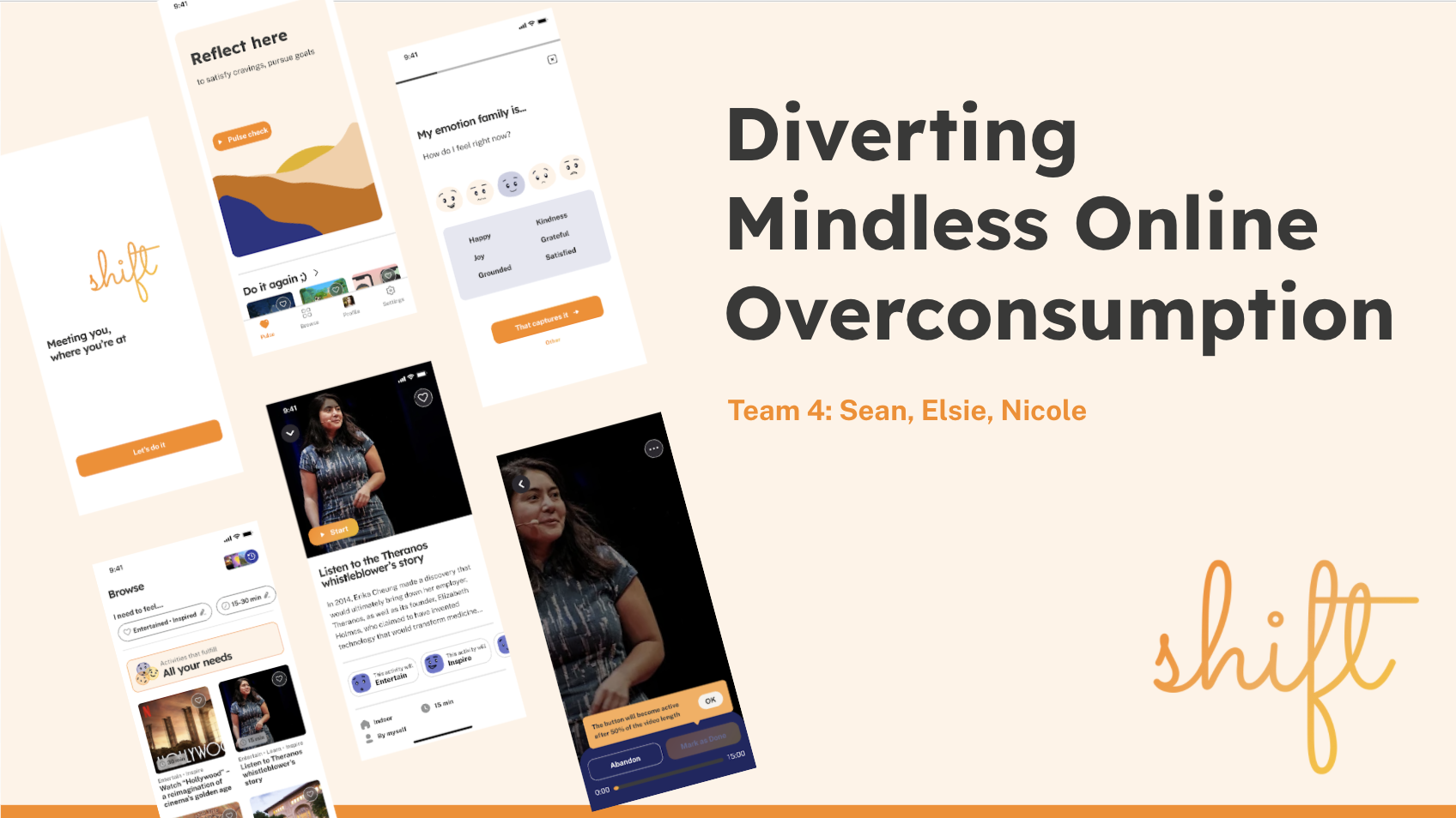
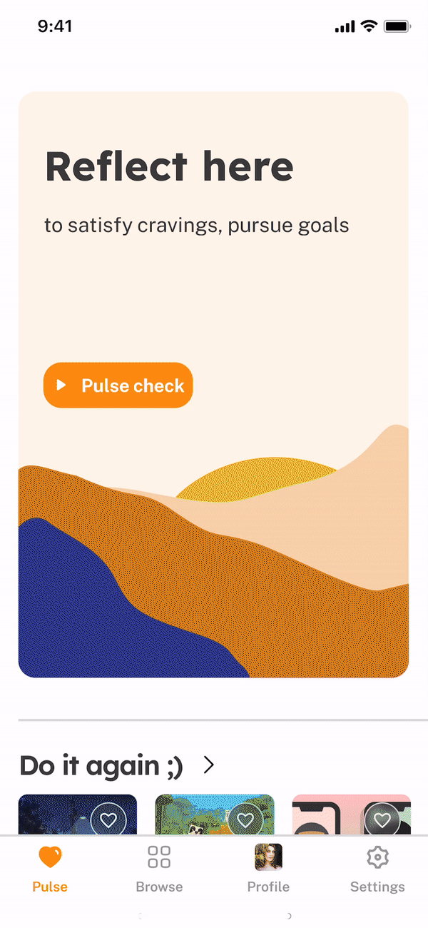
Meet Shift
Our goal is to help people struggling with unrestrained online shopping reclaim control over their digital consumerism.
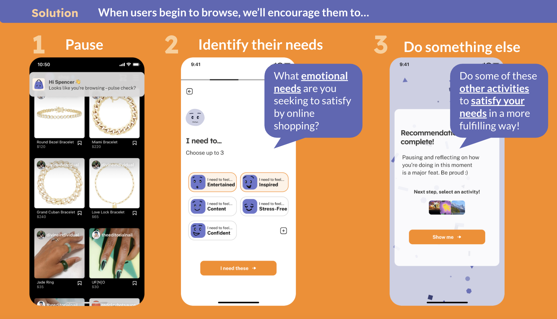
So we designed Shift – your mindful shopping companion that intervenes your browsing session and encourages you to recognize what you’re trying to “quick fix” with online shopping. Then, it’ll recommend activities (that aren’t online shopping!) to help you meet your needs in a more fulfilling, wallet-friendly way.
Now, on to how we got here…
I. Problem Exploration
We selected the impulse shopping domain because…
- Uncontrolled overconsumption is harmful to personal well-being:
- We spend in a way that’s not conducive to our long-term financial goal
- Online shoppers may end up on a hedonic treadmill in which the continuous pursuit of new stuff leaves them unhappy and unfulfilled.
- It’s terrible for our planet: About 10.5 million tons of clothes end up in American landfills each year 😢. If we’re able to reduce unnecessary overconsumption at a broad scale, perhaps we’d also be able to reduce the waste generated by fast fashion.
- All three of us on the team lived with harmful shopping habits that have dented our wallets, relationships, or well-being, so we’re particularly eager to help people overcome it.
Enriching our knowledge: Literature Review & Comparative Research
We began by investigating the existing solution space and reviewing academic research about online shopping addiction, e-commerce design patterns, and self-control strategies to gain a deeper understanding of our opportunity space:
KEY: 📖 = literature review; 🕵️♀️ = comparative research
| Src | 🕯 We learned that… | 😯💭 Which made us wonder… |
| 📖 | There is often an emotional need underlying users’ online impulsive shopping, e.g., relieving stress and anxiety or avoiding negative emotions (Sohn & Choi, 2013) | Would shopping intenders be able to satisfy those emotional needs in more wallet-friendly ways?
→ “Substitute Activity” Intervention Study |
| 📖 | Encouraging shoppers to pause and reflect is the most effective lab-tested strategy in reducing the propensity to make an impulse purchase (Han et al., 2021) | Will pushing shopping intenders into System 2 Thinking via reflection prompts to reduce the desire to shop online?
→ “Introspection Prompts” Intervention Study |
| 📖 | Predictor variables of online shopping include low self-esteem and cognitive overload (Sohn & Choi, 2013) | How might we boost our user’s self-esteem over time? → This later inspired our identity-based “reward” feature.
Will intercepting users before they begin browsing reduce their chances of cognitive overload? → Informed our browsing |
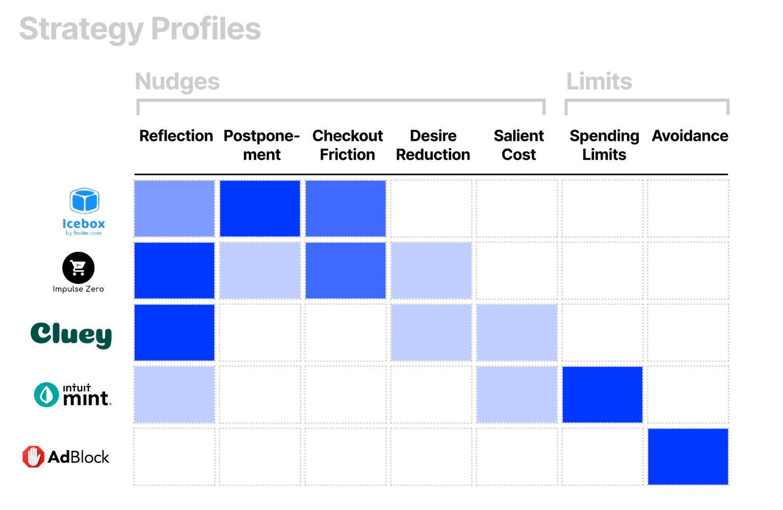
| 🕵️♀️ | No solutions intervene at the browsing or evaluation stages of the online shopping journey ( Figure 3). Instead, existing solutions either intervened indirectly before the online shopping journey (i.e., Mint) or directly at the end during checkout (i.e., Icebox). | How might we effectively intervene at the Browsing and Evaluation stages of the shopping journey? → With the support of baseline study data, intervention study tests were at the browsing stage. |
| 🕵️♀️ | There is a lack of mobile-based interventions: all the direct solutions we found only work on desktop, but people shop on mobile too! And social triggers are way more prevalent on mobile. | How might we deliver an intervention that helps not only web-based shoppers but mobile-based shoppers? → Adopted mobile as our solution platform |
Understanding Existing Behavior: Interviews & Baseline Study
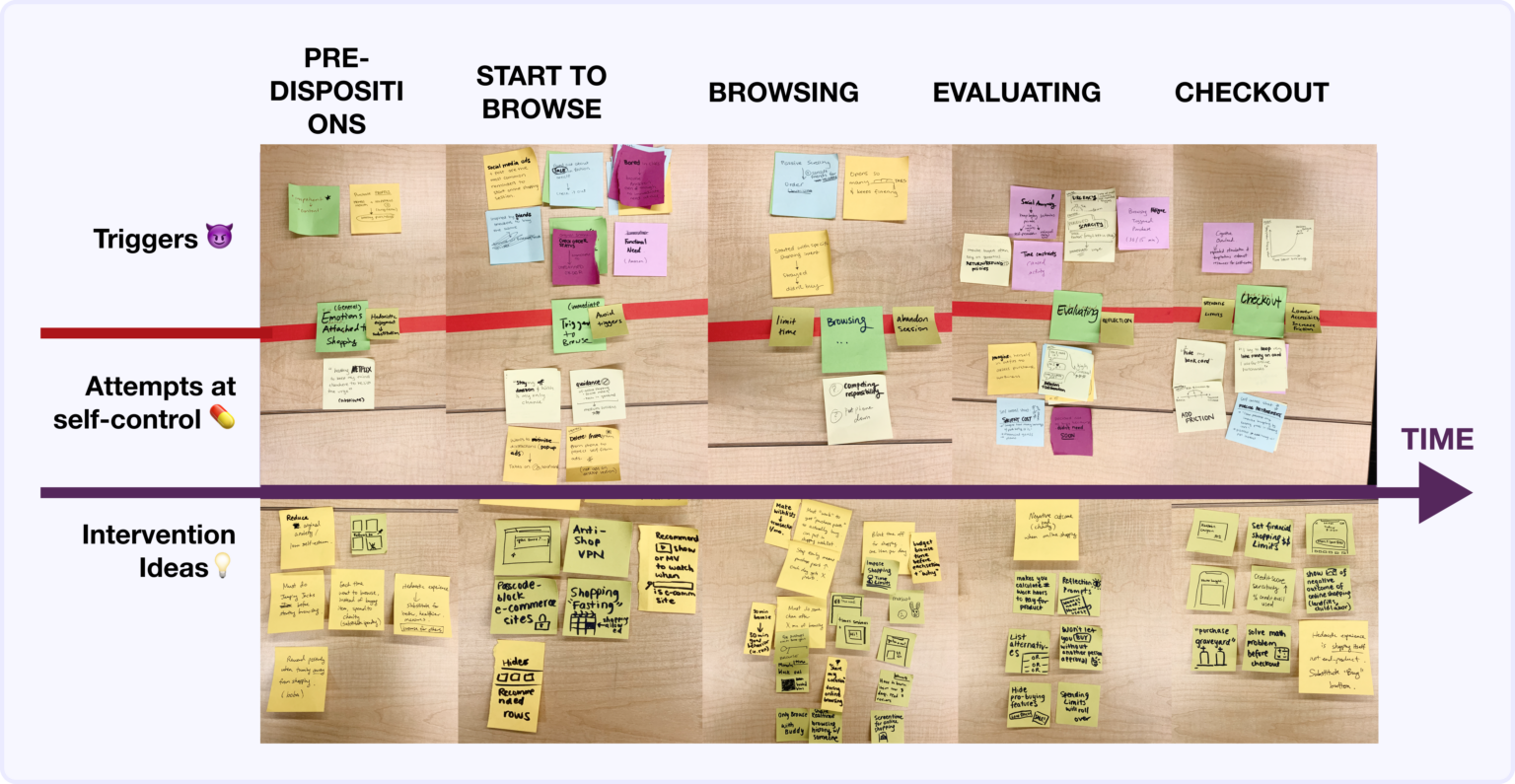
To identify factors that lead digital natives to make impulsive purchases (environment, emotions, motivation, ability), we also asked nine young adults to log their situational context, shopping motivations, and emotions whenever they felt an urge to browse.
Our findings distilled the online shopping experience into five stages (Figure 3). In particular, participants seemed to accumulate desire and mental fatigue when browsing, making it difficult to abandon their shopping cart at checkout.
This insight suggested that intervening at the browsing stage may be more effective than deterring purchases at checkout, so we decided to hone in on the browsing stage in our following problem and solution space explorations.
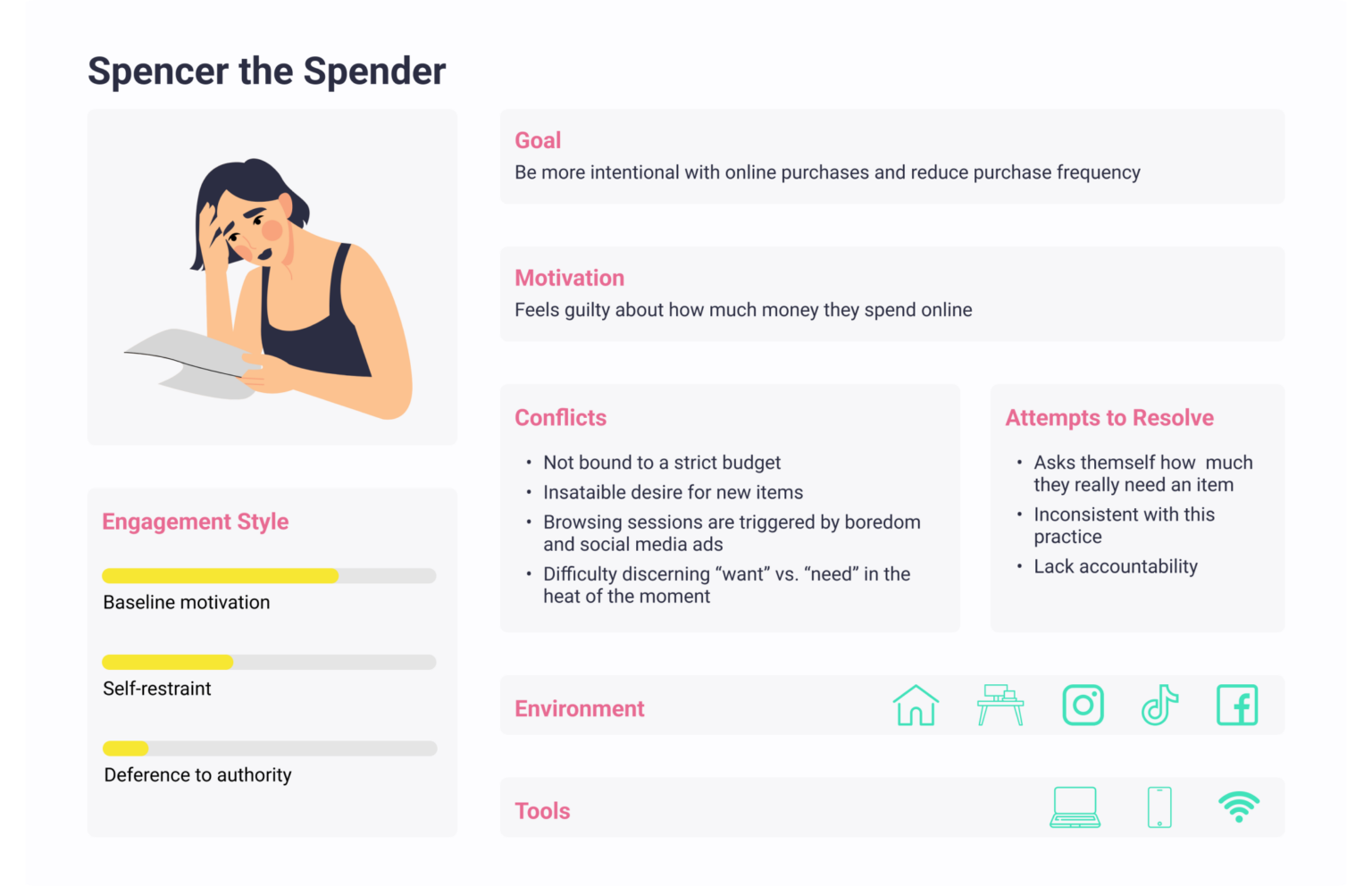
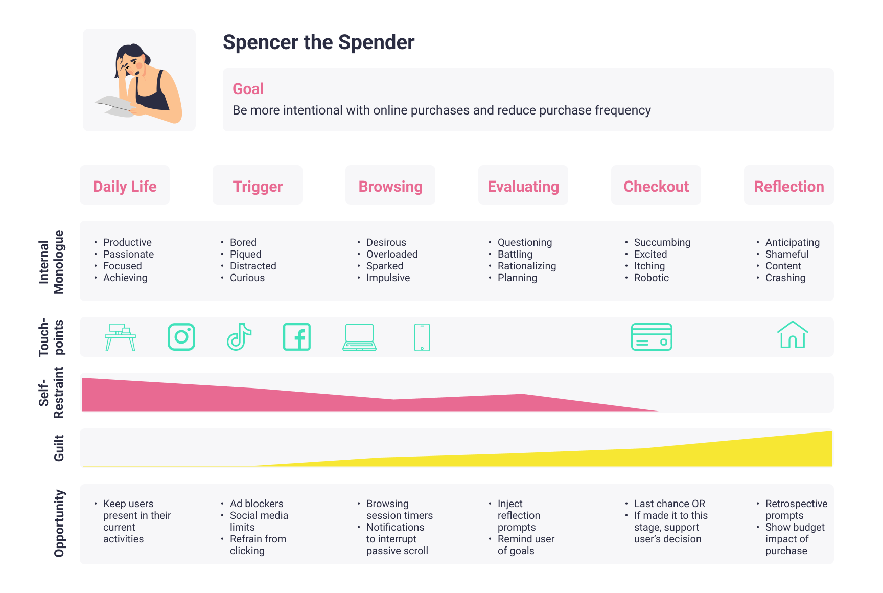
Introducing Spencer the Spender
In addition, we observed that users typically began to browse because they:
- Were prompted by a social trigger to shop (i.e., influencer posts, their friends’ outfits
- Wanted to stave off boredom
- Felt like “rewarding themselves” by satiating their desire for new items
These converging observations (and more) bubbled up to a primary persona to design for: Spencer the Spender (Figure 4) – the digitally savvy hedonistic shopper who spends too much time and money shopping for items that they don’t need.
Retrospectively, we noticed a representation problem with our persona
Though we came up with a gender-neutral name for our persona, we used an illustration of a woman to depict them. We intended our app to help all “digitally savvy hedonistic shoppers,” not just women. But the imagery of our persona being a woman led us to unintentionally design a product that alienated men and nonbinary folk.
For instance, we used the word “Socialite,” a term typically used to describe a high-society woman from a wealthy and possibly aristocratic background, as an identity-based badge to motivate our users. We also designed our behavior change mascot to be a purse – a perceptually feminine icon. In the future, we should be more mindful about whether we’re introducing unintentional specificity to our user persona.
II. Solution Finding
Ideating and Picking an Intervention
Based on findings from our baseline study and comparative research (see the previous section), we decided to investigate two strategies for intervening at the browsing stage:
- Substitute online browsing with an alternative activity
- Use introspection to stop users from browsing
Intervention Study
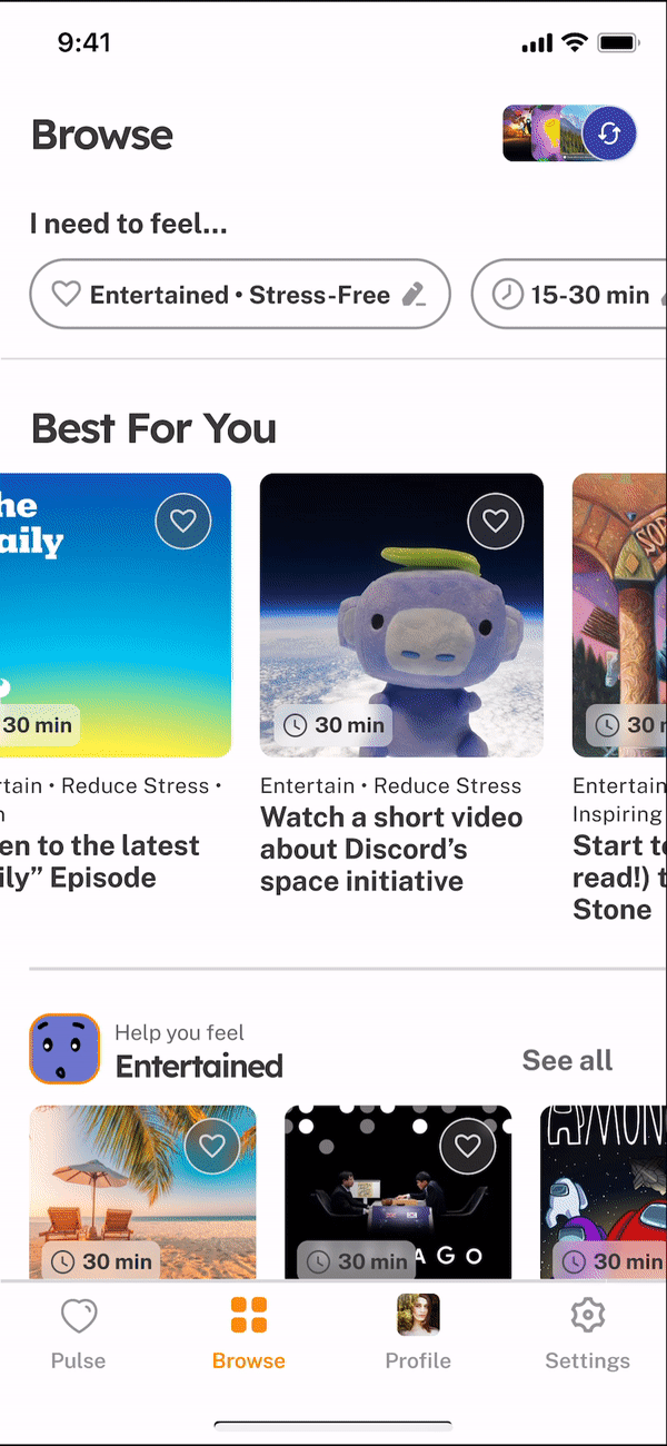
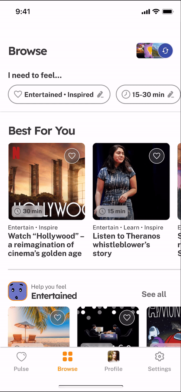
Intervention 1: Activity substitution
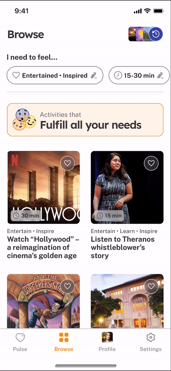
Each time the user feels an urge to browse, we show them a list of alternative activities instead. To avoid overloading users with choice paralysis, we offer only three activities (updated each day): one internet-based activity, one physical activity, and one social activity.
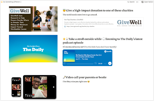
Intervention 2: Introspection prompts
Each time the user feels an urge to browse, we’d nudge them into System 2 Thinking via situational, financial, and motivational prompts:
- Situation: How did I get here?
- Financial Goals: How much have you spent this month?
- Motivation: Is there something, in particular, I need to buy?
What we learned
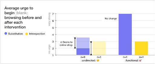
Browsing sessions fell into two distinct categories: functional browsing, driven by a genuine, functional need, and undirected browsing, where users had no target item to buy in mind.
- 📉 Both interventions slightly decreased the urge to begin undirected browsing.
- 🎯 Neither intervention affected the urge to begin functional browsing.
- Participants rarely did the suggested alternative activities. Possible reasons include 1) the activities may not satisfy what participants need emotionally, and 2) they may not match participants’ personal goals and interests.
Future design
If we could do the intervention study again, we would make the following improvements:
- Personalize the alternative activity suggestions. Currently, it’s hard to tell if substitutions didn’t work because the activities weren’t a great fit or because substitution is an ineffective strategy.
- Reduce friction in the intervention. We asked participants to fill out a spreadsheet each time they felt an urge to browse; however, in some cases, the thought of filling out the spreadsheet was enough to deter online browsing. We can remove this factor by using less intrusive ways to test the intervention.
- Focus on undirected browsing groups. Because our target user persona, Spencer, frequently makes unnecessary purchases, we can focus on undirected browsing and exclude functional browsing sessions.
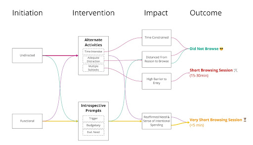
Our Solution Concept
We realized users might not be aware of their underlying motivation behind their urge to browse from the intervention study. While alternative activities may fill up the time the same way as browsing, it may not fulfill the user’s deeper emotional needs (e.g., relieving stress, avoiding negative emotions).
Our solution is to combine our two intervention strategies. When a user starts browsing, our system first prompts them to self-reflect on their emotion and emotional need. Then, our system recommends alternative activities that fulfill those emotional needs. By driving users to become self-aware of their needs and how they can satisfy them in an alternative way, our system may redirect users more effectively.
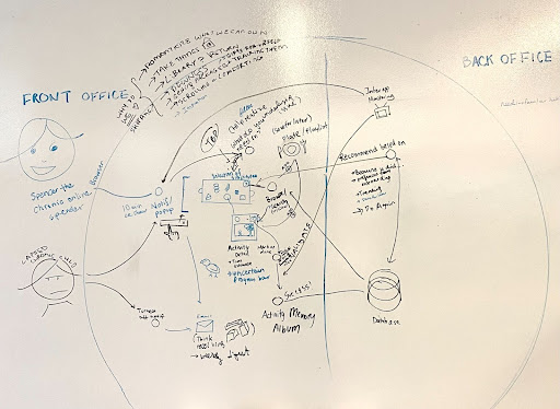
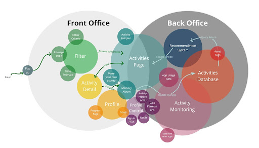
Architecture Mapping
- System Path Diagram: We sketched out the high-level structure of our solution – the user’s interaction with our solution’s front office, as well as the internal handshakes between the front and back offices.
- Bubble Map: We decided on the system’s essential components in terms of content volume (e.g., Activities page) and laid out the sub-components (e.g., make your own activity).
- Story Map: We empathized with the user and prioritized which processes to investigate further (e.g., onboarding, activity filtering, and celebration).
The most helpful mapping was the System Path Diagram, which encouraged us to think about the high-level solution and led to our insight of merging the two interventions. These mapping strategies helped shape the final product, and we would use them all again.
Assumption Testing
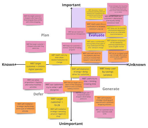
From assumption mapping, we found that our most critical assumption was (in top-right):
- If users introspect on the emotional needs underlying their urge to browse,
- then they will be more likely to attempt a substitute activity,
- because they’re more aware of their needs and how they can be satisfied alternatively.
If this assumption were false, then our solution (combining the two intervention strategies) would not be effective. Hence, we created two conditions to test this assumption (also serving as our hypothesis):
Assumption Test Design
We asked 4 participants to fill in a quick Typeform whenever they were about to pursue undirected online shopping. Each instance of shopping desire constituted one trial, and each participant experienced both the control and experimental conditions.
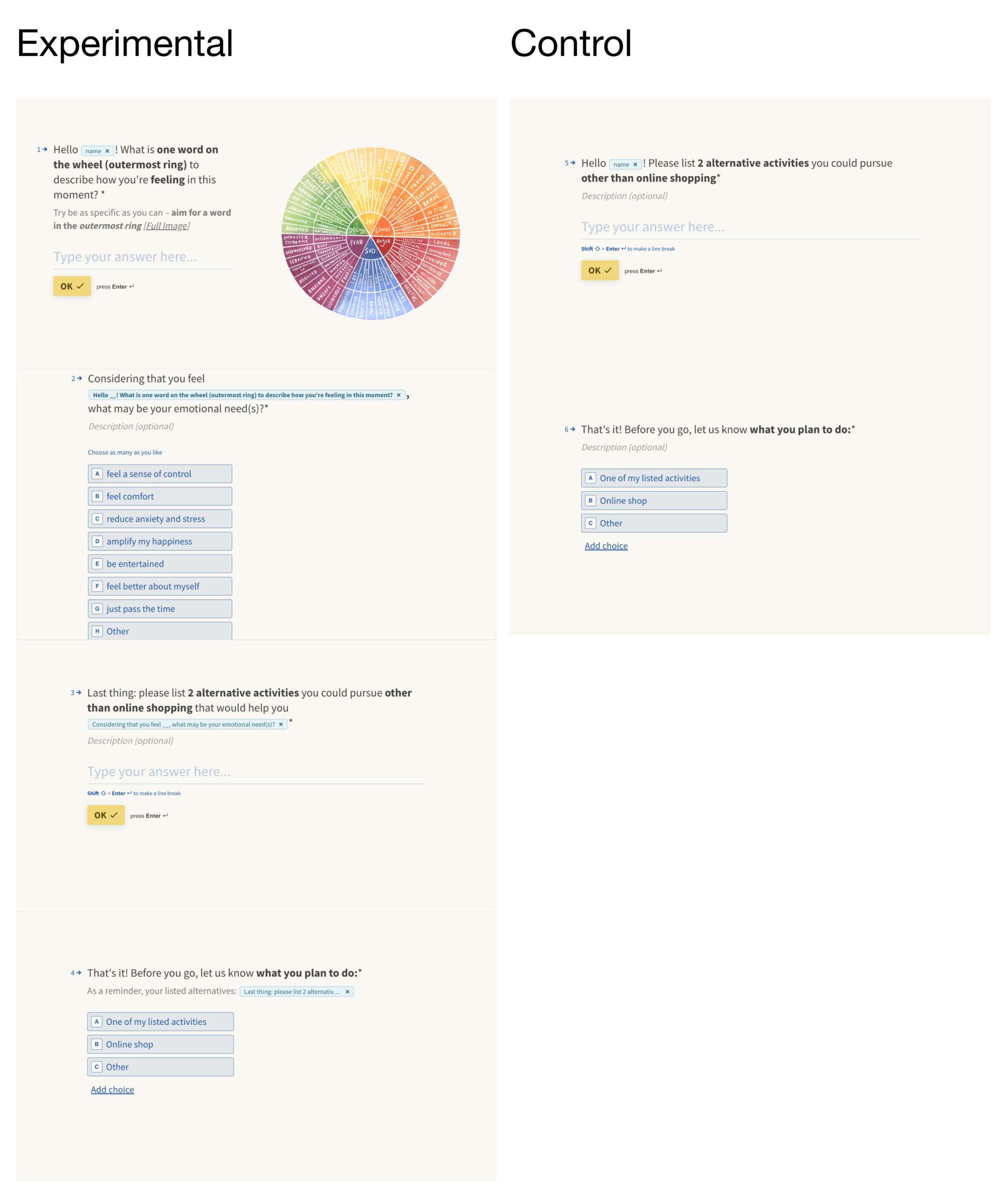
- Control condition: we asked the participant to list two alternative activities to online shopping, then self-report whether they would continue to online-shop or abandon the session.
- Experimental condition: we asked the participant to identify a word (or two) on an emotion wheel that captures how they feel in that moment, then identify their emotional needs based on that feeling. Then, they’d list two alternative activities to online shopping that may satisfy those needs and report whether they continue to online shop.
Results
Our hypothesis mainly was validated ✅: Users in the experimental condition had a slightly higher rate of doing an alternative activity than the control condition (Figure 13, Chart 1). However, we couldn’t conclude any statistical significance due to the small sample size.
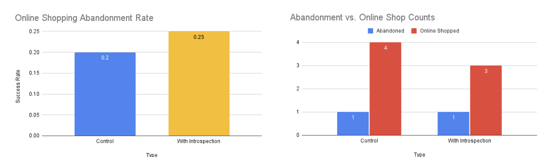
Unfortunately, most participants continued to shop rather than do an alternative activity (Figure 13, Chart 2). So looking ahead, it would be interesting to test with a larger sample size to determine the efficacy of our assumption. It would also be good to exclude users who browse for functional needs for more targeted testing of undirected browsing scenarios.
We also learned two critical lessons about we mere humans 🧬🫀:
- First, we are not the best activity recommenders for ourselves. It takes plenty of cognitive energy to develop a creative, fun activity we’ll enjoy beyond the basics (watch TV, go outside, go on my phone) but that also fits our current mood, energy levels, and schedule.
- We need coach marks and options 🎯 to unearth our true feelings and needs.
Therefore, we:
- Came up with a list of needs of emotions to include in the “needs identification” portion of our activity recommendation flow
- Brainstormed and cataloged a library of activities that mapped to users’ potential needs, moods, and timeframes
- Embedded coach marks into our activity recommendation UI to help users identify the best activity for their unique situation
Ethical considerations
- Nudging and Manipulation: Our solution prompts users whenever they start browsing (or after some X min of browsing). These are acceptable nudges because the user has explicitly signed up for them. However, it can be manipulative if we use this interruption behavior to handicap competitors (in the e-commerce sphere). To avoid this, we give users complete control over what apps they wish to turn on the nudges for (e.g., Sephora).
- Privacy: Here, we define privacy as access to personal and app usage information (e.g., what they browsed, what activities they chose). In our app, users have complete control over whether their data is stored locally or remotely on our servers. While our app could get acquired by another company that decides to sell the data for profit, we can avoid this scenario by including a clause in “Terms of Use” to not sell user data at any time in the future.
- Design of well-being: We help our users satisfy their higher-order desires by reducing their desire to shop excessively, which falls under the Global Desires theory for well-being.
III. Bringing Shift to life
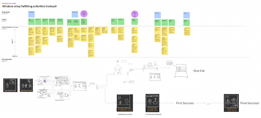
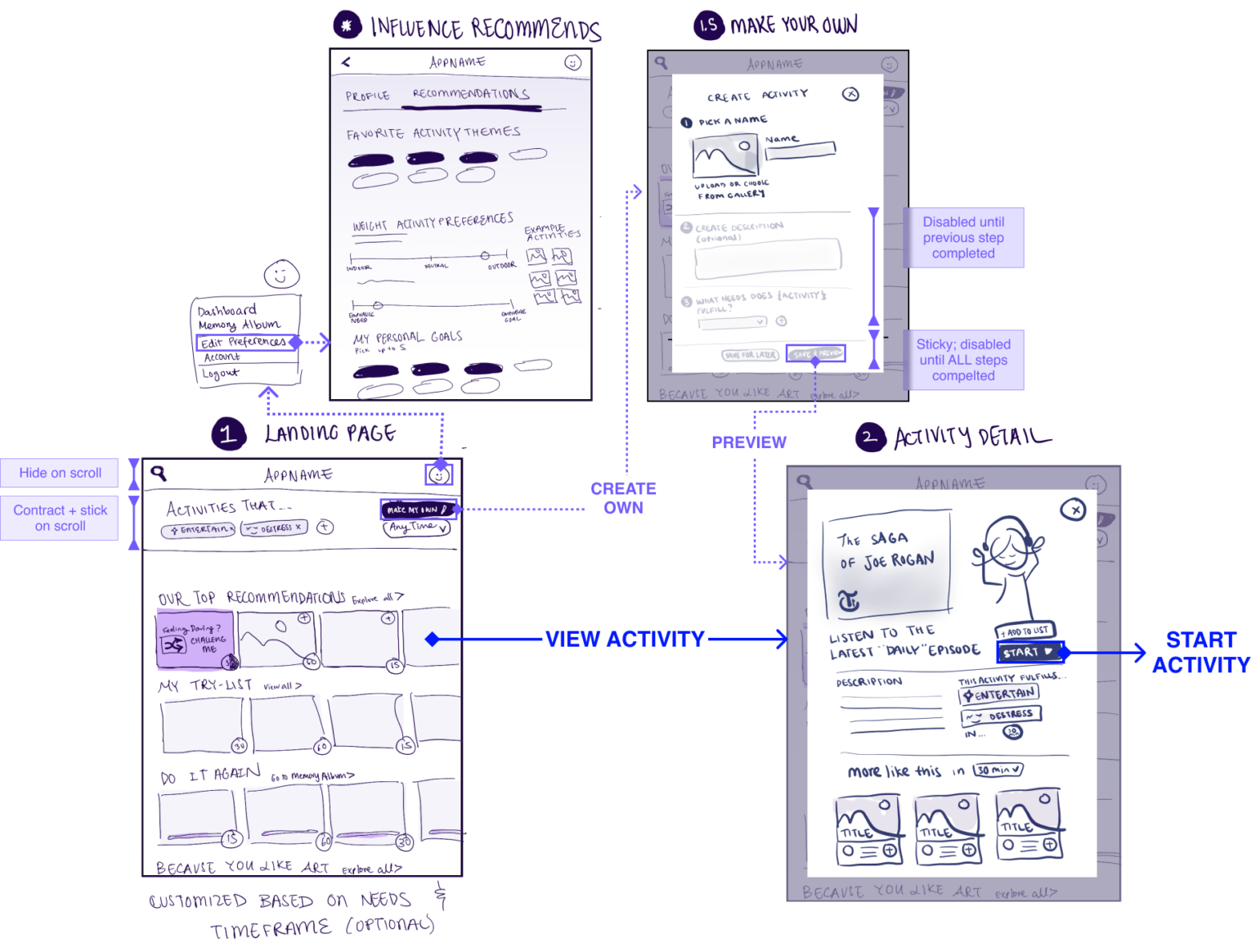
Beginning with wireflows
Building the visual architecture for Shift began with detailed wire flows of our core three task flows: introspection, browsing activities, and completing an activity. The tasks are summarized as follows:
- Interception and introspection: Shift notifies Spencer once they’ve begun a browsing session and prompts them to complete a short introspection module that uncovers their emotional needs at that moment
- Browse and choose: beyond the initial recommendations, Spencer can explore and select an alternative activity from a categorized page based on needs.
- Complete and reminisce: Spencer completes an activity via an intermediary in-progress screen and is rewarded with leveling up in their corresponding chosen goal
This exercise helped us concretize specific intended features and the exact steps that each flow would need for completion. Transforming our system diagrams into mobile UI challenged us to think intentionally about how we were to employ our digital real estate.
Brand Personality & Visual Identity
Nailing the Shift brand was central to our solution execution, as it rests on the idea that this app is a user’s closest, non-judgemental friend they can turn to when on the brink of caving to impulses. Hence, we started by crafting a personality and attitude that Shift would imbue. Our brand would be playful, optimistic, supportive, and welcoming.
We selected warm, saturated oranges, balanced with their split-complementary soothing purplish-blue hues. Rounded components and typography added a casual, flexible flow. A minimalist UI focuses on activity asset photography, which centers on feelings of aspiration and inspiration. Finally, we synthesized these decisions into a design system to help us create reproducible, consistent screen designs. Shift’s best friends Airbnb and Hinge project similar energy.

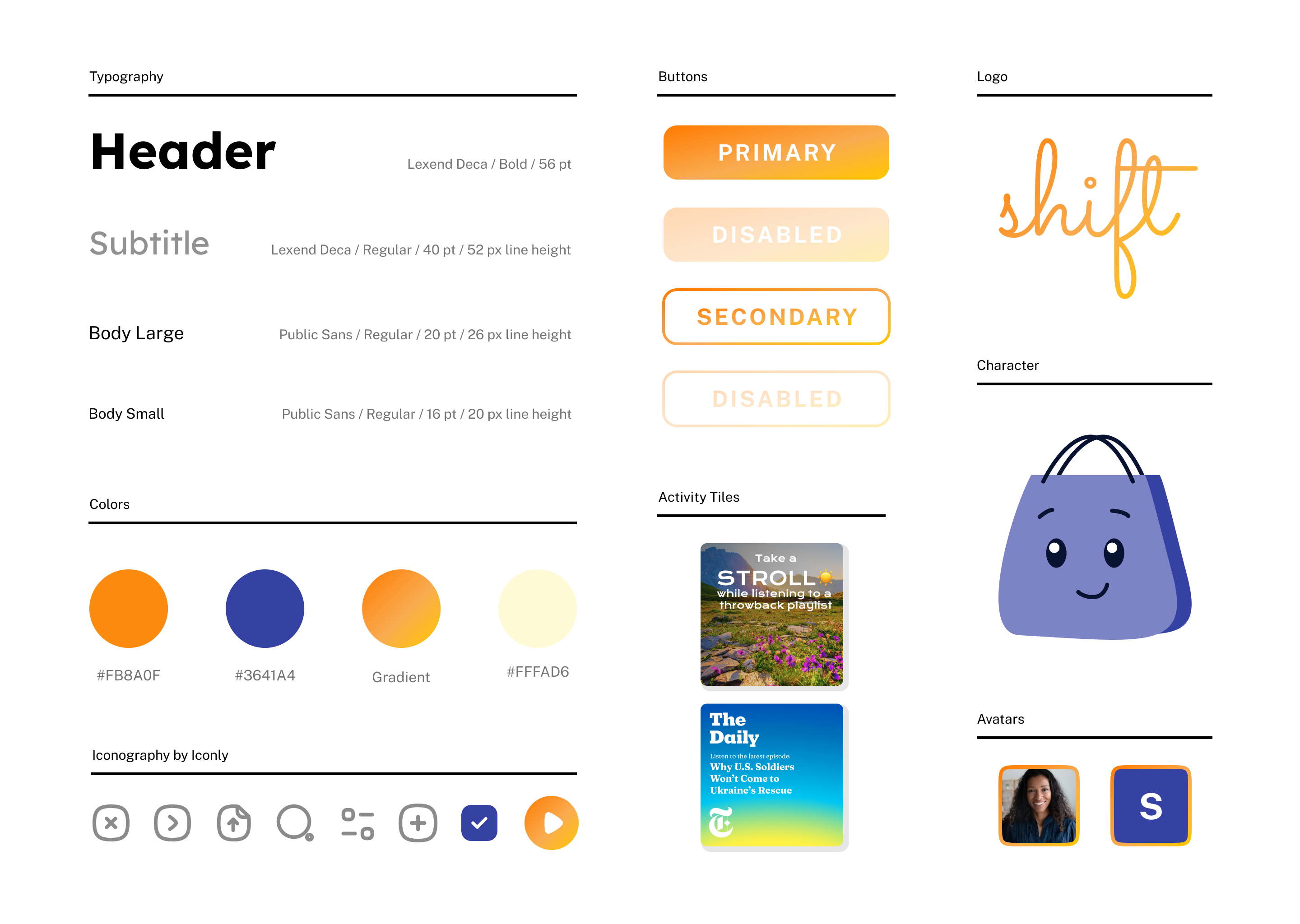
Figure 17 – Style Tile
Sketchy Screens
Having established our visual identity, we further drilled down our wireflows into sketchy screens, this time in a mobile app format. In contrast to our wireflows which were more flow-based, these sketchy screens would serve as our graphical directives for later hi-fi screens, having deployed our design system.
It was critical for us to carefully consider how we were influencing users with copy and component layout. Central to our app’s functionality is inter-app monitoring so that Shift can intervene when users begin to online shop. This requires insight into their activity on other platforms, such as when users transition from their Instagram feed to Instagram shop. The ability to access granular data is a feasibility obstacle in itself, but how this integration impacts user privacy is another question. To ensure that users are fully aware of the permissions they grant, we designed a toggle-based interface embedded within user settings that require users to manually opt into individual inter-app tracking (default inactive) and define appropriate thresholds for push notifications.
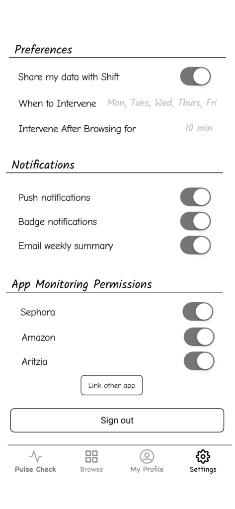
Another concern raised was regarding a byproduct of our narrow persona design that we discussed in an earlier section: we named an identity badge “Socialite” to denote users who’ve completed many social-oriented activities instead of going online shopping. Unfortunately, this word does not accurately represent many of our users’ personal goals. So we incorporated a goal-setting module in onboarding that feeds into the profile page, where users can specify titles that better resonate with them.
Initial Prototype Design
We’ve included gifs of each of our three core tasks described above. A deeper dive into our layout choices can be found here.
Usability Testing and Refined Prototype
We put Shift to the test and asked participants to complete each of the three core tasks. TLDR, there were some significant usability issues, though we addressed them as follows.
Colors aren’t universally nor intuitively related to emotions → We replaced color families with character illustrations to directly capture emotion groups.

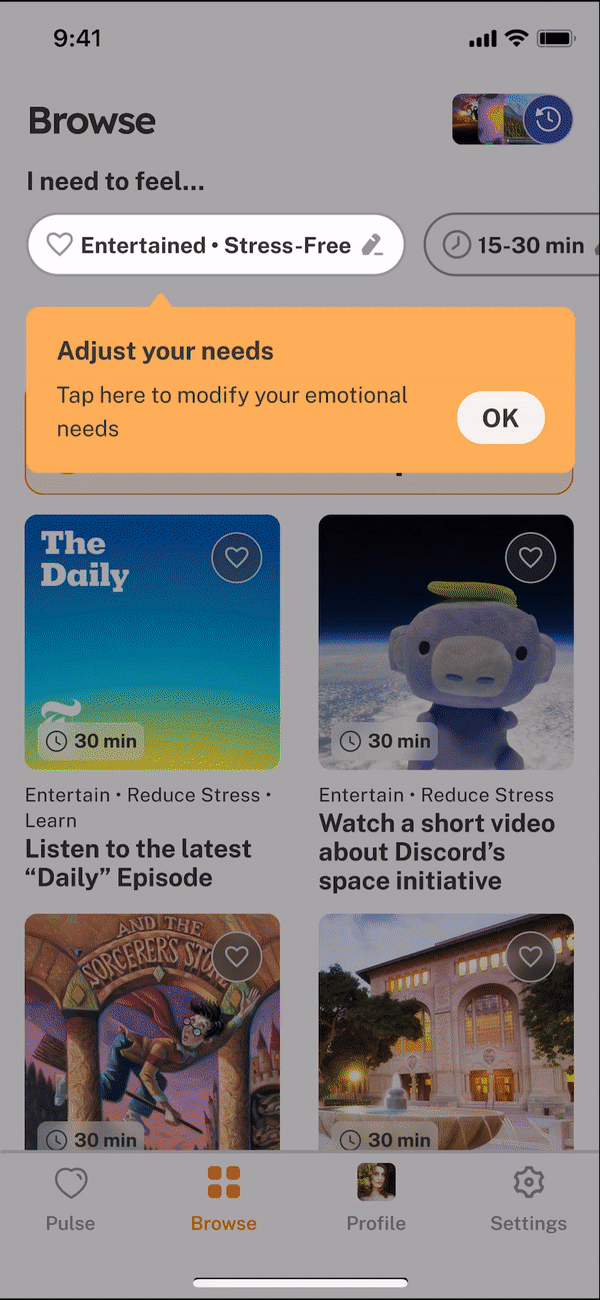
Editing needs and best-for-you functionalities are unnoticed → We used coaching to call out the capability to edit needs and vertical scrolling for best-for-you to avoid immediately scrolling past.
The purpose of the intermediary screen is unclear, and level indicators are interpreted as progress for specific activities → We refined in-progress and congratulatory flow to separate levels from activity completion.
You can find our complete clickable prototype here (including onboarding)!
🌰🐿 Reflections in a nutshell
In this project, we learned to run studies, collect and synthesize data, and rapidly prototype solutions. Most importantly – we learned how hard it is to change someone’s behavior. In our next behavior design effort, we will spend more time running studies and learning about human behavior before introducing a solution prototype. In addition, we will consider issues of privacy, manipulation, and design justice at the early stages of our design journeys!
If we were to move forward with this project, we would fully build out the settings screen (i.e., notification) and gauge uses’ privacy preferences. We would also make improvements to make our app more universal and inclusive. For example, 1) provide more language options, 2) avoid words with negative connotations (“socialite”), 3) flush out the list of activities to avoid a bias towards first-world users, 4) change the feminine bag to a gender-neutral mascot.