
Create an Account/Login Page and Mental Health Resources (Alex)
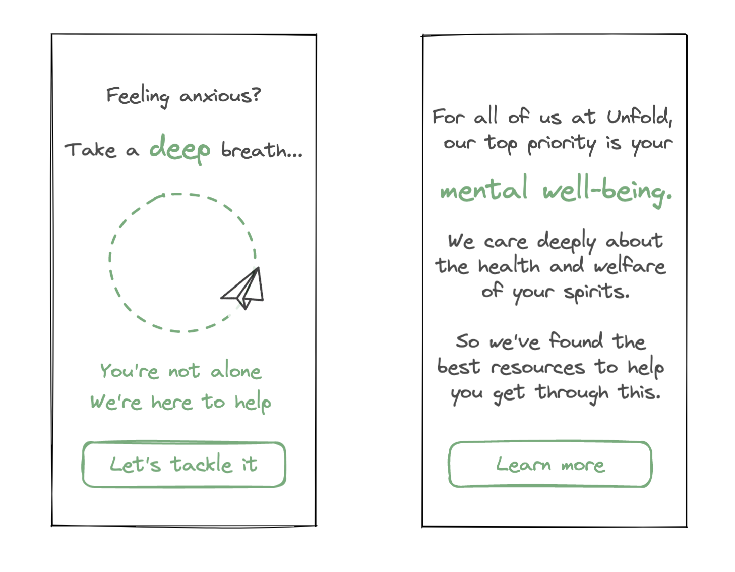
The idea to include a flow for mental health resources was informed by our early testing and our scenario planning. From our intervention and assumption testing, we found that users were sometimes overwhelmed by the boldness of our dares – these challenges often included the push to interact with someone around you as an expression of gratitude. This led us to explore a scenario where mental health and well-being become the top concern for all products worldwide.
As people who chronically experience social anxiety, we completely understand the need to address these feelings and include easy access to mental health resources within the app. These intentions guided our design of the screens. We wanted to design a visual experience that is calm, reassuring, and supportive of the user. Similarly, we took care to word the language on screen to reflect an aura of zen and reassurance. As a result, the user is welcomed to the screen with an opportunity to slow down, take a deep breath, and observe a lazily floating paper airplane drift around. At the bottom of the page, we invite the user to visit a link to a few mental health resources. On our other screen, we take a conversational approach to the same concept – we design to emphasize the importance of the user’s mental well-being to our core mission as well as guiding them towards greater resources.
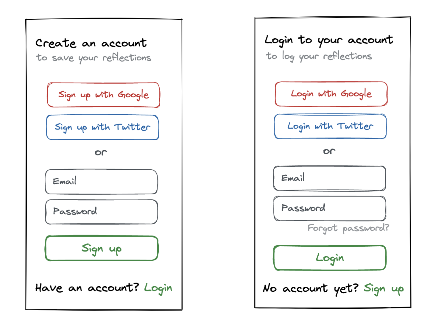
Our design approach for the login / sign up flow is rather conventional. Our primary goals for this screen is to reduce the friction for the user to sign up / log into their account and provide motivation for the user to login / sign up. As a result, we decided to include opportunities to sign up / login to the product using pre-existing accounts like Google and Twitter to reduce the activation energy necessary to join our product. Similarly, we provide small blurbs under the screen titles to explain why a user might want to create an account on our platform.
Progress Screens and Reflection Process (Christina)
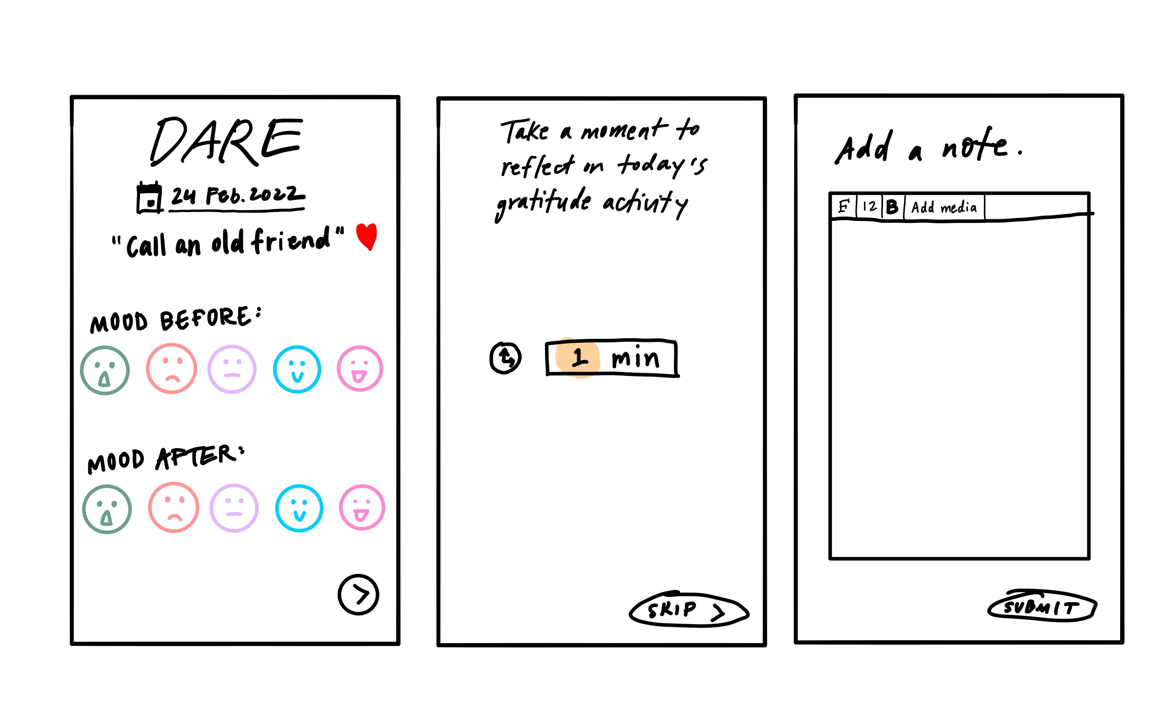
The reflection portion of our app is an important feature to encourage users to think about how the gratitude activities made them feel. I wanted each reflection card to include the type (Truth or Dare) and the prompt so that the user has less to fill out. To keep things simple, we have a range of five mood icons. I wanted users to measure their moods before and after the activity so they can think about how the gratitude action affected their day. Ideally, performing gratitude would lead to positive emotions and improve users’ moods. I also wanted to give users a dedicated time to quietly reflect on the action, so the next step of the reflection is like a meditation period for users to reflect without the use of guided prompts. They can choose to set the timer for however long they want to reflect for, or skip the quiet reflection step altogether. Finally, users can type out some of their thoughts in the text box and optionally add media like photos and videos or voice memos. Finally, they will submit their reflection which will go into their memory pool.
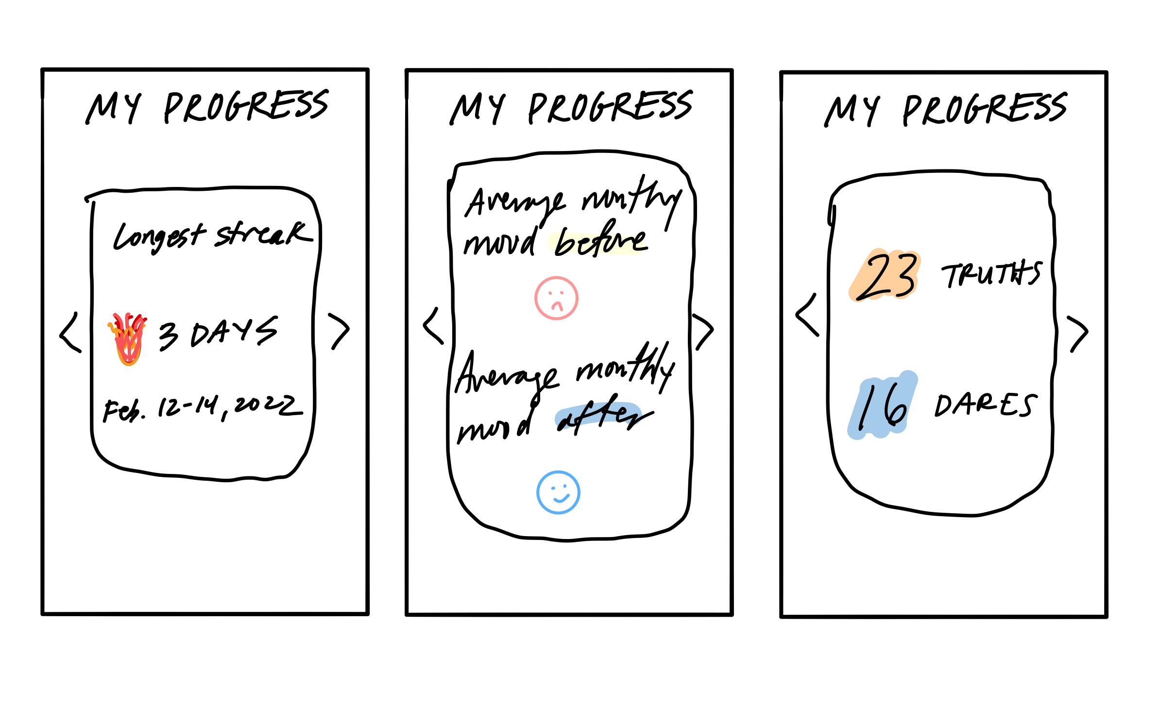
We are also thinking of giving our users a way to track their progress aside from just looking at their old reflections. This way they have We could give them some metrics, like activity streaks, average moods before and after the activity, and counts of how many Truths and Dares they have done so far.
Notification Settings and Weekly Recap (Jacob)
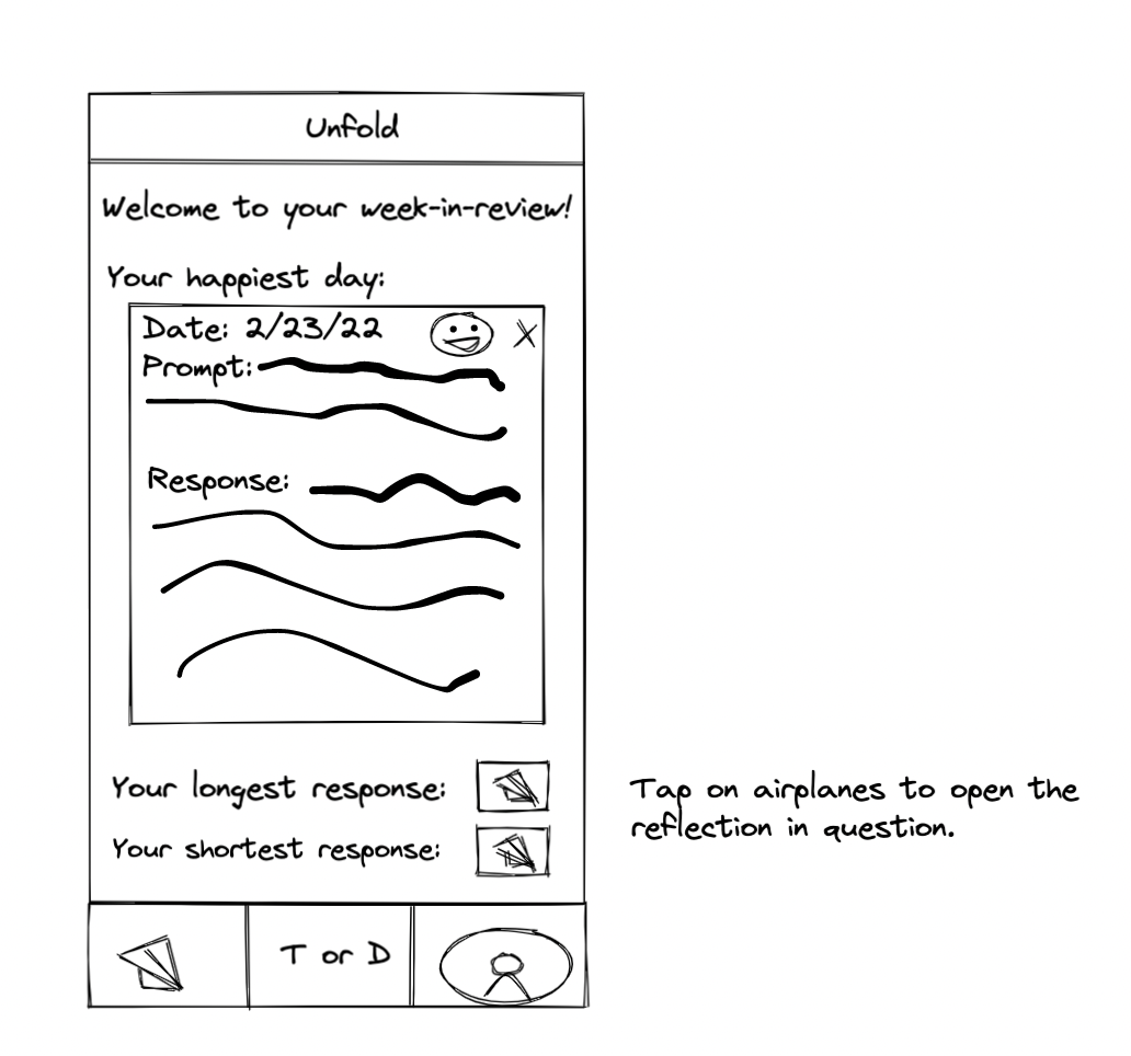
One of the ways that we discussed to get users to return to the app was a week-in-review. This would functionally give highlights from the week to users in a condensed place at the end of the week. Our app aesthetically aims to be a calming experience for users, so I chose to not have this week-in-review to have all of the prompts and reflections from the week but only a select view that would best demonstrate to users the progress that they made during the week without being overwhelming. I also wanted this to share some key features with the memories portion of the app, so it shows the paper airplane (which could just as easily be a paper crane) as a way to actually view the specific prompt/reflection pairing. This also adds to the previous goal of not being cluttered by allowing all of the memories to compress down to our origami theme.
In our critique, we thought of different ways to format the week in review, mostly settling on it being a horizontal swipe to see each rather than a vertical scroll. Additionally, we would like this to take up the whole screen, covering the bottom navigation.
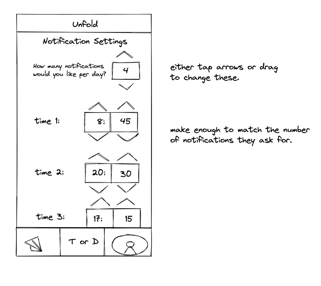
Another key feature of our app is the user’s ability to create their own notification schedule. This will allow users to be reminded of their gratitude practices when it is convenient for them and not during busy times in their day. Here, I have allowed users to not only pick how many times they would like to be notified but also what times those are. I have used the arrow buttons/swipe up and down as a standard that users would already be familiar with from either timer or alarm apps on their phones. This will allow users to interact with their notification scheduling in a way they are already comfortable with.
Truth/Dare Cards and Initial Onboarding (Will)
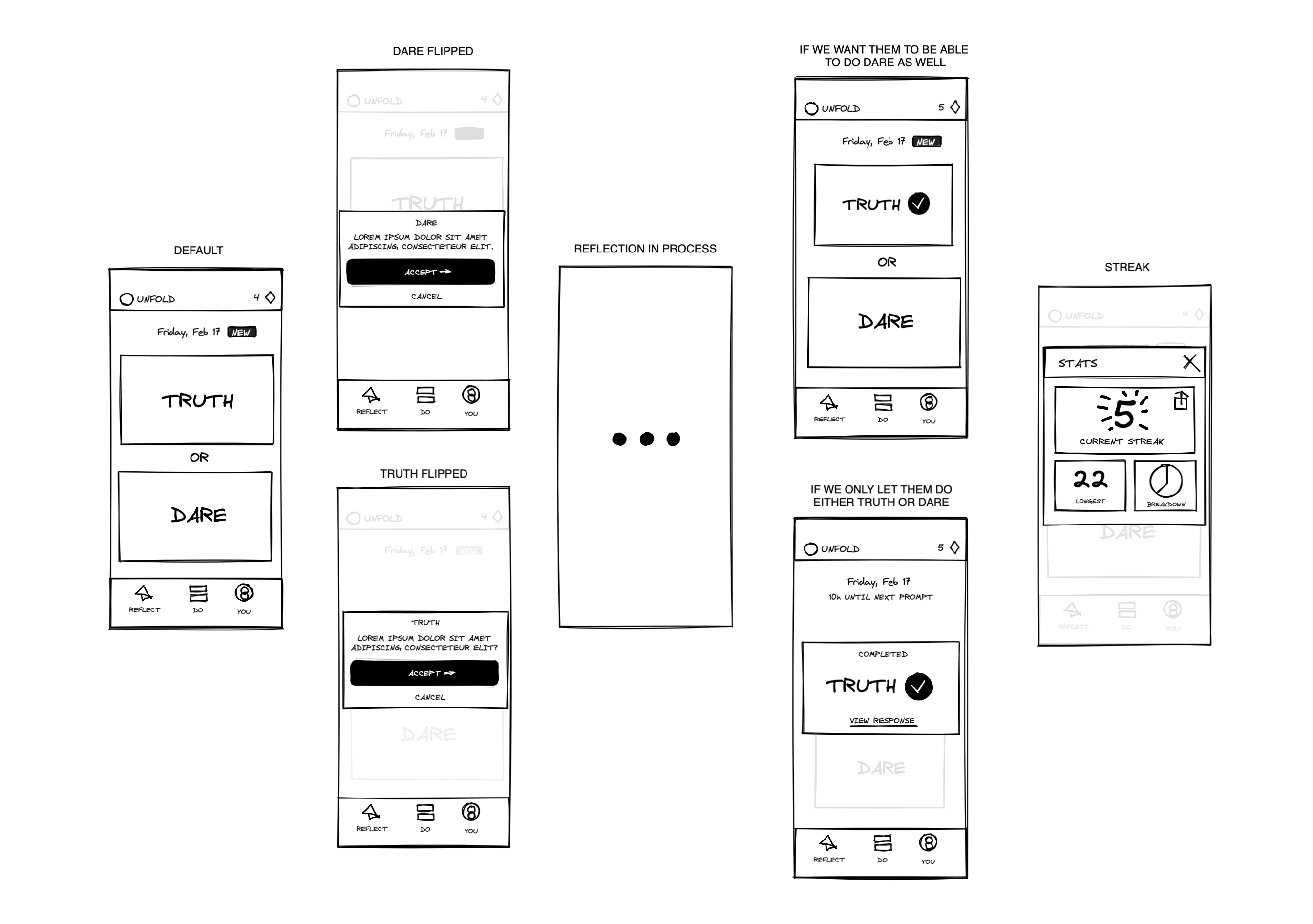
The screens here together create the entrypoint to our app: it’s where our users receive their prompt each day.
The first screen on the left is our homescreen, which the splash screen opens up to each day. The intent here iss to keep the screens as simple as possible with a clear CTA: choose truth or dare. We ultimately decided on a card design that flips forward (screens 2 & 3) because it makes the choice less daunting and constricting. We want our users to have the freedom to freely switch between the two options, so immediately bringing the user away from the homescreen and into a new, dedicated page for each option would be counterproductive to our goals. This design allows users to explore both options and decide which to accept — at no point do they feel like they’re “backing out.”
The only other thing to note here is the “New” tag that appears next to the date whenever the prompts have been refreshed from day to day.
After the user has completed their dare for the day, they’ll arrive at one of the two screens second from the right. The top design affords the user the opportunity to also do the dare for the day, while the bottom option essentially tells them that they’re good to go — nothing left to do until the next day (this countdown is shown above).
Lastly, we see the streak modal — this is intentionally simple so as not to draw too much attention to the mechanism. Ultimately, we don’t want our users to be intrinsically motivated to complete the prompts, so the streak simply gives them a way to track and be proud of their progress over time (this is also why we’re including the ability.
Reflection Browsing and Reflection Card View (Krishnan)
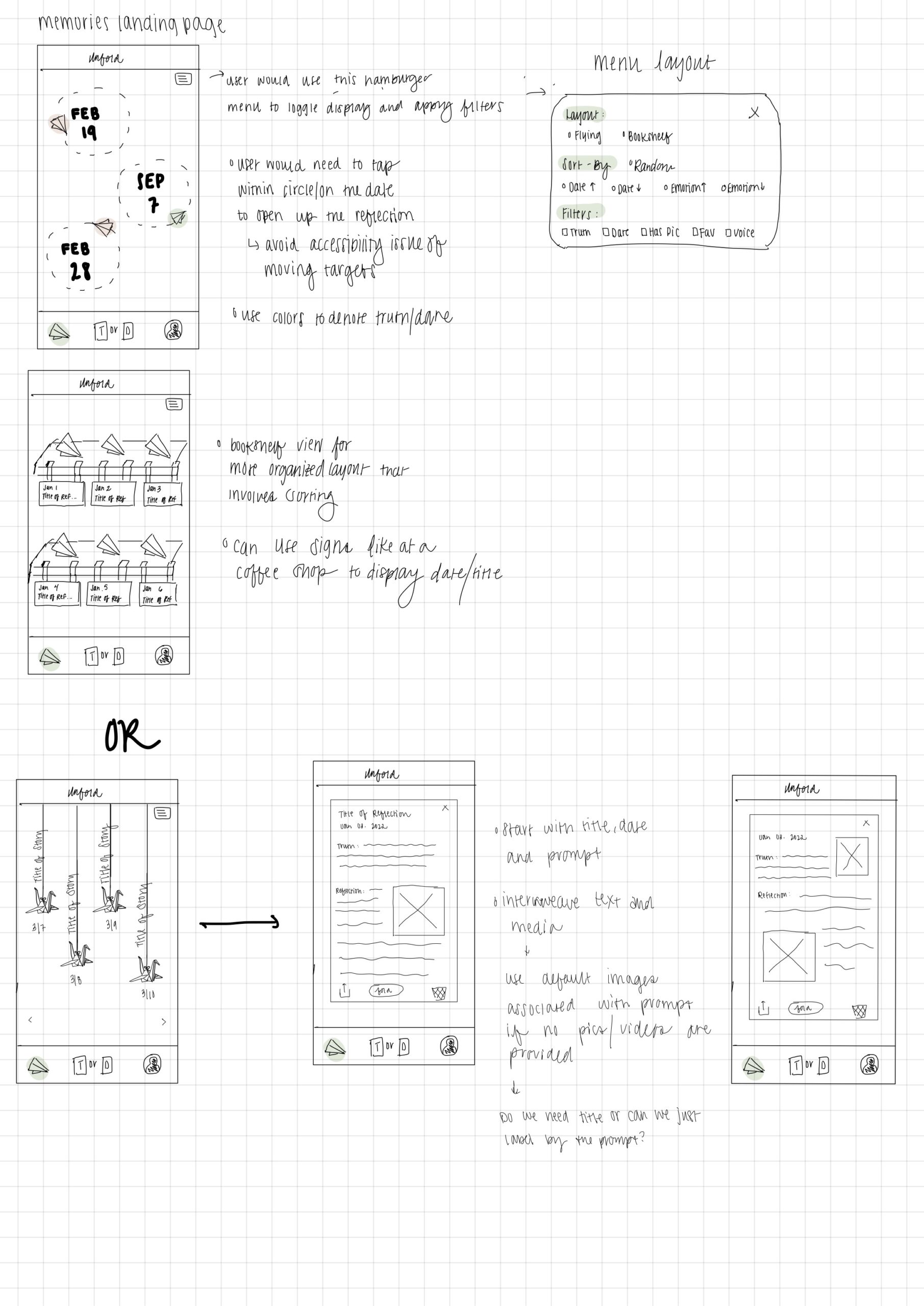
One key functionality that we wish to provide to our users is the ability to review their past reflections. Our aesthetic revolves around a down-to-earth, calming, coffee/tea shop. One thing that we thought would pair well with this aesthetic is origami. This practice is calming, requires patience, engages with one’s creativity, and is the foundation of many reflections: a piece of paper. After a user submits a reflection, we thought it would be entertaining and motivating for a user to see their reflection turn into a piece of art that they are inclined to visit.
With this origami style in mind, I came up with two major design ideas: paper airplanes and paper cranes. I chose these two objects because they are symbolic of freedom and flight. They drift in the wind and go with the flow, a feeling we want our users to embody as they practice gratefulness.
In the paper airplane design, I decided to have paper airplanes flying in a circle with the date in the center. The color of the paper airplane would tell the user whether the reflection was from a truth or dare prompt. Upon further review, it is probably better for the user to be given the actual prompt rather than the date, as this will be more familiar to them. We want the reflection to open whenever a user taps within a circle/on the date rather than just tapping the airplane in order to avoid creating accessibility issues with moving targets.
In the top right corner, we provide a hamburger menu with options to help users filter/sort their reflections. Some metrics that we predict a user would want to sort by are date, emotional rating, truth/dare, whether a picture was included, and potentially their favorites.
Knowing that some users would want a more organized version of the display, I also created a layout in which the airplanes are layed out on a grid as if they were laying on a bookshelf.
The second display design revolves around origami cranes. One common way these are presented is by hanging them from a piece of string. Inspired by this scene, i decided to display the cranes on strings of varying lengths with the title along the string. Users can scroll left/right to view more reflections. They will originally be randomly sorted to help users explore more, but users can sort effectively using the same options presented above.
When a user clicks on a plane or crane, they are given an aesthetic layout of their reflection. This will come with stock images that relate to the dare, or images provided by the user if they submitted any. We wanted these reflections to feel like a short story that the user can read. The user also has the option to share their reflection with their others or delete the reflection. After reviewing the screens with the group, we learned it would be a good idea to also have a favorites button on this screen.
Things we want to standardize/change:
- We want the reflections to be displayed as a letter to the user. This is to make it feel more personal and feel like it was meant to read by them in the future.
- We will be choosing between cranes or planes this week. We think both go with our aesthetic and theme.
- Reducing the number of steps to get to mental health resources by consolidating it to a single scrolling screen. We want to reduce the barriers as much as possible while maintaining a conversational, supportive tone from the app.
- When browsing over the reflection cranes/planes we would like to display the prompt with the crane/plane as they are easier to recognize than the date.
- There are two places where we will need to allow users to set their notification schedule. (1) When they accept the dare/truth prompt. (2) A place where they can input their daily/weekly schedules. We think the weekly/daily scheudles will need to be more comprehensive, similar to a when2meet format that will allow users to explain their availability throughout the entire day.
- We would like to standardize the way that our truth/dares are laid out. One thing we are considering is that after a user accepts either prompt, they are taken to a countdown timer (til midnight) that signals how long they have to submit their reflection. When they are done with the challenge or ready to fill out their reflection, they will then be taken to the actual form where they can input text, voice or images.


Comments
Comments are closed.