
Problem Finding
The Problem
As a team of college students, we found ourselves living life passively, with happy moments passing us by. Captivated by Stanford’s culture of achievement and overcommitment, we get lost in our chaotic schedule. After assembling our team, we realized that many of us wanted to change this ritual of passive enjoyment. In our Measuring Me studies, several of us measured our social media usage, while others tracked the ways they engage with breaks. In the end, we all felt obligated to be as productive as possible, feeling guilt when we decided to disengage or take time for ourselves. This insight conjured a great design challenge: how can we help busy people be more present without hindering their sense of productivity?
Background
In our literature review, we found that mindfulness is an umbrella term for various activities that help users engage with the idea of presence. These practices could be divided into three categories: compassion, attention, and theory of mind. However, these practices tend not to build off of each other, and address different goals of users. To create an effective product, we knew that we would have to narrow down on a specific practice.
Two of our major findings in the literature review were:
- Gratitude practices were more effective for college students than other forms of mindfulness.
- Short-term mindfulness practices were equally as effective as long-term practices. Typically, mindfulness is associated with 10 minute meditation sessions.
With these two findings, we drew a new question to guide our design process: how can we create a quick, gratitude practice for college students that doesn’t detract from one’s schedule?
From here, we looked at competing businesses, hoping to find success and gaps in the market that could drive our product. In this 2×2 we identified our competition by two factors: how traditional the app was in terms of its engagement with mindfulness and the level of commitment the app requires. We chose traditionalism because we were interested in seeing how diverse the market represented mindfulness in comparison to our research. Furthermore, we wanted to see how much commitment existing solutions required, identifying whether this could pose a barrier to our target population.
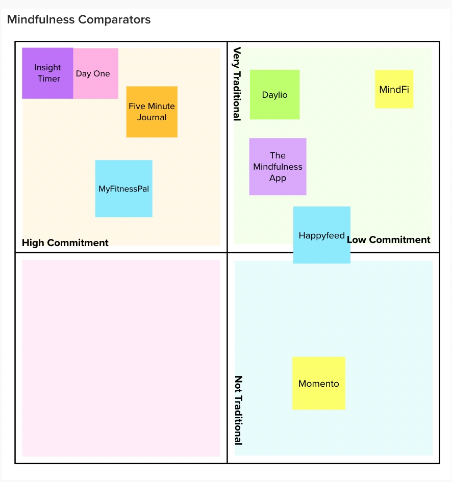
Our main finding was that these apps are overwhelmingly traditional. They act as digital journals or provide breathing exercises for users, but rely on the motivation of the user to come back each day. As a result, the majority of these apps are designed for users who are disciplined enough to start establishing a new habit on their own volition. Our comparator study showed us that there is a major gap in our market. Users need a more casual, inviting engagement with mindfulness that encourages them to keep coming back. In particular, we noticed a lack of gratitude apps that go beyond simplistic gratitude journaling.
Baseline Study
Because our target audience is busy people looking to engage with mindfulness, we found it most appropriate to first find the optimal times that we could intervene. Knowing that our target audience has this obligation of productivity, we decided to focus on what occurs during the times that a person doesn’t necessarily feel productive: their breaks.
Over the course of 5 days, we asked 8 participants interested in mindfulness to submit a daily form before they went to bed. We asked users to elaborate on their breaks throughout the day, including what they did during their breaks, how often they took breaks, and how they felt before and after their breaks. We also asked users to think about when they felt the most present/most capable of taking time for themselves during the day.
Our diary study was trying to answer two questions:
- How does a student’s energy available vary throughout the day? At what points are the most capable for mindfulness activities?
- Are there exhibiting behaviors during one’s break that we can attach our intervention to in order to make them stick?
From our baseline study, we learned that mindfulness for our participants wasn’t something that they looked forward to, actually feeling like another task that they had to accomplish. We also found that all of our users sought out distractions during their breaks, rather than pure relaxation and reflection. Our users taking multiple short breaks, not a long one, also pushed them to distraction activities. Activities like Tik Tok, despite their addictive scrolling and hedonistic properties, allow users to decompress instantaneously. However, mindfulness provides a delayed gratification and requires significantly more thought.
Moving forward, we knew that our intervention would need to be something that provides instantaneous/spontaneous pleasure, while also allowing users to reflect on their day. We also knew that the activation energy of this intervention would have to be incredibly low, in order to incentivize users to choose mindfulness over mindlessness.
Personas and Journey Maps
Based on our baseline study, comparator study and literature review, we develop two key personas to guide our analysis.
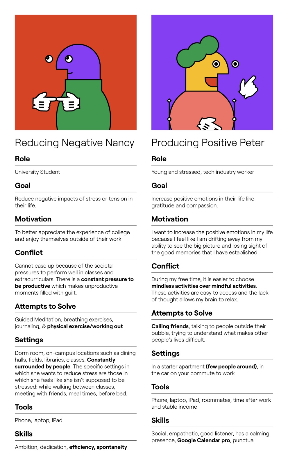
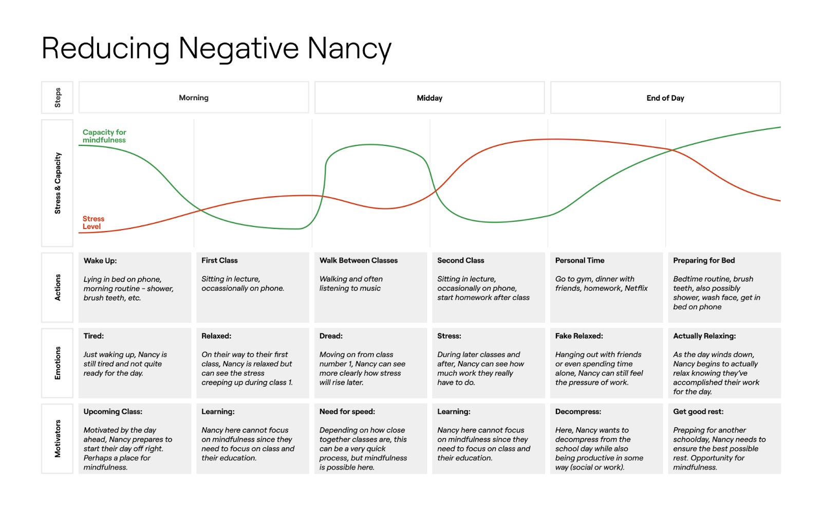
Reducing Negative Nancy is a stressed college student who wants to be able to enjoy their university experience. However, their overcommitments prevent them from feeling happy during their “unproductive” periods.
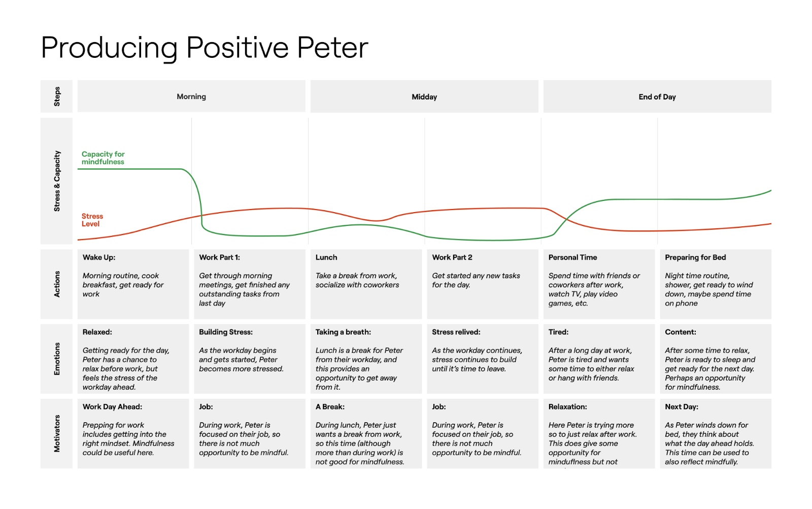
Meanwhile, Producing Positive Peter is a young industry worker who feels her life slipping by as she is so focused on her career success. She finds herself getting stuck in a routine, with work as the core.
In both journey maps, we decided to track our personas ability for mindfulness and their stress load.
In both journey maps, we note that our users are most capable of mindfulness at the start and end of their days. We believe that this would be the optimal time to present one’s options to be mindful or to instigate the desire to be mindful. We also see that Negative Nancy, modeled after a college student, tends to have a more fluctuating schedule as they have breaks between classes and other commitments. These pockets provide them the opportunity to be spontaneous in their day, an affordance that industry workers don’t have.
At this point, we knew that we could not design an optimal solution for both of our personas because of their differing affordances. Students have the advantage of more flexibility in their schedules and live on campus, with easy access to peers. Meanwhile, industry workers tend to have more isolated living arrangements and have a more strict routine. For this project, we decided to focus on helping Negative Nancy, as her persona felt very connected to our identities as a team. Furthermore, the abundance of university students at Stanford provided us with a generous amount of testers.
StoryBoards:
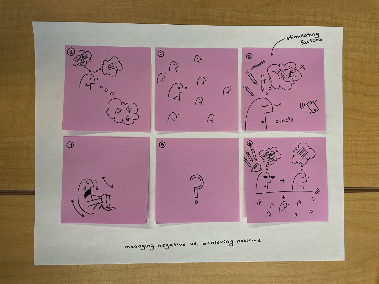
In our storyboards, we imagine our users as a busy college student who is feeling scatterbrained because of their commitments. As a result, they start to feel removed from their friends and the world around them. Ideally, our app would send a notification to help a user reground themselves and focus on a singular task: gratitude. Our goal is to transition our users from a mind of chaos to a mind of clarity. Although they may be stressed, they are able to see the world through a wider lens.
Solution Finding
From our previous work we knew that our intervention would need the following qualities:
- Can be accomplished within a 10 minute break
- Encourage spontaneity/breaking out of a schedule
- Would not induce stress when introduced in the morning
- Center around gratitude as it is the most effective form of mindfulness for college students
- Would be seen as playful rather than another obligation
During a brainstorming session, we realized a game like Truth or Dare has a lot of the qualities we are looking for. The game is playful as it encourages users to perform challenges. The truth prompts tend to be more thought provoking while Dare prompts allow users to exit their comfort zones. These challenges don’t take long and provide users with a sense of satisfaction. We experimented with how we could modify the game in order to engage our users with gratitude practices.
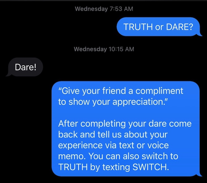
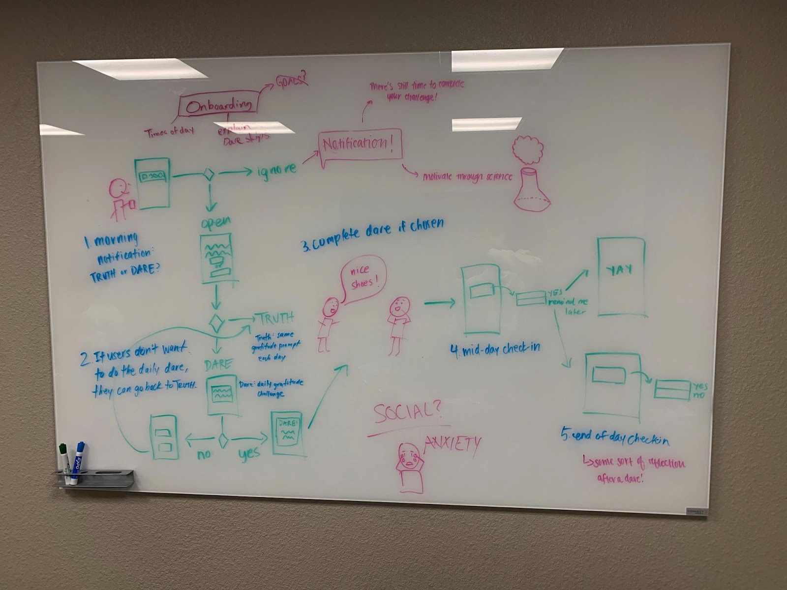
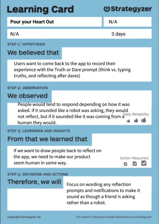
In our intervention study, we designed a small-scale game of Grati-Truth or Grati-Dare. Each day our users would pick between a Truth prompt or Dare prompt. Upon picking “truth”, they would receive a truth asking them to reflect on something that they were grateful for from the last 24 hours, and this prompt remained constant throughout the five day study. If they instead picked “dare”, they would receive a social challenge asking them to step out of their comfort zone to act on their gratitude. The goal of the dares was to get users to act on their gratitude rather than solely reflect on it and playfully introduce gratitude reflections. Truth or Dare is a very low commitment and removes users from the mindset that gratitude has to be very serious. Our intervention is also inspired by Wordle, where every user would have the same challenge each day. After completing the challenge they would have to wait for the following day. This restriction in gratification was designed to allow users to return to their schedules, but also have something to look forward to each day.
Our main goal of the study was to see whether gamification affects people’s desire to practice gratitude. Our users found mindfulness more approachable in the form of a game. Furthermore, actively thinking about how they would complete their dares was beneficial to their outlook on a given day, even if it broke them out of their normal routine. Outside of our predefined goals, we found that users desired more variation in truth prompts, as Truth or Dare’s foundation is unpredictability. More negatively, some users reported anxiety caused by some of the dare prompts, which we have responded to by adjusting the severity of prompts for future studies.
If we were to do the intervention study again, we would change the ways in which we prompted users. We found throughout the study that it was difficult to motivate users to return to reflect on their dares after completing them. To better incentivize users, we would likely focus more gamification on users actually reflecting and include rewards for long streaks.
Mapping
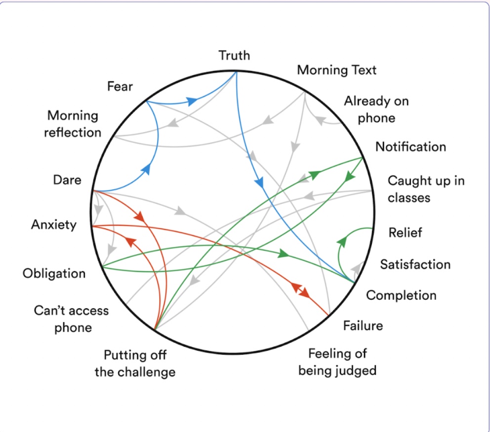
Our connection circle was based on our intervention study. In addition to what was discussed above, we saw how notifications that were randomly assigned made the task seem more like an obligation, removing the agency from the user. Thus, we wanted to design a personalized notification system for each user.
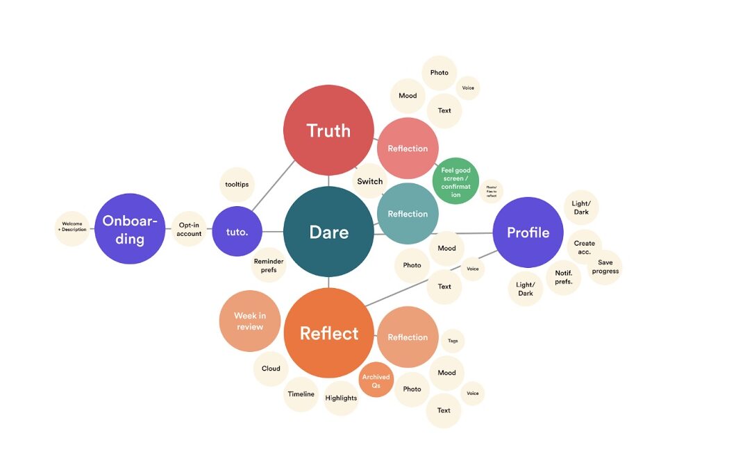
From our bubble mapping, we realized that the core of our product is 1) the Truth or Dare challenges and 2) the ability to look back on past challenges. We knew that our onboarding process should take users through the purpose of the truth/dares, and give an overview of what to expect from prompts. This overall gave us more structure for the final product as we dove into our sketch screens.
From our story mapping exercise, we learned the importance of providing flexibility to users when playing Truth or Dare. Traditionally, after choosing a prompt, a user would not be able to back out and would have to complete the challenge or accept failure, which we changed in order to make the challenges seem more casual.
Through our system path diagram, we identified key places that our solution could be used to prevent users from abandoning the app. Typically, mindfulness activities are abandoned because of their lack of stickiness. Furthermore, small failures often discourage users from continuing. Here, we learned that we could use weekend reviews and broken-streak reviews to help users perceive their failures in a different light. Rather than seeing a broken streak as a lack of potential, a user would be able to see the progress that they have made over time, encouraging them to continue working to develop their daily habit.
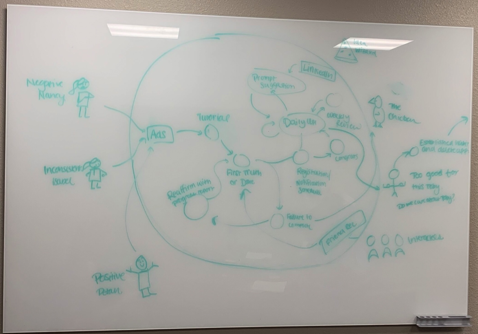
Overall, each mapping provided us with unique insights that we didn’t realize that we needed initially, helping us develop a sense of the role we wanted our app to play.
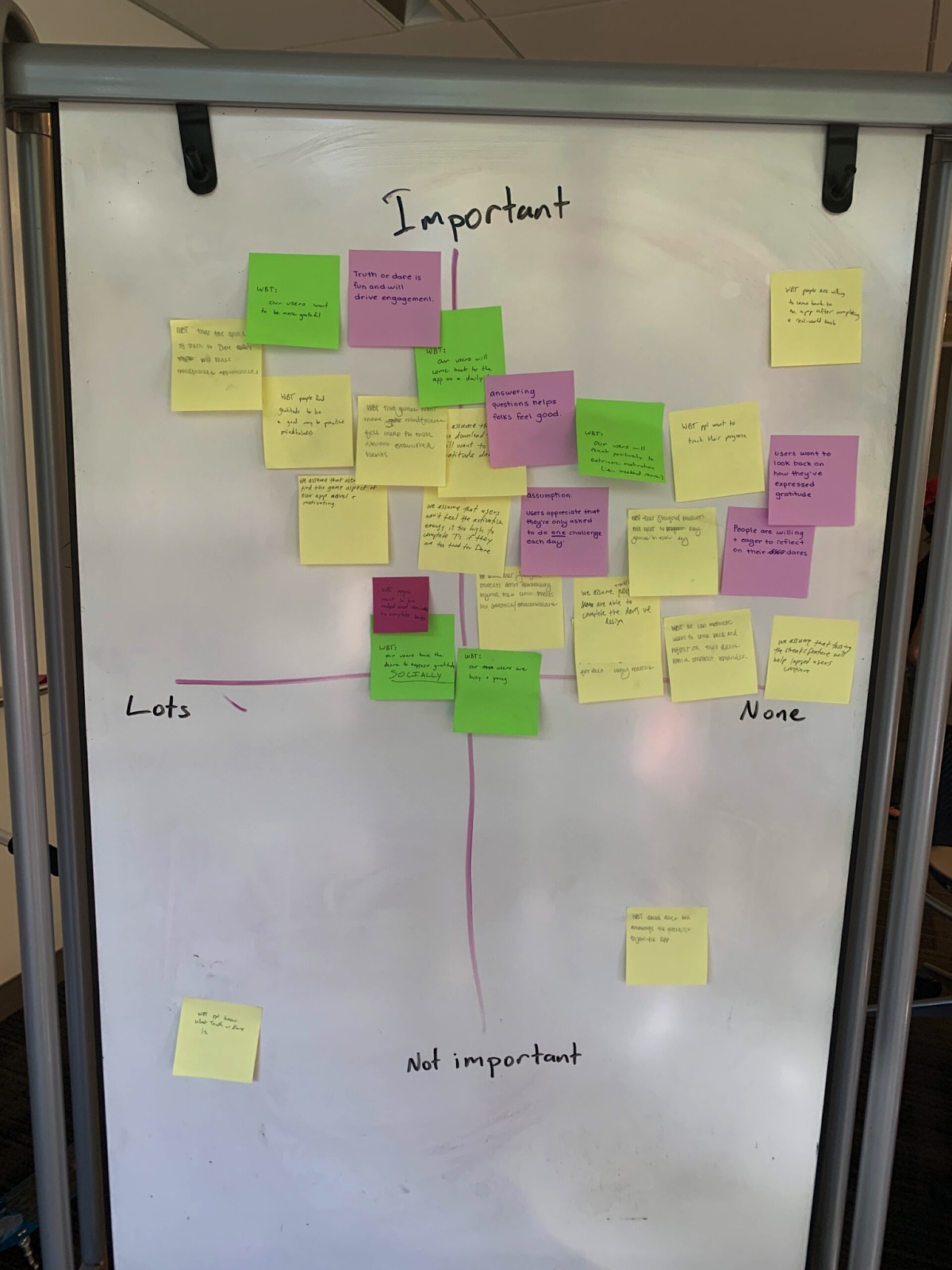
In our assumption map, we realized that we didn’t fully understand how game mechanics could affect one’s conception of mindfulness/gratitude, especially as mindfulness isn’t perceived as playful traditionally. To test the integrity of our solution, we tested three key assumptions related to the dynamics of play and motivators:
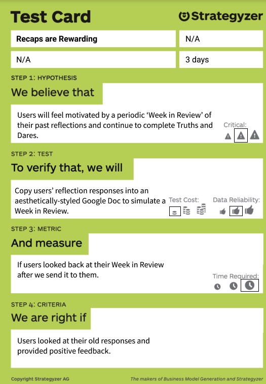
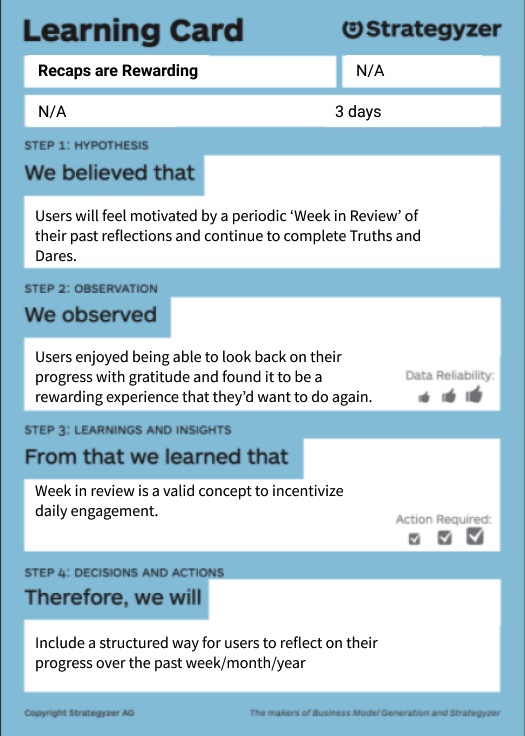
- Users would feel motivated and benefit from a “Week in Review” of their past reflections. This idea stemmed from our System Path Diagram, as we wanted to find ways to help users see their progress at incremental stages.
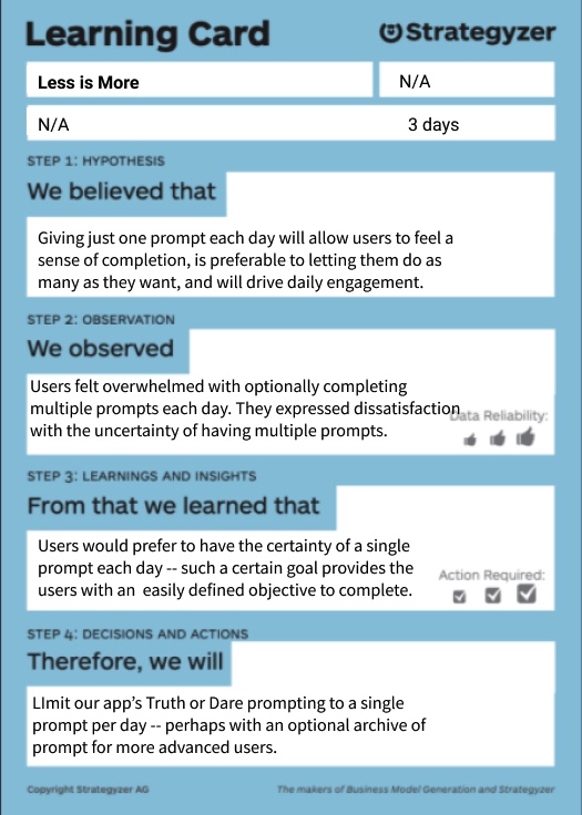
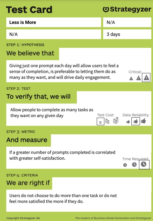
- Users would feel accomplished and complete when completing only a single challenge each day, rather than multiple. We wanted to reduce the time that users spend on the app by restricting the number of challenges, but also want to ensure that they will be satisfied by just one challenge.
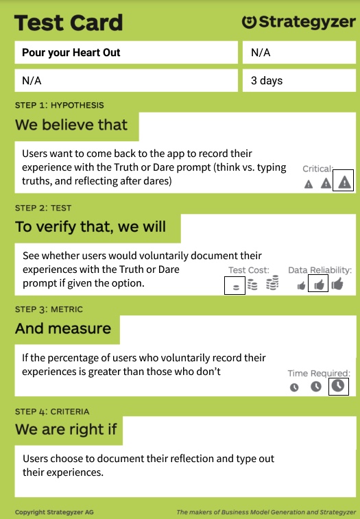
- Users will want to come back to reflect on their experiences of completing a Dare challenge (if the challenge is not done instantaneously). This was pivotal as these reflections would serve as a way to look back on past challenges in the future.
To test this, we created three studies that lasted for 3 days. We invited four participants from our intervention study to test assumption 1 and 2. We replicated our intervention study with two caveats. First, we provided a review of their challenges from the intervention study on Day 1. Second we provided them with the option to complete multiple challenges in the day, offering a new Truth or Dare after completion. We found that our users were very excited by the Weeks in Review because it helped them learn about themselves and see their own progression. We also see that users were most thoughtful during their first challenge/reflection, but became disengaged when trying to complete more than one. One user stated that it wasn’t clear when they should feel done if they had the option to complete as many challenges as they could. These two assumptions tests informed us that we should find ways to motivate users to look back on their past reflections themselves and utilize this as a motivator to continue establishing their habit. We also learned that we should follow the model that Wordle has established. A single challenge each day keeps the user coming back for more, allowing them to establish habits that last over a long period of time.
To test our final assumption, we simply gave 3 new users dare prompts over the course of three days and gave them an option to reflect at the end of each day. Users responded about their experiences completing a challenge depending on how we asked. When prompting the users like a robot, we were typically ghosted. However, if users were asked about their experience in a humane way (in which we genuinely sounded interested about their experience), we found that the majority would spend a significant amount of time detailing their experiences. This encouraged us to focus on the tone of our app, leading us to perform some branding exercises.
Experiment 1:
Experiment 2:
Experiment 3:
Designing the Solution
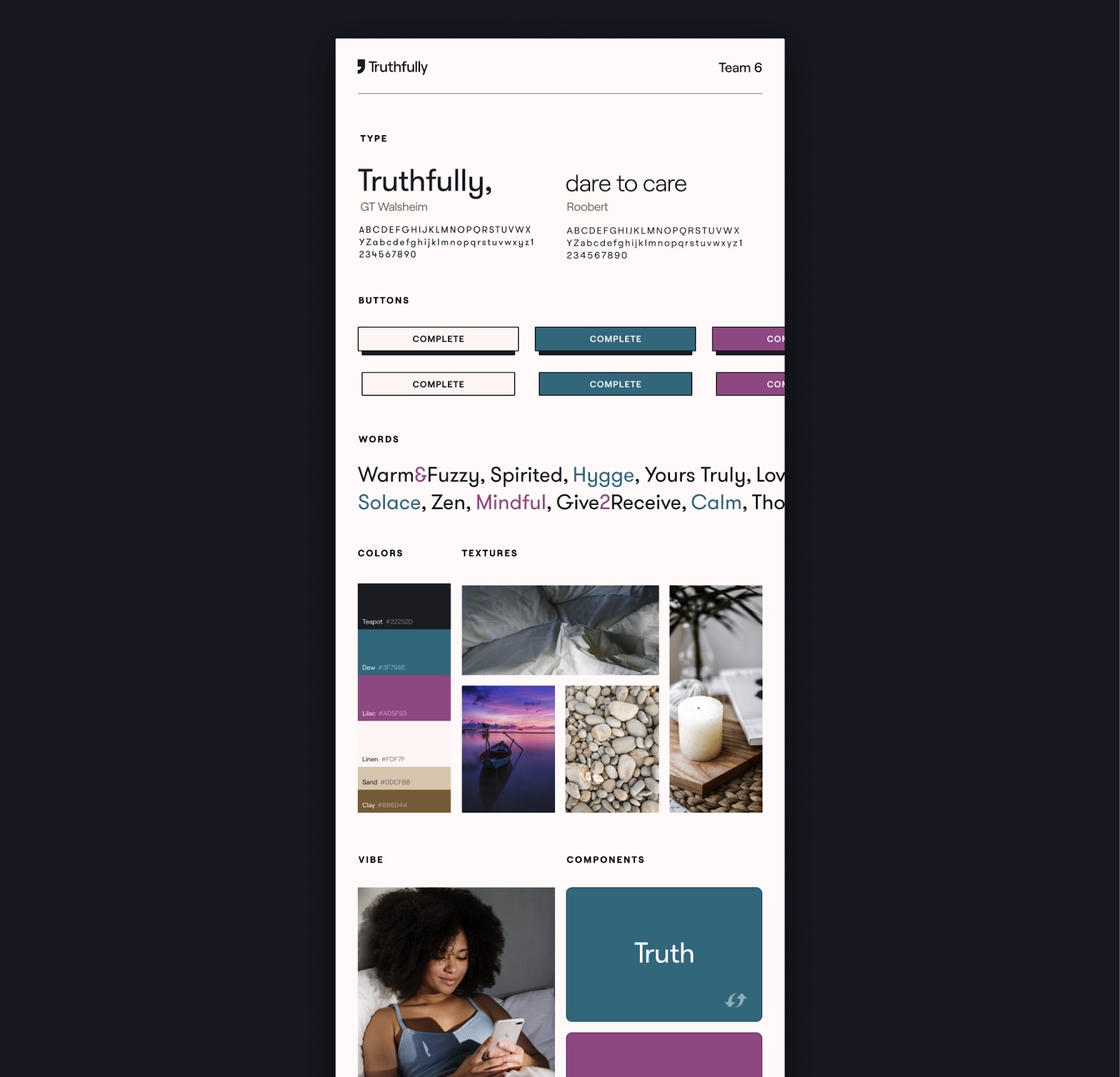
Figure 12: Our revised style tile. We feel that the brighter blue and purple colors will feel more playful and exciting to users than the more muted earth tones we used before.As we moved into actually designing the solution, we realized that we would have two main flows. The first would simply be completing either a truth or dare in its entirety including giving a reflection. The second was checking past reflections. These were both outlined in our wireflows (full article: https://highercommonsense.com/cs247b/team-6-wireflows/ ). After figuring out what we wanted the app to do, we needed to start wondering about what it would look like. As such, we made a group mood board and individual style tiles. We then came together to combine the style tiles into a joint style tile that showed our down-to-earth nature and laid back personality (full report: https://highercommonsense.com/cs247b/moodboards-and-style-tiles/ ). After doing some user testing with our style tiles, we found that our users didn’t make the app feel like a game. It felt relaxing but not playful. As a result, we redesigned our styletile and moodboard to incite more feelings of play and spontaneity. Rather than just feeling safe, we want to encourage users to go out of their comfort zone, which can be dangerous but also exciting.
With the newfound mood board and style tiles, we integrated our brand’s personality into our wireflows in our sketchy screens that once more laid out our main flows (https://highercommonsense.com/cs247b/team-6-the-sketchiest-of-screens/ ). Since our sketchy screens were hand drawn or made on excalidraw, we needed to transfer the designs to figma for our clickable prototype. This also required greater inclusion of our style tile as we added in color and icons to the prototype (seen at https://highercommonsense.com/cs247b/team-6-clickable-prototype/).
After finalizing this prototype, we used it in our usability testing in class (full report here: https://highercommonsense.com/cs247b/team-6-usability-report/ ). We did, however, have some issues that stood out above the rest. First, both users were confused as to where to find their past reflections. They first went to the profiles tab, as it appeared that past reflections would be attached to their profile. The cloud icon was a bit too ambiguous. We then fixed this by changing the icon to quotes and adding text below the navigation icons to make clear their uses. Next, users felt like typing a reflection posed a barrier as it required more effort than other forms of journaling. We fixed this by adding a voice option to the process for faster reflections. As such, we also made adding media and mood completely optional. Lastly, users felt that the dares were more daunting because they were red, in comparison to the blue truths which were calm but exciting. This was important to us because we want the dares to seem fun but not scary. As such, we changed the dare color to fuchsia to give off excitement and playfulness.
Our final prototype with changes following our usability testing can be found at this link.
There are a lot of features that we did not have the time to fully flesh out. First, we would like to explore the prompt suggestion system to allow users to give back to the app with their own suggestions of truths and dares. Second, we would like to design and test different reward systems to add extrinsic motivation to the app. The app’s existing intrinsic motivators will be most beneficial for long term results, but we also think that extrinsic rewards could be beneficial as users start to use our product. Throughout our process, testers thought that some sort of social aspect in the app could be a beneficial motivator, but we have been unsure how that would possibly look. As such, we would like to test social accountability on the app at two scales:
- as a large scale social network with a feed of all friends successfully completing challenges.
- partnering users with a social accountability partner where you could choose which dare and truth for them to choose from for the day.
Lastly, we would just like to know if our app works by performing a long-term behavioral study to see if the app actually makes a difference in users’ gratitude practices.
Ethical Analysis and Broader Impacts
We will discuss the three core ethics topics that influenced our design – ethical persuasion, user privacy, and universal design.
We first tackled the concern of ethical persuasion. Early in the process, we decided to use push notifications and gamification as our mechanisms of behavior change. Of course, these types of nudges are not inherently ethical on their own – however, we believe that our nudges are acceptable as we offer our users as much agency over these nudges as we could.
First, we made transparency a core value of our design – we are fully transparent with our intentions to encourage our users to practice and express gratitude in their daily life. Second, we also allow users to set the frequency and timing of push notifications to their desired comfort level. They opt-in to our nudges rather than get enrolled by default. This ensures that our nudges would likely delight our users more than they would annoy them.
We also debated another form of persuasive design – incorporating a social aspect to our app, for example, by motivating users to share their experiences using social proof. We opted to design our app without a social component as we deliberated over intrinsic versus extrinsic motivations. We don’t want users to feel compelled to embellish their gratitude because they saw their friend share a reflection or because they want to curate a certain digital persona. The value of social proof, we decided, was not worth the risk to our users’ well-being and sense of self-regard.
We also dealt with considerations in universal design. We valued inclusive design and aimed to reach a respectful balance between designing with universality and with specificity in mind. We were intentional in maintaining a visually accessible design with our choice of color schema, and ensured that our buttons were accessible tap targets with clear feedback on interaction. We also incorporated feedback from our usability testing towards inclusive design – we attempt to ease cognitive load by labeling our navigation bar and text forms clear, and adding functionality to allow users to reflect on their experiences using voice memos in place of a typed response.
The largest challenge for us in designing for a universal audience lies within the truth and dare prompts that we serve to users. We recognized from our early testing that purely social dare challenges would pose a barrier for those without the access or comfort to interact with others around them – to this concern, we incorporated non-social challenges into our app. Still, we can imagine many of our prompts would not be readily accomplishable for users in our “blind spot”. For example, including a prompt suggesting that users treat themselves for a day could be alienating for users without great financial resources; a prompt suggesting users go out and appreciate their natural surroundings could alienate users in barren or war-torn environments; a prompt suggesting users to leave sticky note on their roommate’s door could alienate users who live by themselves. The viability of our prompts for users in our blind spot is a real concern that challenges our attempt at universal design – given more time, we would like to focus more effort towards evaluating and relieving these concerns.
Conclusion
We learned a lot about the corporate design process in ways that we did not expect we would as students. With this, we were able to look from an outside perspective and see what parts we feel like work and are no longer necessary, such as some of the mapping and synthesis processes. In our next behavior design effort, we will probably focus more on testing out different solutions after finding a problem. We would also focus more on making a very good app for a targeted audience. With this, we would need to tread carefully on the ethical considerations of making sure our target audience or “persona” is not too limited by anything that could be deemed discriminatory but focuses mainly on user behaviors. We would also use the techniques that we learned in this class for creating a coherent product, one that uses aesthetics that match a target brand personality and functionality. We felt like this was one of the most helpful parts about creating our final post-usability test product that looks and feels usable for the desired use cases.


