
Team Antelope: Curate
Team Antelope
Ariane Lee, Ayana Griffin, Nicholas Bui, Thanh Tieu
Baseline Study
Overview
When discussing which habits we wanted to explore, our group quickly gravitated toward personal finance and mindful consumption. After reviewing research on the psychological and emotional triggers behind impulse spending, we decided to focus on helping users build conscious spending habits. By encouraging more intentional purchasing decisions, we aim to empower users to align their spending with their values, reduce financial stress, and develop a healthier relationship with money.
Methodology
For our baseline study, we recruited 11 participants. Our target group was college students or recent graduates who want to control unconscious spending habits. To screen participants, in addition to checking if they wanted to decrease their spending, we also checked if they were able to do a four-day diary study and checked how long and which apps they used on their phone for shopping. Moreover, we checked if they had an existing budget already. We sent out a Google Form and selected 11 out of 25 participants for the diary study.
Participant Recruitment
Around 90% of the original participants were the ages of 18-23. Roughly 90% spent an hour or less on shopping online a week, with the most popular being Amazon at 92% use rate. 68% of participants don’t have a budget, and only 1 participant stuck to their budget 100% of the time. Participants were split into two groups of 40% across “I’m happy with my budget” and “I’d like to decrease it slightly,” with the remaining 20% wanting to decrease it significantly.
Raw Data -> Grounded Theory
After completing our baseline study, we synthesized our data into affinity and frequency maps. From our mappings, we developed the following 6 theories:
Grounded Theory 1: Small purchases create a psychological blind spot in spending awareness
- Mental discounting of small purchases: Participants overlooked frequent small expenses (e.g., $7 coffee) due to their low individual cost, despite their cumulative impact.
- Value perception bias: Decisions around small purchases were driven by perceived value (e.g., larger sizes for “a few more cents”), even when it led to unnecessary spending.
- Key insight: Small, frequent purchases often bypass conscious spending awareness, making them a hidden financial drain.
Grounded Theory 2: Social Spending Creates a Distinct Category with Different Decision Rules
- Higher spending justified in social settings: Participants viewed spending on social activities as an “investment” in relationships, rationalizing more expensive choices.
- Gifting suspends financial boundaries: Gift spending operated under different financial rules, with participants prioritizing relationship value over monetary cost.
- Key insight: Social and gift-related spending is psychologically distinct from personal spending, with different justification patterns.
Grounded Theory 3: Students Experience a Complex Relationship with Food Spending Despite Meal Plans
- Convenience over financial logic: Students prioritized convenience (e.g., buying food at odd hours) over meal plan utilization, leading to additional spending.
- Emotional spending patterns: Food purchases triggered unique guilt responses (e.g., “really boring black coffee” as a punishment), especially when they duplicated meal plan coverage or felt wasteful.
- Key insight: Emotional and situational factors drive food spending decisions, often overriding financial rationality.
Grounded Theory 4: Large Purchases Follow Distinct Psychological Patterns
- Prolonged consideration for large purchases: Participants spent weeks deliberating on big-ticket items, demonstrating more thoughtful spending behavior.
- One participant spent multiple weeks checking flights in preparation for a trip.
- Another participant spent multiple weeks deliberating on expensive clothing
- Long-term value justification: Large expenses were often rationalized through their perceived long-term benefit (e.g., wellness, confidence, or utility).
- One participant highly values Pilates despite being “unsustainably expensive.”
- Another participant spends more on “high utility item[s]” like a speaker
- Key insight: Significant purchases trigger more calculated decision-making, with a focus on future value. Since participants seemed to appreciate large purchases made with careful thought, we wanted to include this into our final design. Behaviors such as considerate browsing were an opportunity to apply this insight
Grounded Theory 5: Financial Tracking Behaviors Show Systematic Avoidance Patterns
- Diversified payment methods obscure spending awareness: Splitting payments across accounts obscures total spending and discourages reflection.
- Return policies as spending safety nets: Easy return options lowered purchase hesitancy, creating a false sense of spending security.
- Key insight: Payment diversification and lenient return policies reduce perceived spending accountability.
Grounded Theory 6: Online and Offline Spending Follow Distinct Behavioral Triggers and Awareness Patterns
- Different spending triggers:
- Offline spending: Driven by physical proximity and spontaneous decisions (e.g., farmer’s market purchases).
- One participant notes how they would have never purchase chips if they were not readily available in front of them
- Online spending: Triggered by digital stimuli (e.g., sales emails) or boredom browsing.
- One participant noted how sales emails often led to purchases
- Offline spending: Driven by physical proximity and spontaneous decisions (e.g., farmer’s market purchases).
- Digital records increase spending awareness: Online purchases felt “more real” due to visible digital records, making them easier to track.
- Very few participants were surprised when viewing their Amazon purchase history
- Key insight: Online and offline spending follow distinct behavioral patterns, with online purchases offering more transparency due to digital logs.
Overall Insights
- From Grounded Theory 4 we concluded that since participants seemed to appreciate large purchases made with careful thought, we wanted to include this into our final design. Behaviors such as considerate browsing were an opportunity to apply this insight
- From Grounded Theory 6, we decided to reclassify our target behavior to online, solo shopping. This is often characterized by emotional, sales-driven browsing. We wanted to target this experience without leading to actual purchases.
System Models
During this phase of our project we wanted to explore a variety of possible areas that seemed like good candidates for intervention. From our baseline study and raw data, we noticed that daily food purchases were a potential option. Participants tended to feel the most guilt and regret surrounding food purchases that they deemed as unnecessary, yet conversely felt most satisfied with purchases that were a part of a social activity, like going out to eat at a restaurant with friends. So, food is particularly on students’ minds and contributes to their monthly spending in a meaningful way.
The connection circle below explores more of the daily thoughts and actions that lead to food purchases, and why some are viewed positively while others are viewed with guilt.
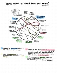
From this circle, we see a feedback loop with social spending: students schedule meals as hangouts, have a good time, feel good about the purchase, then subsequently continue to plan these outings. But, factors such as the dining hall hours and school-related stress contribute to impulse food purchases (like ordering DoorDash at night). Even though a student may regret these purchases, the outside factors continue to influence them to buy more food, continuing the cycle even if the student feels regretful after each instance.
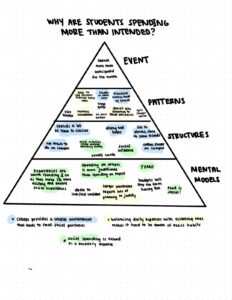
This second model is a bit more general and focuses on why students are spending more than they anticipate each month, a very common theme among our interviews. This model highlights that social spending is viewed fundamentally differently than other types of spending. Students are more willing to spend money on or with others. Like the connection model, this model also highlights how unique aspects of life for university students encourages spending. Finally, it demonstrates that although food was a common expense and theme for our baseline study, other purchases still contribute greatly, such as larger purchases or recurring ones (gym memberships, hair appointments, etc). But, since more planning goes into these purchases and since some are viewed as fundamental to their health, students are more easily able to justify them.
Insights from these models give a few interesting opportunities for intervention:
- Find ways to suggest social activities that don’t center around pricey food, allowing students to still benefit from social interactions while also saving. But, if students feel justified in their social spending at restaurants, will they be motivated to do this?
- Bridge the gap between planning and action when it comes to smaller purchases so students feel just as empowered with small purchases as they already do with their larger ones. Apply micro-planning strategies to daily expenses, helping students manage smaller purchases.
- Instead of focusing on cutting spending, we can try to highlight spending reallocation, showing students how small daily savings can fund larger experiences they care about, like travel or concerts. This approach aligns with how students already plan larger purchases and may make budgeting feel more rewarding.
Ultimately we decided that daily food purchases, while prevalent topic brought up by our participants, would be difficult to target effectively:
- Daily food purchases were often accompanied by social activities.
- Due to the high perceived value of social-related spending as noted in Grounded Theory 2, any change to this spending would be met with high opposition
Secondary Research
In order to further explore potential behaviors to target, we examined related literature and existing products to find information about how currently available tools targeted some of these behaviors.
College students often accumulate credit card debt due to easy access to credit, lack of financial education, and the normalization of debt (Leclarc, 2012). Factors like gender, academic performance, family income, and financial aid influence debt likelihood, highlighting the need for targeted financial interventions. With 84% of college students owning credit cards (averaging 4.6 per student), promoting financial literacy and budgeting skills is essential. Psychological factors such as normative influence, perceived barriers, and perceived control also shape budgeting success (Kidwell, 2003). Research suggests that interventions boosting confidence in financial management and emphasizing emotional benefits can encourage better spending habits.
E-commerce and social media fuel impulse spending through reduced perceived risks, social influence, and seamless purchasing experiences, yet many impulse buyers seek tools that encourage deliberation, spending limits, and cost awareness (Moser, 2019). Offline shopping relies more on sensory experiences and in-store promotions, whereas online platforms amplify impulsive buying through targeted ads and convenience (Aragoncillo, 2018). Implementing friction-based interventions—such as delaying purchases or making costs more salient—can help curb impulsivity. These findings suggest that tackling impulse spending, especially among college students, requires a combination of financial education, psychological motivation, and digital friction strategies to foster long-term financial discipline.
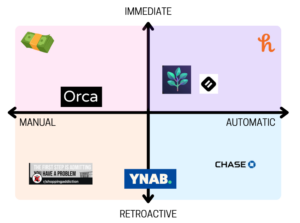
For our comparative research, we wanted to examine what home solutions there were. We also wanted to see if people were willing to pay for solutions, and what form these solutions took (i.e. browser extension, apps, etc.). Moreover, we wanted to examine if these solutions took place retroactively, as in after our audience purchased an item, or immediately during a purchase. We also wanted to see if the tool required manual input or helped our user more automatically.
Solution 1: Google Sheets
- A highly flexible and personalizable way to track spending
- Requires significant manual effort which creates friction in their use rather than the spending habit
Solution 2: Chase Mobile
- Provides an overview of financial activity to allow users to make informed decisions
- Automation tools reduce manual effort through estimating income, tracking bills, etc.
- Integrating with bank provides real-time spending insights and allows for a all-in-one financial management solution

Solution 3: Spend Wise
- Uses evidence-backed interventions to promote self-control in online purchases in the form of a wishlist to introduce delay before purchases.
- Reflection, Distraction, Desire Reduction, and Salient Cost (Han, 2021), has shown that prompting users to pause and reconsider their purchases effectively reduces impulsive buying urges
- Increasing interactional friction (requiring users to take extra steps before buying), providing timely feedback on spending habits, and engaging distraction by shifting attention away from immediate purchases
- This aligns with studies on nudge-based interventions (Mandolfo, 2022)
- Long-term habits built through the app persist beyond its usage

Solution 4: Orca
- Reframing spending habits to encourage users to transfer money into savings instead of making a purchase.
- Goal-oriented nudges, analyzing past spending behavior to suggest when and where users can save
- Similar to Spend Wise in fulfilling a need for lasting behavior change

Key Insights
Although these applications cover a wide range of audiences and employ a variety of tactics, we believe there are a few features that would contribute to an even more effective solution:
- Gamification: Studies show that gamified distraction strategies are more effective than substitution strategies in reversing impulse e-buying behavior (Tobon, 2024)
-
-
- Enhance user engagement and long-term behavior change
- Game-like elements can make the experience feel less transactional and more rewarding
-
- Social Component: As seen with communities like r/shoppingaddiction, individuals can share experiences and offer support
-
- Features such as group challenges or progress sharing help to build both accountability and overall camaraderie
Read more about our comparative analysis here
Proto-Personas
While we would later focus on solo, online shoppers, we still wanted to fully flesh out the personas that our system models captured. Broadly speaking, during this first phase of research we found that our audience would be represented by two proto-personas that collectively combined their behaviors.
| Drawing | Name | Social Simon |
 |
Activated Role | Friend |
| Goal + Motivation |
|
|
| Conflict |
|
|
| Attempts to Solve |
|
|
| Setting/ Environment |
|
|
| Tools + Skills |
|
|
| Habits |
|
Our first persona is Social Simon, highly social spender who prioritizes shared experiences over financial restraint. He thrives on social interactions and sees outings as opportunities to strengthen friendships, often opting to join group activities even if they involve unplanned expenses. His spending habits revolve around food—eating out for lunch and picking up dinner with friends on the way back home.
While he tracks his expenses using budget sheets, he finds it difficult to say no without feeling like he’s missing out. Moreover, when spending with friends, he rarely tracks Venmo or Zelle. The enjoyment of time spent with friends outweighs the concern for money in the moment, but by bedtime, reality sets in as he logs his expenses and realizes how much he has spent. Despite the occasional regret, he struggles to break the cycle, as socializing remains a core part of his identity and happiness. He’s unsure of how to proceed because he doesn’t want to cut down his social time, but finds himself overshooting his budget often.

An overview of Simon’s day reveals pain points before and after each social event which stem from a fear of missing out and awareness of his spending, respectively. The strong mental connection between socializing and spending money makes it very difficult for Simon to see how he would be able to reduce his spending without reducing his socialization. However, we can notice that his mood is heightened simply in the presence of others. Thus, he should be able to achieve the same affect without placing a burden on his finances. The most ideal time to be able to reach Simon would be near the beginning of his day when friends begin to make plans and he considers his budget for the day.
| Drawing | Name | Seeking Sara |
 |
Activated Role | Sweet Treat Seeker |
| Goal + Motivation |
|
|
| Conflict |
|
|
| Attempts to Solve |
|
|
| Setting/ Environment |
|
|
| Tools + Skills |
|
|
| Habits |
|
Our second persona is Seeking Sara, a young, active individual who struggles with impulsive spending on sweet treats and snacks.
Living in a vibrant area with easy access to bakeries, cafes, and food markets, Sara frequently encounters opportunities to purchase treats throughout their daily routine. Whether it’s grabbing a pastry after morning pilates, stopping by the farmers market between classes, or joining friends for post-dinner dessert, Sara’s environment is filled with temptations that align with their love of sweets.
What sets Sara apart from a typical social spender is their tendency to purchase treats even when alone. The motivation isn’t primarily social – it’s driven by a genuine love of sweets, a desire for novelty (like limited edition items), and using treats as self-rewards for accomplishments. This pattern is particularly pronounced because Sara doesn’t mentally register purchases under $10, making it easier to justify these small indulgences without feeling their financial impact in the moment.
Despite having access to tools that could help monitor spending (like digital credit card statements), Sara actively avoids reviewing their financial records. They’ve seamlessly integrated modern payment methods like Apple Pay into their routine, further reducing the friction of making purchases. While RF has friends who could potentially help curb this behavior, they haven’t made any concrete attempts to address their spending habits.
Sara’s daily patterns create multiple vulnerability points for unplanned purchases. Their busy schedule often leads to skipped meals, creating situations where hunger combines with convenience and desire for treats. The prevalence of food-centered social activities in their life adds another layer of spending opportunities, as Sara finds it difficult to decline when friends suggest getting dessert or boba after meals.
This spending pattern is sustained by Sara’s habit of checking promotional emails from bakeries and regular visits to local food markets, keeping them well-informed about available treats while potentially triggering more purchases. The combination of their genuine enjoyment of sweets, environmental access, and lack of small-purchase awareness creates a cycle that remains unaddressed due to their avoidance of financial self-reflection.
Read more about our proto-personas and journey maps here.
Baseline Conclusions
Ultimately our research and work throughout this phase of our project led us to a few key ideas we drew upon moving forward:
- Targeting online, emotion-driven behaviors would be the subject of our intervention
- Incorporating some from of gamification and social component into our final design would increase its effectiveness
- Developing another persona that captures the online, solo shopper would be key to fully representing our audience
Read more about our baseline study here.
Intervention Design
Our development process involved multiple stages of research, testing, and iteration, gradually refining our approach to addressing impulse shopping. Initially, we explored several intervention ideas before ultimately shifting our focus to a Pinterest-style board creation activity as our core intervention. This decision was influenced by a combination of assumption testing, storyboarding, and insights from user behaviors. Below, we summarize key insights from each stage, emphasizing how we arrived at our final intervention and the insights gained along the way.
Assumption mapping & testing
Assumption Mapping | Assumption Testing
At the outset, our assumption map helped us break down key uncertainties about impulse shopping behavior, leading us to test different hypotheses about what interventions might work best. We initially assumed that:
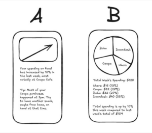
- Users prefer quick, digestible spending insights over detailed breakdowns, which we tested by showing survey responders two different interfaces and asking which one they prefer and would look at more:
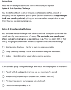
- A social accountability feature (group savings challenges, shared goals) would increase engagement. We tested this through again asking survey respondents how they’d react to different social accountability methods:
A financial tool would be most effective if it required minimal effort and fit into existing routines. We had respondents rank five options for financial tools which ranged from heavily dependent on user input and heavily automated:
Through testing, we learned:
- Users actually preferred visual spending insights (graphs, charts) rather than text summaries. 78% of our 25 respondents preferred option B. This told us that representation matters, and a successful intervention must feel intuitive.
- Social accountability was a mixed bag—many people didn’t want to share spending details (it was about 50/50), but 40% liked anonymous visibility. This led us to consider gamification rather than direct social comparison.
- Automation mattered, but not at the cost of control. Aggregating the rankings, the middle option, which balances automation with manual engagement, was the most well-received, while the fewest people preferred the manual spreadsheet option (10 respondents reported this being the option they are least likely to use). People liked some level of manual engagement to maintain intentionality in financial decisions.
Key takeaway: These insights pushed us toward an intervention that would be engaging, visually driven, low-effort, and potentially anonymous—but still allow users to be mindful of their spending habits.
Storyboarding & early intervention ideas
Based on our assumption testing, we brainstormed several intervention ideas, initially focusing on social spending and impulse purchases. However, as we moved forward, we realized a major flaw in our approach:
Social spenders may say they want to spend less, but they don’t have strong motivation to change. Despite all of our baseline study participants saying that they wanted to spend less money, when doing our post-study interviews, most did not regret the social purchases they made. Sara, for example, saw her purchases with friends as necessary and would rather find ways to earn more money than reduce her social spending.
Impulse shoppers, on the other hand, actively want to change but struggle with self-control in the moment of purchase. Our group spent some time looking through r/ShoppingAddiction, which showed that there is a large population of people who want to change but struggle. This is a much better population for us to focus on for intervention.
This insight led us to pivot away from social accountability-based interventions and instead focus on helping impulse shoppers develop more mindful spending habits. The ideas below build up to our final idea, which employs the above insights.
Early ideas we explored leading up to the pivot:
Idea #1: Geo-triggered reminders

Users would receive location-based alerts when approaching frequent shopping locations.
Issue: Privacy concerns, and users may experience notification fatigue or even increased temptation by being reminded of their shopping triggers.
Idea #2: Real-Time Aggregated Spending Reminders

Users receive a running total of their spending throughout the week, addressing the issue of payments being split between many different sources which conceals the actual amount spent.
Issue: While this could be an informative approach, without the ability to integrate with all payment methods, users would need to input costs manually–this wouldn’t be much more helpful than a spreadsheet, and our assumption test showed that this is not desirable.
Idea #3: Emoji Spending Log + Social Feed

Users log purchases using two emojis—one for the item and one for how they felt about it. A social feed shows others’ logs, but only if the user logs their own purchases that day.
Issue: Engagement may be inconsistent, and some users might forget to log purchases, reducing effectiveness. This also requires a critical mass of users to be effective.
Idea #4: Tinder Amazon

Users swipe through items in a bracket-style elimination process, forcing them to reflect before making purchases.
Issue: While this may make spending more intentional, it didn’t necessarily reduce shopping behavior—just delayed it.
At this point, we felt a little stuck and realized we were focused on curbing spending at the moment of purchase, but what if we could prevent the impulse urge altogether?
Pivoting to a more intentional approach
We began considering why people impulse shop in the first place and went back to our baseline interviews and realized:
Shopping itself—the browsing, selecting, and anticipation—is a huge part of the enjoyment. For example, a participant from our baseline study, Vanessa, said that she enjoys the act of just scrolling through Amazon when she is bored or in class, with no intention to buy anything.
So, if we could replicate that feeling of browsing and selecting items, but without leading to actual purchases, we might be able to provide an effective alternative to impulse shopping.
Intervention Study: Pinterest-style board creation
Why we chose this approach
Based on all our prior insights, we moved away from Tinder Amazon and instead tested an intervention inspired by Pinterest. The goal was to simulate the enjoyment of shopping (the curation, discovery, and selection process) but in a way that would be more mindful and intentional.
How the study worked
For four days, participants created a Pinterest board daily in response to a curated prompt. These prompts were designed to encourage intention, creativity, and reflection rather than impulse-driven product accumulation.
Prompts used:
- “Create a board for your favorite fictional character’s wedding.”
- “Envision your dream work environment—your workspace, decor, location.”
- “Plan your ultimate reset day—everything you’d do to recharge.”
- “Make a playlist-inspired board—Choose a song or album and visually represent its vibe.”

Example board a participant submitted for the first day’s prompt
Key insights from the study
Insight #1: Prompts must be carefully curated to avoid triggering shopping urges.
- Evidence: One participant relapsed into impulse shopping after being exposed to self-care product images while creating a board for the “Reset Day” prompt. “Reset Day turned into a shopping catalog for me. I ended up buying a hair oil and a skincare product after seeing them on Pinterest.” Participants felt more in control when prompts focused on abstract or non-consumerist topics like designing a fictional wedding or ideal work environment.
- Effect on design: We will have users input their shopping triggers in the onboarding flow so we can avoid prompts that lead to shopping. We will also focus on conceptual, experience-based, or fantasy-driven themes to maintain engagement without promoting spending.
Insight #2: The act of browsing, selecting, and curating is as engaging as shopping.
- Evidence: 6/7 participants found the activity at least as engaging as online shopping, with 5/7 reporting that it was more engaging than shopping. 5/7 reduced time spent browsing shopping sites because Pinterest provided a substitute for product discovery. “This gave me the same satisfaction as shopping, but without spending money,” one participant shared.
- Effect on design: We will emphasize browsing and discovery by refining the selection and curation experience. The app should reward completion of boards to reinforce engagement without linking to purchases.
Insight #3: Reflection after completing a board increases mindfulness.
- Evidence: Multiple participants suggested adding a step for self-reflection. “I would love reflection questions to process my urges after creating a board,” one participant shared. Some participants realized their shopping habits were emotionally driven only after answering the survey questions. “I was very inspired by the first two days’ themes and found that the relevant thinking process has helped me distract myself from excessive online shopping as a result,” another participant stated in their post-study reflection.
- Effect on design: We will integrate a short reflection step after each board, asking “How do you feel now?” to encourage self-awareness.
Insight #4: Task-oriented shopping replacement works best for impulse shoppers.
- Evidence: Participants who struggle with impulse shopping enjoyed the structured nature of the prompts. “Having a goal in mind was similar to shopping. I just like being on the hunt,” one said. Several participants mentioned ADHD or difficulty regulating impulse control, and structured tasks helped redirect their focus.
- Effect on design: The app will lean into goal-oriented discovery, making browsing feel like a productive task rather than an aimless activity. We will consider adding gamification elements to keep users engaged (e.g., point systems for completed boards). Prompts will encourage exploration without shopping, similar to how some users browse shopping sites just for entertainment. This insight was also very validating for our overall approach!
Insight #5: Participants need a variety of prompts to stay engaged.
- Evidence: Users had mixed preferences for different prompts. “I liked some prompts more than others. The wedding one wasn’t for me, but the workspace prompt was fun,” said one participant, while another loved the wedding prompt. 5/7 participants said they would continue using the intervention if prompts felt more relevant to their interests.
- Effect on Design: Instead of random prompts, users will have three options to choose from daily, ensuring they always find something engaging. Prompts will be diverse in theme (e.g., fantasy, lifestyle, hobbies) to appeal to a wide range of users.
System paths & story maps

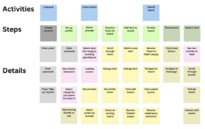
To ensure the intervention worked as intended, we mapped out different user paths to understand how people would interact with the app. This exercise reaffirmed several key insights from our intervention study and revealed new considerations for our design.
Through these paths, we reaffirmed that:
- Board creation needs to be the core experience. No matter where users enter from, we want them to engage in this step, meaning most of our focus should be there. This aligns with our intervention study, where users who actively curated boards felt meaningfully engaged in the task.
- Users should not passively browse without first participating. We want this to be a mindful activity, not just another doom scrolling platform. Our study showed that engagement felt most productive when users had a structured task (e.g., selecting a prompt, creating a board).
- Onboarding should identify spending triggers to personalize prompts and avoid unintended shopping urges. Our intervention study revealed that certain prompts triggered shopping behaviors, so this mapping exercise helped expand what the onboarding process should include.
However, a new insight that emerged was that certain personas may take different paths through the app. For example:
- Some users may enter with the intent to create a board immediately, while others may navigate first to explore. To guide engagement, our system paths must clearly direct users into the board creation flow.
- Users who frequently browse shopping sites may engage differently than those who shop impulsively in physical stores. This suggests we may need different intervention approaches within the app. However, for this prototype, we decided to focus on those who primarily experience online impulse purchases, as this is what is most tied to our intervention and backed by our previous findings.
So, based on this mapping exercise and the study results, we refined and validated the vision for our prototype by:
Restricting board exploration until users create their own board. This ensures active participation before passive browsing.
Adding an explicit reflection step before saving a board. This supports mindful engagement, as many participants naturally reflected, while others needed prompting.
Allowing customization to avoid categories that might trigger shopping. This helps ensure relevance while minimizing risks.
Focusing on the shopping experience itself. It is important that the board creation flow mirrors the dopamine-driven aspects of shopping without actual purchases.
MVP features
From our research, we determined that our MVP should focus on four key features:
- Prompt selection: Ensures engagement is personalized and relevant. From our intervention study, we saw that users engaged more deeply when given a variety of prompts, reinforcing the need for an intentional but streamlined selection process.
- Item exploration & board creation: The primary experience that replaces impulse shopping. We must prioritize making this experience engaging, as our intervention study confirmed that searching for and curating items was what kept users most engaged.
- Reflection step: Helps reinforce mindfulness. Since our study showed that some users naturally reflected while others needed guidance, this step must be integrated without feeling intrusive.
- Explore page (locked until board creation): Encourages intentionality before passive browsing, while still adding an anonymous social aspect (which our assumption testing showed to be the most popular method for social interaction in this case). Our study found limited engagement with others’ boards compared to engagement with the creation task itself, so this feature will be secondary to board creation.
Bubble map

Our Bubble Map analysis helped visualize where users spend time in the app, reinforcing insights from both our system paths and intervention study.
- Users should spend most of their time creating boards. This means the board creation experience must be seamless, rewarding, and easy to navigate. Our intervention study showed that users who fully engaged in board creation reported lower shopping urges, meaning this is the most relevant feature to our intervention.
- Prompt selection should be quick and seamless, even if we provide several options. Our intervention study suggested that having multiple prompt choices improves engagement, but, the bubble map reveals that the selection process itself should be fast to avoid decision fatigue. So, we will dedicate only one screen to this task rather than overcomplicating it, and we will stick to providing three options to offer variety without fatigue.
- Navigation must be clear, with easy next steps, since the “shopping” experience connects multiple interactions. Users move through the app in various ways (prompt → exploration → reflection → social features), so we must ensure a logical, frictionless experience.
- We want users to engage with reflection! Based on our intervention study, some users naturally reflected, while others skipped this step unless prompted. So, this will be a required step to finalize a board, but we will offer both quick, clickable responses and a free response option to accommodate different preferences. We will also display the reflections when the user views their previous boards so that this step isn’t just tossed away after completion.
- Onboarding must clearly communicate the app’s purpose. The bubble map helped us realize that this stage must frame the app as a shopping alternative rather than just a general creative activity. While we initially didn’t think onboarding was important to this app, it is necessary to both ground the user and allow us to personalize their experience to avoid triggers.
Final takeaways from the intervention design stage
- Social spenders say they want to budget, but impulse shoppers have a stronger motivation to change, leading to our pivot.
- Shopping isn’t just about buying! It’s also about browsing, selecting, and curating.
- Pinterest-style curation can be an effective alternative, but prompts must be intentional to avoid encouraging spending. Users must still have some control over prompt selection, instead of us assigning a single option each day.
- Reflection is critical as it transforms mindless browsing into a mindful habit.
Read more about our intervention study here
Interaction Design
Based on the insights from our interaction design, we each created different wireflows and sketchy screens to illustrate different ways we could design our features. After agreeing on the specific pathways we wanted, we explored various styling options for our app. Using our style selection and sketchy screens, we created a clickable prototype that we used for usability testing, which we then refined into our final prototype. Below, we summarize key insights from each of these design stages and explain how we arrived at our final prototype.
Wireflows and Sketchy Screens
In our wireflows and sketchy screens, we each iterated on a couple key flows: prompt selection, board creation & completion, and board social exploration.
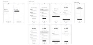
Ayana’s Screens (Prompt Selection, Home Screen, Board Finished)
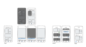
Ariane’s Screens (Shopping Feed, Saving Items, Saved Boards, Social Feed)
Thanh’s Screens (Explore Boards, Saved Boards, Save/Share)’s Screens

Nicholas’s Screens (Saved Boards, Shop Feed)
Prompt Selection
From our prompt selection iterations, we concluded that that we wanted:
- Friendly and welcoming text: Despite little styling, inclusion of text like “Hi, *username!” made the sketchy screens feel warm, so we noted that for our copy going forward
- Multiple prompt options, but with no option to regenerate prompts: From our intervention study, we knew that some prompts would resonate more with some users than others. However, we weren’t sure how many prompts to present them with. Iterations we created included showing one prompt with the option to infinitely regenerate, showing three prompts with no regeneration option, or showing three prompts with regeneration. Ultimately, we decided on three prompts with no regeneration as it allowed for optionality while preventing decision fatigue.
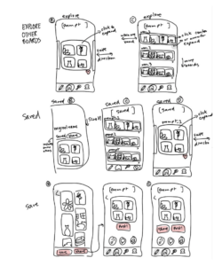
Board Creation & Completion
In this flow, we iterated on screens for the feed through which users could browse items to add to their board, enlargement of items, and user profiles which contained their past and active boards. From our iterations, we concluded that we wanted:
- Unified copy & language throughout the app: We noticed some of us used words like “saved” and others used words like “added” so we made sure that going forward we decided on the same language
- Compelling and intuitive call to actions: We wanted to make sure that the next step was clear at each point of the app, so we decided on making one clear call to action in a consistent color
- Well-structured hierarchy and architecture: From our iterations, we ultimately narrowed down the possible ways to navigate to different screens like your board and also decided on the main navigation tabs, including home, explore, and profile
- Affordances to indicate if an action has been taken: We noticed that we liked iterations that had both active and disabled states for things like buttons, as well as notifications, which gave the user more information about where they were in the process
- Consistent UX patterns with other shopping apps: We experimented with different modes of interacting with a feed like horizontal scrolling and swiping, but ultimately settled with vertical scroll to better mimic the traditional shopping experience
Board Sharing
From our board sharing iterations, we concluded that we wanted:
- No numeric social metrics: We toyed with the idea of with counting likes or having comments but ultimately felt like that was unnecessary to the core browsing experience and could have unintended consequences
- Similar display format to personal boards: While we experimented with different display formats for both seeing your own boards and other people’s boards, we ultimately decided that keeping the format consistent would be most intuitive
When designing our wireflows, we also spent some time iterating further on how users would enter our app. While we knew we wanted the app to be accessible at any point, we also knew that impulse shoppers wouldn’t always be conscious enough of their actions to proactively stop scrolling and shopping and open up our app. Therefore, in addition to opening up our app, we resolved to design another way for users to reach the app: shopping interventions. We wanted another entry point into our app to be directly from shopping apps like Amazon, Depop, etc, and decided to include this in our prototype.
Read more about our wireflows and sketchy screens here
Moodboard and Style Tile

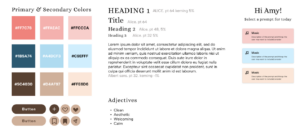
Following the creation of the basic wireflows and sketchy screens, we worked on the branding of our app. When creating our app’s mood board in class, we aimed for a clean, warm, and welcoming vibe. In person form, our app would be sustainable, consume ethically when possible, and have a bubbly personality with a clean girl aesthetic. From our style tile, we drew out the following colors and fonts, including blues, pinks, and browns, and a serif font for titles alongside a more readable san-serif font for body text.
However, following feedback from Uday, we ended up scrapping the variety of colors that we originally created in our style tile. He pointed out that having more colors could draw more attention and arouse too many emotions related to shopping, and suggested using a more monochrome, black and white palette instead. Ultimately, we pivoted to just using black and white as our colors in order to maintain a cleaner, more refined look to the app, and we also reasoned that having images on the app would provide enough color so that it wouldn’t look too greyscale. However, in order to retain a bit of the warmth of the app, we kept our fonts.
Read more about our moldboard and style tiles here
Prototype and Usability Testing
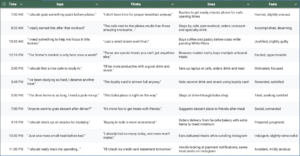
Following the branding decisions, we then proceeded to build a prototype of our app, incorporating all of the features we had decided on so far. To recap, at this point, we had decided on a pinterest type browsing experience, where users selected fictional prompts to curate a board for. After building the prototype, we tested it on users to see how intuitive and engaging the core features of the app were, including onboarding, prompt selection, board creation, reflection, and social exploration. We were looking to understand how users navigated the app and if they understood its intended purpose.
Usability test script: Linked here
Prototype: Linked here
From our usability tests, we were able to detect numerous issues that we classified into high, medium, and low priority. Read a more detailed breakdown of the issues we found here.
Aside from smaller prototyping, animation, and styling errors (ex: not enough padding or incorrect icons), there were some more pressing issues that warranted more significant changes to our prototype.
- More explanation of onboarding and interruptions: Several of our testers felt that features were unclear and warranted more explanation, even though they liked the UI. They wanted more of an “onboarding” experience. Additionally, when entering the app through the interception flow (being intercepted while shopping on a different app), several users stated that they were confused by what was happening. From this feedback, we decided to create a more thorough onboarding experience that involved walking the user through the app and its features, as well as altering our interception flow to give more context and explanation to the user as to what is happening as they are being intercepted.
- Not enough similarity to the shopping experience: Some testers noted that although our app mimicked the browsing experience well, there wasn’t as much of a thrill or excitement to our app’s experience because there was no money on the line. Someone who self identified as a bargain hunter commented that there was no deal to try and find, nothing to game. From this feedback, we concluded that adding a layer of gamification to our app would make it more engaging. We decided to give users a point “budget” for each of their boards and assign point values to each image, forcing users to try and curate the best board possible with the limited budget they had.
We finally refined our prototype to include the following features:
- Onboarding with instructions
- Selecting a prompt
- Adding something to a board
- Finalizing a board
- Sharing a board
- Going through others’ boards