
Wireflows
Wireflow #1: Sign Up / Onboarding
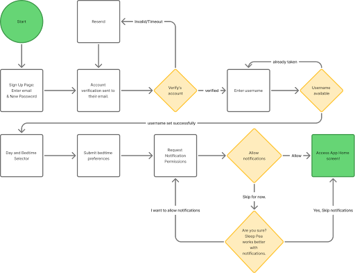
Our sign up and onboarding process is intentionally designed around the behaviors and needs of our persona: the “just-one-more” user. This user has bad bedtime procrastination mostly stemming from clicking “next episode”, “next video game”, or “next chapter”. They are constantly looking for the next source of entertainment. With that in mind we keep our onboarding straightforward and quick, only keeping the bare essential steps to have our product function: email, password, username, bedtime target, and notifications. Given the already high friction of deciding to change a habit, we want it to be extremely simple to set up.
Wireflow #2: Pod Competition
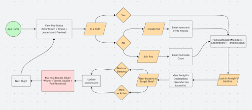
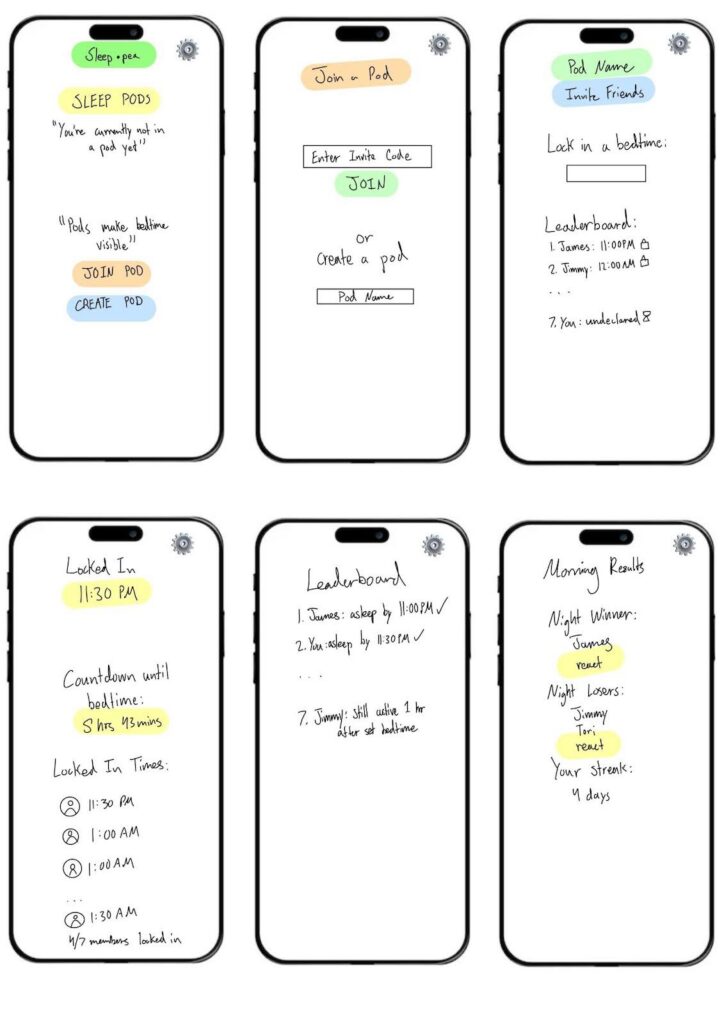
Our Pod Competition Loop is built around the same “just-one-more” user, but now it introduces social visibility and light competition to counteract that impulse. The “just-one-more” user doesn’t struggle because they don’t know sleep matters. They struggle because at 11:47 PM, nothing is holding them accountable. So instead of making sleep another private promise they break, we turn it into something visible. When you join a Pod, bedtime becomes something you declare out loud. You see who already locked in. You know your friends will see if you fold. It’s not aggressive competition, but it’s enough social pressure to make you think twice before opening another episode. The loop is simple on purpose: check the pod, lock in your time, countdown, wake up to results. Then it resets. Over and over. The goal isn’t to shame people, it’s to make that 12:02 AM decision feel different. When it feels different consistently, discipline starts to build without forcing it.
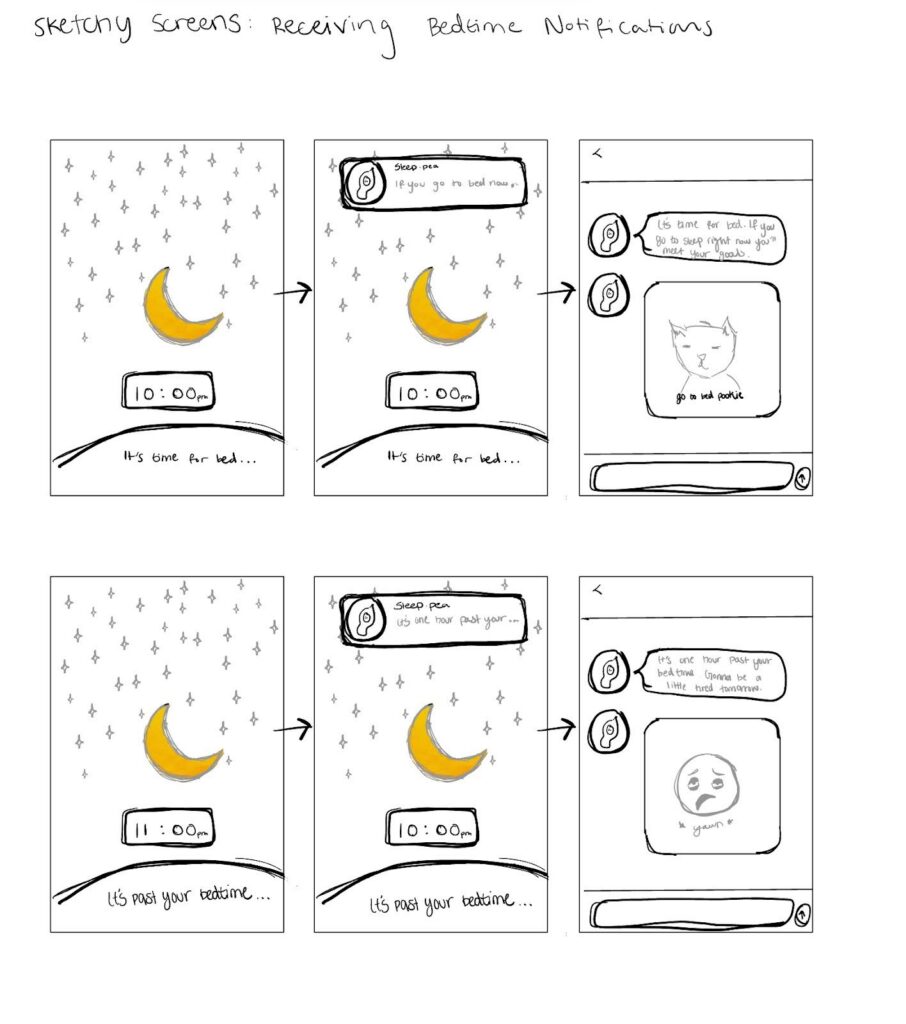
Wireflow #3: Receiving Bedtime Notifications (Visualize Tomorrow)
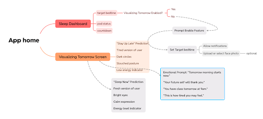
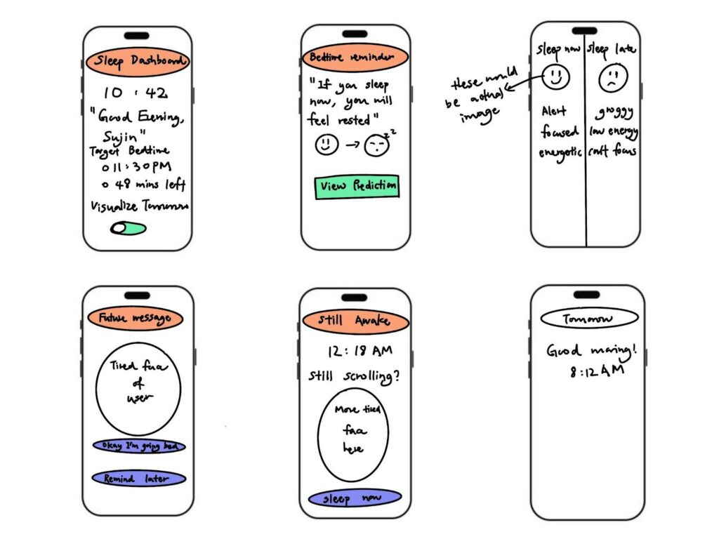
Our Visualizing Tomorrow wireflow is designed for the same “just-one-more” user, but instead of social pressure it uses future-self visualization to interrupt. The user usually doesn’t stay up because they don’t value sleep, they stay up because at midnight, tomorrow feels abstract and far away. This feature makes tomorrow feel immediate. As bedtime approaches, users receive notifications that show how they might feel the next day if they stay up versus if they sleep now. Seeing a tired version of themselves creates a moment of pause before continuing to scroll or watch another video.
The flow stays simple on purpose: the user sees a reminder, views the visualization, decides whether to sleep or snooze, and then sees a short reflection the next morning. The goal isn’t to scare or guilt users into sleeping, but to make the late-night decision feel more real. When tomorrow feels visible and personal, going to bed becomes easier without relying on willpower alone.
Sketchy Screens
Sketchy Screen #1: Sign Up / Onboarding (Canon)
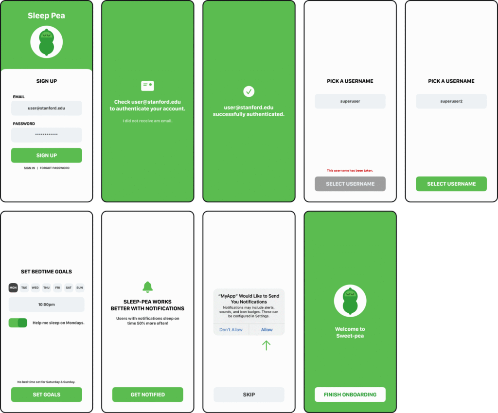
Sketchy Screen #2: Pod Competition (Adrian)
Sketchy Screen #3: Receiving Bedtime Notifications (Osose)
Sketchy Screen #4: Receiving Bedtime Notifications (Sujin)
Group Critiques/Comments:
- The current sketchy screens show the essential tasks for the users of our app, and main criticisms revolved around finalizing color and image and styling as well as choosing a cohesive layout and landing screen
- We appreciated seeing each others sketchy screens and are largely happy with the current flows each group member presented; however, our main concern is how to union all four of our wireflows into a cohesive design
- As our intervention solution has three main tasks, we will also need to pay special attention on how to use elements from the two versions of sketchy screens for the “Receiving Bedtime Notifications” task.



