
Intro
For this week’s Product Sense Pushups, I examined the checkout flows of three online marketplaces: Amazon, Warby-Parker, and Patagonia. Each focuses on different product types and has checkout flows that clearly reflect their values.
The Flows
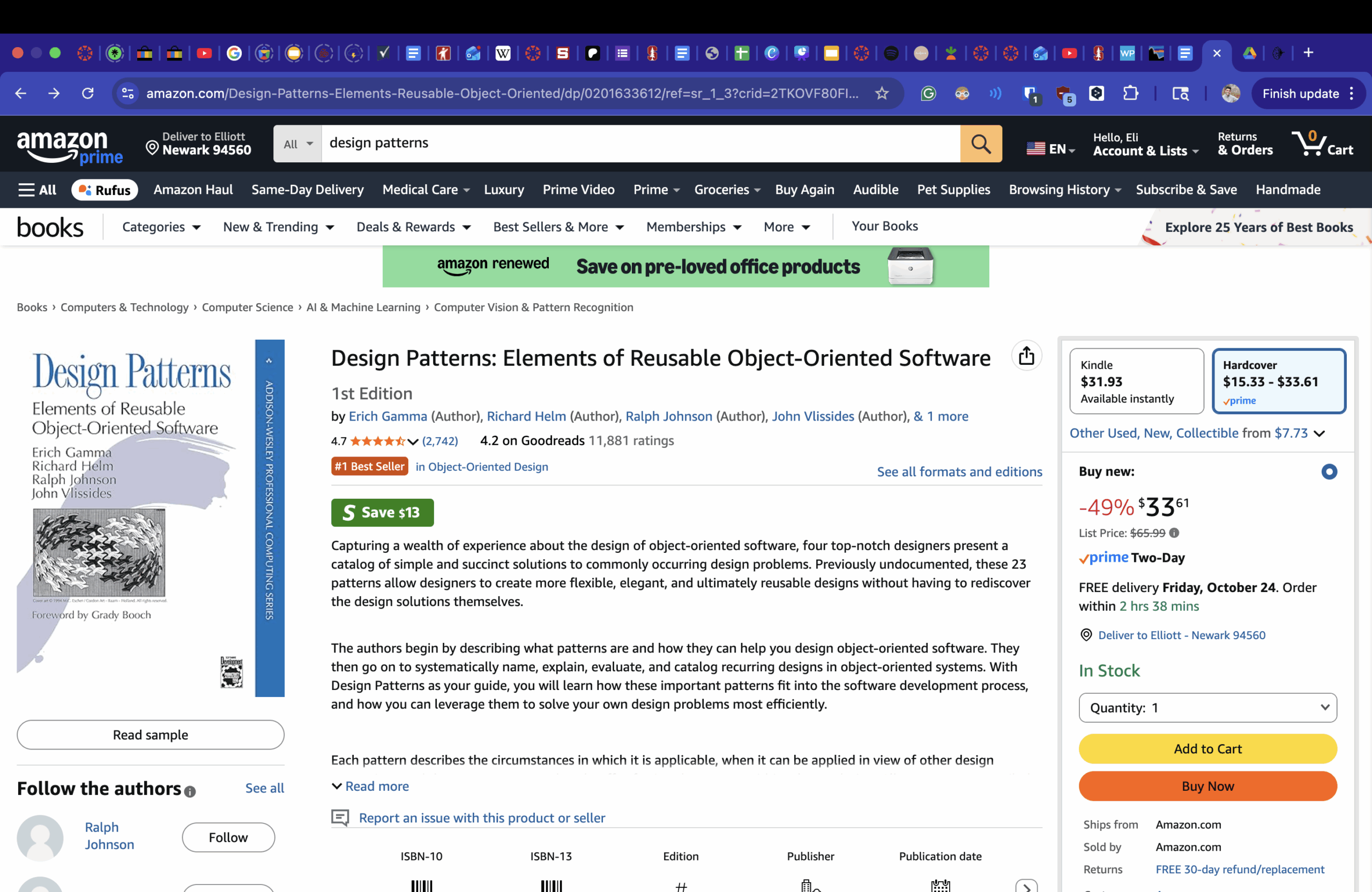
The first flow I explored is Amazon’s, also known as “Speed-Optimized.” Amazon’s flow features a “Buy Now” button that bypasses some extra screens, such as options for shipping location and payment method. It also includes the traditional “Add to Cart” button.
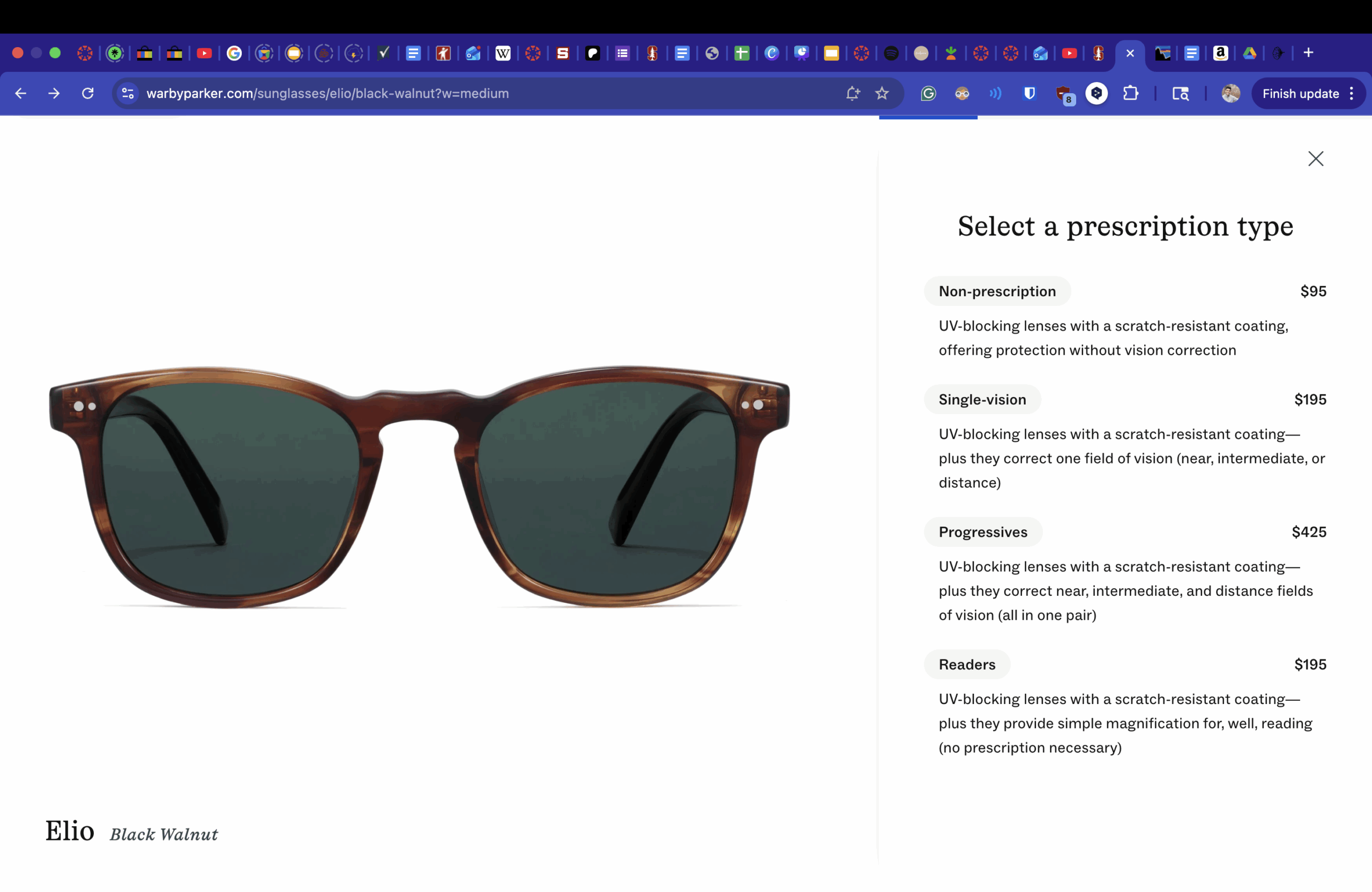
Warby Parker (confidence-building) takes a very different approach. Instead of making you do everything all at once, you move through the process step-by-step, making specifications based on detailed descriptions provided by the company. This flow ensures you get exactly what you want and helps you feel in control.
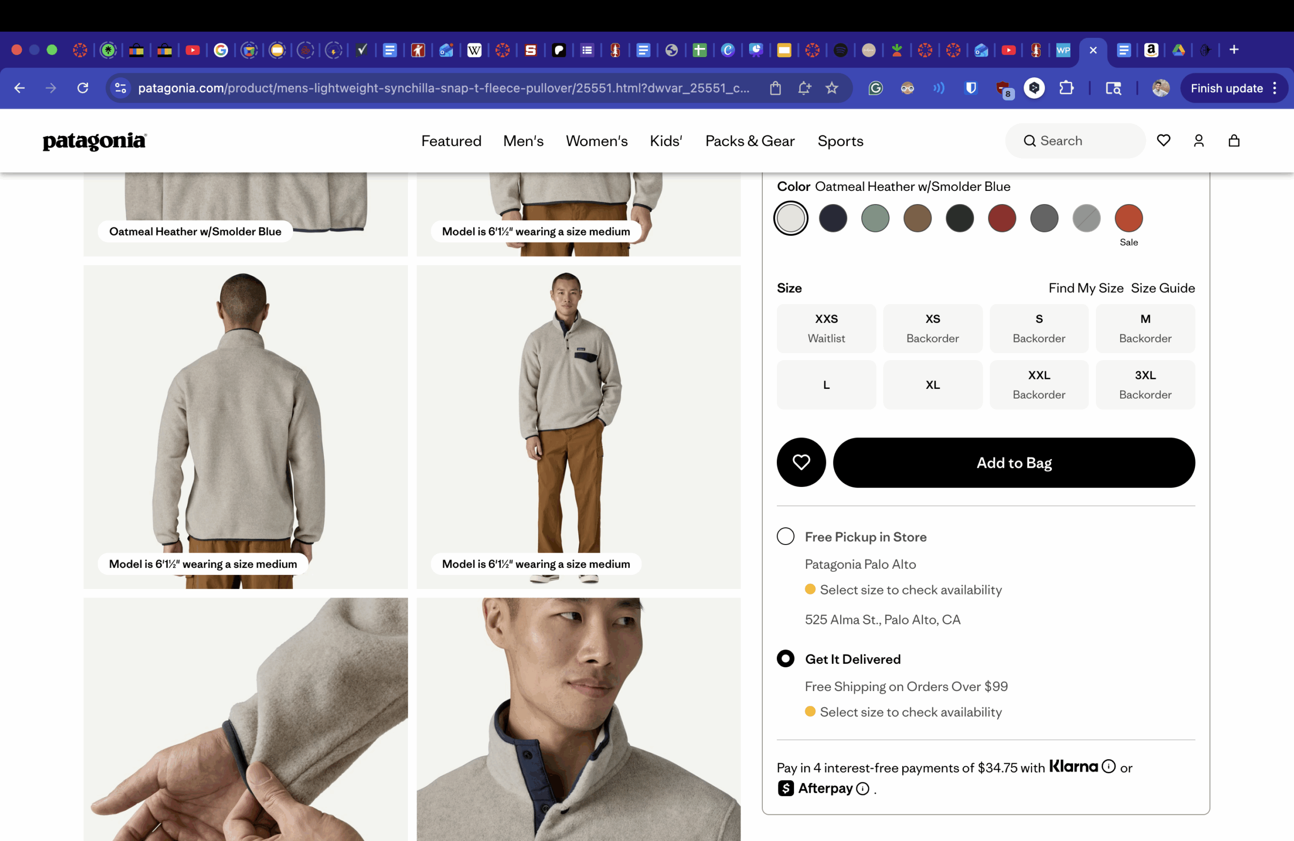
Finally, Patagonia’s checkout flow is values-aligned. Rather than pushing you to make a decision right away, they provide you with alternatives that strongly present their values. First, we see customer-centricity. The checkout page is abundantly clear regarding what items are currently in stock, and which are backordered. This gives the customer choice on which is more important: speed or design.
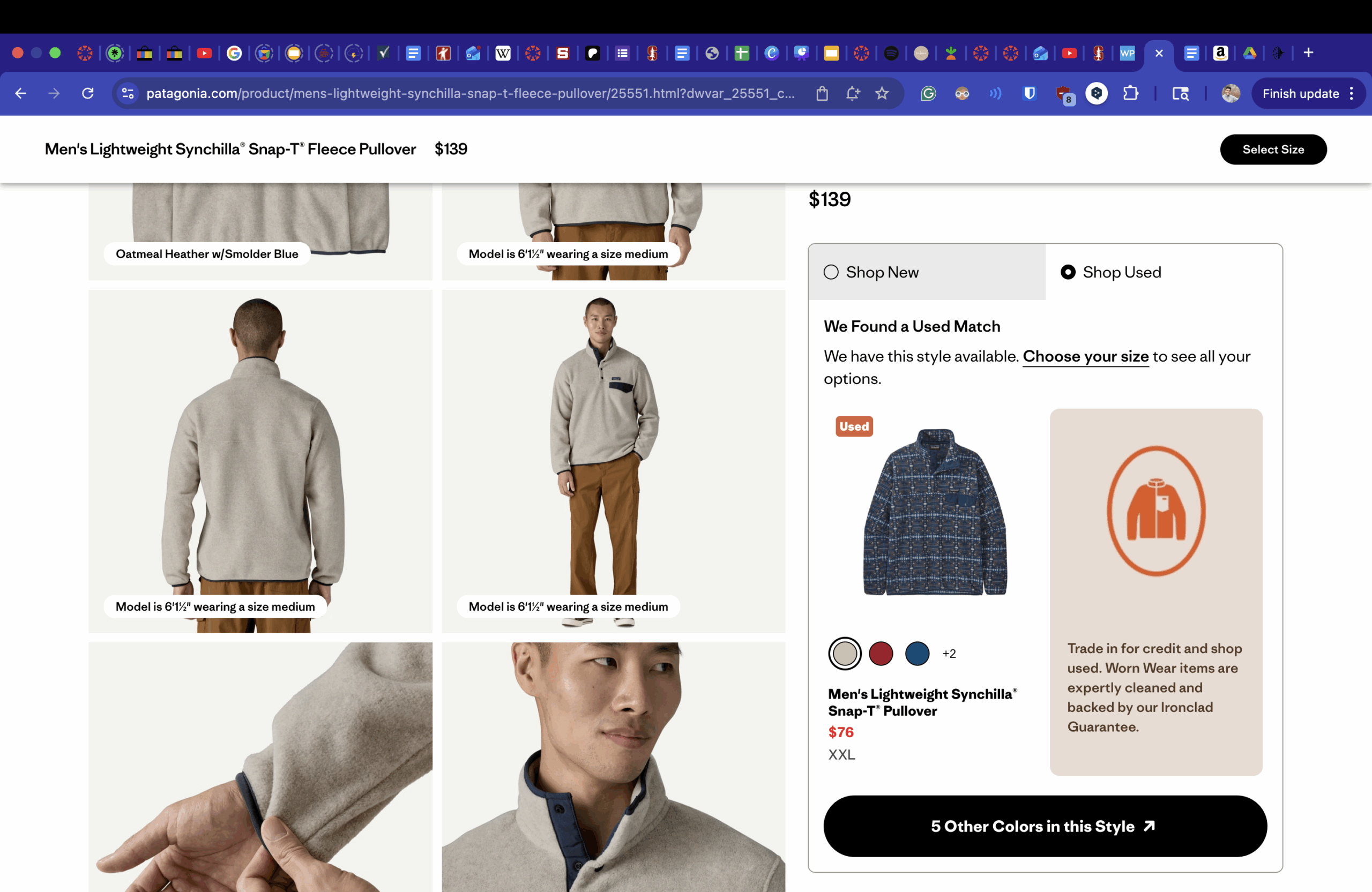
They also offer the option to buy used items, which supports their focus on sustainability. Instead of contributing to pollution and waste, they want to make sure their clothes find a new home, even if their profit from the sale isn’t significantly affected.
Conclusions
A business’s checkout flow reflects its values. Amazon’s streamlined process makes it as easy as possible to buy NOW, while others focus more on customer needs and use their checkout to communicate that. Going forward, this exercise will be helpful to consider when thinking about how design choices influence customer behavior and mirror a company’s ideals.