
Amazon
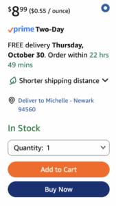
When you check out on Amazon, it’s clear that the goal is speed. Everything about the process pushes you to finish fast. If you’ve ordered before, your address and payment info are already saved. The “Buy Now” button lets you skip the cart entirely. There are no surprises or pauses to rethink your purchase. It works because fewer steps mean fewer abandoned carts, which boosts Amazon’s conversion rate.
Warby Parker
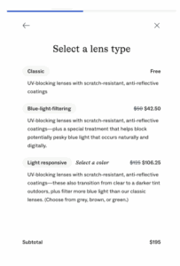
Warby Parker takes the opposite approach. Their checkout feels slower but more thoughtful. You see clear photos, progress indicators, and small explanations for each step. The process builds trust by helping you feel sure of your choice. The optional add-ons, like blue-light filters or lens coatings, appear naturally along the way instead of feeling like upsells. This careful design raises confidence and even average order value.
Patagonia
Then there’s Patagonia, where checkout feels almost like a reflection of its mission. Instead of pushing you to buy more, the page reminds you of the brand’s values: recycled materials, the Ironclad Guarantee, and “1% for the Planet.” It’s not the fastest checkout, but it strengthens loyalty by reminding shoppers that buying here means supporting a cause. That’s how Patagonia turns values into lifetime customers.

