
Tinder’s original deck (back when it was called MatchBox) is ten slides, and most of them exclusively tell a narrative
The problem arrives through Matt, who spots someone he likes at a party and never walks over. “Like most of us” does most of the work here. It turns one awkward moment into a universal experience, using a singular anecdote to create a worldwide problem.
Slide 4 names the thing it is combatting: fear of rejection. Slide 5 offers their service, MatchBox, as a solution. You like people nearby, and you only connect if they like you back. The double opt-in directly counteracts the fear, because nobody can reject you if they never learn you were interested. The problem and the solution are mirror images, making their product seem like an obvious cure to this prevalent social problem.
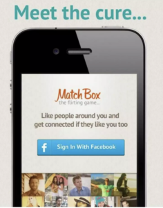
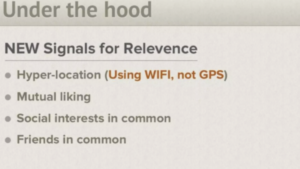
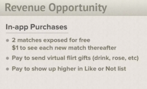
As far as evidence the problem is real goes, nothing beyond that “most of us” line. There’s no survey, no beta numbers, and no user quotes. Market size? It isn’t on any slide. The deck goes from app screens to an “under the hood” list of relevance signals (WiFi-based location, mutual likes, shared interests and friends) and then straight to revenue. This seems almost counterintuitive, and yet their narrative easily makes up for this.
As far as my biggest takeaways from this, I’m almost certain this lack of numbers would be turned away by an investor today. You would certainly have to provide something rather than the two slides of actual information given here. However, I also understand from this the power of a strong user story. They had nothing except a vague idea, and yet their platform has absolutely skyrocketed. While I think providing no figures is simply unrealistic in today’s landscape, their use of narrative is admirable in this and goes to show how important it is to really understand your customer.
