

Introduction
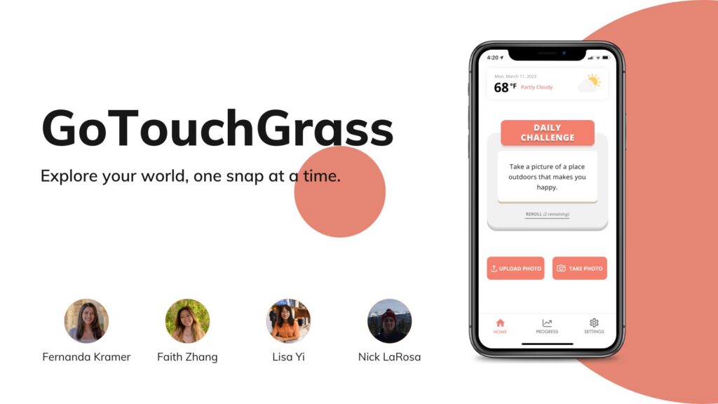
We are GoTouchGrass. We developed this 10 week project for CS 247B: Design for Behavior Change (Winter 2023). Our project aims to help people increase the amount of time that they spend outside.
Problem Finding
Justification for Choosing Problem
When coming together to decide what topics of interest we would be interested in tackling, our group quickly came to the conclusion that personal health and wellbeing was an area we wanted to focus on. After finding significant amounts of research showing the correlation between going outside and mental wellbeing, we decided to focus on finding ways to get users to go outside more frequently. This would allow us to have a positive impact on our users lives and help them build meaningful habits and a better relationship with the outdoors.
What is known about the problem
In our previous blog post, we listed 8 pieces of literature that have aided our study design, and summarized the key findings from each of them. All of these studies show supportive evidence that going outside is good for mental health, and the overall health status as well. Therefore, we decided to work on an intervention study to improve participants’ time spent on the outdoor activity. A majority of these studies focus on college students and that motivated our intervention research to target college students as a first pass.
One research paper highlights the importance of urban green spaces and opportunities for outdoor recreation to foster students’ wellbeing in their everyday lives. That motivates our design to encourage participants to link their daily life with more green spaces or plants. Therefore, in our intervention studies, we created the daily challenge part, asking the participants to take pictures of trees, flowers and animals outside. In our prompt messages, we remind our participants about the nice weather outside, and encourage them to go out.
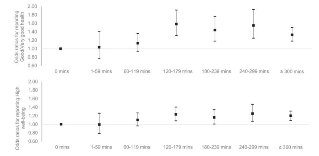
In addition, from a recent research paper, we learnt that there exists an optimal amount of outdoor time that could increase the participants’ wellbeing the most. Therefore, we would like to develop an app to help increase the outdoor time for participants to their optimal amount.
We analyzed a few existing solutions that target this behavior. Below are the eight representative apps we looked at that solve for increasing outdoor activity.
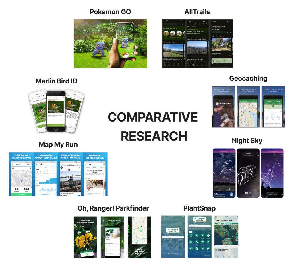

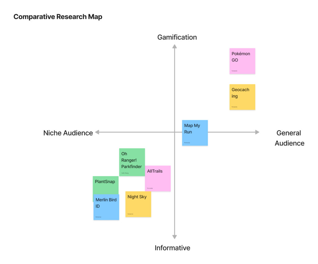
From mapping these solutions on a comparative matrix, we found an open market in the general audience, informative space, in which we hope to distinguish our product from others by reaching more people and designing around user’s existing routines to minimize activation energy. For a more detailed description of our comparative research and analysis, please refer to this blog post.
To summarize, our app has the following features that could potentially overcome the weakness of the existing apps.
- Use daily challenge to get user engaged with outdoor activities
- Use weekly recap to encourage developing habit
- Use sharing feature to attract potential users and increase the social media impact
- Allow users to adjust their notification frequency to fit their daily routine
Baseline Study and Synthesis
Our target users are full-time college students, who are often overwhelmed by their daily tasks and need a nudge to go outside and to embrace nature.
For our baseline study, we recruited 4 participants. Our target audience is adults with busy schedules who would like to spend more time outside. With college being a busy period during which we spend many hours indoors, we recruited college students to participate in this study. When screening participants, we made sure to only recruit participants who do not already spend time outside each day. Our goal is to get people outside more, and so those who go outside each day would have little to gain from an intervention. We also screened participants to ensure they want to ideally go outside at least a few days per week. Any less would mean we would not get enough information from them in a 5 day study. Lastly, we screened participants to ensure they enjoy time outside. Those who do not have less incentive to go outside, and so they are not our target audience.
We made an effort to recruit students from a wide age range and with different types of schedules. Our participants’ age range is 19-29. Some participants have jobs in addition to schoolwork, and others do not.
With this baseline study, we hoped to extract the following information: the gap between how often people would like to go outside and how often they actually do, how they spend their time outside, emotional changes from going outside, and which factors contribute to or impede going outside . We also hoped to gain insight as to how motivation to go outside affects total time spent outside.
We asked participants to log each time they went outside over the span of 5 days. We asked them to record the start and end times of each excursion, a description of what they did, and their emotions before and after going outside. At the end of each day, we sent participants a brief survey where we asked about their level of motivation to go outside and any factors that prevented them from or encouraged them to go outside.
After completing our baseline study, we synthesized our data into the following affinity and frequency maps. To read a more detailed description of these maps, please visit the section titled “Affinity Map and Frequency Map” in this blog post.

When synthesizing data from our baseline study, we found there were three factors that most strongly influenced our participants and how frequently they went outside: Time, Weather, and Social factors. Time and weather most strongly influenced motivation, and social factors impacted the intensity of the positive impact of going outside. We were able to come up with opportunities for intervention based on these areas, for example specifically timed nudges or weather based reminders to go outside (these two ideas did in fact make our intervention study plan). Social factors are the most difficult to capitalize on as creating a social aspect to a product is very difficult and brings in a large set of challenges.
Personas and Journey Maps
Our group is focusing on increasing recreational time spent outdoors. We were able to synthesize information from our 5-day baseline study to develop an intervention study. We selected two representative participants and summarized their Personas and Journey Maps in this blog post. For a detailed description of our Personas and Journey Maps, see the sections titled “Provision Personas + Journey Maps” and “Journey Maps” in the link above.
Solution Finding
Intervention Study
We liked the idea of gamifying going outside through a scavenger hunt, but we agreed that scavenger hunts require a large amount of effort from the user and can cause users to lose interest. And so, we shifted towards daily challenges. These challenges would give users a task to complete each day, and these tasks must be completed outside. Instead of rewarding users with a found item, users would feel intrinsically rewarded by having completed a challenge.
With an intrinsic reward established, we wanted to remind users of their achievements– through photos! Users will take photos of their completed challenges, and we will send them weekly recaps in the form of a photo collage. We came to this idea after considering apps like Spotify. At the end of each year, Spotify gives users a yearly recap of their most listened-to songs, known as Spotify Wrapped. We have noticed that users enjoy sharing these recaps on platforms like Instagram. While Spotify is not an inherently social app, the yearly recap has become a yearly social tradition on social media. Friends can share their favorite songs / artists and compare their music interests. Some users have even stated that they use Spotify instead of Apple Music so that they can receive this yearly recap. Considering the success of Spotify Wrapped, we decided to include a recap of our own. Our intervention study is only 5 days long, so we chose a weekly recap instead. Including this recap will allow for the social component that some users like Gregarious Greg want from outdoor experiences.
For our intervention study, we did a wizard of oz style interaction by messaging the participants every morning and once during the day/evening with a prompt to go outside. The morning prompt provided a photo based challenge for the participant to complete at some point during their day, with some examples including taking a picture of a bird, tree, or favorite building. The afternoon/evening prompt was a weather or event based message, telling participants to go view the sunset or that it is sunny outside and they should go outside for a few minutes.
We had a mix of participants, 4 who participated in our baseline study and one who was new for the intervention study. The previous participants were invited back due to their enthusiastic completion of the baseline study, and the new participant was chosen primarily to diversify our roster after passing the screening from our baseline study. Throughout the course of the intervention study we came to a few significant conclusions that we plan to utilize in our product development. We found that the smaller nudges were very effective in getting people to go outside more, even if just for a few minutes, and many participants noted that they enjoyed the reminders when they were related to weather and events like the sunset. Even when our participants were bogged down with work and other priorities they took the time when prompted to go outside. They also generally enjoyed the reward at the end of the week with the collage, with some even saying they wished they had done more during the study. Overall these insights will allow us to create a product that can effectively prompt users to go outside more frequently, bettering their health and wellbeing overall.

Design Architecture
We mapped our storyboard, system architecture, and bubble map according to two main questions: What are the most important facets of the app that users would need to frequently access, and how should they get there?
Story Mapping
We storyboarded a college undergraduate student who wants to spend more time outside to improve his overall health and wellbeing but is always preoccupied with work. From our storyboard, we found that being outside doesn’t necessarily boost mood or energy if there’s an absence of meaning to their time spent outside. This inspired the team to further explore the concept of intentionality and learn more about building purpose to get people to want to go and stay longer outside. Read this blog post for a more detailed description of our storyboard.
System Path
For our system path, we considered three types of users and how they may enter the app. First, we considered the new user. This user should go to settings first to enable location services and input their calendar so that they can get the most from their experience. We also considered a returning user. Their interaction with the app will begin with the daily challenge notification each morning. Lastly, we considered a user that has turned off their notifications. Instead of receiving an early morning notification, they will need to remember to open the app.
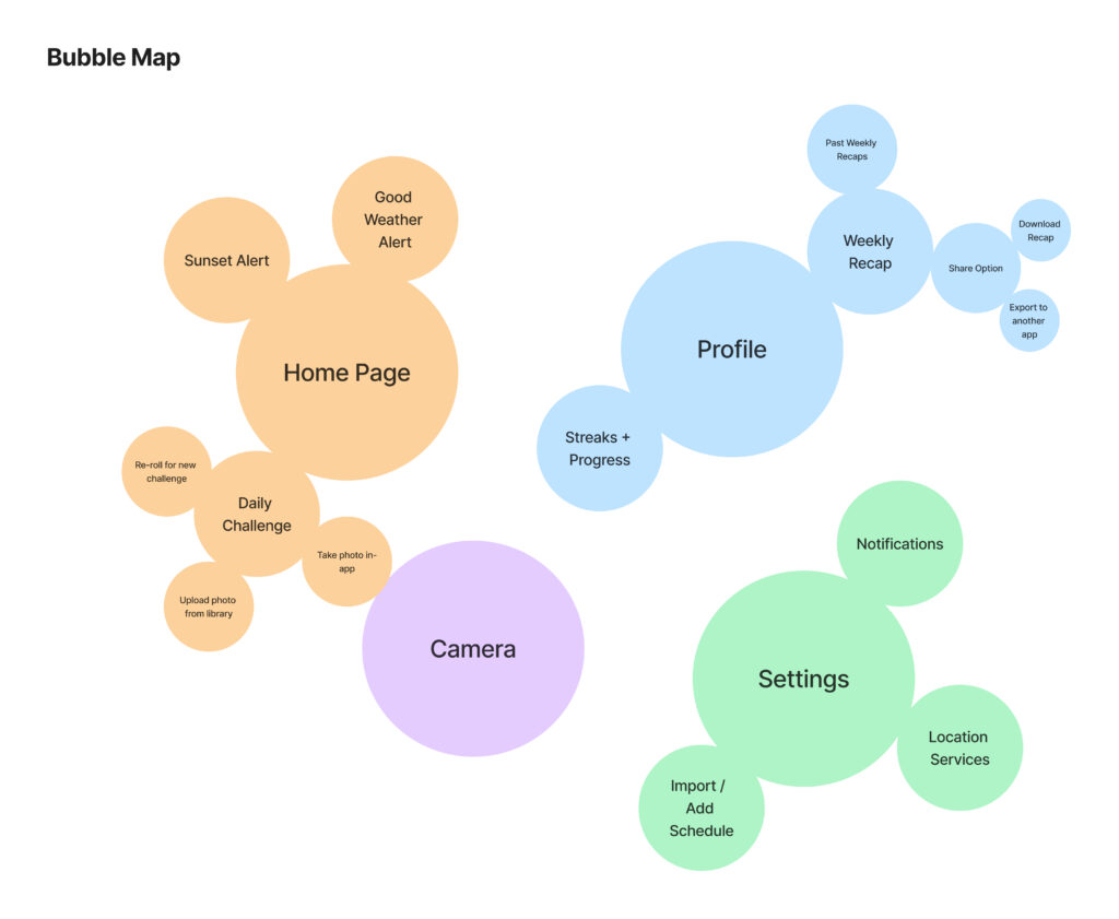
Bubble Map
For our bubble map, we mapped the most important features to the tab navigation system (home, profile, current challenge, settings), with the smaller bubbles contained within their respective components. This made connecting the components very simple, as all of the larger sections are accessible at any time via tab navigation, as opposed to having to navigate to a central screen to access the most commonly used components.
Assumption Mapping & Testing
Following ideation, we identified assumptions relevant to our solution and plotted them on to a 2×2 matrix. One axis measures the importance of the assumption. The other axis measured whether the assumption is known or unknown. We have this assumption map below:
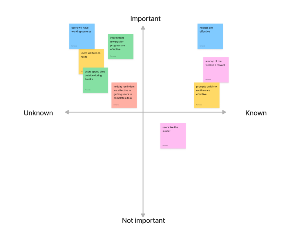
Below are the two assumptions that our team decided were most important:
- Intermittent rewards in the form of weekly recap collages are effective at getting users to continue desired behavior for long periods of time.
- Midday reminders are effective at getting people to complete daily challenges.
To read more about how we chose our assumption tests, click here.
To test our first assumption, we gave participants daily challenges to complete over four days and then compiled their photo submissions into a weekly recap collage. We then asked participants to fill out a survey asking about their experience and motivation.
To test our second assumption, we texted participants to go outside at varying frequencies each day to determine the most optimal frequency. The number of reminders increased each day, starting with one per day and ending with one per 2 hours. We then had participants fill out a survey asking about the effectiveness of each.
Assumption 1 Key Insights:
- Motivation to continue desired behavior increased after receiving weekly recap
- Reinforcement of progress makes users feel sense of accomplishment
- Receiving recap when failing to complete challenges elicits negative feelings
- Users don’t want to be reminded of when they fail
To address these insights, we decided to keep the weekly recaps but adjust how often they would be revealed. Rather than revealing it at the end of the week, in which users with a busy week would only see a few photos, we decided to reveal the recap each time a user completes five challenges. This accommodates for the busy or off weeks a user could experience and ensures that a complete recap will always be received.
Assumption 2 Key Insights:
- Users went outside more frequently and for longer when receiving 2-3 reminders a day
- Users forgot to go outside with only 1 reminder a day but found 3+ reminders to be annoying. It also pressured users to shorten their time outside.
To address these insights, we decided to set the default notification frequency to 3 times a day, the most optimal frequency. Users can then adjust their frequency in the settings if necessary.
For a more detailed description of our assumption testing results and synthesis, click here.
Future Assumption Testing
In future assumption testing, we would test the type and difficulty of the challenges. In our tests, the challenges were fairly open-ended so users had the freedom to really take photos of whatever they wanted, but it would have been valuable to test the effectiveness of different challenges depending on how open or specific or how difficult they were. This would help us determine what prompts keep users the most engaged and excited to go outside.
Remaining Assumptions
An assumption that we’re still making is that users will enable their notifications. Our app relies on the user having their notifications turned on so that we can remind them to complete their daily challenge and alert them of opportune times to go outside such as when the sun is setting.
Building a Solution
This section highlights how we went used our findings from our baseline study, intervention study, and assumption testing to develop a solution.
Wireflows and Sketchy Screens
Below we have our finalized wireflow:

Our wireflow includes paths for a new user and a returning user. New users are taken through our onboarding process, where they are introduced first to the Daily Challenge. We provide an explanation that the Daily Challenge requires taking a photo outside and that users can opt for a reroll to obtain new challenges. Then, we ask users to enable Location Services and Notifications, explaining why doing so is important for enhancing their experience. After completing Onboarding, new users are taken to the Home screen where they can see and complete their first Daily Challenge.
Returning users are taken to the Home screen. From the Home Screen, they can complete a Daily Challenge or reroll for a new one. We keep the Daily Challenge on the Home screen since it is what users will likely want to access the most frequently. Returning users may also want to see their progress or view their Weekly Recap, so they can go to the Profile screen to do so. Also, returning users may desire to modify their notification settings for various reasons. For instance, they may have been forgetful about completing Daily Challenges and might want to increase their notifications to remind them. Alternatively, they may feel bothered by frequent notifications and prefer to reduce their frequency. And so, our wireflow incorporates a route to the Settings screen where notification settings can be accessed.
These wireflows show the happy path that we envision for our user. We imagine a user enters our app with a preexisting motivation to go outside more frequently. By making the Daily Challenge the first thing they see in our app and by allowing users to personalize their experience, we hope that users can exit our app feeling satisfied with their progress towards achieving their outdoor engagement goals.
To access the earlier versions of our sketchy screens and gain a better understanding of the reasoning behind each screen, please see this blog post.
Branding
Based on findings from our intervention study, we want our app to evoke emotions of amusement, joy, and tranquility. We noticed that many apps from our Comparative Analysis, such as AllTrails, PlantSnap, Oh, Ranger! Parkfinder, and Geocaching, use green as their primary color. To set ourselves apart from these apps, we decided to pursue a different color scheme. Participants in our intervention study expressed that they found the challenges fun, and so we also chose to have a fun color– a pinkish orange– be our primary color. Lastly, we wanted our app experience to remain positive, so we made sure that we chose colors and fonts that reflected the positive experience we strive for. Some participants in our intervention study expressed feeling pressured to complete Daily Challenges, so we also decided to incorporate some blue, a calming color, into our design. Below you will find our style tile:
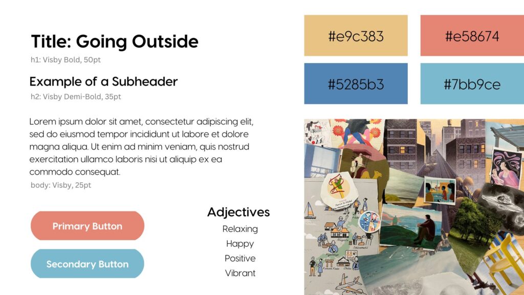
For more information on our style tile and mood board, please see this blog post.
Usability Testing
For usability testing, we asked users to complete the following five tasks:
- Completing a daily challenge
- Change their daily challenge if they wanted a new one
- Access their Weekly Recap collage
- Access a past Weekly Recap collage
- Change notification settings to be every 2 hours
The Biggest Issues
After testing our prototype on four users, we identified three severe issues that affected the functionality of our app. First, we found that once a user completed a daily challenge by uploading a photo, they were not redirected to the “Congratulations” screen that confirmed they completed the challenge. Instead, users were redirected to the Profile screen where they could see their Weekly Recap collage. Users expressed that this bug made them unsure if they had completed their challenge. To address this issue, we fixed the linking problems in our Figma prototype to assure users that they have completed a challenge, irrespective of whether they uploaded a photo or took one directly within the app.
Second, we found that some users were not sure how to access their Weekly Recap Collage. The Weekly Recap lives in the Profile screen, but some users went to the Home Screen to look for it. One user mentioned that he assumed the Profile screen would house personal information such as their email address or username. We use the Weekly Recap collage as an intermittent reward to encourage users to continue going outside over a long period of time. If they cannot find the Weekly Recap, they cannot receive this reward. To address this issue, we renamed the Profile screen, and it is now called the Progress screen. Additionally, we will include an indicator arrow that points to the Profile screen when a new user receives their first weekly recap. This change will inform users of where the Weekly Recap collage is so that they know where to access it in the future.
Third, we found that users were unsure what the Progress Bar on the Profile screen represented. This Progress bar was intended to keep track of how many daily challenges a user had completed for that week. Once a user has completed 5 challenges in a week, they can receive their Weekly Recap. One user asked us what would happen if they did not complete 5 challenges, and we explained that they would not receive a collage. This user expressed that he would feel disappointed at not receiving a recap if he had a particularly busy week. To address these concerns, we decided to change what our progress bar represents. Instead of monitoring the number of days per week a user finishes their challenges, we would keep track of the total number of challenges completed by the user since their previous weekly recap. Also, we added the phrase “4 challenges completed. 1 more to go!” underneath the progress bar. Lastly, we changed the name of the “Weekly Recap” to “Recap” since users may take longer than a week to complete 5 daily challenges. These changes will make clear what the progress bar represents and will allow users to receive Recaps even when they have especially busy weeks.
Moving Forward
Moving forward, we would like to make our app more customizable. We learned from our baseline study and intervention study that people have different goals when it comes to getting outside. Also, a few users mentioned during usability testing that their schedules are not consistent week to week, so their goals vary week to week as well. Ultimately, we want our app to help users achieve their goals. Therefore, we would like to add the following features and conduct usability testing with them:
- Include challenges that can be completed at night for those that would like to go outside at night.
- Allow users to adjust how many challenges must be completed before they receive a recap collage.
- Allow users to sync their calendars so that they can receive notifications during breaks.
- Allow users to adjust the types of challenges they receive based on accessibility needs.
Prototype
Our clickable prototype addresses the issues found in our usability tests and includes four main flows: onboarding, completing a challenge, viewing & sharing a recap, and adjusting settings.
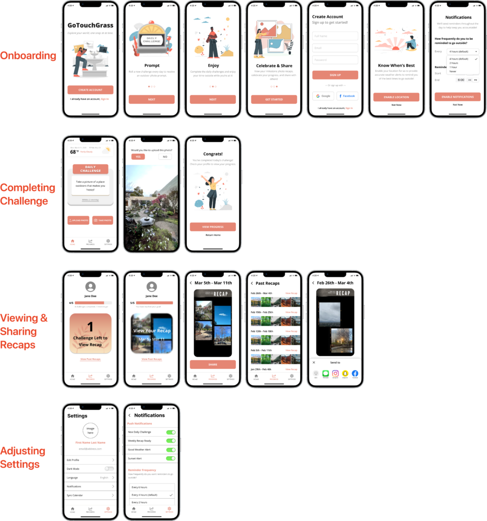
Onboarding
In the onboarding process, users are introduced to the app, create an account, enable location for weather alerts, and enable notifications for reminders. This sets the user up for a successful app experience while being as concise as possible.
Completing a Challenge
The home screen displays a daily photo challenge, which the user can complete by clicking Take Photo with the in-app camera or Upload Photo with the phone’s photo library. Users also have two chances to reroll their challenge if they want to, ensuring that they have the ability to receive a prompt that they’re excited to complete. Upon completing the challenge, the user reaches a congratulations page that directs them to their progress page.
Viewing & Sharing a Recap
The progress page displays the user’s challenge streak as well as a countdown for when their recap will be revealed. Once a user meets the five day goal, they can view their recap and share the collage with others via other social platforms. Users also have access to past recaps to be able to reflect on their progress.
Adjusting Settings
Users have the freedom to filter what notifications they’d like to receive. They can also customize the frequency of the reminders and choose when they’d like to receive notifications. We allow them to sync their Google or Apple calendar for convenience, and by default, we have the frequency set to the optimal amount from our research.
Ethics
Ethical Implications
We require getting access to the location of the user, and that might violate the privacy protection criteria.
Because we are storing and utilizing location data, we have to ensure that we are only using this data both in a de-identified manner, and only in the ways we explicitly get consent form the user for (in this case displaying the weather at their location while they are using the app) and nothing more. Even if we do not necessarily learn anything special from the information, the simple fact that we could surveil the user is enough to breach privacy and trust(Solve, Why Privacy Matters), which is why we must be explicit about when and for what purpose we collect information.
The nudge notification for daily challenges serves as the persuasive tool to get people involved with outdoor activities.
We utilize a nudge, specifically a congratulations for completing a challenge and a recap at the end of the time frame, to drive our users to create a habit of going outside. By rewarding them when completing a challenge instead of trying to directly convince them to go outside, we create an effective nudge to alter their behavior into a more healthy habit (Wilkinson, Nudging and Manipulation).
The weekly recap and challenge progress could encourage developing habits to go outside for users.
By employing tactics of soft resistance, UX professionals can design an app that not only meets users’ needs but also promotes healthy behavior and habits. Ultimately, this could lead to positive social and environmental impacts by reducing sedentary behavior and promoting a more active lifestyle.
Broader Impact of our Solution
Our app could encourage people to get outside and to embrace nature. After using our map, the users could have formed good habits and have increased their outdoor activity time. In addition, by allowing users to share their user experience in social media apps, we can increase the influence of our map, and could potentially generate positive impacts on more people. Our app is creating positive impacts on the world!
Conclusion
If we had more time to continue working, we would have liked to spend more time in our research and testing stages. Because we were limited in the participant pool, our app mostly just centers around university students’ efforts to increase recreational outdoor activity, but we would have liked to expand to a larger population to account for more user types. We also would have assumption tested for longer if given the time, as the assumptions we were testing were relevant to user retention over long periods of time. Another assumption test we would have added and investigated is the effectiveness and necessity of challenge rerolls in a user’s experience with our app.


