
Table of Contents
Baseline Study
To view our Baseline Study Synthesis in complete detail, follow this link to the original blog post.
Study Overview
Our baseline study aimed to assess our participants’ relationship with social media usage. Because recent generations have a reputation and tendency to overindulge in online media consumption, our app and solution initiative was to examine how we could assist our users to participate in a sustainable relationship with social media and their responsibilities, whether it was job-related items, chores, or other desired tasks.
Our key research questions to answer were:
- Does social media usage inherently lead to a negative experience?
- How do people in their early careers interact with social media?
- Is social media usage intrusive enough for our initial planned demographic that it necessitates intervention?
Study Methodology
Our diary study followed the schedule below:
| Day 1 | – Conduct pre-study interviews with our participants – Brief our selected participants on the infrastructure of our study and provide more context |
| Day 2-5 | Each morning: – Collect survey responses from participants regarding what tasks they would realistically like to accomplish over that day Throughout the day, every two hours: – Send a ping with a Google Forms surveySurvey examines whether or not the participant had used social media in the two hour window (between each ping) – If they did, we additionally examine the duration of usage, their reason for usage, and their consequent feelings/reactions towards the usage We gather both qualitative data (nuances of emotions and mood changes) and quantitative data (frequency of usage). |
| Day 6 | – Conduct a post-study debrief with the participant – Summarize and ask additional questions for context as necessary |
We recruited young adults in their early career stage to assess social media overconsumption in younger demographics. Our criteria targeted participants in their 20s with white-collar jobs, including some currently unemployed individuals with relevant past experience. We selected participants with various self-identified relationships with social media (both “good” and “bad”). The recruitment process included an initial assessment, a screener questionnaire, and an in-depth pre-study interview to gather background information and study requirements.
Link to additional details on the original blog post here.
Link to our Screener and Baseline Study Materials here.
Link to out Pre-Study Interview Script here.
Raw Data -> Grounded Theory
Through analysis of our participant data using affinity mapping and thematic coding, we identified three key grounded theories about social media usage patterns:
Grounded Theory 1: Habit-Driven Usage Over Meaningful Engagement
Social media usage is primarily driven by habit and convenience rather than meaningful engagement. Users typically engage during transitional moments as a time-filler, evidenced by short, reflexive usage bursts during waiting periods or between tasks. Platform-specific behaviors reveal users often check notifications (particularly on LinkedIn) without meaningful interaction, suggesting compulsive rather than intentional engagement patterns.
Grounded Theory 2: Social Benefits vs. Productivity Costs
Users experience tension between social media’s connection benefits and its productivity disruption. While social media alleviates loneliness, users simultaneously feel guilty about its use, creating a complex relationship where connection tools double as procrastination mechanisms. Work activities create natural boundaries for social media use, with users avoiding it during focused work but turning to it when unmotivated, indicating it functions as a psychological escape valve.
Grounded Theory 3: Motivation-Outcome Disconnect
A disconnect exists between users’ motivations for social media use and their emotional outcomes. The frequent “neutral throughout” responses suggest social media often fails to deliver promised entertainment or connection, with users remaining bored despite seeking stimulation. Active offline engagement reduces perceived need for social media, suggesting it primarily serves as a substitute for real-world interaction when such opportunities are limited.RetryClaude can make mistakes. Please double-check responses.
Link to our Full Grounded Theory Materials here.
System Models
To view the ALL of the following models in full resolution, follow this FigJam link.
Our system models, based on our findings from our baseline study, challenged many of our initial assumptions. We had initially assumed that users felt negatively when using social media, and that usage was a form of procrastination or unintentional doomscrolling. However, we found that social media usage and its associated feelings were more nuanced, based on the context of the situation.

Our Affinity Grouping Map connected underlying themes between our participant’s experiences in the study. Done in class, this helped us visualize the strongest insights from our baseline study, from how users felt about their relationship to social media, to what motivates them. Our most notable insight was that users needed an intentional and structured approach to using social media to avoid excessive overuse.

From our Frequency Map, which analyzed usage over the course of a day, we found that social media usage at work didn’t hold the same negative connotations as using it at home. Due to the structure of the workday, there was an inherent limit on how much participants could use social media, which prevented excessive usage. Additionally, when social media usage was balanced with productive tasks at work, less negative emotions were observed. We found that participants who were able to complete productive tasks felt less personal guilt and shame when using social media, but negative feelings from social media itself—like seeing upsetting political news—remained unaffected by gratification from doing work.
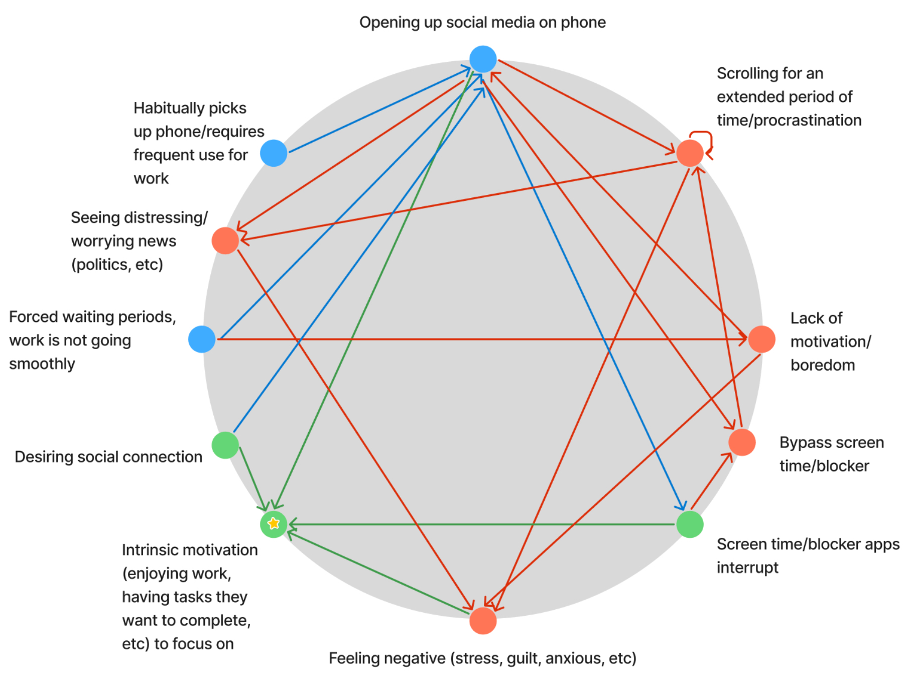
From our Connection Circle, we further observed that social media usage was not an inherently negative or detrimental action. Most negative feelings were associated with opening social media itself, the result of a participant actively choosing to do an activity they knew wasn’t productive and consequent guilt/shame/anxiety over procrastination.

Our Fishbone Diagram examined the various factors that fuel negative feelings from social media use, which further confirmed our findings that an addictive relationship with social media creates guilt and tension with other areas of the participant’s life. In that sense, we identified a need to manage social media usage, but not to entirely prevent our participants’ usage.
Ultimately, we found that a key factor of managing usage was having intrinsic motivation to participate in an alternate activity, such as spending time with friends, arts and crafts, etc. Because unintentional social media usage led to negative feelings, there should instead be a redirection of energy/interest to other tasks that don’t prompt the same feelings of guilt. However, because it was a habit to open social media, our participants needed a facilitator to help redirect their attention to other activities.
To view the ALL of the above models in full resolution, follow this FigJam link.
Secondary Research (Lit Review + Comparative Analysis)
Our literature review examined key studies on social media usage impacts in workplace and personal contexts. These findings, combined with our comparative analysis, revealed significant insights that informed our ideation phase.

Current Intervention Approaches and Market Trends
Existing interventions include cognitive reconstruction, mindfulness practices, and screen time limits. However, these approaches often rely heavily on self-discipline, demonstrate only short-term effectiveness, and fail to address fundamental platform design issues encouraging addictive behavior.
Market analysis revealed several key trends that influenced our ideation:
- Personalized user experiences adapting to individual behaviors and goals
- Holistic approaches to digital wellness beyond simple app blocking
- Positive reinforcement through gamification (virtual rewards, achievement systems)
- Data-driven insights with visual analytics to help users understand usage patterns
- Cross-platform integration for seamless experience across environments
Social Media Impact on Mental Health and Productivity
Social media usage correlates with negative mental health outcomes (stress, anxiety, depression), with one study finding 77.6% of employees showed severe addiction. Low self-esteem functions as both a risk factor and consequence of excessive use. In workplaces, social media creates conflict between work demands and technology use, reducing productivity. Usage types vary in impact: cognitive use (information-seeking) typically benefits work, while hedonic use (entertainment) offers short-term benefits but potential long-term harm.
The Double-Edged Nature of Social Media
Despite benefits (connection, collaboration, information sharing), social media increases social comparison and materialism (b=0.59 correlation), particularly on image-sharing platforms. Women appear more vulnerable to related mental health issues.
Critical Questions for Further Exploration
Several questions remained unanswered and guided our ideation phase:
- Does social media cause mental health issues or do pre-existing conditions lead to increased usage?
- What are the long-term effects of excessive social media use?
- How can platforms be redesigned to minimize addictive features?
- Which interventions provide long-term effectiveness across different populations?
- Do different platforms contribute varying levels of addiction and mental health impacts?
- What role should employers play in supporting digital wellness?
Link to the Literature Review here.
Link to the Comparative Analysis here.
Proto-personas
We developed our personas by synthesizing key patterns from our user interviews, focusing on qualities directly linked to the behaviors we’re designing for. From our individually-made personas, two primary personas emerged:
Persona 1: The Self-Critic
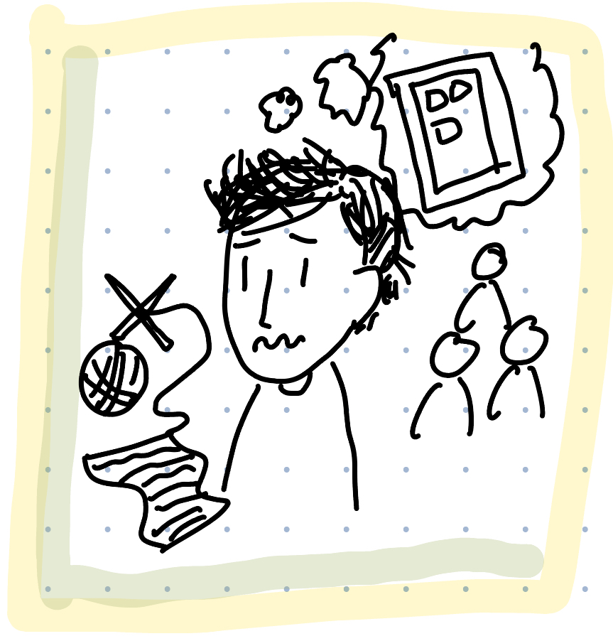
This early-career professional wants to use downtime productively instead of engaging in what they perceive as mindless social media usage. They’re motivated by a desire for rewarding and accomplishing activities but default to social media during free time. This creates internal conflict as they feel guilty about not doing something more “productive.”
Their attempts to solve this problem include adding friction to media usage (screen time limiters) with little effect, and redirecting attention to rewarding hobbies like knitting or reading. While these alternatives were more effective at reducing screen time, they require mental energy that isn’t always available when exhausted.
This persona typically engages with social media at home, during work hours, or while waiting in lines. They use platforms to maintain distant relationships but tend to overconsume content for hours without breaks. Their high mental load makes it difficult to initiate alternative activities, as deciding on and beginning new projects requires considerable effort that social media doesn’t demand.
Persona 2: Social Media Reflex

This early-career professional wants to meaningfully engage with downtime instead of reflexive social media usage. Their goal is focusing on work tasks or self-identified productive activities like spending time with loved ones. They’re motivated by building deeper relationships but struggle with mindful device usage.
Their social media browsing has become so automatic that they often open their phone, launch social media apps, and forget their original task. Attempts to use blockers like Apple Screen Time proved ineffective and demoralizing. This behavior occurs across environments – in-office work, remote work, and during waiting periods.
This persona’s challenge isn’t primarily about wanting to be on social media, but rather the reflexive habit of opening apps without intention. The problem becomes significant when they’re immediately captured by infinite scroll systems that provide instant gratification, making what started as an accidental opening turn into extended usage.
Journey Maps
Our first journey map examines the ‘self-critic’ experience, where users feel a lot of personal responsibility and internal guilt over using social media. The key focus of this persona is that they choose to use social media as a form of entertainment or passing the time, which often leads to overuse, procrastination, and guilt. The journey map identifies moments in which the user has the choice to do an alternate activity, but lacks the intrinsic motivation and mental energy to deviate from their comfortable activity, in this case social media usage.

Our second journey map identifies the ‘social media reflex’ experience, where the user lacks intention and purpose when using social media, which results in feelings of guilt and wasted time. The key difference between this persona and the self-critic is that the social media reflex doesn’t mean to open apps. It is a habitual, reflexive activity and response to stressors, boredom, and as a reward, leading to a lot of accidental consumption. This user may not benefit as much from growing intrinsic motivation, but rather facilitating interruptions and adding friction to break the reflexive opening of social media. This persona may already have interest and motivation in doing alternate activities, but becomes sidelined and distracted from doing so due to their unintentional and habitual media usage.

Intervention Study
To view our Intervention Study Synthesis in complete detail, follow this link to the original blog post.
Assumption Mapping
Link to the original assumption mapping post here.
Our assumption map revealed nuances in the ways people perceive their social media use and how they might want to adjust their usage habits. We observed various assumptions about target demographic, desired app interactions, preferred behaviors (that would replace social media use), motivations, technical logistics, and competitors. As we discussed, some assumptions were refined into more detailed ones that either added them to the important and unknown quadrant or created a more concrete basis on which to test.

In comparison to other assumptions, we realized there were two key areas of questioning that were important to our solution:
- What kind of reward feedback do users want (to reinforce their desired change)? To what degree?
- How many customization and disruptive measure (against distracting social media use) features would users want for them to be effective?
Without these questions answered, our solution would struggle to distinguish itself from existing solutions and/or find its own niche. Answering these questions would help us understand what approach we wanted to take and what we wanted to convey to users.
The three assumptions that we chose to test were:
- Users want to experience a sense of achievement as they work on reducing their social media use.
- Having high user customization ability regarding limitations/disruptive measures would be helpful
- Our users would rather be doing something else productive than being on social media
Assumption Tests
Selected Participants & Focus
- Participants were selected based on self-reported struggles with doom scrolling and excessive screen time.
- Focus is to explore rewards that are motivation based, productivity concerns, and personalized interventions.
Test 1: Achievement and Reward-Based Motivation
- Hypothesis: Users feel motivated to reduce social media use if they experience achievement.
- Method: Tested different achievement/reward systems and observed user preferences.
- Findings:
- Negative reinforcement was more effective than positive rewards.
- Users responded well to reminders of alternative habits combined with rewards.
- Positive reinforcement may require tangible incentives to be equally effective.

Test 2: Productivity and Social Media Use
- Hypothesis: Users would rather be productive than spend time on social media.
- Method: Participants ranked statements on their social media habits, guilt, and productivity loss.
- Findings:
- Corporate workers use social media for social engagement.
- Freelancers see social media as a major distraction.
- Startup employees use it for both networking and distraction.
Different work settings require tailored interventions to replace social media with relevant alternatives.
Test 3: Customizable Disruptive Measures
- Hypothesis: Users engage more with screen time interventions if they can customize them.
- Method: Participants tested different intervention options, including time limits, grayscale filters, accountability features, and self-created customizations.
- Findings:
- Users preferred customizable options over forced limits.
- Gentle reminders and custom messages were more accepted than aggressive interventions.
- Social accountability features were effective but only when optional.

Key Takeaways:
- Users prefer engaging and meaningful rewards.
- Negative reinforcement is surprisingly effective.
- Different work environments require different solutions.
- Customization is key. Users want to control how they manage their screen time rather than having strict, forced interventions.
Future solutions should balance motivation and deterrence while giving users more control over their own habits. A mix of gentle reminders, meaningful rewards, and optional restrictions may be the most effective way to help people reduce their social media use in the long run.
Storyboarding: Top 3 Ideas for an Intervention
We developed three potential interventions based on our research and personas. Each addresses different aspects of problematic social media usage patterns.
Idea 1: Micro-Game Intervention
Description: To replace reflexive/unintentional social media use, this intervention substitutes phone interaction with small, short games. These games shift user attention to break the social media craving, allowing users to refocus on intended tasks.


Pros:
- Games replace endless scrolling without drastically changing behavior, lowering adoption resistance
- Timed/intentionally short games present brief but achievable goals
- Offers follow-up activities after games to redirect attention
- Increases friction after multiple games (suggesting physical activities), enabling gradual behavior change
Cons:
- Games themselves could become addictive (would need randomization, daily limits)
- Replacement might be too similar to original behavior, reducing effectiveness
- Some games/activities may have varying effectiveness for different users
Idea 2: Mindful Usage Prompts
Description: This intervention encourages intentional social media usage through user-set time limits and mid-session reflection prompts that ask if the current usage aligns with the user’s goal.

Pros:
- Encourages mindful usage through user-defined time limits
- Promotes self-reflection with mid-session prompts
- Gives users control over their experience and time allocation
- Facilitates gradual behavior change rather than abrupt blocking
- Improves focus by preventing mindless scrolling
Cons:
- Users might habitually dismiss prompts, reducing effectiveness
- Frequent prompts could become annoying rather than helpful
- Relies on user willpower, which may not work for those needing stricter limits
- Without external motivation, some users may ignore the feature
- Addresses symptoms rather than root causes of digital distraction
Idea 3: Good Habit Jar
Description: The Good Habit Jar is a social media intervention where users record notes and images about how they feel when doing alternative activities. When they open social media, it displays a collage of these memories to remind them how good they felt and encourage them to do something else instead.

Pros:
- Personal Relevance: Uses the user’s own experiences and emotions, making it more meaningful than generic advice
- Positive Reinforcement: Emphasizes positive alternatives rather than negative messaging or guilt
- Visual + Emotional Impact: Combines images with emotional notes for powerful memory triggers
- Timing: Intervenes at the critical moment when users are about to engage with social media
Cons:
- Effort Barrier: Requires users to actively document experiences, which could lead to low participation
- Habituation Risk: Users might start ignoring the collage after seeing it multiple times
After evaluating our three interventions against our personas and research findings, we selected the Good Habit Jar as our final concept because it addresses both emotional and behavioral aspects of social media usage while providing positive reinforcement rather than restriction.
Intervention Study
To see the full details of the intervention study, view the Intervention Study portion of our synthesis here.
Research Question: Investigate if daily ‘good habit memories’ presented at peak social media times would decrease usage, shift timing/duration, or encourage offline activities.
Methodology:
- Participants: 4 young adults (18-35)
- Duration: 1 week
- Intervention: Automated pings every 2 hours during peak usage times
- Content: Daily changing collage of ‘good habit memories’ and a short survey
- Survey questions: Recent social media use, emotional impact, alternative activities
Key Findings:
1. Intervention Effectiveness:
- Minimal impact on social media usage for most participants
- Self-awareness increased through tracking alone
- Form-filling process often felt disconnected from actual usage context
2. Usage Patterns:
- Average session: 5-20 minutes
- 67% used social media for downtime/procrastination
- Weekend patterns differed from weekdays (different apps, more intentional leisure use)
3. Emotional Impact:
- Mixed responses: neutral, entertaining, anxiety-inducing, guilt-inducing
- Anxiety often stemmed from social comparison
- Guilt associated with distraction from tasks or in-person interactions
4. Alternative Activities:
- Physical activities (e.g., gym, running, walking) reported as energizing and stress-relieving
- Social activities (e.g., eating with coworkers, visiting partners) provided positive alternatives
- Personal hobbies (e.g., gaming, baking, shopping) often competed successfully with social media use
5. Individual Differences:
- Existing goals (e.g., marathon training) significantly influenced choices
- Some viewed certain social media use (educational content, Strava) as positive/productive
- New interests (e.g., gaming) sometimes led to decreased social media usage
Key Insights:
- Self-awareness impact: Tracking alone increased consciousness of habits
- Self-comparison anxiety: Distinct concern separate from general overuse
- Activity threshold: Low-effort activities competed more effectively with social media
- Social vs. solo activities: Both proved effective alternatives
- Existing routines: Alternative activities fitting established routines were more likely to be chosen
- Intrinsic motivation: Personal interests and goals proved more powerful than the intervention itself
Intervention Limitations:
- Cognitive disconnection: Form-filling created a separate task, disrupting natural behavior flow
- Reflection timing: Post-usage reflection limited preventative potential
- Intervention burden: Survey requirements may have created additional unwanted cognitive load
Proposed Redesign:
1. Contextual Integration:
- Implement lightweight nudges linked directly to social media usage attempts
- Create solutions that respond when users actually open social media apps
2. Personalization:
- Align interventions with users’ existing goals and interests
- Differentiate between types of social media usage (productive vs. unintentional)
- Account for varying usage patterns between weekdays and weekends
3. Reduced Friction:
- Replace multiple survey questions with a single in-app pop-up for quick reflection
- Focus on in-the-moment interventions rather than retrospective reporting
4. Emotional Framing:
- Address specific negative emotions like guilt or anxiety from social comparison
- Highlight positive aspects of alternative activities rather than emphasizing guilt reduction
- Build on the positive experience of reminiscing reported by some participants
5. Environmental Triggers:
- Design interventions for specific high-usage times (e.g., after work)
- Create specific alternatives for different contexts (work breaks vs. leisure time)
- Consider time-based interventions (e.g., before bed, as mentioned by one participant)
This redesigned approach aims to create a more seamless, personalized, and context-aware intervention that addresses the limitations identified in the initial study while building on its key insights.
System Paths
To view the full system path diagram, please follow this FigJam link.
Our “happy path” through our solution can be seen through Eileen, our persona who would engage with our intervention to disrupt their frequent, unintentional social media use. This helped to form the core path through our system: the user encounters a popup that intervenes with their attempt at social media use, and if they are using it without intention, then they are presented with past habit memories and are offered some alternative activities to do.

Rob and Gökçenaz represent different interests in using the solution. Rob, who is interested in reminiscing on past memories, may want to view additional memories and add new ones. Gökçenaz, who is more disciplined about their social media use, might want to see memories/activity options to proactively counteract any tempting use.


Our interested new user is Mary, whom we focused our onboarding process on. This helped shape our process for inputting new habit memories, which we divided into manual inputs and pre-filled suggestions. This was important in our design as we wanted to lower user friction when it came to adding more entries. Our goal is to make it easy for early users to use the app, and build continual engagement over time.

From making our system diagram, we recognized four key use cases:
- The new user
- The existing/intervention engaged user
- The reflective user
- The proactive user
We combined the last two cases into our power user, thus resulting in three types of users. We also recognized where users would be inclined to exit out of our system (prematurely or otherwise), and made those cases explicit. These key findings ultimately shaped the three wireflows that we mapped and helped us focus on the key screens that needed to be designed.
To view the full system path diagram, please follow this FigJam link.
Story Map
Our story map highlights the key aspects in our app that are necessary for the user to engage with our app in a meaningful way. To see the full story map (which includes a timeline and beta features), follow this FigJam link.

The first challenge is getting our user to commit to using our app, as we have a longer onboarding process that involves selecting/listing good habits and selecting which apps they want to track. Because of this, we designed our first MVP feature – onboarding – to encourage users to fill in the necessary information for using our app, and then confirming their account creation at the end.
Compare this to creating an account and then doing the onboarding process after logging in; the user could decide that doing that mental labor isn’t worth their time and every step is another opportunity for them to quit. We offer a login step after the onboarding process is already completed in order to:
- Encourage them to commit to account creation as they already filled out all the necessary information, and
- Make beginning app usage as seamless and effortless as possible, since there wouldn’t be additional labor to do after account creation.
The second key feature was actively logging and pursuing their good habits. We realized from story boarding that we wanted our app to be an encouraging and safe environment, not punitive, so we focused on integrating positive reinforcement tactics rather than guilt-tripping or constantly nagging our user.

Users can actively track and mindfully/intentionally pursue good habits rather than just being poked and prodded for too much screentime usage. The idea is that at the same time as reducing bad habits (in this case, overuse of social media), we foster and facilitate good habits as well.
Our third key feature was nudging the user when accessing a social media or otherwise restricted app past the predetermined allotted screen time. Story mapping helped us realize we didn’t want to turn into a punitive system, but nudging is still a critical part of the process in deterring users from acting on impulse or reflexive social media usage.

We imagined a screen time limit notification nudge and examined why it wouldn’t/hasn’t worked for our past study participants (namely, they could easily hit ignore and weren’t motivated to listen). We ultimately landed on providing a visual reward to help foster a sense of investment. This is how we created our ‘cookie jar visual’ idea, similar to how people who are becoming sober may keep a jar of marbles and add a marble each day. The idea is to provide a visual sense of their accomplishments–showing them that other alternatives are possible, that they’ve already done them and are capable, and encouraging them to keep going. By providing a visual reward, and reminding them of their predetermined alternate activities, we can doubly motivate them through a visual reward and redirecting their attention/need for mental stimulation towards a ‘healthy’ habit.
MVP Features
1. Onboarding
Users need to tailor their experience to stay engaged. Without this step, engagement would drop, and interventions wouldn’t be as effective.
- Select good habits to track
- Choose social media apps to monitor
- Set screen time limits
- Customize interventions (nudges, reminders)
- Confirm account creation
2. Tracking Good Habits
Users need reinforcement to reduce social media usage, not just restriction. Seeing their progress makes them more likely to stick with behavior changes.
- Log a new habit entry
- View habit jar progress
- Access past habit logs & reflections
- Receive habit suggestions
3. Social Media Nudges / Visual Element
Traditional screen time alerts are easy to ignore—interactive nudges and visual rewards make interventions more engaging and effective.
- Trigger pop-up when opening a tracked social media app
- Display a reminder of selected good habits
- Offer alternative activity suggestions
- Visual reinforcement (habit jar growth)
- Customizable nudge messaging
These three features are the foundation of the app. Without them, users wouldn’t be able to set their goals, track progress, or get the right nudges to stay on track. Onboarding ensures users personalize their experience, making them more likely to stay engaged. Tracking Good Habits gives them a way to see their progress, which keeps them motivated. Social Media Nudges help break mindless scrolling by reminding users of their goals at the right moments. For V2, we can add extra features like habit streaks, social sharing, or smarter habit suggestions, but these core MVP features are essential for making the app useful from day one.
Bubble Map
To view the bubble map in more detail, follow this link.

This bubble mapping process clarified the Good Habit Jar’s dual approach:
- Positive reinforcement through memories, streaks, and activities
- Intentional intervention via prompts, nudges, and app limits
The structure highlights how behavioral change requires both motivation and friction, ensuring users are supported while also being encouraging them to pause and reflect before engaging in impulsive behaviors. A key insight from this process is that customization and balance are crucial. Users need flexibility in how they track progress and receive interventions to create meaningful behavior change.
While making the bubble map, we considered how users need options in how they track progress and receive interventions to ensure the approach aligns with their individual preferences. While some may respond better to gentle nudges, others might benefit more from stricter app limits. Given these diverse needs, our solution must provide adaptable tracking and intervention methods, allowing users to tailor their experience in a way that best supports their habit-building journey.
Interaction Design
Wireflows + Sketchy Screens
To view all the wireflows in full resolution, follow this FigJam link here.
To view the details of the original post, follow this link.
From the three types of users we identified in our system path, we developed three wireflows:
- New User: creating an account, onboarding, and initial interaction
- Existing User: experiencing the intervention process
- Power User: adding habit logs, viewing previous logs and data, editing settings
Each of these use cases helped us identify the key screens and system flows that we needed to prioritize.
New User
For the new user wireflow, there were two key areas: login and onboarding, and recovering the account login/password.


Combined with insights from our user story, we decided to focus on the login and onboarding portion of the wireflow as this was most critical to the adoption of our solution. Each step is designed to ease users into the app’s functionality. By providing clear guidance and immediate value through personalized suggestions, the onboarding flow ensures that new users quickly grasp how to benefit from the system. The design of the corresponding screens were informed by persona insights that highlight that a smooth and informative experience will likely increase user engagement and long-term retention.


Two key elements are shown in these screens:
- The tap-to-select functionality (screen 2a) intended to reduce friction when a user is onboarding the app, with the option to input custom options (screen 2b)
- The permissions request (screen 3) followed by app selections sorted by most used app in each category (screen 4)
Key feedback included:
- Standarding button size for a more organized interface
- Arrows for scrolling through additional options
- Placing fine print of agreement above the next button for more clarity
Unfortunately, we did not have enough time to make revised sketchy screens with this feedback. However, this feedback has been incorporated directly into our prototype! The reflected changes are in the corresponding screens.
Existing User
The goal in mapping our intervention in a wireflow diagram was to capture the sense of friction that we want to introduce during their decision-making process. We aim to prompt users to pause, reflect, and choose healthier and more mindful social media engagement.


The accompanying screens illustrate the following:
- A short questionnaire checking user intentionality when using social media, deterring them from using it unintentionally by presenting past alternative activities
- Viewing suggested alternative activities and their details
- Offering the option to log the chosen activity to track their habit progress


The main points of feedback were:
- Being aware of terminology – changing the repeated use of “Recommended” for the alternative activities page to be more distinct to the user.
- Changing the “previous activities” to direct the user to “your memories” instead, following the core element of users having logged memories of other activities
Below are the revised screens in response to feedback:

Power User
This flow arose from two of our personas, who enjoyed reflecting on past activities/might look to the app to proactively intervene with their social media use. The full wireflow includes 3 areas:
- Adding habit memories/logs
- Viewing past memories and data
- Core user settings
Taking from our user story map, we focused on the first point as part of our MVP, as it is crucial for providing the information we use in the user’s nudges. The latter two points were developed into screens as well, and those are included in the Additional Screens section below. We chose not to iterate on them since they would not be developed fully in our MVP.
The green wireflow traverses what it would look like to add additional habit memories.

Below are the screens for this flow:


The main points of feedback were:
- Removing the request to add another memory after submitting the current entry, as the process is not overly complex and users can be redirected to the home screen, which has a prominent button for new entries. A temporary popup to confirm the entry can still be kept.
- Adding submit buttons at the bottom of the entry screens.
Below are the revised screens:

Additional Flows + Screens
To reiterate from the section above: We chose not to iterate on these screens since they would not be developed fully in our MVP. However, it was informative to explore what these screens might look like to help us understand the larger vision of the app.
The blue wireflow shows different ways about how users might look at data on their past habit memories.

This was an exploration of how the data can be viewed, and teammates discussed the possibility of consolidating the flows. The below screens explored what a combined flow might look like:


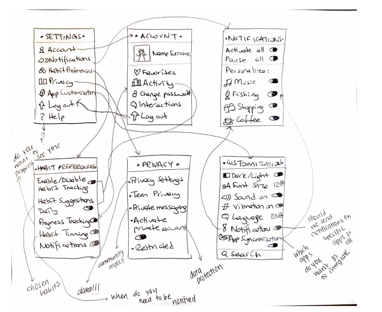
The pink flow is for the core user setting interactions that we anticipate for users, and we note additional ones that might be of relevance.

The below screens walk though the different user settings elements in the flow and explore others, including:
- Account Details
- Notifications
- Habit Preferences
- Privacy
- Customization
Moodboard + Style Tile
Our moodboard aimed to have:
- A chic and trendy aesthetic
- But ALSO be fun, relatable, and engaging for our target audience
We chose a balance of artistic/trendy visuals and quirky little creatures to try to capture that. We chose pictures of positive things such as nature, food, and art to convey a calming, encouraging, and sincere feeling in our app. We feel that our moodboard shows our brand because it feels artsy and visually appealing, but also a little imperfect in an intentional and relatable way.

When choosing our style tile colors, we leaned into the colors present on our moodboard. The light, grounding earth tones serve as the base tone, while the green and blue shades provide some energy and calmness. The bright yellow-orange is meant to pop and grab the user’s attention.
Visually, we wanted to have an organized style without sacrificing the fun, playful tone that we wanted to convey. To do that, we had initial ideas for a cat-like mascot to make our brand unique, along with on-theme fishbone buttons. This idea later evolved into our final “catbear” mascot present in our prototype. Their purpose is to differentiate ourselves from other apps and make a sense of connection with the user.
To go with the playful tone, we chose an appropriately quirky font for our titles and other larger system text. For readability, we chose a more clean font for smaller text and descriptions.

Prototype + Usability Testing
We created our clickable prototype using FigJam, following the color palette mockups and utilizing custom UX components to facilitate the desired feeling of our app.
We incorporated three main action flows into our prototype:
- Login/onboarding
- Adding new habits to track
- Receiving a nudge when using social media
We chose these flows because they incorporate the key features necessary to use our app. Our login/onboarding process depends on heavy personalization in order to identify the most relevant topics/activities to incorporate into their nudges. Users can tap to select various activities sorted into categories, which is meant to reduce friction in the onboarding process. The user can also manually input custom activities if their desired one isn’t available for selection.
Once the user finishes onboarding, the user may add or remove any habits they want to receive in nudges through the ‘adding new habits to track’ flow. By tracking the good habit, they will receive nudges and be able to see how many times they’ve engaged in the activity through the home page. This flow is another key feature because we wanted our app to deviate from purely punitive strategies and since redirection of attention was a critical component of creating intrinsic motivation for our participants in both the baseline and intervention study.
Outside of the app, users receive a nudge when they use social media. This is meant to interrupt the user’s actions and add friction to using apps which they selected to track. In the home page, users can view their progress in tracked habits through the cookie jar visual. The cookie jar displays custom icons for each instance of when the user participated in an alternate activity, which provides visual feedback as the user engages in the nudges. We chose this flow as another key action as users are able to build motivation/feel gratified about their progress by adding rewards to the jar, which is a critical part of user retention and emotional investment.
View a walkthrough of our clickable prototype below:
We discovered critical insights about our design through usability testing. To view the full details, view the report blog post here.
The main theme amongst our top issues was being too overwhelming due to the clutter of visual components in the app not working cohesively. The most severe issue was with the intervention screen experience. Users found the screens to be confusing, one participant mentioning that “so much is going on” when encountering the nudge. On top of clutter, our screens did not have enough visual hierarchy to indicate where the user’s attention should go, creating confusion and decreasing the app’s usability. In response to this, we wanted to simplify our visual design, reorganize the layout to present visual hierarchy, and standardize button sizing. While we did not have enough time to change many screens, below is one example of changes made to improve part of the intervention screen experience:

Another theme that our issues revealed was that our onboarding process was too confusing due to the overwhelming amount of options provided. We initially hoped to reduce friction by providing tap-to-select instead of manual input, though that was still an available option. However, our feedback indicated that our design was actually more difficult in other ways, as the organizational process of categories and items wasn’t relevant to the users, or some options being preselected had been confusing. However, as changes would necessitate additional testing before implementation, we decided to not include some of the issues in our revisions given the constraints of the quarter.
Final Prototype
View our final prototype here.
Please refer to the video in the Prototype + Usability Testing section above for a guided walkthrough of each task. For reference, the tasks are:
- Go through the login/onboarding process:
- Sign up!
- Select a few hobbies you want to do
- Allow the app notifications and tracking of other apps
- Select a few apps of concern that you want to track
- Enter a new habit log:
- Pick from the suggested, pre-filled options or input your own
- Add a date, tags about your log, and media (currently only placeholders!)
- Submit!
- Encounter a nudge (in this situation, you are someone who uses Instagram reflexively)
- Swipe up from the bottom to go the phone home screen
- Go to Instagram
- Reflect on your intentions to use Instagram, and reflect on your previous activities!
- Look over your suggested activity and details
- Track your activity and see it added to your Good Habit Jar!


