Before this class, the only design class I had taken was CS 147. I knew that class didn’t cover everything, but I thought it gave a comprehensive template for how the design process should be followed. However, after taking CS 247B, I realize now how much more open-ended and flexible the design process can be. I appreciated how Christina showed us a lot of different options for methods we can do to aid in the process but emphasized that ultimately these are just options, and we can just use the tools that work.
As for the class itself, one thing I lament is how quickly we moved with how much work we had to do. I can understand the trade off of learning more information versus having more time to absorb it, but it prevents me from personally engaging as deeply as I wanted and allowing certain more confusing concepts the time to stick. I think part of this fault lies in the quarter system, but this class being a torrent of so much knowledge and different activities we had to do made it feel especially fast. Still, I found this class to be a valuable follow-up to CS 147 and my own design experiences outside of class.
One pleasant surprise about our project was our team being able to execute things well, even if there were some hiccups, like some disagreements about how we should do something, or three people catching covid at the same time. The distinction is that our disagreements ended up being fairly constructive learning experiences for me, plus being given feedback that there is a time and a place for extending a discussion on a point of contention, versus sometimes we need to table discussion and just go with the flow, was also useful for me. Because I’ve had enough negative group project experiences in the past, it was nice to know what it feels like to be in a functioning and responsible team, even if it wasn’t always totally perfect (and I take ownership for some of that but my teammates were always understanding).
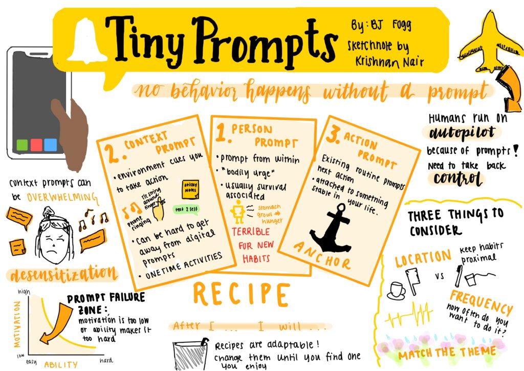
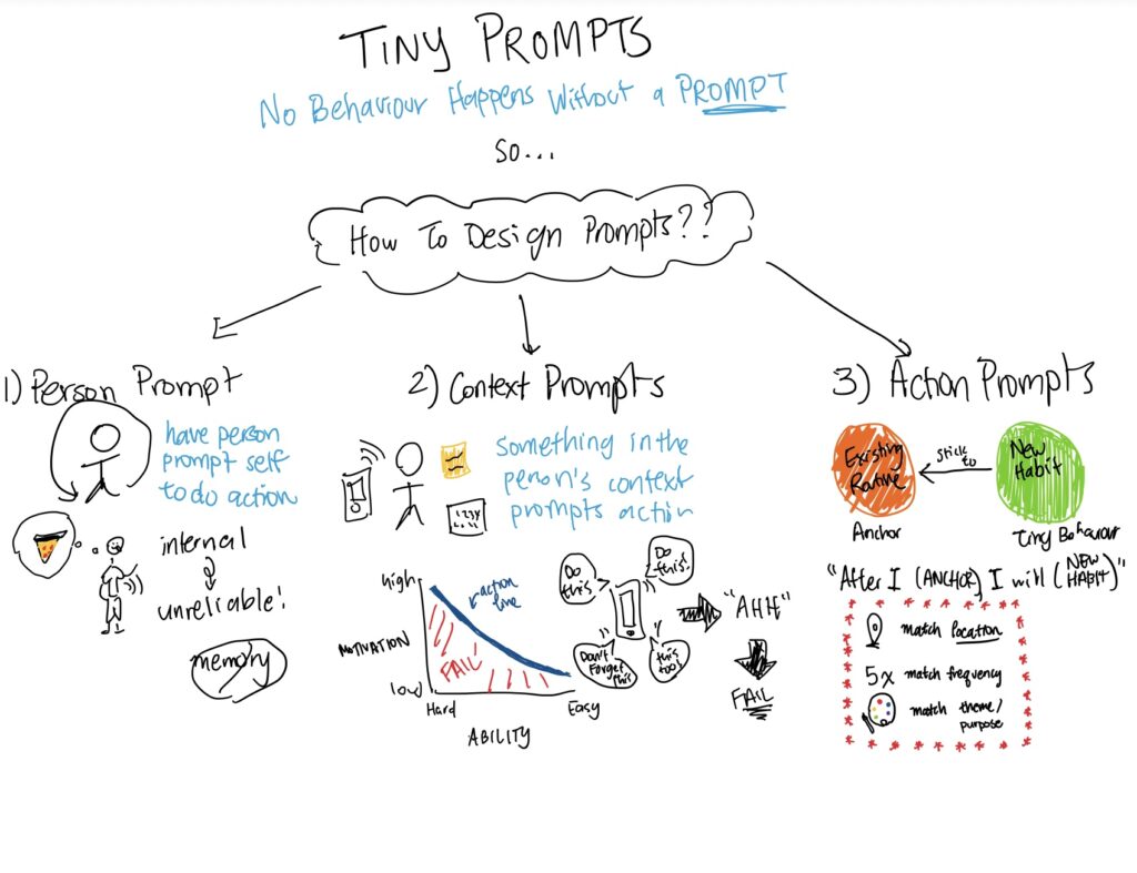
A challenge in our project was trying to nudge people without doing so in a stressful way. Because forming a habit around mindful movements is ultimately about improving wellness at their own pace, we wanted to be gentle in our approach, which meant there were certain things we decided to rule out, like putting too much social pressure on the user or punishing them for missing a movement. Reminders might seem like a basic nudge, but because our main premise was smart reminders, it’s meant to be a tool that makes the habit-forming process easier, instead of punishing. Plus our research showed the problem with most of our users wasn’t that they were reluctant or too lazy to do a movement, but that more often, they would simply forget to, or felt like they didn’t have the time to move more. That’s why our project’s focus was simply on making it easier to add time for mindful movement in people’s schedules. The most punishing feature we included in our app is tracking people’s movement history using streaks, which might help encourage people to keep the streak going, but the only consequence of breaking your streak is that it resets to zero, which is not that world-ending. Again, we of course want the user to move more, but the point is for them to get what they need out of our app, not pressure them too much into having to move more.
We gave the user more liberty to choose the movements and decide what mindfulness means for them, but if we could improve something, then maybe we would find a way to give more movement suggestions and mindfulness guidance. For the timeframe we had in our project, we decided to be more open in part because we were considering accessibility. Acknowledging different levels of ability as well as different bodies is part of why we chose our logo to be more abstract and decided not to have any explicit imagery or suggestion of what a body should look like or be able to do, like in any of our icons (we almost used a depiction of a person standing as our icon for the “Start a movement” button on the home screen but then changed it to our logo).
On the home screen, there is also a Settings icon that leads to a screen with buttons for accessibility options and the ability to delete the user’s data. Our prototype doesn’t actually let users do these but it did show that we designed space for them. In terms of user data privacy, we decided to keep data collection at a minimum. That’s why our onboarding process only asks for the minimum amount of information needed to be useful for the user. Because it’s not a social app, there was no point in asking for things like a profile picture or email. We’d rather people think of Momentum as more like a focused and friendlier version of a tool like their phone’s alarm app, than something that feels more like a service like Headspace.
One take-away from this class is that I learned to be a little less rigid, in terms of both how I thought the design thinking process should work, as well as with my role and presentation of opinions in a team.
In the future, I want to reflect on all the ways our group managed to do well and be able to apply that to any future conflicts I might encounter in a different team.


