
Wireframes
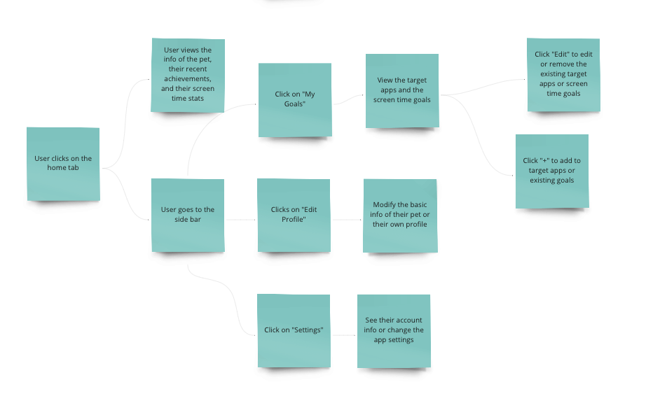
Home Screen
Community Screen 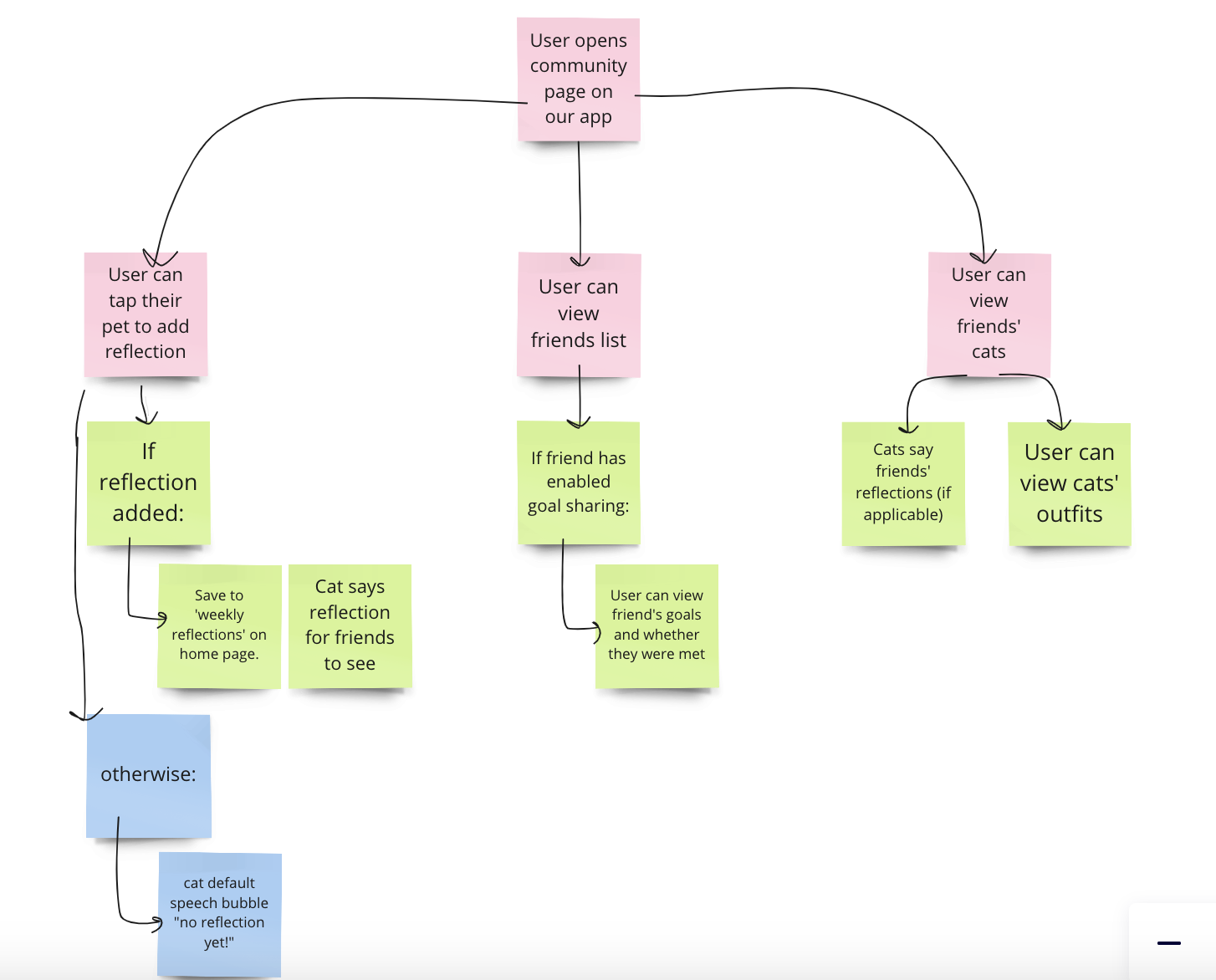
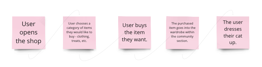
Shop Screen
Screen Paw in Action 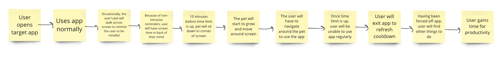
Sketchy Screens
Home Screen
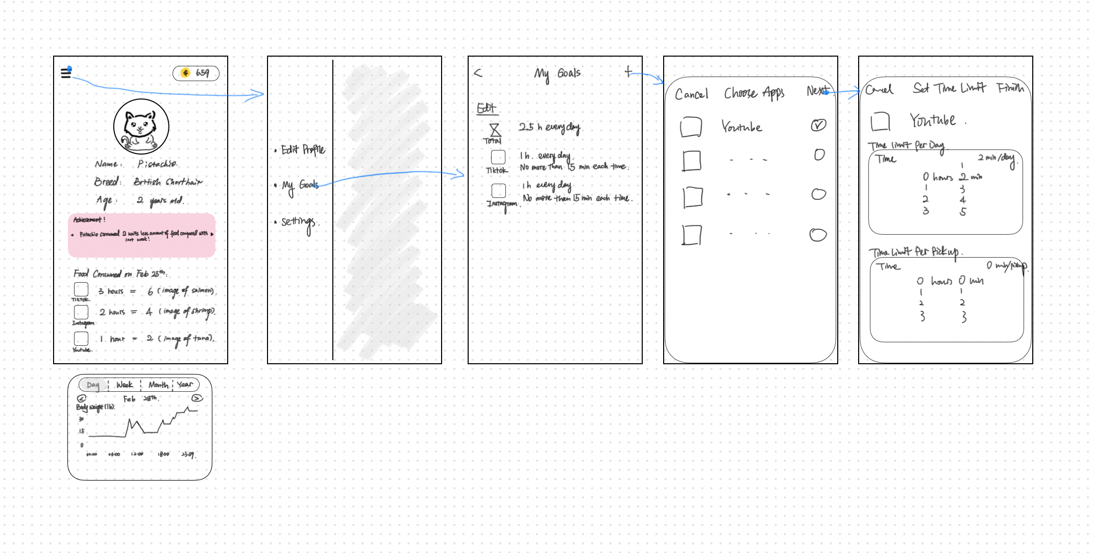
Critique & Suggestions for the next iteration: I like the cat being on the main screen. You can visually see the pet you are taking care of by being mindful of your screen time. I am curious about the graph underneath the homepage. Does this appear as you scroll down? This information would be nice to appear immediately when you open the app so you can quickly see how well you have been doing. I am curious how you could incorporate this data over time while highlighting the current day usage of the user.
Community Screen
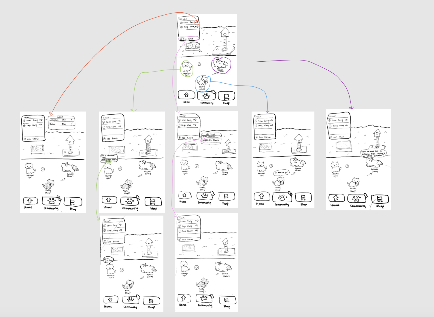
Critique & Suggestions for the next iteration: Update buttons to make it more clear when pressed in or not pressed in. Have “Click me” or some feature that shows that cats are clickable. Placement of the friends tab could be more natural instead of just a box. Since we are trying to minimize time on the phone, everything on the app screen should be immediately understandable. Minor detail but include a header at top of page.
Shop Screen
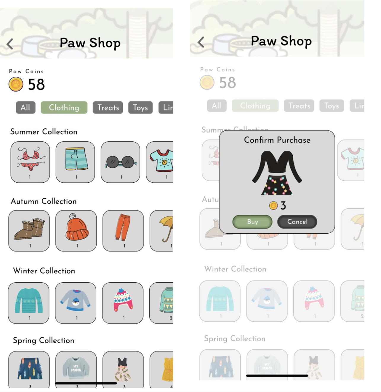
Critique & Suggestions for the next iteration: Having less items with more variation in pricing could be another option that we consider to keep the incentivization but avoid gamifying our solution too much. It’s possible that people get sucked into customizing their pet and spend too much time on our app, which would be counter productive to our goal! But I really like the idea of grouping the items by theme. It would also be good to have the navigation bar visible from all screens/pages on the app.
Screen Paw in Action
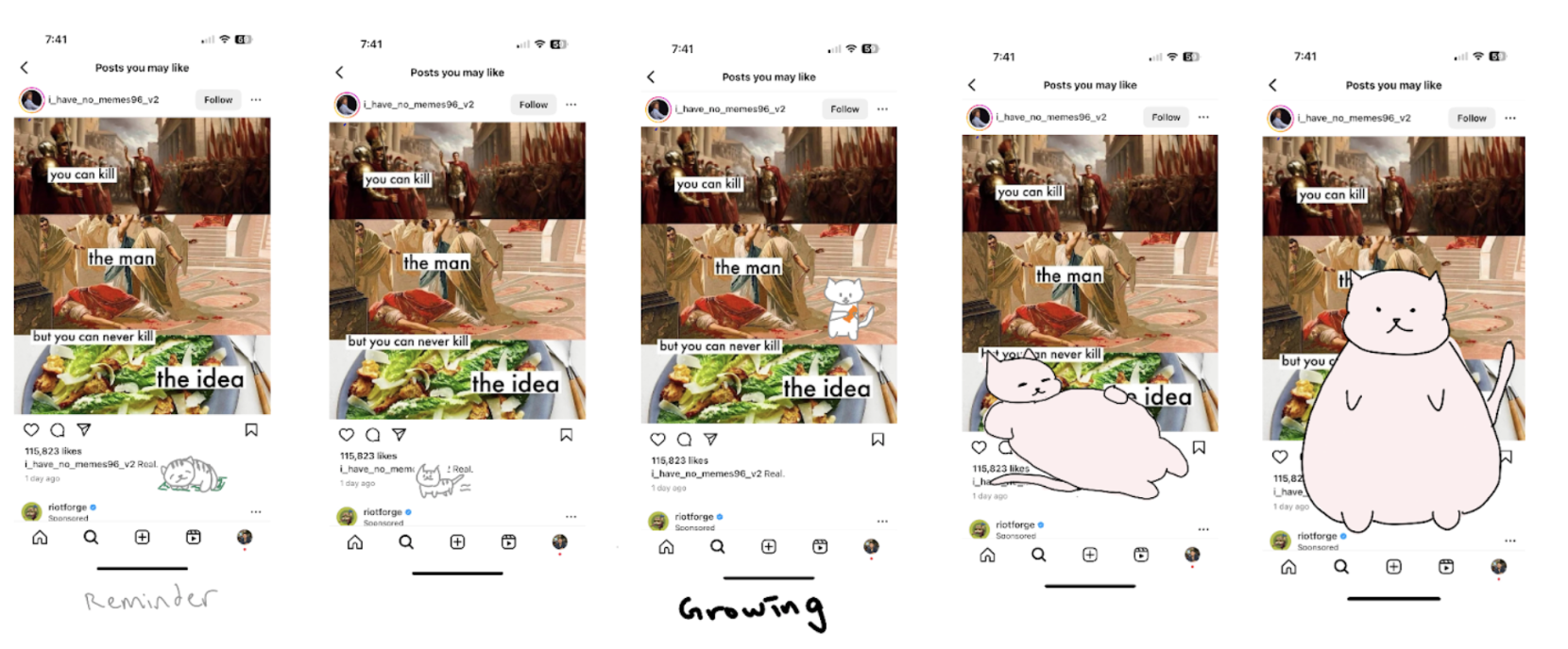
Critique & Suggestions for the next iteration: A few minutes before the user reaches the screen time limit, have the cat remind the user how much time they can still spend on the app (maybe in the format of a countdown to add some pressure). This is because it is often the case that once the user starts watching a video or calling a friend, they would want to finish the activity before exiting the app. So knowing the remaining time helps the user plan ahead on what to do and what not. Otherwise, the design is visually appealing and clear.


Comments
Comments are closed.