
Introduction
1.1 Project Details
Project Name: Screen Paws
Date: Mar 17, 2024
Team Members & Roles: All team members participated in each phase of the project. The following roles only suggest the parts of final deliverables where one might be more involved:
Sophie Jin: M.S. CS ‘24, Prototype Design
Brent Johnson: M.S. Learning, Design and Technology ‘24, Ethics Project
Collin Jung: M.S. CS ‘25, Assumption Test & Final Writeup
Xinyi Wang: M.S. CS ‘24, Assumption Test & Final Writeup
1.2 Project Summary
As one of the primary sources of information, communication, and entertainment, mobile phone use is in excess. Young adults spend more time on cell phones for social media, playing games, and other entertainments, to the point that phone usage affects many other aspects of their lives, as well as their mental and physical wellbeing. Screen Paw encourages users to cultivate better phone usage habits by helping them achieve their self-set screen time goals with the companionship and supervision of their e-cats. With our time-up screen-blocker, reflection and progress rewards, and community support, individuals who want to alleviate phone addiction or reduce doom-scrolling can start cultivating better relationships with their phones!
Problem Space
2.1 Literature Review
From our literature review, we looked into several different papers related to our topic, including the effects of pop-up notifications (Karina L., Karin T., Dmitri R., 2020), possible intervention tactics (Olson, J.A., Sandra, D.A., Chmoulevitch, D. et al., 2023), sentiment analysis of current screen-time apps on the market (Rahmillah F, Tariq A, King M, Oviedo-Trespalacios O, 2023), and correlations between screen-time and mental health (Zhu, X., Griffiths, H., Xiao, Z. et al., 2023). After consolidating our sources, we reflected on some key findings that guided us later during our comparative analysis and subsequent prototyping and journey-mapping. One was that social accountability seems to play a role when it comes to reducing screen-time (Rahmillah F, Tariq A, King M, Oviedo-Trespalacios O, 2023). That is, being aware of others’ perceptions of your screen-time can influence how accountable you feel when it comes to reducing it. Another finding was that, especially post-COVID, increases in screen-time tend to be related to higher levels of dependency and mental health concerns, especially in youth and adolescents (Trott M, Driscoll R, Irlado E, Pardhan S., 2022). In addition, when it comes to methods of reducing negative screen-time behaviors, gamification and social accountability seem to have higher rates of success than other methods (Rahmillah F, Tariq A, King M, Oviedo-Trespalacios O, 2023).
2.2 Comparator Analysis
Based on our literature review, we conducted a comparative analysis of current apps on the market that aim to reduce mobile screen-time usage. In particular, we looked at Forest, SPACE, Session, Buzzkill, ScreenTime (built into iOS settings), Flipd, ScreenZen, and Opal. We tried to diversify the range of apps in relation to the methods that they use to reduce user screen time. These methods included app blockers, notification blockers, gamification, social accountability, Pomodoro timers, and customizable notifications.
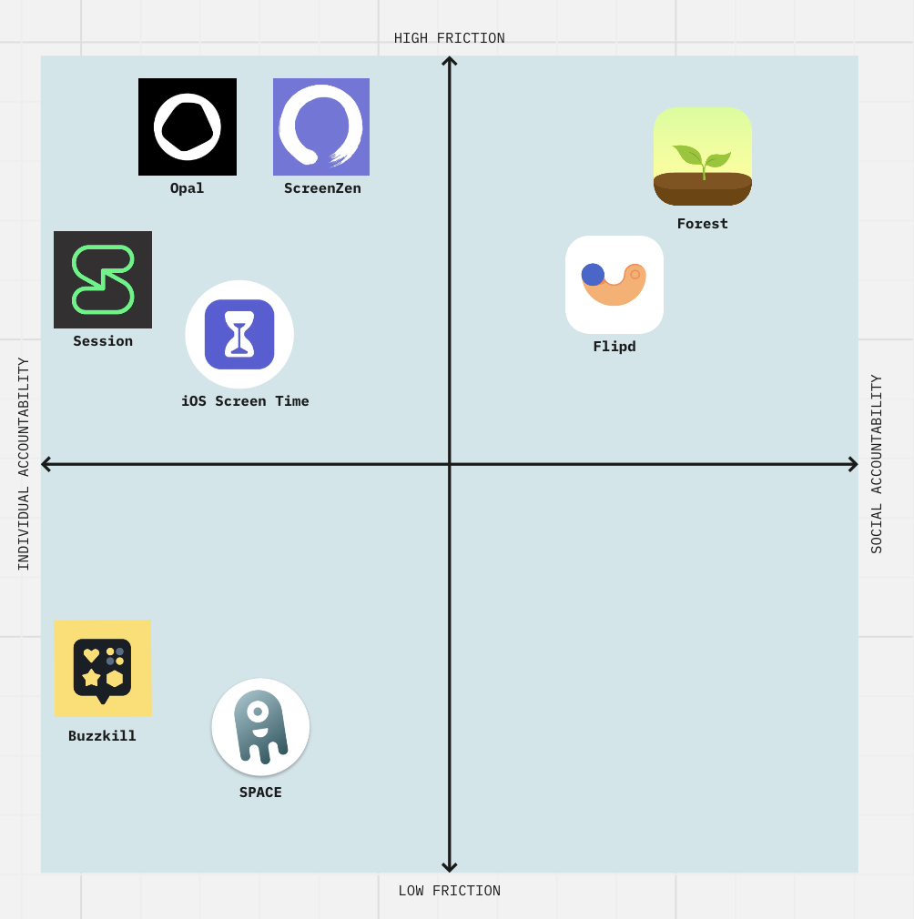
We found that across all apps, there were differing amounts of friction when it came to how easy or hard it was to bypass the app’s restrictions and go back to using your phone freely. There were also differences in the kind of accountability that the different apps offered. That is, some apps focused more heavily on social accountability by allowing you to see your friends’ screen-time or compete with other users, whereas other apps were more focused on individual accountability by allowing you to customize your own screen-time preferences and stick to them. Based on this analysis, we mapped our competitors with individual vs social accountability on the x-axis and low vs high friction on the y-axis.
From our competitor analysis, we found that the more effective apps (based on the app store reviews) tended to have higher friction. Individual vs social accountability tends to be more of a preference depending on a particular user, but in general it seems as if social accountability tends to help with retention and engagement. Forest, for example, which combines high friction with social accountability, has 25 million downloads and over 2 million satisfied paying users in 2021 (Kharbanda R., 2021). Given these findings, we want our solution to be higher-friction and build in some aspect of social accountability, although the extent to which we implemented these features was also influenced by the results of our intervention study.
Baseline Study
3.1 Target Audience and Baseline Study
In our baseline study, we looked into people’s existing phone usage patterns and their attitudes toward different types of phone usage. With our target population being young adults who feel over-reliant on their phone as a daily source of screen time and are unsatisfied thereof, we used a screener that asked people’s main source of daily screen time, how they feel about their daily phone usage, and whether they have tried to reduce their phone usage in the past to recruit people who fall into our target group. From the 17 people who filled out the screener, we selected 8 participants who have a daily phone screen time of over an hour, feel unsatisfied and want to reduce their screen time to enter into our diary study. We conducted a pre-study interview with each of the 8 participants, asking about their current phone usage and how they feel about it, their previous efforts to change their screen habits, their most used apps and the circumstances under which they use these apps, as well as what positive (negative) screen usage means for them.
Then from Jan 22nd to Jan 26th, we ran a 5-day diary study to collect logistical and content data of the participants’ phone usage with the plan of associating quantitative and qualitative, objective and subjective perspectives. We asked the subjects to report their screen time analytics on their phone at the end of each day so we can see: (1) their daily screen time, (2) The distribution of this screen time across different apps, (3) the times at which they use their phone throughout the day. We also asked the subjects to write a short description of how they feel about their screen usage on that day. At the end of the 5 days, we conducted a post-study interview to hear participants’ reflection on their experience of being mindful of their screen time data, and dig in some data that stood out to us. Afterward, we compiled the data across our participants to extract: Average daily screen time, the most commonly used apps, the times at which participants tended to use their phones, and the circumstances under which people use their phones. Based on the data and insights collected from the baseline study, we created an affinity mapping and formed 5 key theories (bolded below) about phone usage habits.
3.2 Synthesis (Link to our writeup)
3.2.1 Grounded Theory
Based on the data and insights collected from the baseline study, we created an affinity mapping and formed 5 key theories about phone usage habits. Here we focus on the 2 theories that inform the design of our app the most:
Theory 1
Looking into the factors that are conducive to high screen time, we discovered a prominent one among which is the convenience and proximity of phones. Participants noted that the absence of their phones for extended periods rendered them less inclined to check, suggesting a correlation between physical distance and reduced screen time. Amar and Bob highlighted how engaging in social activities or being on the move diminished their reliance on their phones, whereas solitude often prompted increased usage. Moreover, the ease of accessing smartphones for brief interactions, as noted by multiple interviewees, facilitated habitual scrolling during idle moments. Another insight revealed a tendency for individuals to unintentionally spiral into prolonged phone usage once they initiated brief checks, as observed in the experiences of Sandy and Amar. Additionally, participants disclosed a preference for using their phones extensively in comfortable environments, such as bed or cozy seating areas, attributing this behavior to the ease of access compared to other devices like laptops. Mandy’s account underscored this notion, emphasizing the allure of smartphone usage in relaxed settings. Allison further exemplified this by describing extended morning phone use while still in bed. These findings elucidate the intricate interplay between environmental comfort, habitual behaviors, and smartphone usage patterns, contributing to our understanding of the factors influencing prolonged screen time.
Theory 2
Interestingly, when looking horizontally across the participants, we realized that different people have varied perceptions in terms of screen time or type of screen usage. Firstly, satisfaction with screen time is closely tied to the progress made in altering one’s usage habits compared to previous days, as evidenced by Mandy’s contentment with a reduced screen time despite still spending a considerable amount. Similarly, Sam expressed a sense of accomplishment on a day with significantly less screen time. Secondly, perceptions of screen time are highly subjective, as observed with Judy, who expressed concern about TikTok usage despite data indicating otherwise, suggesting certain apps may feel more draining, thus influencing perceived usage. Conversely, Sam’s extensive efforts to curb screen time contrasted with the lowest recorded usage among participants, underscoring the individualized nature of screen time perceptions. This made us more aware of the need for personalized interventions and a nuanced understanding of user experiences.
3.2.2 System Models
Based on our raw data and the grounded theory, we created 4 models, including 2 cluster maps, 1 matrix, and a 2×2, which you can find on this Jamboard. Here we focus on two of them:
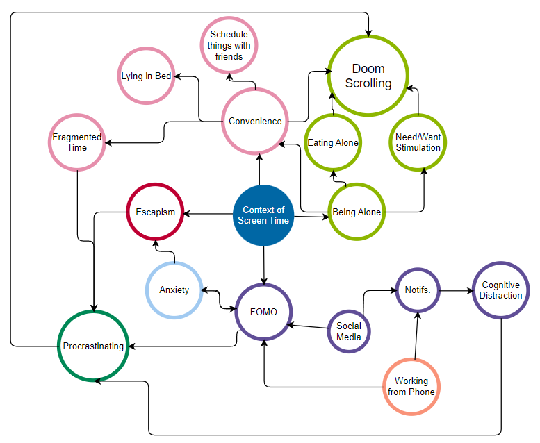
In this cluster map, we explored the contextual and psychological factors conducive to phone usage. These include:
- The fear of missing out (FOMO), which often happens when people either need to work from their phone or don’t want to miss their friends’ life updates on social media. This in turn contributes to notifications being a huge source of distraction.
- Escapism from something that they don’t want to face in real life, which is usually caused by an underlying anxiety or unease about that thing. This anxiety, for example, leads people to procrastinate on deadlines. And one major way that people procrastinate is through doom scrolling.
- Convenience. Phones are a close-at-hand device to access information, to connect with people, to find stimulations, and to kill time. They are also convenient in the sense that compared with offline activities that need venues and scheduling, phone usage has low friction and people can do it so easily anytime anywhere. And this leads to the last factor.
- When people are alone, there’s a higher chance for them to spend more time on their phone, first because of the convenience of phone usage, and second because of the instant gratification that people can acquire from phones, especially when they are bored and alone. This leads to reduced social time, which then reinforces the reliance on phones to alleviate boredom.
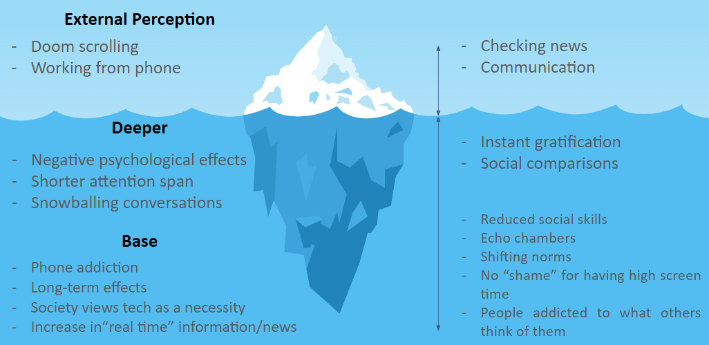
In this iceberg model, we categorized behaviors from the visible, everyday activities like checking news and communication, to deeper, less visible issues such as shorter attention spans and negative psychological effects, and finally to the impacts at the base level like reduced social skills and phone addiction. By evaluating these activities through the lenses of perceived positivity versus negativity, we can see how certain actions we immediately deem as “bad” or “good” are actually side-effects that stem from deeper issues. To us, positive high-investment activities include meaningful communication and self-improvement, while negative high-investment behaviors encompass doom scrolling and prolonged digital conversations, especially when a user has tasks needed to be completed. Here, we can see how the instant gratification and inevitable comparisons between users and their virtual friends can snowball into bad habits such as doom scrolling and escapism. With this model in mind, we wanted to cultivate habits of positive phone usage by starting from the activities that are positive and have a low time investment, and depending on the individual’s own goals, decide whether to include activities that are positive and have a high time investment.
3.2.3 Proto-personas & Journey Maps
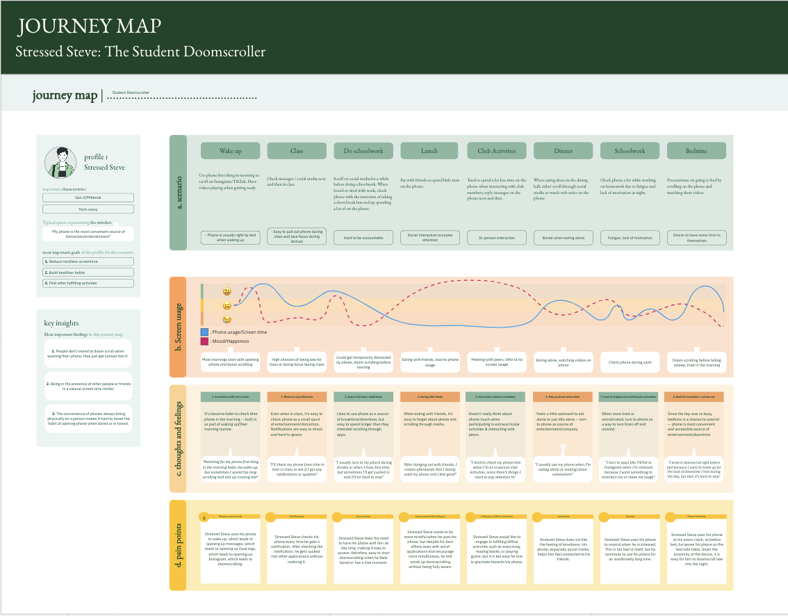
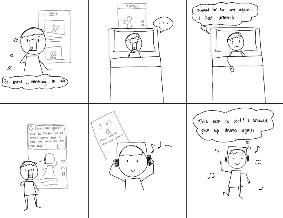
For our proto-personas, we consolidated each of the personas our group made based on the core issues that they faced. Our first persona, Stressed Steve, represents someone who has many priorities and tasks at hand, but finds himself stressed due to doom scrolling. Stressed Steve often picks up his phone while working intending to only take short breaks, but always ends up scrolling for hours on end before realizing how long he’s spent on his phone.
| Drawing | Name | Stressed Steve |
 | Activated Role | Student Doomscroller |
| Goal | Reduce mindless screen time | |
| Motivation | Focus more on the tasks that he has at hand rather than his phone | |
| Conflict | Hard to keep track of priorities when scrolling on phone | |
| Attempts to Solve | App time limits, remove apps from home screen (Can only be searched), delete social media, turn on grayscale | |
| Setting/ Environment | On college campus, in their dorm, in bed, in between classes | |
| Tools | Phone, laptop, friends and family to hold them accountable | |
| Skills | Tech-savvy, well-informed of latest online trends, social media king | |
| Routine & Habits | – Check their phone first thing after waking up – Check phone reflexively when they are bored, anxious or have free time – When starting to use phone, intend to only use for a short period of time – Uses phone while in bed before falling asleep |
Throughout the day, Stressed Steve is often using his phone in ways he did not intend. He will wake up in the morning with good intentions to check messages and continue his daily DuoLingo streak, but he will end up switching over to applications such as Instagram, then spend undesired amounts of time scrolling through content. When he is using his phone in such a way, it is correlated with a decrease in mood. His emotional self (the elephant) gets instant gratification from doom scrolling, but his rational self (the rider) feels bad that he is being unproductive. His rational self also feels that he could be doing better things with his time rather than scrolling through mindless content. He would not mind if he only spent a few minutes engaging with friends, but the application hooks him in, and he has trouble getting out until he has the increasing time pressure to get to class or engage in some other activity. In fact, Steve has a tendency to use his phone much less when he is busy. We ideated ideas that make Steve more mindful of the time he is spending in these applications.
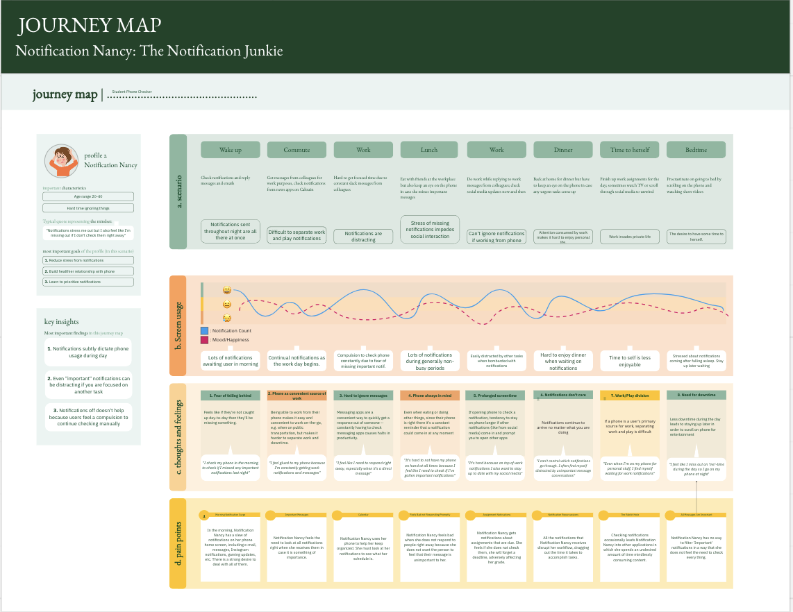
Our second persona, Notification Nancy, is usually able to resist the temptation of doom scrolling itself, but finds herself with a high screen time because she is constantly checking her notifications. As a young professional, Nancy devotes a lot of effort to her work and does not want to miss important messages. Although many of these notifications may be related to work or necessary updates, she will occasionally get lost in a random conversation that could have waited until her work was finished, due to the compelling aspect of notifications.
| Drawing | Name | Notification Nancy |
 | Activated Role | Phone user who can’t ignore notifications |
| Goal | Reduce distractions that stem from phone notifications | |
| Motivation | Gets distracted from tasks due to notifications, feels glued to phone throughout the day b/c constantly checking notifications | |
| Conflict | For people with more impatient personality types, it feels hard not to respond to notifications immediately. May also fear that the sender of the messages will feel their lack of immediate response is due to the sender not being important. | |
| Attempts to Solve | Do Not Disturb; notification blocks; app blockers. But usually too easy to undo / can see the notifications anyway, so doesn’t help much | |
| Setting/ Environment | Usually has phone on them, environments where notifications are easy to check | |
| Tools | iPhone, Screen Time, friends/family who can hold them accountable, notification blockers | |
| Skills | Mindfulness, quick to respond | |
| Routine & Habits | – Brings phone with them everywhere throughout the day – Does not turn phone on do not disturb mode – Checks phone every time gets a notification |
Notification Nancy is constantly bombarded by notifications from various applications that get in the way of her productivity, consequently, affecting her mood. She finds that getting hundreds of notifications daily makes it hard for her to stay focused. She gets off track by opening other applications and engaging with content that she feels she does not need to. Her work piles up, making her feel stressed and anxious. She feels the need to always check her notifications in case there is something important that she needs to deal with immediately. In the ideation phase, we used Nancy’s journey map to come up with solutions that help her feel at ease not checking notifications so often.
Click the following link for a clearer resolution of the journey maps.
Intervention Study
4.1 Ideation
Our ideation process took several turns before we reached our final solution. To start our ideation process, we first asked ourselves a series of questions related to the fundamental idea of what we wanted to solve. With our two proto-personas, Notification Nancy and Stressed Steve, we knew that we wanted to provide a solution related to screen time and phone use. However, we found ourselves with the issue of having too wide of a scope, which resulted in solutions that worked for one but not the other. For example, in order to help Notification Nancy manage the excessive notifications she receives that distracts her from work, we proposed a solution in which we filtered the notifications a user received, with notifications from games or social media being muted at certain times of the day. This solution, which is able to reduce the amount of external distractions for Nancy during her work hours, still meant that Stressed Steve, our chronic doom-scroller, received no benefit – simply because Steve was already on these apps and maybe even had notifications turned off. After repeatedly running into this issue, we realized that we needed to narrow our scope and design a solution that revolves around one of these audiences. Thus, we decided to focus on Stressed Steve and ideate/brainstorm around doom-scrollers.
During our brainstorming sessions, we started with a basic list of needs for our persona. To do this, we generated a series of “How Might We”s. However, when we looked back on our HMW’s, we realized that many of our ideas were limiting; the HMW’s had “built-in” solutions. Some examples of these limiting HMW’s are “HMW filter notifications for Nancy” or “HMW block apps for Steve”. With this in mind, as we continued our ideation process, we were also able to generate more open-ended ideas that led us to think about new solutions rather than limiting us to one.
4.2 Story Boarding
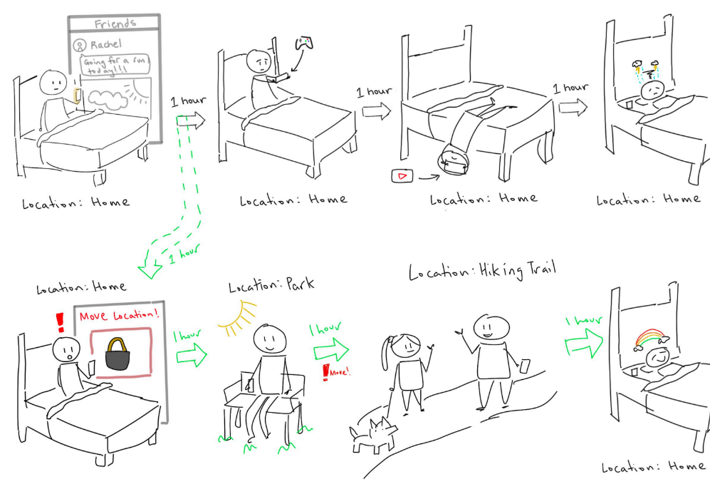
Notable early ideas we had involved physical distance from phones, taking advantage of social accountability, and implementing forced breaks during screen use. We came up with these initial ideas because of a common trend we noticed in our synthesis process where people will often use their phones during brief periods where they are either alone, in transit, or comfortable in bed, and end up being unable to stop using their phone until hours have already passed. Our ideas related to physical distance included extreme examples like freezing one’s phone in ice (In which case a user would have to wait until it melts before being able to access their phone) and more subtle ideas like placing your phone on a far corner of the room before going to bed (Because most of our interviewees mentioned being late to events due to scrolling first thing in the morning). Our ideas related to social accountability were more broad in the sense that we tried to find subtle ways to leverage a community to change behavior related to phone usage. This resulted in ideas revolving around gamification of screen time where users could see a leaderboard of screen usage shared with their friends, or ideas like screen time passwords being set by a friend so a user would have to ask their friend for the password. Similarly, our ideas for forced breaks during phone usage had to do with tracking a user’s current screen time and either locking the phone or removing specific apps temporarily, making it difficult to physically access.
The three key ideas that emerged from this brainstorming process were the following:
- A solution that alerts a user when they have been using their phone in the same location for some number of hour(s) and locks the user’s phone until they move to a new location. The motivation behind this idea was that the user could still use their phone as the feature doesn’t outright block usage of the phone once they move, but the time taken to travel would give them a moment of reflection and mindfulness.
- A solution that displays a pair of eyes on the screen if phone usage is too high and changes expression based on what the user is doing. This idea’s main goal was to address the accountability issue of many existing screen time apps. For example, iOS’s built-in screen time function or other third-party lifestyle apps allow users to lock their phones after a set period of time, but it is easily circumvented by the user just typing in a short passcode. With this idea, the user no longer is fully self-accountable and instead has this “figure” introduced that acts as an outside pressure.
- A feature that gives a user new tasks or activities to do (Checking out new music, etc.) when the user is using their phone for prolonged periods of time. With this feature, we wanted to reignite motivation for users who may just need a gentle push to get off their phone and do other activities.
Even with these three top ideas, we felt that something was missing. The first idea was promising because it introduced a novel factor of physical location but it felt too impersonal, in the sense that some external “system” was telling the user to move somewhere else, which had the same limitations as the built-in screen time timer in that the user may just get annoyed and delete the app. The second idea was a dark horse idea and we liked the incorporation of a third-party entity that wasn’t just a screen modal, but it was a bit too extreme for us and we thought the uncomfortability of having a pair of eyes constantly watching might outweigh the benefits of reduced screen time for a user. The third idea we had was important to us because of the gentle reminders it offered as opposed to a strict timer, but we found it limiting because of the lack of self-accountability. With this in mind, we were able to combine the best features of each and come up with our final solution.
For the final idea that we decided to pursue, we took 3 key points from our previous top 3 solutions:
- The solution we design should feel personal
- The user should feel held accountable, not just by themselves, but by another party
- We should prioritize gentle reminders and mindfulness rather than strict “on or off” solutions that shame users for using their phones in any manner
From these key ideas, we took our first steps to creating Screen Paws. To make the solution personal, we introduced a pet companion that the user would connect with over time. This companion also fulfilled our second need which was external accountability. Rather than having to be held self-accountable, our companion would act as a third-party that the user felt responsible for. Specifically, the companion was designed so that when doom-scrolling, the user would feel motivated to take a break not just for themself, but also to keep their pet healthy. Our last need was satisfied in a similar manner, with the companion showing up physically on the screen and taking up space, which allowed us to serve as enough of an inconvenience to remind the user to be mindful, while not outright denying access to specific apps.
For more details regarding our ideation, top 3 ideas, higher resolution pictures, and brainstorming process, please check out our previous blog post here.
4.3 Intervention Study Details
Goal: For our intervention study, we wanted to introduce mindfulness by implementing a system of daily check-ins and questions. Since our target audience was doom-scrollers, we wanted to introduce subtle friction between the user and their phone by not just directly stopping them, but asking them personally how they felt about their screen usage at the moment and whether it was intentional scrolling or unintentional doom-scrolling. We purposefully designed a less extreme intervention because our intended solution was something that would center around more passive or gentle reminders, and we wanted to take on the role of something closer to a companion rather than a timer/alarm.
Participants: In order to better use our existing data, we used the same pool of participants as our baseline study. This means that our participant pool consisted of a diverse group of people with a wide range of ages from teenagers to university graduates. Since phone usage is an issue that isn’t solely centered around one specific demographic, we found it important that we found people who aligned with our proto-personas and could relate to the issue of doom scrolling or getting lost in phone usage.
Set up: Each day, we checked in with our participants at 2 hour intervals between 12pm and 8pm to encourage mindfulness regarding their screen-time. For each check-in, we messaged them with these questions:
- What are you doing on your phone right now and is it an intentional use?
- How do you feel about your phone usage for the day?
The times we decided to check-in on are deliberately chosen by our team after discussion with our TAs. As the normal day for most people is from 9am – 5pm, we wanted the first check-in at noon, after the user has gone through their morning routine. Then, we checked-in at 2 hour intervals so that we could provide gentle nudges for them to be mindful, trying to balance between being less intrusive while still making the participants keep us in mind throughout what we believed were “peak doom-scrolling” hours between 4pm-8pm.
In other words, we want to see the extent of the effect of occasional un-intrusive nudges as opposed to direct blocking of phone usage, which we believe is unhelpful.
Data collected: The data we collected was the correlation between what they said at the first check-in and their subsequent check-ins. Since this intervention is occurring with our members directly texting the participants, we hoped to also include a hidden, added aspect of social accountability, which was also something we actively kept in mind. In other words, since the users knew there was a person on the other end of the screen, they might have reflected deeper and have been more mindful about what they were thinking rather than if we had just asked them to take quick notes on their phone.
Questions addressed by study: We decided not to do a check-in right at morning/wake-up times because we mainly want to see the process of “Reflect on how I’ve been using my phone” to a positive change rather than starting with “Plan how I’ll use my phone for the whole day”. This is because expecting a user to accurately plan their phone usage for the entire day seems unreasonable and too difficult to take accountability for, while scheduled reflections and mindfulness throughout the day can allow for easier and more visible changes since the user knows exactly what to change or not change, based on the reflection.
4.4 Intervention Study Synthesis
For our intervention study, we had to go through a series of changes right before we began our testing based on feedback from the teaching team. This meant that instead of our intended 2 check-in a day structure at 2pm and 7pm, we had a shorter check-in every 2 hours starting at noon and going until 8pm. At each check-in, we asked 2 main questions. The first was about “What are you doing on your phone?” and the second was “Is this an intentional use of your phone?”. Even with the change of plans, the intention behind our study was the same: Seeing the effect of a constant reminder on someone intending to reduce screen time and the impact of guided mindfulness.
One thing we noticed was that although we posed as a distraction and reminder to be mindful of screen time, the intervention was not as effective as intended in the sense that scheduled reminders asking about a user’s phone use did not directly affect phone usage. However, this did not mean that we weren’t able to gather important data. Looking at the screen time screenshots each of the participants sent us at the end of the week, we found that the actual time that users spent on their phone did not decrease by a significant factor. With that being said, when we conducted our post-study conversations, we were told that the constant check-ins made them feel more accountable for their screen time. Additionally, we found that although we were sending messages semi-frequently, we often missed our participants who would be off their phones at the exact moment we sent the texts, which resulted in them getting back to us as soon as possible, but still later than what we intended.
From these initial findings, we were able to gain a number of key insights. First, although our intervention may not have directly reduced our participants’ screen times, we were able to successfully make them feel more in control and accountable about their phone usage. Even if users were on specific apps or partaking in specific actions on their phone that could be perceived as negative, because they were interrupted or saw our messages asking if their phone use was intentional and had to respond, we were able to introduce a new aspect of mindfulness and have our users take a step away from mindless doom-scrolling. In this regard, we believe we were successful in that we were able to subtly change a user’s mindset and make them aware of a third-party involved in their phone usage. At the end of the study, one of our users even said, “Now that there are no more check-ins, I’m like ‘Oh, I guess nobody is checking on my screen time anymore so I can go on TikTok however long I want’”. This showed us that having a third-party at the back of a user’s mind still has the intended effect of keeping users mindful and thinking about their phone usage.
Another key insight we found was that scheduled messages or “one-and-done” time limits like iPhone’s screen time are not very effective. We believe that having set notifications by time or a specific time limit for apps that just says “Stop using this app” actually reduces accountability because it is easy to become indifferent to these notifications and ignore them. Instead, we have come to believe that a more individualized solution is needed and that true change in this regard is only possible with some aspect of personalization. Specifically, instead of timed messages at set times or a timer that goes off every hour that someone is on an app, a solution centered around subtler, more frequent reminders could prove more effective. This is further reinforced by our previous research done that showed that apps like Forest, which are “activated” by the user and incorporate aspects of flexibility are better received than features like iOS screen time in which users are forced to either be completely off of an app or ignore the screen time alert for the remainder of the day. A user gave us feedback about this topic as well saying, “The screen time notification thing is dumb because it’s just like ‘YOUR TIME IS UP’, and it’s easy to click out of it. But I feel like if I got a notification that’s like ‘Checking in! Are you being intentional with your screen time?’ where I could say yes or no, and maybe at the end of the week the app can tell me how I responded over the week, that would be nice”.
This intervention study was crucial in finalizing our solution design in that it showed us aspects that were weak in our initial ideas while highlighting aspects that were beneficial and impactful. Based on our key insights, the first change we wanted to make was a transition from a notification-based solution into something more physically visible. Some of the biggest flaws to notifications that we found was that it is
- Inherently easy to ignore if doing something by simply swiping up on it
- Only really effective if it’s seen by the user
- Can be counterproductive and bring users to check their phones more due to the compelling aspect of unread notifications.
In other words, if a user is using their phone mindlessly between noon and 2 pm, and the notification or time limit comes right at 2 pm, that whole 2 hour period was wasted and the user may not have been aware until right when the notification came. An alternative solution we proposed that could solve this is a constantly visible feature that displays on apps that a user wants to use less. Instead of intermittent notifications, the user would be able to see our solution constantly as a subtle reminder of their screen time. Similarly, a second change we wanted to make was making our solution more personal. Notifications and screen time alerts are quite impersonal and may feel like the system itself telling users to stop what they are doing. However, if we were able to introduce a feature that is more personal such as a virtual pet or plant that reacts to their screen time, we believe users would be more susceptible to alerts or reminders about their phone usage. Additionally, this would further strengthen the feeling of accountability as users would be supported by a virtual pet that is always alongside them rather than the cold notification system with no personality.
Using the findings from our intervention study, we were able to refine our original plan of mindful phone usage into a much more personal, engaging system of change. Although the quantitative results of our intervention may not have been significant, we believe that the process and insights gained from the study were an important factor in redesigning our solution. Additionally, we were able to adjust and rethink our existing cluster map to account for the new findings.
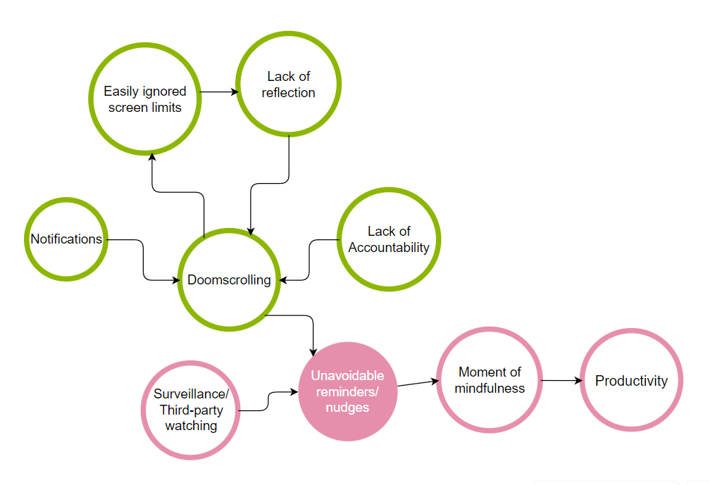
In our new cluster map, we reimagined the nodes with some additional cycles that show the ineffectiveness of existing screen limit applications. Specifically, the cycle of users seeing a screen limit notification that is easily closed and ignored, a lack of reflection and mindfulness, then a return to doom scrolling. In pink, we highlight the positive findings from our study and show how one can get from doom scrolling to more productive time through more subtle means.
Solution Design
5.1 Design Architecture
For our solution design process, we went through a series of various modeling and mapping practices to better understand our needs and start making a plan for what our solution might look like. The models that we created for this part of the process were story maps, an MVP (Minimal Viable Product), system paths, and a bubble map.
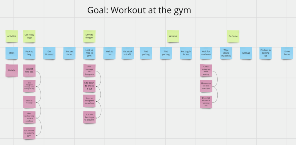
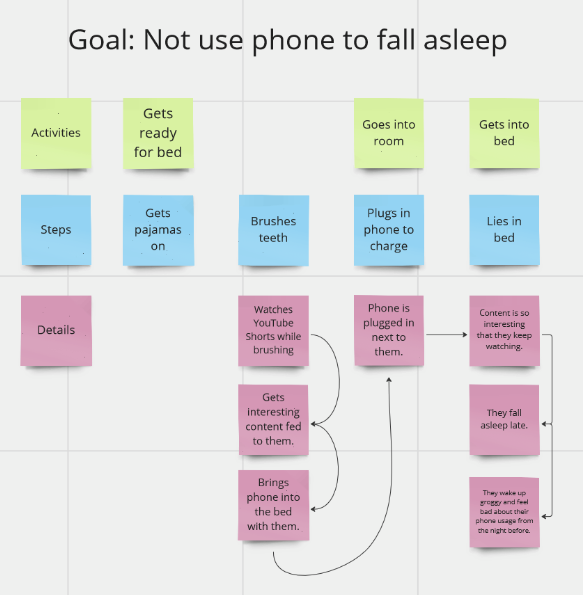
5.1.1 Story Maps
Through our story maps, we noticed that a single notification or an interaction with the phone can lead to hours of mindless scrolling. The user needs a way to stay mindful of their time on certain applications, especially when that is getting in the way of the goals they are trying to achieve or when overuse leads to negative feelings towards oneself. This led us to MVP features that aim to help users to be more mindful of the time that they have spent within an application.
See higher resolution images at our blog post here.
5.1.2 MVP Features
From our storymapping, we generated a list of MVP features for our solution. The outcome we wanted was for users to not use their phones mindlessly. Through these studies, we also realized that phone usage is highly personal, so we wanted to build in the idea of setting personal goals and practicing mindfulness when it comes to a user’s own screen time. We thought that our persona Steve was an especially fitting target audience for these goals because he often uses his phone as mindless stress relief or distraction.
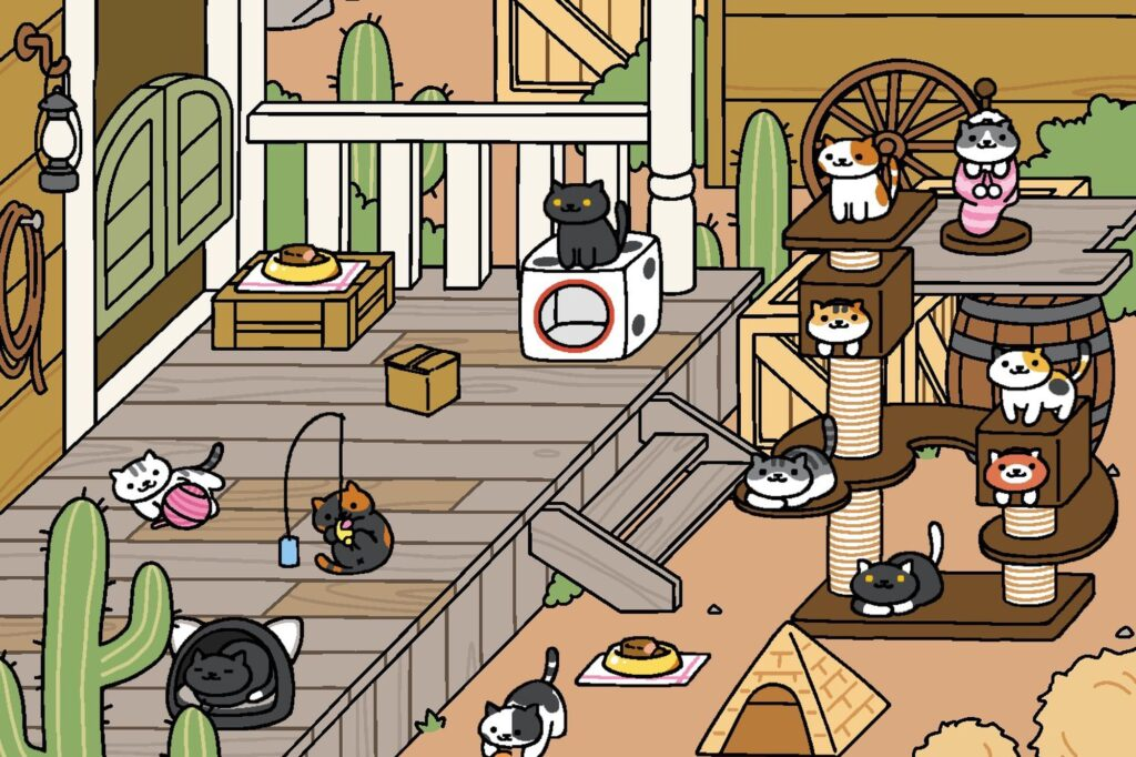
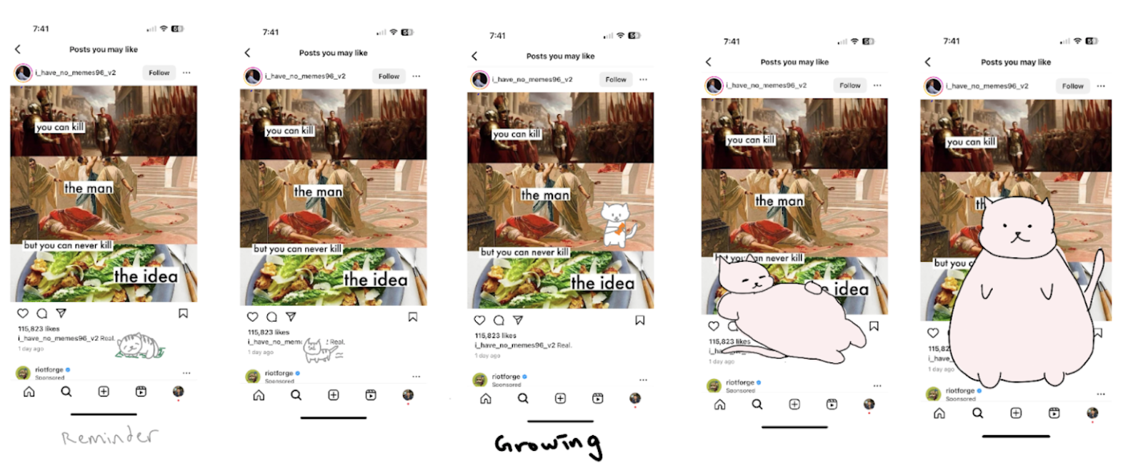
For our solution, we drew on our story maps and study findings and decided to design an interactive app blocker. Our app allows users to set target limits for certain apps and choose a pet cat. If they open an app that they’ve indicated they want to limit, their cat appears in the corner of the screen. The cat continues eating and growing the closer the user gets to their time limit, and once the user has reached their time limit the cat is so big that it covers most of the screen. In order to make the cat shrink, the user has to exit the app. We’re also thinking of building in different ways of making the cat shrink faster (like going on a walk or putting your phone down altogether). Within our app itself, the user can add friends, and their friends’ cats will live together in a community with their cat. The user can view their screen time for the day and add a reflective message for their cat to say (e.g. “I’m proud that I didn’t use TikTok today!”) which will be visible by other users (and vice versa the user can see their friends’ reflections too). As the user continues to meet their daily goals, they will earn points with which they can buy clothes or accessories for their cat. With this idea, we’ve aimed to design an app blocker that is engaging, customizable, and not easily ‘swiped’ away, since in our studies our users indicated that many screentime blockers they’ve tried are too easily removed. We’ve also tried to build in social accountability and mindfulness by prompting users to reflect on their screentime and share it with their friends. The cat community idea was inspired by a mobile game Neko Atsume — you can view an image of the game below to get a better sense of where the inspiration came from.
From there, we formulated these MVP features:
Step 1: Choose 1 to 3 apps you want to engage with less
Step 2: Choose your cat (customize color, patterns, and personality)
Step 3: Put your cat in your ‘friend hang out space, aka, make a friends group (in this space you can see and interact with your friends’ cats)
Step 4: When the user opens one of the apps they want to engage with less, their cat appears at the top of the screen. The cat asks, “Are you sure you want to be here?”
Step 5: If the user exceeds the time limit they set for the app, the cat starts to grow bigger, taking up more and more of the screen. The cat in the friend playground synchronously grows for the user’s friends to view.
Step 6: If the user wants to use the app more without the cat blocking the screen, they must shake their phone to shrink the cat. During this process, they have to hear the angry sounds of the cat being jumbled around on the phone.
Step 7: If the user does not exceed their screen time limits with the set apps, they are rewarded with clothes, toys, treats, and accessories for their cat.
Extension: User enters in goals to achieve. Cat reminds the user of the goals they should be doing as they mindlessly scroll.
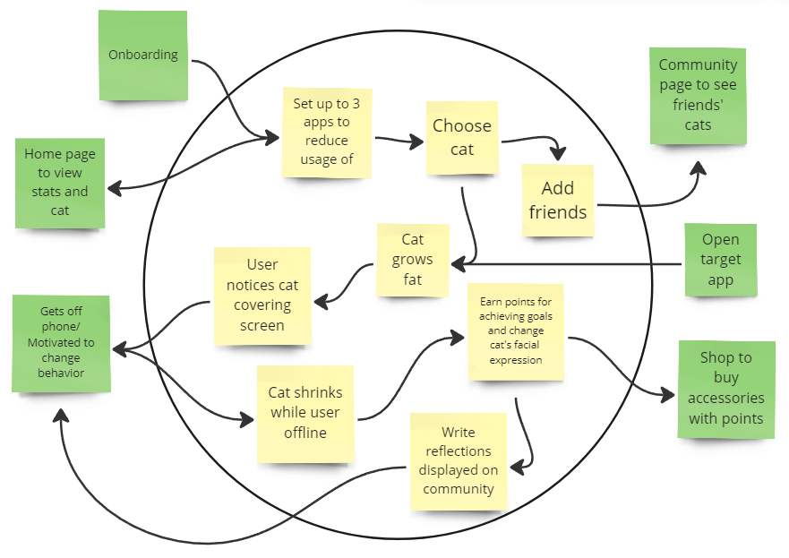
5.1.3 System Paths
After designing our initial solution, we drew out our system path, again focusing on our persona Stressed Steve. The system path takes Steve through an entire flow of this solution, starting with an onboarding process that consists of goal-setting and customization, and ends with various paths of Steve finding motivation to change his behavior using our solution. The system path was helpful to figure out as a group because we were forced to account for a variety of previously unknown issues such as how to balance app usage with productivity and how to incorporate more personal solutions for users. Using the key insights from the Story Maps and MVPs, we wanted to focus on a less notification-based solution and keep our users invested in positive change that they would be able to visualize, which in the case of this system path, would be the pet’s facial expressions and items.
5.1.4 Bubble Map
For our bubble maps, we focused on three main features that we wanted to focus on for our solution that were intended to solve the issues found in our story maps. In our map, the size of the bubbles in this map represents the importance of different modules. As shown in our graphic, the three most notable modules were the “Home”, “Community”, and “Shop”. Each of these central nodes represents an essential aspect of our solution. The “Home” bubble represents a visual representation of progress and the basic analytics surrounding phone usage. This bubble is meant to be a more personal way of approaching screen time reduction and allow users to set goals and check progress. The “Community” bubble represents our emphasis on social accountability. Although small personal change can be done through individual motivation, we find that having a community and support group of friends can be beneficial, and at times, necessary for making progress. Through the community, users will be able to send support to each other and view everyone’s progress as they ideally reach their goals together. The final bubble is the “Shop”, which represents a reward system. Instead of an intrusive gamification system where users become addicted to artificial currency and doing mindless tasks, we opted for a more subtle approach in which users can be positively rewarded for good change such as using productive apps or exercise, where they can go to our shop and buy cute outfits or items for their pets. This means that even if users “grind” for these points, they will be more actively achieving their goals by spending time exercising and being more productive. The key point of including the customization feature of pets is to create a stronger connection between the user and the cat, thus resulting in the user feeling more accountability for the cat. If the user is being rewarded with points that can then be used to customize their cat, they will associate positive change with better equipment or cuter outfits for their companion.
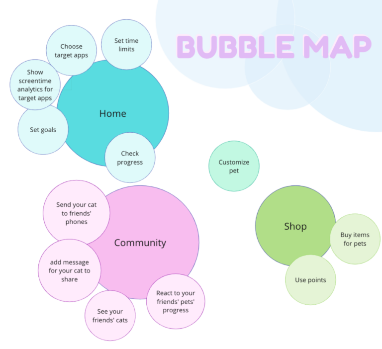
Creating our bubble maps as a group meant consolidating our ideas and figuring out how to make our solution approachable, personal, and effective. Throughout our brainstorming process for this map, we discussed a variety of different ideas that resulted in many important additions such as a shop to introduce gamification into our app and sending messages and reactions through user pets to facilitate a more social aspect.
5.1.5 Mapping Reflection
The maps that we created during this phase of our development process were crucial in solidifying our idea and clearing up how we might organize our app. The story map allowed us to see in a more specific scenario what a user might need or is missing based on the current market. Using the story maps, we were also able to create our MVP, which became the backbone for the rest of our process. The MVP, or minimum viable product, was a direct result of simplification of all of our ideas, and gave us a clear idea of how someone with low-motivation but high need might use our app. The system path was the basis for our physical prototype and because we included “end” points in our updated system path, we designed our app screens on these pages. This includes screens such as the home page, the community page, and the shop. Finally, the bubble map was important for us to imagine exactly what would exist on each page, not just what pages we needed. Interesting ideas we discussed when doing the bubble map were things like where we should add the customization for pets or whether progress should be public on the community page or private on the home page.
Out of these models, the most useful for our prototype were the MVP and Bubble Map. The MVP was the most useful because it was the turning point from our original ideas into our final design prototype, and the Bubble Map was one of the most useful because it sparked important discussion for us to balance usability with minimalism. Since our app was designed to reduce users’ screen time, we felt that we had to reduce the amount of time they could spend on our app as well.
5.2 Assumption Testing
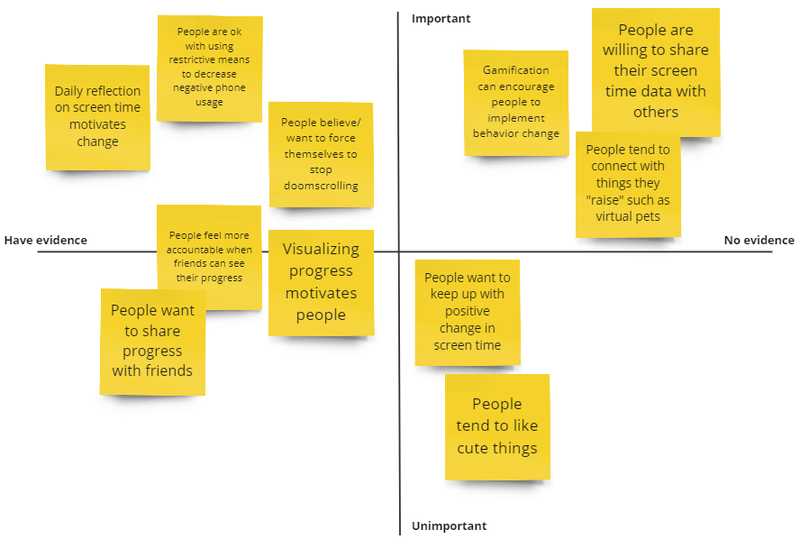
5.2.1 Assumption Map:
The assumptions most critical to our solution are mainly in the top right corner in the “Important” and “No evidence” section. Specifically, the three assumptions are:
- Extrinsic rewards through methods such as gamification can encourage people to implement behavior change
- People tend to connect to things they anthropomorphize or attribute character to
- Having a distraction/intervention prompts people to have a moment of mindfulness/reflection
Another assumption that we found important was the ones regarding visualization of progress and “momentum” of positive changes. These insights are important for our solution because they lead us to a more personal, visual solution that allows people to feel supported while facilitating behavior change. Additionally, phone usage is unique in that people are always with and surrounded by their phones, so being able to personalize solutions and make people connect with our solution is essential for making positive change.
5.2.2 Assumption Testing:
Originally, we designed assumption tests that would be conducted over 5 day periods of time. However, after feedback from the teaching team, we were able to pivot the same assumptions but test them in shorter ways for more direct results.
Assumption 1:
We believe that extrinsic rewards through a system of gamification can encourage people to positively change their phone habits.
To verify this, we will have participants set a screen time goal for one day and tell them that if they meet this goal, we will give them a small prize.
We will measure the time they spend on their devices with a focus on their target apps and their response to the reward.
We are right if the user’s screen time is reduced because it shows that gamification with a reward can positively impact one’s mindfulness.
Results: From this assumption test, we found that only some of our participants actually reduced their screen time for the prize. Interesting feedback we received about this assumption test from one participant was that the prospect of receiving some reward, even if it was as small as candy, was enough for them to think about it throughout the day and they were able to accomplish the goal because it introduced a “Why not?” mindset in which reducing screen time was a goal they already had, and the added motivation of a small reward was enough for them to achieve this goal in the short term. For the participants that did not achieve this goal, they said that the incentive was not enough and that they would rather have cash or something more tangible, or that the screen time goal that they initially set was too ambitious and was not enough of a priority to change.
These results were important because they validated our assumption that people would be motivated by gamification, but it also showed us other motivation may be required for some people. One important change we made was that people need flexibility when it comes to screen time and that if the change is too drastic, they may feel less motivated to make change as opposed to smaller changes over time. After discussion, we decided to add onto our gamification slightly while still keeping a balance since our goal is to facilitate positive change through mindfulness and gentle distractions as opposed to direct compensation or extreme gamification. We did this by incorporating the community page where users can see others’ cats and the shop page where users can purchase accessories, with coins being earned for each goal met. Since users would be able to see other cats and their decorations, it would serve as a form of gamification where they are motivated to “keep playing”, or in other words, continue with their progress for reducing screen time to earn more points.
Assumption 2:
We believe that people connect with things that they spend time with or raise, even if they are not “real”.
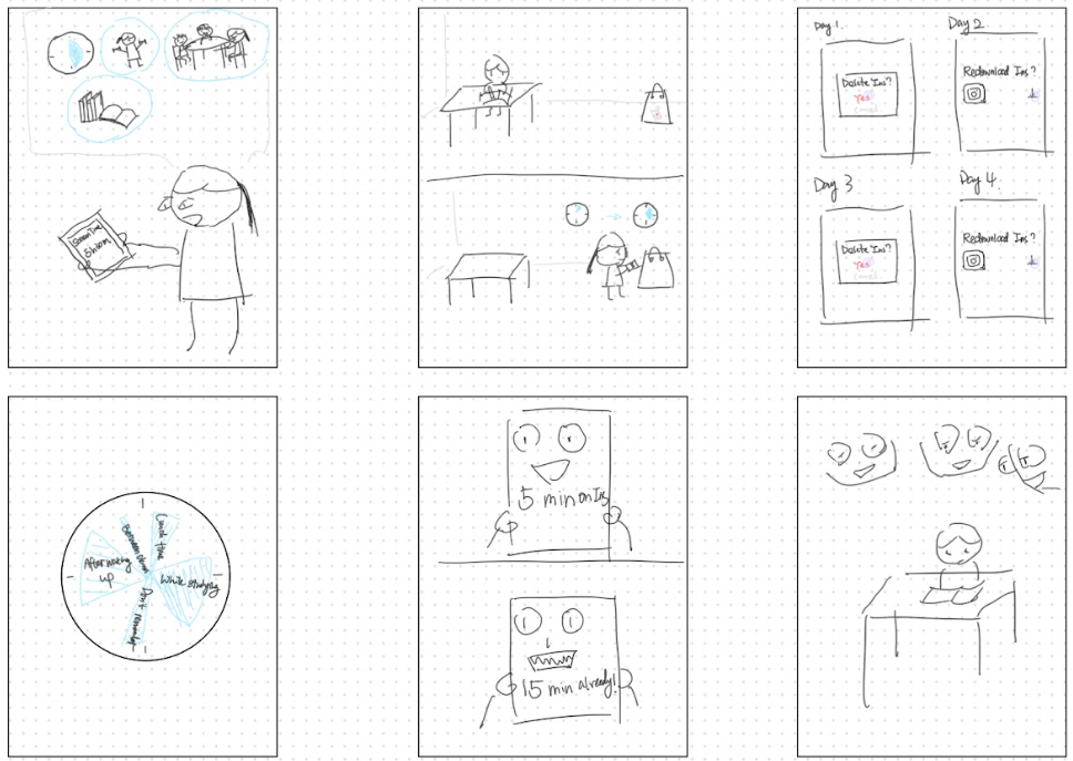
To verify this, we will have participants draw a cat on a post-it note, then have use one of their target apps normally. We will periodically introduce the cat onto their screen, putting it in more inconvenient spots over time, and document their reactions and perceptions of the cat.
We will measure their reactions to the cat and see what makes them upset/frustrated or happy.
We are right if even after the inconveniences and distractions, the participant still has positive feelings towards the cat.
Results: We also had slightly mixed results with this assumption test, the main issue we found being that users had difficulty connecting with the cat during the short testing period. This meant that the cat proved to be more of a nuisance than a companion during our assumption test, and that users had either neutral or negative perceptions of the cat towards the end of the test. However, an important result we got from one of our participants is that if the cat was too easily swipeable, they would revert back to texting, and the reason they stopped doing it during the test was because of the involvement of our tester. From this feedback, we decided that we would balance the cat being difficult to remove, while still making it relatively simple to temporarily disable in case of emergencies. In order to do this, we discussed implementing a tap or shake feature in which users can shake their phone or tap the cat a number of times in order to temporarily deactivate the cat. Then, after a short period of time, the cat would return, with the intention being that if a user truly needs a bit more time, they have the option, but otherwise it would prove too much of a hassle to have to continually shake or tap the screen.
Assumption 3:
We believe that people will be willing to share their screen time data with friends to show their progress and motivate each other.
To verify this, we will have participants screenshot their screen time data and most used apps and ask them if they feel comfortable sharing this with a group chat of friends or family. We will also ask if they think this could serve as motivation for them to reduce screen time.
We will measure their reaction to our question and document their reasoning for their answer.
We are right if users are comfortable sharing their data with close friends or family or if they say initially that they may not be comfortable but change their mind to say that it could help them stay motivated to reduce screen time.
Result: The results for this assumption test were more positive in that all users agreed to share their screen time data. Two of our participants shared their screenshots with friend group chats while one user sent it to their family. When they explained their reasoning, one person said that they felt uneasy sharing with people that weren’t close friends and another said that they found it awkward to share with someone other than their family because it entailed a conversation about what it was and why they sent it. From this data, we decided to adjust our solution slightly to account for this, by making reflections and showing data an opt-in feature, with the default being private. Additionally, we made it so that personal goals could be private so that people had more control over what is shared with friends.
5.3 Low-fi prototype
5.3.1 Wireframes
For our wireframes, the ideal path we are hoping for is that users will spend minimal time on the app itself, and only use it to check their progress or adjust their targeted apps. Because a big part of the results from our assumption tests was a focus on steady, visible progress, we wanted our community and home page to have aspects of visible growth, with reflections and status. We implemented our shop screen as a means to portray more permanent progress, in that after achieving enough personal goals, they can customize their cat with accessories that will stay with their cat forever. Finally, the wireframe for our in-action screen shows the flow of a user going from doom scrolling to having a moment of mindfulness and being able to transition to more productive activities.
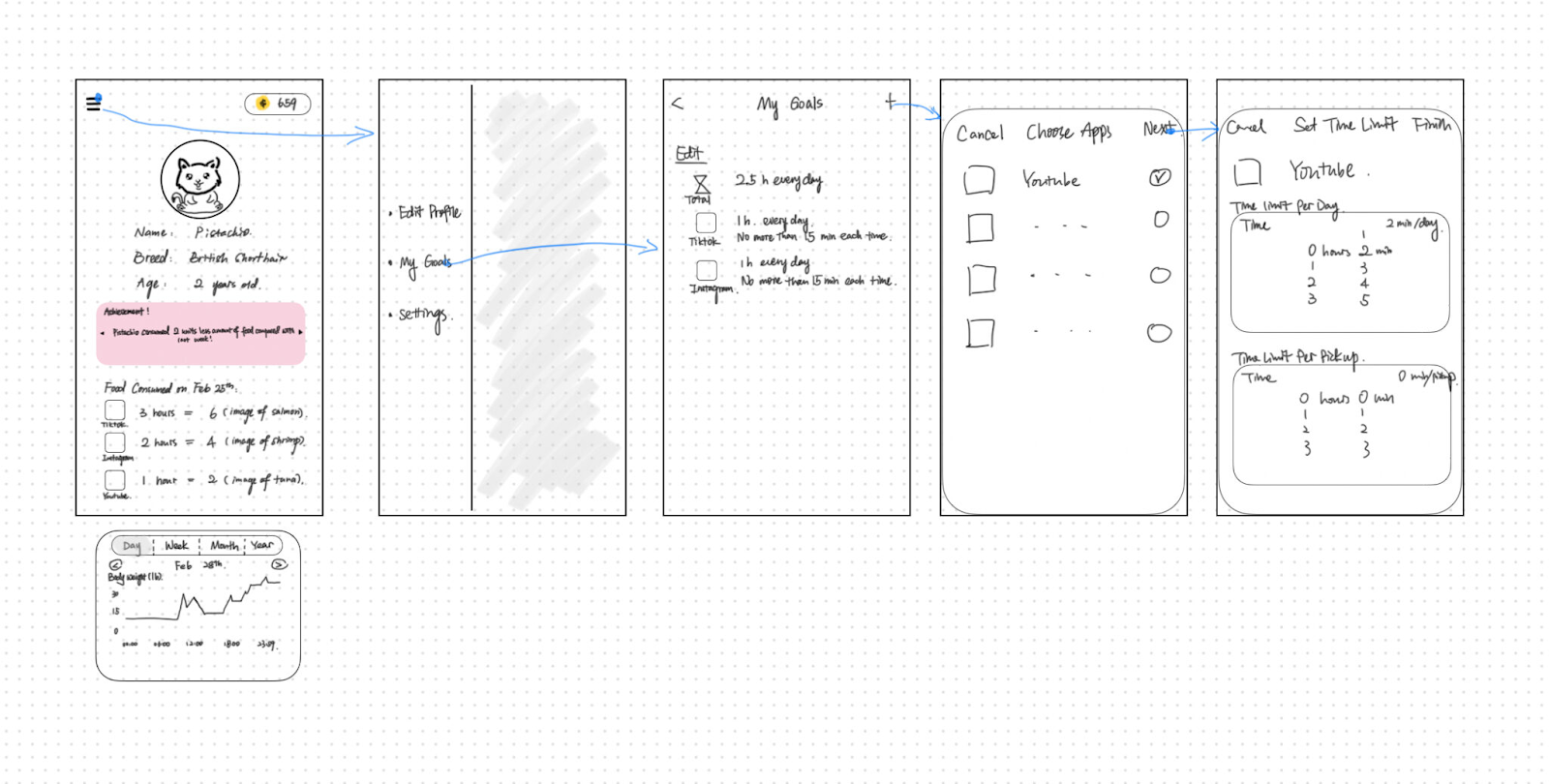
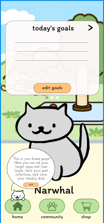
Home screen
Community Screen
Shop screen
In-action screen
5.3.2 Sketchy Screens
Home screen
Challenges: Important information, such as graph data or progress, was not visible enough on the main page and the cat could be larger since that should be the focal point.
Adjustments: Made the user’s cat larger, more visible, and centered on the screen, with the user’s current goals and progress clearly displayed directly above. Instead of the hamburger menu, we incorporated a swipeable modal that can switch between stats, goals, and reflections.
Impact: People will open this page to reflect on their progress, then leave after viewing their data. Since the new design makes the data easily accessible and visible, app usage time is minimized.
Community Screen
Challenges: The navigation buttons need to be more clearly pressed or not pressed, clickable features should be more obvious, and the placement of the friends tab could be more natural.
Adjustments: We made the button press animation include color changes and fill so that users can tell immediately what tab they are on. We also added a header to each tab so that users know where they are through text as well. We included a tutorial in our onboarding process that shows what can be clicked for more information. Finally, we made the friends tab take up the whole width of the page and centered so that it fits on the page more naturally.
Impact: With the new changes, the community page is now a central hub for viewing progress within a community of friends and will allow the user to reignite their motivation by viewing others’ cats. The navigation bar changes are for better quality of life and will allow the user to more easily navigate throughout our app.
Shop Screen
Challenges: The pricing needs more variation to keep the incentive of meeting goals while avoiding gamifying our solution too much, since people could get sucked into customizing their pet and spend too much time on the app itself.
Adjustments: Implemented small changes such as making the shop window smaller and displaying the user’s cat at the bottom. We made the navigation bar visible and kept the items being sorted by type/collection.
Impact: The shop is the crux of the gamification feature of our app, and while we want the user to be motivated by the accessories, we don’t want it to be another mindless distraction for the user. By incorporating the user’s cat into this page, they will be able to view their progress while not getting sucked into the shop.
In-action screen
Challenges: Instead of the cat immediately appearing the time is up, the cat should remind the user a few minutes before the limit about how much time they have left. The reasoning behind this is that users often start watching a video or calling a friend, and would likely want to finish the activity before exiting the app, so knowing the remaining time before the limit is up would allow users to plan ahead.
Adjustments: We decided that the cat would come onto the screen before the time limit is up as a visual reminder to the user to be mindful and start planning. Then, the cat would start to grow at a slow pace so that the user can continually be nudged subtly, even while completing necessary tasks.
Impact: As mentioned throughout this report, we found the balance between intrusion and gentle nudging to be an important aspect of our prototype. By allowing the user some time to prepare by sending the cat to wander a bit before the time limit expires, we introduce the idea of libertarian paternalism, where the user’s freedom is respected while still helping with behavior change.
For more detail on our Low-fi prototype or images of higher resolution, check out our blog post here.
5.4 Medium-fidelity prototype
First draft of our prototype clickable link: [Figma]
The flows that we implemented were onboarding, the home page, community page, shop/wardrobe, and the in-action flow. For the onboarding, we went through tasks such as explaining how the app works, picking a cat, setting targeted apps for screen time reduction, setting specific goals, and navigating the app. We decided to place a high importance on onboarding because users should not be spending a long time on the app itself, which can only happen if they have a good understanding of the app itself.
Onboarding flow sample:
For our home page, we adjusted the style based on comments and discussion from our low-fidelity prototyping. Specifically, we wanted to make the cat more visible while having the goals, reflections, and stats be easily visible. In addition to that, we redesigned our navigation bar to be more clear and visible when it comes to what tab the user is currently on. The box with the information about the cat can be swiped or tapped through, and instructions on how to use it are included in our onboarding process. Below is an example of the main home feed screen and a flow showing how to add goals
Home feed flow sample:
Add goals flow sample:
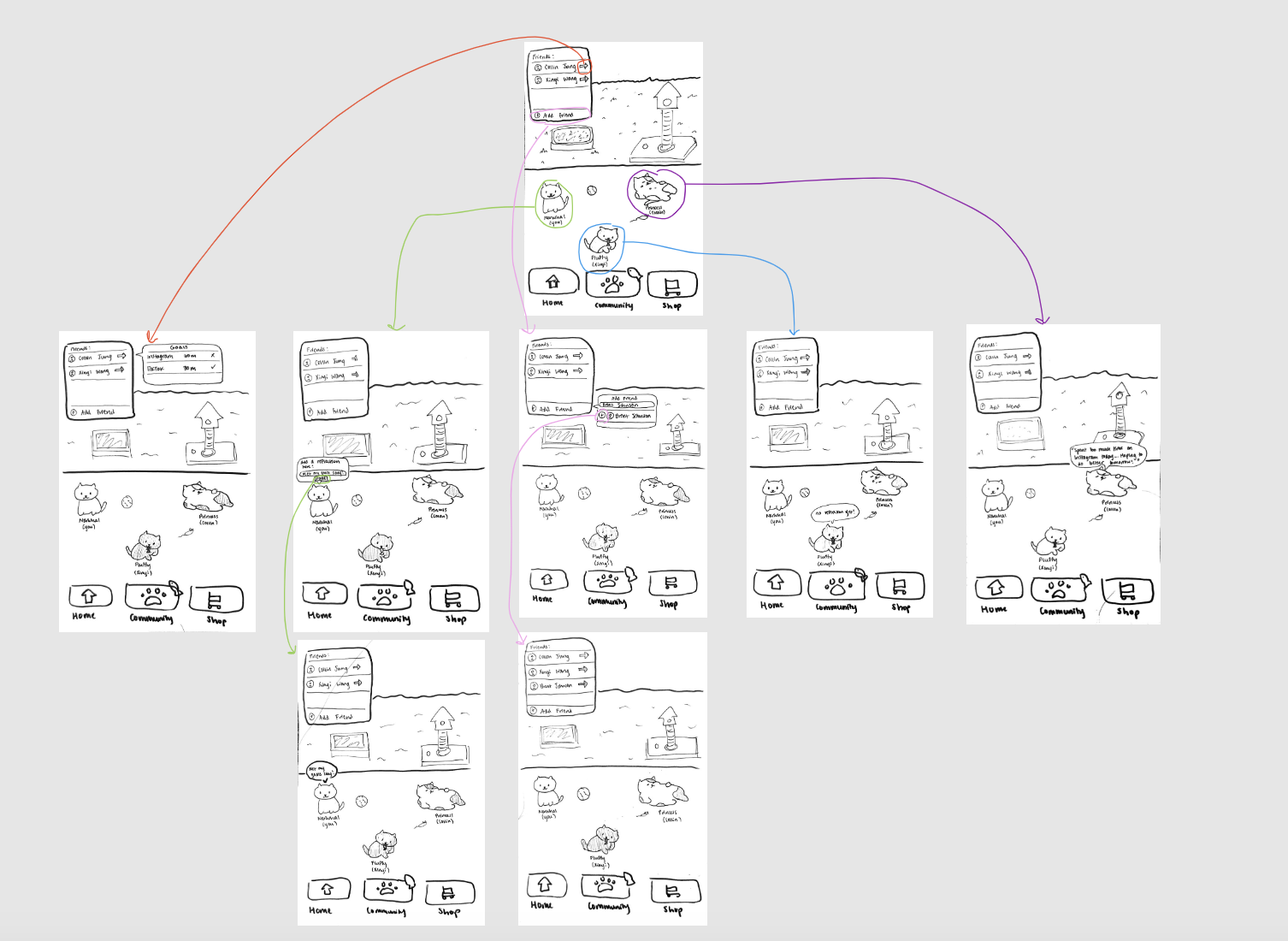
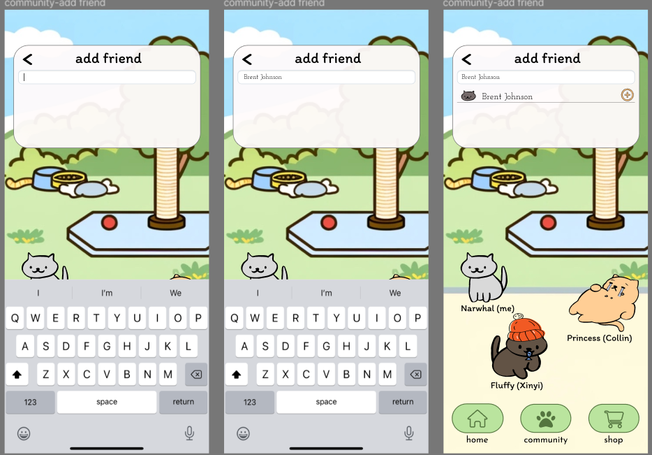
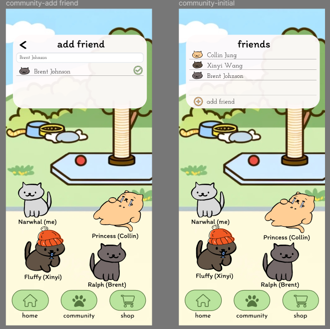
The next flow that we worked on was implementing the community page. In this page, we wanted to highlight the social aspect of our app as a two-pronged approach to tackling social accountability, while also being a means for progress visualization. In essence, as users see their own cat amongst their friends’ cats begin to gain new outfits and accessories, it will act as group motivation where everyone succeeds together. Specific changes we made to this page include making the friends list look more natural on the page, and adding the ability to tap other friends’ cats to see their daily reflection. Instructions on how to add friends, click other peoples’ cats, and how to add your own reflection are included in our onboarding.
Main community page sample:
Adding friend flow:
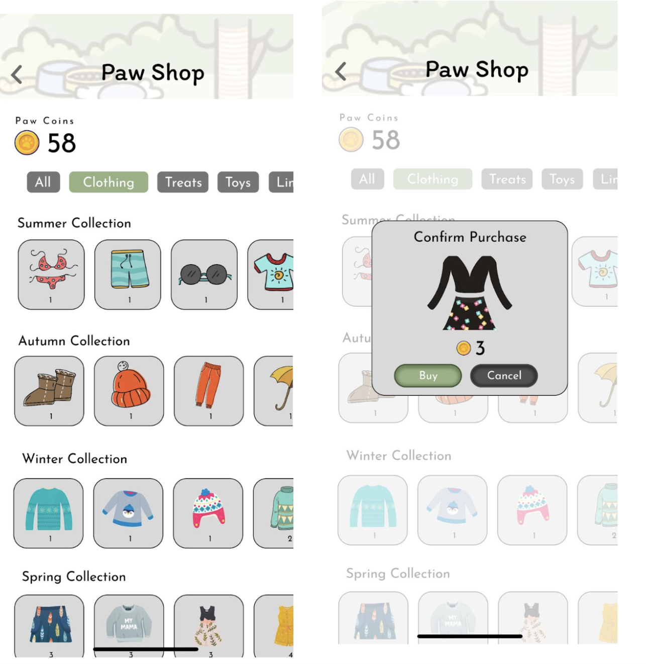
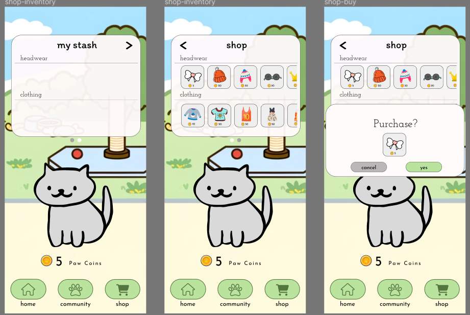
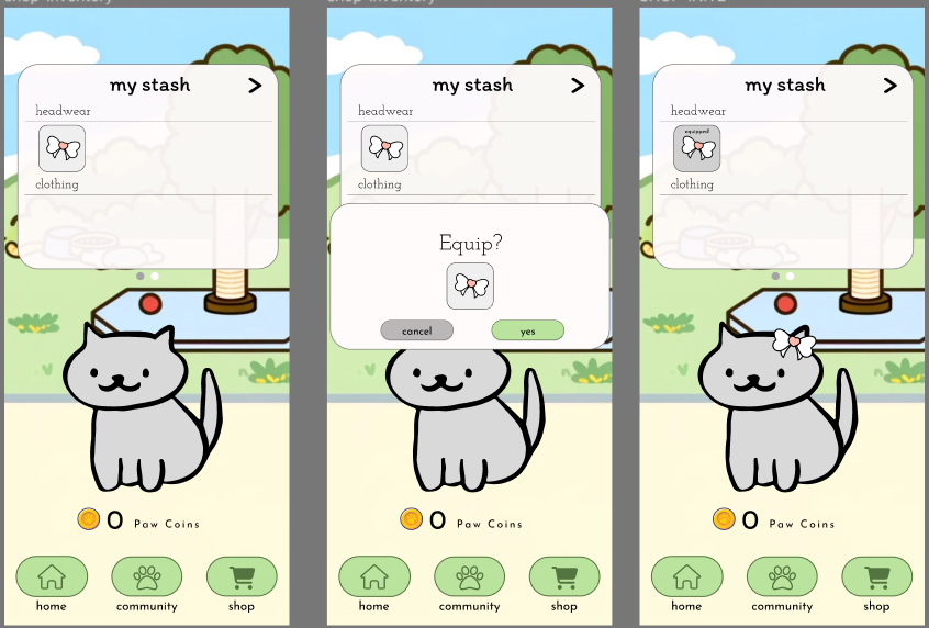
The shop was one of the areas we made larger changes based on feedback from our low-fidelity prototypes. On this page, instead of the shop taking up the entire screen and each having the same price, we made adjustments to the pricing, and styled the page to fit with all the other pages. Similarly to the home page, the shop and personal stash can be navigated by swiping or clicking the arrows. Once items are purchased, they can be equipped from the stash.
Shop sample:
Equipping item flow:
Finally, for our in-action flow, we were able to implement it into Figma using animation and transitions. From our feedback in prior prototyping and group discussions we’ve had throughout the quarter, we were careful to balance inconvenience/nudging the user to be mindful with obstruction of the screen. We didn’t want the cat to be too annoying that the user would delete the app, but we wanted it to intervene enough for the user’s doom scrolling to be interrupted and for the user to be able to make the decision to turn off their app or device.
Growing cat flow:
5.5 Usability Testing
5.5.1 Task Design
The main tasks that we wanted our users to accomplish during our usability tests were divided by the screen on which they were held on and incorporated the various flows we implemented in our medium-fidelity prototype. Below is the list of the tasks we had our users complete.
| Task Number | Section | Description |
|---|---|---|
| 1 | Onboarding | Imagine you are someone addicted to TikTok, YouTube, and Instagram. Add these as goal apps for which you want to reduce screen time. |
| 2 | Onboarding | Exit the app and open TikTok to simulate the cat growing. |
| 3 | Home | View your stats for the week. |
| 4 | Home | Add a goal for Messenger instead of YouTube. |
| 5 | Community | View your friends’ reflections for the day. |
| 6 | Community | Add a reflection of your own |
| 7 | Community | You just learned that Brent also wants to reduce his screen time. Add him to your community so you can embark on this journey together. |
| 8 | Shop | Buy something the white bow accessory for your pet |
| 9 | Shop | Equip the newly bought item |
5.5.2 Results
The results from our usability tests were generally positive and all users were able to complete the tasks within the allotted time. We conducted one to two tests each and compiled all the feedback to make a list of changes to make from highest priority to lowest priority. Notably, the top 3 issues we found that resulted in many of our high priority changes were:
- The onboarding process was unclear at times due to the screen not focusing important areas. Since there was no highlighted area on the screen pointing attention to the onboarding helper cat or the next clickable button in the onboarding process, users got confused on exactly which button to click to progress in the onboarding tutorial.
- The onboarding helper cat was not obviously part of the onboarding process and users thought it was just a feature of the app.
- Font sizes and font styles were not uniform and difficult to read when too small.
With these issues in mind, we created this table to help us through the final stages of our prototyping process:
| Priority | Description |
|---|---|
| High | Gray out background when cat talking |
| High | Make speech bubble/font sizes bigger |
| High | Have the onboarding cat introduce itself so people know it’s a part of the onboarding and not the actual app |
| High | Explain what the cat does when the user is on a target app: It says hi, checks in again halfway and stays on a corner of the page, then grows when the user reaches the time limit. |
| High | Show user how to swipe through cards to see reflections & stats |
| High | Explain what “pickups” mean |
| High | Explain that the state of cat reflects the state of user’s current app usage time |
| Medium | Make cat look fat after the user returns to the Screen Paws app to simulate what the app would actually do |
| Low | Consolidate all font types to Itim |
With this list highlighting the changes to make for our prototype, we were able to address the top 3 issues from the feedback. To make the onboarding process more clear, we made extra screens that showed more detailed instructions on navigating through our app and showing what each page could do. We also added in a brief introduction from our onboarding helper cat to make it clear that the user should follow the helper cat’s lead when learning to use the app. Finally, we addressed the issue regarding accessibility by making our font sizes larger and making all of our text have uniform fonts.
5.5.3 Reflection
If we had the chance to pursue this app further, there are a number of things we would take into consideration, especially new features that could accommodate issues we did not address from our story maps. First, we would have to consolidate our plans for how to make the cat temporarily shrink when it has already grown to the size of the page. Some early ideas we had on this topic were being able to swipe the cat around, tapping the screen, or shaking the phone itself a number of times until the cat has shrunk.
Another change we would make is doing more in-depth usability tests with a larger, more diverse audience. Since screen time is an issue that not just students face, we would be able to gain important insight by testing our app with a wider range of people. Regarding an official release of our app, we would have to take into consideration our app as part of the application store ecosystem. Since our app, at its core, is helping people out of the trap of doom scrolling and mindless screen use, we may have to indirectly “compete” with apps such as social media or streaming platforms. For apps like social media, the goal directly interferes with ours in that they want users to click and stay on their apps as long as possible.
We would also want to generally improve the functionality of our app and create our own distinct style, while possibly adding in new features such as choosing pets that aren’t cats, the ability to send a pet to a friend’s screen to send a message, and unique accessories. We would also want to build on our community page itself, addressing issues related to privacy and user data, and allowing the user to more easily decide what data they want to share with others and who they want to share with.
Finally, because our prototyping is done solely through Figma, there are limitations to what we can display and implement, and in future iterations, we would definitely want to explore how this app might look on a platform such as React Native and JavaScript.
Final Prototype
6.1 Branding
From our individual mood boards, we consolidated the images and themes that we liked from all of our ideas into one mood board. We decided on the key words “cute”, “mindfulness”, and “companionship” because we felt like they were the most important aspects to emphasize in our solution.
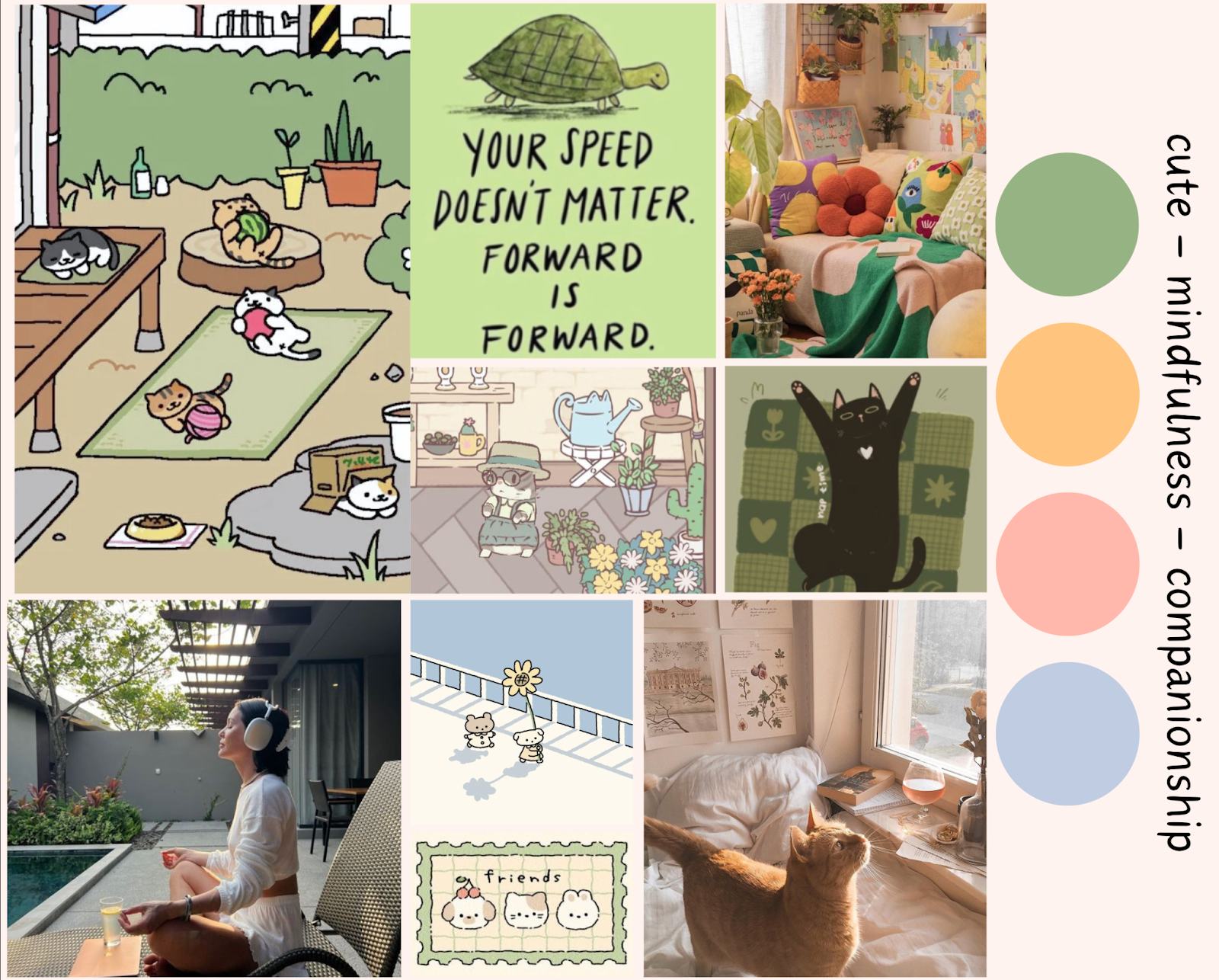
We thought that making the visual design of our app cute would increase engagement and make users feel more accountable when it comes to nurturing their cat companion. We also wanted to emphasize mindfulness, since the point of our solution is to enable users to be mindful of their own goals when it comes to their negative screen time behaviors. We also thought that companionship was central to our solution, not only through the companionship that you develop with your cat companion, but also through the social capabilities where you can share your reflections with friends and hold each other accountable.
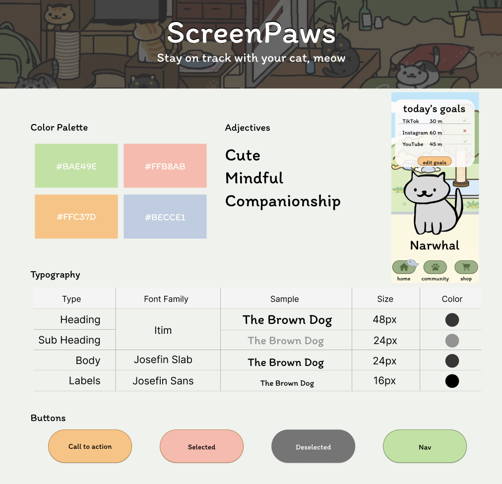
From our synthesized mood board, we designed a style tile to have a template for our fonts, buttons, and color palette. We chose “Granny Smith Apple” green as the primary color, and light red as secondary color because we want to give our product a fresh, positive, and endearing vibe. The font we use (Itim, Josefin Slab, and Josefin Sans) are commonly used in children’s books so are able to convey a friendly and cute feeling.
6.2 High Fidelity Prototype
Our high fidelity prototype consists of five components: three major screens (Home Screen, Community Screen, and Shop Screen) as well as the onboarding flow and the Growing Cat Flow (i.e., what the user will see when using the target app). For a clearer resolution on our frames or to try out our prototype, please click this link to our Figma prototype.
Onboarding Flow
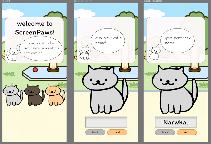
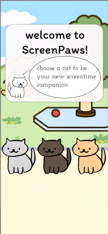
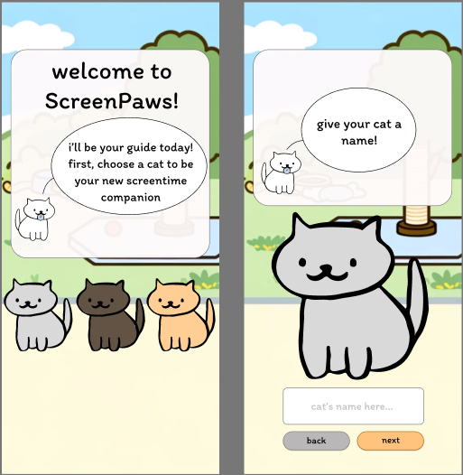
When the user first opens our app, they will need to go through the onboarding process to select and name their cat, as well as provide their own name so that their friends could look them up (Frames 1 & 2).
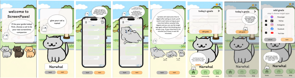
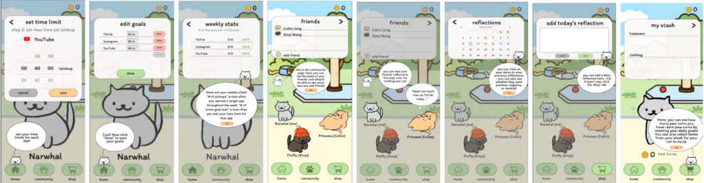
Then we walk the user through different features of the app. This includes:
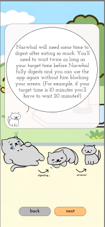
- How the cat will grow fat and gradually cover the screen as it approaches the time limit on the user’s target app (Frames 3-5)
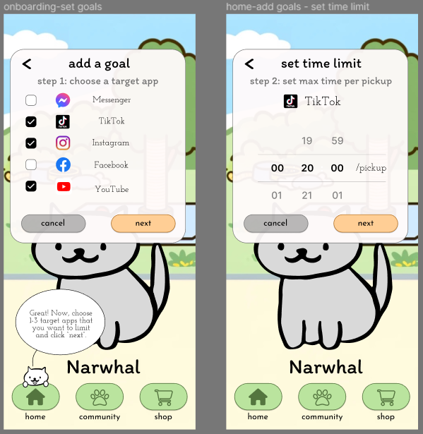
- How to add screen usage goals (Frames 6-10)
- How to check the user’s weekly stats (Frame 11)
- How to add friends and see friends’ reflection on the community page (Frame 12-13)
- How to check and add one’s own reflection on the community page (Frame 14-15)
- How to buy stash for the cat with paw coins (Frame 16-17).
We consider it important to walk the user through different parts of our app because the idea and design behind our app are very novel so the user may not know immediately how to navigate themselves in our app based on their past experience with apps. Once the user gets familiar with different features of our apps, they are then free to exit our app to use their phone as usual (Frame 18). And now we will see how our app could help users control their usage with their chosen target apps as we enter into the growing cat flow.
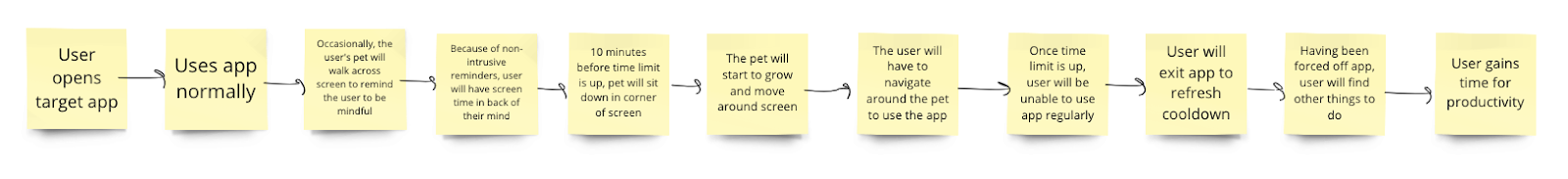
Growing Cat Flow
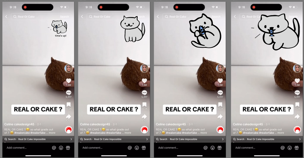
As soon as the user opens the target app, their cat will appear briefly in the corner to remind the user that they have a time limit for this app, and then walk out of the screen (Frames 1-2). Then every 10 minutes, the cat would appear once to remind the user and then disappear (Frames 3-4). But when it approaches the time limit, the cat would stay on the screen and become fatter over time (Frames 5-7). Ultimately it would block a considerable part of the screen to the extent that the user could no longer use the app normally (Frame 8). They have to exit the app to let their cat grow back to the normal size. On our prototype, we also have a “Back to Screen Paws” to return to our app due to the limitations of Figma.
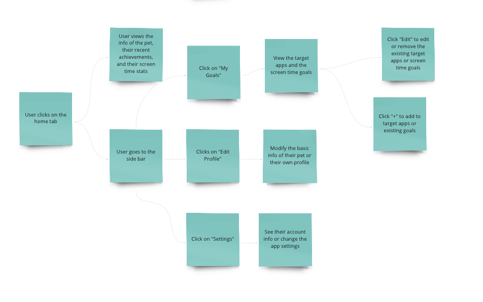
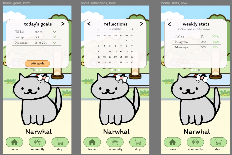
Home Screen
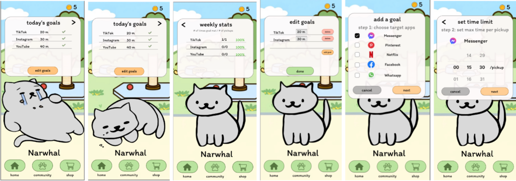
On the Home screen, the user is able to see how fat their cat is currently so that they know whether they have taken a long enough break to be able to use the target app again (Frames 1-3). They are also able to see the percentage of the pickups where they use the target apps within the time limit (Frame 3). Each user can set time goals for at most 3 target apps, so if they haven’t reached the maximal number of apps, they are able to add more goals (Frame 4-6). Since users’ goals change frequently based on their setting and situation, we wanted the goals and edit goals feature to be the main screen available. Then, we also show the weekly stats on the next slide if the user ever wants to check their progress over multiple days.
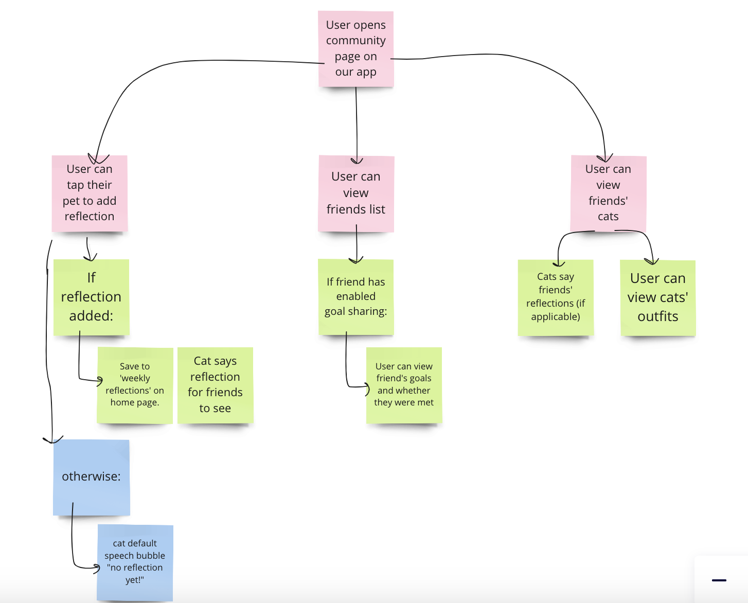
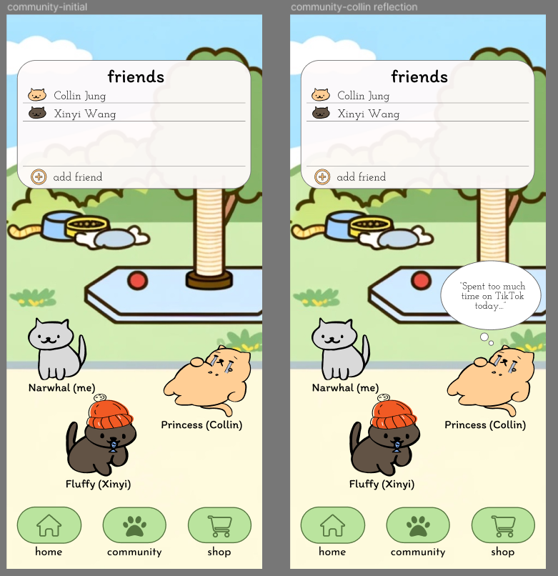
Community Screen
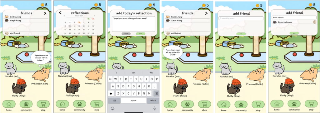
Going into the Community Screen, the user is able to see the status of both their own and their friends’ cats, as well as read their reflections by clicking on the cats (Frame 1). Clicking on the right arrow in the “friends” window, the user is able to see a calendar view where they can check their past reflections and add new reflections (Frames 2-4). We embed reflection as a crucial part of our app to encourage the user to be mindful of their screen usage habits and how they are making progress toward cultivating better screen habits. The user is also able to add new friends by searching for the friend’s name in the search bar (Frames 5-6). Since the community tab is mainly for visualizing progress and to serve as social accountability, we wanted the cats to be the main feature on this portion, highlighting reflections between users and their individual outfits.
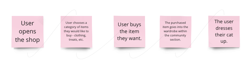
Shop Screen
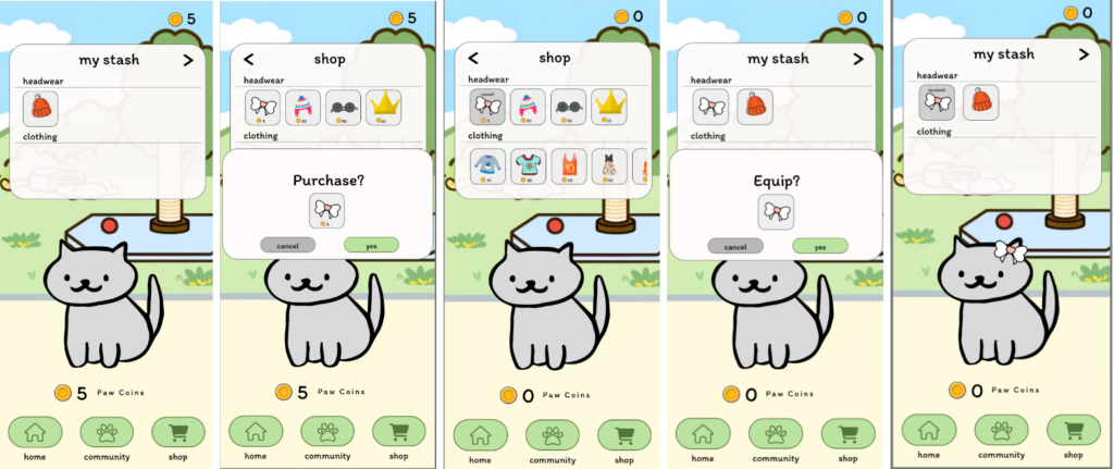
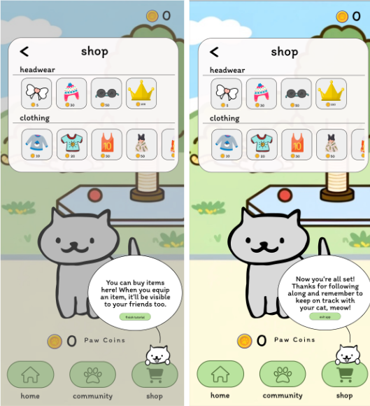
Going into Shop Screen, the user is able to see the stash they currently have (Frame 1) and they can also use the paw coins they win from achieving their goals to buy new stash (Frame 2-3). Then they can equip their cat with the stash they bought (Frame 4) and the cat on the screen would refresh to have the stash on (Frame 5). We used the feedback from our usability tests to make the shop easier to use with the shop clearly showing the prices and the stash being easily used to equip accessories.
Conclusion
7.1 Ethics Creative Project
Our application, Screen Paws, has the potential to positively impact people worldwide by helping them be more mindful about their screen time usage, resulting in less phone usage in applications that are deemed negative by the user. Despite its benefits ,there are some potential unintended consequences of the application. For example, high school students could use the application to mock their peers for spending so much time on their phones. Or the app could be abused by parents who attempt to interfere in the personal lives of their teenagers by monitoring their phone usage on the app, resulting in their children feeling socially isolated from their friends because they are no longer to engage with friends on social media. A third case is that the application could have the opposite effect as intended. Users could potentially find the mechanic of making their cats fatter humorous and begin to use their phones more often. Or they may see that everyone has fat cats, which makes them feel justified in the screen usage. While Screen Paws does have good intentions and could result in positively affecting the lives of millions, it also has potential flaws that should be thoughtfully considered before its widespread use.
7.2 Reflection
7.2.1 Takeaways
Through this project, our team learned collectively about the value of effective collaboration and how to use our diverse talents to solve a problem. Specifically, we were able to reap the benefits of a “divide and conquer” approach while using modern collaborative tools like Miro and Google Docs to work alongside each other. Using online tools to synthesize our data made us realize the importance of accessible, synchronized work environments, especially when doing the quick iterations we had to perform throughout our design process. Additionally, we were able to learn and develop our skills related to the iterative design process, where our initial ideas were constantly refined through feedback and testing, fostering a dynamic approach to solution development. Finally, we also had to practice being comfortable with the flexible nature of design, with our team pivoting from conventional ideas to a more innovative solutions like “Screen Paws”. This project journey taught our team to embrace insights from unexpected sources, to adopt a creative and iterative approach to problem-solving, and the importance of synchronized teamwork using modern tools.
7.2.2 Next Steps
To investigate the effectiveness of our solution for helping people reduce negative screen time, we would first want to develop a fully functioning application that we could use to run a large scale research study. With a functional application, we could recruit groups of participants to participate in various studies to get more substantial feedback and results than with our medium-fidelity and clickable prototypes. An example of this would be to have consenting participants provide us with their phone usage data from the previous month. Then, we could have participants fill out a survey about how they feel about their screen usage in regards to specific applications, rating them on a Likert scale of whether they think they are positive and negative. With this data in mind, we could have the participants download the application we develop onto their phones. Within “Screen Paws”, the users would add three applications that they would like to use less and would be instructed to keep the app installed on their phones for a month. At the end of this period, the participants would provide us with their new phone usage data post-“Screen Paws”. We could compare the first month of phone usage data before they used our application with the phone usage data that was collected during the time the users were using our application. Using this direct comparison we could measure the effectiveness of our application as to whether or not it affected screen time usage. We could check for things such as:
- Did overall screentime reduce, increase or stay the same?
- Did users spend less time on the target applications they were trying to decrease?
- Did usage of other applications increase, decrease or stay the same as a result of using our application?
- Were users spending too much time in our application? If so, on which screens?
In addition to directly comparing the data, we could also administer a survey to see if the application changed any non-phone portion of their lives. Some example questions could be:
- If phone usage decreased, what other activities did you find yourself doing more often?
- Do you view the activities that substituted previous screen usage as positive or negative?
- Do you feel you would continue to use this application?
Having a better understanding of our app in the real world would allow us to further iterate and adjust our design to fit the needs of our user base.
7.2.3 Final Reflection
For our next design efforts related to behavior change, we intend to incorporate the knowledge we have learned from this class such as the concept of nudges, B.J. Fogg’s Behavior Model, and ensuring the consideration of the ethical implications of design decisions and potential unintended consequences of those decisions. Additionally, with the processes we refined throughout the development of our app, we hope to continue to utilize flows such as need finding, visual prototyping, and system modeling. We will also emphasize user research to ensure our solution is closely aligned with user needs and challenges. One technique we will continue to practice is the iterative design process which allows us to refine our solution through continuous prototyping and user feedback. Personalization will be another key focus, such as using data from surveys to incorporate individual user patterns and preferences. Finally, we will prioritize ethical design, making sure to keep transparency and control over personal data, especially with products related to behavior that users engage with.
References
Karina Loid, Karin Täht, Dmitri Rozgonjuk. Do pop-up notifications regarding smartphone use decrease screen time, phone checking behavior, and self-reported problematic smartphone use? Evidence from a two-month experimental study. Computers in Human Behavior, Volume 102, 2020, Pages 22-30, ISSN 0747-5632, https://doi.org/10.1016/j.chb.2019.08.007.
Kharbanda R. How a top-rated productivity app, Forest, uses gamification to retain users. https://bootcamp.uxdesign.cc/how-a-top-rated-productivity-app-forest-uses-gamification-to-retain-users-9345f6867a2d
Neuwirth, L. S. (2022). Flipd App Reduces Cellular Phone Distractions in the Traditional College Classroom: Implications for Enriched Discussions and Student Retention. Journal of College Student Retention: Research, Theory & Practice, 24(2), 386-420. https://doi.org/10.1177/1521025120921348
Olson, J.A., Sandra, D.A., Chmoulevitch, D. et al. A Nudge-Based Intervention to Reduce Problematic Smartphone Use: Randomised Controlled Trial. Int J Ment Health Addiction 21, 3842–3864 (2023). https://doi.org/10.1007/s11469-022-00826-w
Rahmillah F, Tariq A, King M, Oviedo-Trespalacios O. Evaluating the Effectiveness of Apps Designed to Reduce Mobile Phone Use and Prevent Maladaptive Mobile Phone Use: Multimethod Study. J Med Internet Res 2023;25:e42541. URL: https://www.jmir.org/2023/1/e4254. DOI: 10.2196/4254.
Trott M, Driscoll R, Irlado E, Pardhan S. Changes and correlates of screen time in adults and children during the COVID-19 pandemic: A systematic review and meta-analysis. EClinicalMedicine. 2022 Jun;48:101452. doi: 10.1016/j.eclinm.2022.101452. Epub 2022 May 21. PMID: 35615691; PMCID: PMC9122783.
Zhu, X., Griffiths, H., Xiao, Z. et al. Trajectories of Screen Time across Adolescence and Their Associations with Adulthood Mental Health and Behavioral Outcomes. J Youth Adolescence 52, 1433–1447 (2023). https://doi.org/10.1007/s10964-023-01782-x


