
Final Report: bloom
Team 1: Grace Zhang, Grace Zhang, Alix Cui, Godsfavour Simon
Problem Finding
We were excited about this problem space because we all felt the effects of long-distance learning and Covid and moving states for university and being separated from our networks back home. We also have all felt the frustrations and difficulty and stress of trying to find times to meet and hang out with people while juggling everyone’s busy schedules. We were all personally invested and passionately believed in the vision of helping people foster their friendships more, and leveraging technology to help break down many of the barriers to doing so.
There’s a lot of apps already that try to help people stay in touch or meet new people or deepen their friendships, whether it’s calendar apps or reminders, or social media and messaging platforms. There’s an entirely separate suite of enterprise CRM tools to help companies navigate and manage large groups of people as well. We took a deep dive into all the different categories of applications and grouped them based on the activation energy required to use the apps effectively and the integration the apps had with other apps a person uses.
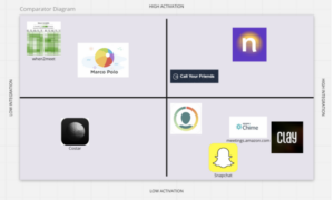
Figure 1: Comparative Research Diagram
For our baseline diary study, we decided to monitor every time a participant had an interaction with a friend (whether a physical hangout or a virtual call/activity). We tracked their emotions and reflections before, during, and after the interaction to better understand the thought processes and emotional states of our participants throughout all of the stages of interaction. We found that a point of friction was how difficult it could be to find times that worked for multiple people, and the back-and-forth of scheduling was unpleasant. This helped refine our problem statement in that we wanted to focus on creating something automated and seamless that could target this pain point.
From our diary study findings, we eventually all made journey maps to take a deeper dive into the problem itself and how it fit into peoples’ daily routines. We found that there were multiple pain points or stressors throughout the process of interacting with friends. At every step (deciding how to reach out, waiting for a response, trying to schedule a time, anxiety before the interaction, etc.), we identified the root causes and tried to see how we could mitigate those barriers.
After all of these initial studies and research, we also identified the main use cases of our app and created 4 main personas: Reflector Rachel, Reconnector Rei, Busy Bree, and Scheduler Sammy.
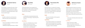
Figure: Personas
Solution Finding
Taking into account all of our insights from our initial phase of problem finding, we moved onto more studies to catalyze our solution finding process. Previously, we found that people were often too busy and stressed to schedule interactions themselves, or just chose to not try to reach out to people when they thought they were busy or the process would take too long. Therefore, in designing our intervention, we wanted to find a way to surpass that mental hurdle by simulating automation of that process. Our hypothesis was that this would allow participants to be less stressed overall and encourage them to interact more.
For our intervention study, we tried to “automate” parts of the interaction flow for our participants. We aimed to lower the activation energy and stress of planning an interaction in hopes of encouraging people to interact more. We messaged participants every morning to hang out with a friend chosen from a list they gave us, and we included the activity, time range, and some conversation topics as well. After compiling our study results, we found that some people were stressed and treated the interaction as some task they had to complete, and that some activities that we suggested to be “low-stakes” were actually stressful for people if they had been having a busy week. Therefore, we realized the importance of emotional context in planning out suggested interactions and the cadence of interactions. We also found that the suggested conversation topics were actually counterintuitive as well – participants said some of the prompts seemed random and difficult to bring up in the middle of a conversation because they’d treated them as mandatory to complete within the study.
After our intervention study, we did all sorts of mapping, from story mapping to bubble maps to assumption mapping. Throughout this process, the story mapping helped us decide that the anchor of our app would be interactions around friends, such as the friends feed and friend profiles, and the automation and ease of scheduling. The overarching goals accomplished by focusing on these two pillars were to ease the interaction process and to help people feel more connected and engaged in their friendships over time. The bubble maps helped us start brainstorming preliminary ideas for the types of interactions and flows and screens we would have in our app, which we explored thoroughly throughout our design phase. And the assumption mapping helped us justify some of our main features and confirm that what we were attempting to do with our solution would actually be received appropriately and appreciated by users.
Taking a closer look at assumption mapping, we identified two main assumptions to test throughout the process of diagramming all of the assumptions. We first started with brainstorming statements that fit into the categories of desirability, feasibility, and viability. Then, we mapped all of those statements onto a 2×2 of important vs unimportant and known vs unknown. We chose the two most critical assumptions from the important and unknown assumptions. These assumptions in particular (friendship indicators and friend updates) were important because they comprised significant parts of our hypothesized interface.
The two assumptions that we tested were:
- WBT people want to see their friend’s social updates across platforms all in one place
To do so, we showed participants a digest of compiled social updates across 1 week from multiple social media platforms, including Instagram, Twitter, FB, Linkedin, etc. We hypothesized that having social updates shown to users would lower the stress and friction of a couple stages of the interaction process and encourage them to reach out to their friends and have topics to discuss or reasons to reconnect.
- WBT that indicators for frequency of interaction will encourage more
We would show participants multiple versions of indicators for friend “closeness” within their friends list. We hypothesized that having manipulative indicators could serve as a subtle reminder to encourage people to reach out to their friends more, as well as allow people to celebrate the progress they’ve made.
Overall, participants were receptive to the experiments we conducted and affirmed our hypotheses. For social updates, people felt more connected and felt it was easier to maintain positive feelings between real-life interactions, and said that they could derive easy conversation starters or topics in response to certain updates, like a friend getting a job offer or posting a cool travel picture on their Instagram. For social indicators, people appreciated indicators as subtle reminders, but were hesitant about how manipulative they could be. For example, emojis were disliked overall due to how much they resembled Snapchat and were explicitly emotional and could be confusing at times. However, participants did like the plant-based indicators that showed different stages of growth but didn’t give participants feelings of sadness or guilt. This influenced the design of how the indicators would look and change in an attempt to minimize negative emotional manipulation. In response to our hypotheses being confirmed in both assumption tests, we did eventually incorporate a friends’ updates feed in our app and indicators as well.
Designing the Solution
After our solution-finding phase, we brought all of our insights and findings together and started to synthesize and create our design. Overall, we had a few main interaction flows and critical components and features in our app.
During our Wireflow phase, we first created designs for 4 flows: an onboarding flow, a scheduling flow, a post-interaction flow, and a friends flow.
https://highercommonsense.com/cs247b/team-1s-wireflows/
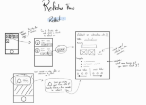
Figure: Reflection Wireflow
During our Mood Boards and Style Tiles phase, we first all created a mood board together in class from magazines and other materials. Themes we were going for were organic and welcoming, yet modern and clear. After creating our moodboards, we all created individual style tiles and synthesized them into our final style tile. We chose colors that were refreshing and organic yet had contrast and pops of color, for a sleek and aesthetic look and feel. During this phase, we also settled on our final name: bloom. This encapsulated both our nature-inspired design and also our overarching design challenge and mission, to grow and foster friendships.
https://highercommonsense.com/cs247b/team-1-style-tiles/

Figure: Mood Board and Style Tile
During our Sketchy Screens phase, we added more detail and interaction to the same flows from our Wireflow phase. We created outlines in Figma of our 4 main flows.
https://highercommonsense.com/cs247b/team-1-sketchy-screens/

Figure: Scheduling Sketchy Screen
For our Clickable Prototype, we worked in Figma to create our entire app interface. We retained our same flows but added in additional features and connections between all of the interactions. We started with an onboarding flow, where users would create a profile, answer questions to help us gauge their use case and tailor the app experience to be personalized, and add their friends. This would take us to the main page of the app: their friends list, with friendship indicators and other quick information. In the main app, we had several screens: one was the friends’ updates feed, one was the friends list, one was a note-taking flow, one was a scheduling flow, and one was a user’s own profile. The scheduling flow was a way for people to easily find times that overlapped with their friends, or choose suggested times, and schedule a time to meet and set up reminders for themselves. The notes flow was a way for a user to add notes about their friends, which would be added to their friends’ profiles. We also had a post-interaction reflection flow, where users would be guided through a flow to help them reflect on an interaction and add to their friends’ notes after an interaction happened.
https://highercommonsense.com/cs247b/team-1-clickable-prototype-and-usability-script/

Figure: Friends list and profile
We went through Usability Testing with some of our classmates and found some areas to improve and iterate on before our final presentation. Our three biggest issues were:
- Confusion about purpose of onboarding questions: Users thought it would be confusing to be given the series of onboarding questions without having context about what they were for and how the responses would be used. We will add an extra screen initially that gives an overview of the app’s mission statement and what the questions hope to achieve in terms of fine-tuning the user experience for each use case.
- Add vs save buttons in post-interaction flow (adding friends and statements): The buttons to add friends and add statements in the post-interaction flow vs the buttons to save those inputs were confusing to users. We will change this interface to make it more intuitive for users by adjusting the button placements and sizes.
- Potentially missing significant use cases in onboarding flow: One potential use case that users thought we may have missed was the case of someone who is lonely and doesn’t really have friends or wants to meet and hang out with more people. This was notably mentioned in the notification question, where a low number of notifications could either indicate someone who is extremely responsive, or someone who just has no one reaching out to them or talking to them. We will add more questions and clarification to the questions themselves.
https://highercommonsense.com/cs247b/team-1-usability-test-report/
After presenting to the class, we also received more feedback about our app about future directions, which we synthesized with our own projected future directions. One critical feature we would want to develop is some sort of mood-tracker or pulse-check when users interact with the app – as we found in earlier stages that peoples’ emotional states at the time of scheduling or engaging in an interaction had a significant impact on that process or experience, we wanted to find a way for our app to be more empathetic and understanding by adding some sort of emotional check-in. This would influence the cadence and tone of our nudges and reminders, to ensure users don’t feel pressured to schedule interactions or go to an interaction if they’re already feeling overwhelmed. We could also add more questions to our onboarding to understand our users better, not simply their habits, to create an even more personalized and seamless experience.
Ethical Analysis and Broader Impacts
Because our app dealt with a lot of user data and nudging, we had a lot of ethics to consider when designing our product. One of the core features of our app was the nudging which prompted a user to reach out or try to schedule a social interaction with one of their friends. The important ethical consideration we had was designing these nudges so they weren’t manipulative in the sense that they would potentially skew a level of friendship or forceful so the user didn’t see their interactions as a means to an end. To resolve this, we tried to find the best way to semantically word our automated nudges, and we tried to give the user as much control over them as possible. In terms of semantics, we avoided phrases that sounded mandatory such as “Do this”, and we instead opted for looser phrases such as “Try to” and “sometime soon”. This helped in making the user feel like the interaction wasn’t forced. To make the nudges as less manipulative as possible, we offered as much control over them as we could. For example, users could turn off the nudges completely and change the frequency of when they wanted to be nudged. In addition, like the ethics reading described, we implemented escape hatches from the nudges such as easily selecting an option to remind the user later or clearing the notification itself.
Privacy was also a very important ethics question we had to think about when designing our app. This is because our app relied on a lot of integration with other apps such as calendar apps, messaging apps, and social media apps. Therefore, we wanted to think about the best way to get users’ permission to share their other apps’ data with ours. Luckily, many of these external apps have public APIs that can be accessed and have their own privacy settings built with them. However, we didn’t have time to consider fully how we would deal with the algorithm behind nudging users to interact with certain friends. If given more time, we’d definitely look more into this and see what would be possible and what wouldn’t.
Conclusion
For next steps, we hope to incorporate more mood-based features to address our user research insight that people’s motivation to socialize is more dependent on mood rather than activity, person, or other characteristics of the interaction. This could look like a regular pulse check accompanied by some kind of artificial intelligence algorithm that delivers nudges based on this emotional data. We also hope to conduct further research on how to format our reminder nudges and social indicators to be non-manipulative, so that they healthily encourage in line with the user’s individualized goals and never create feelings of shame or impact the quality of the friendships negatively. Lastly, we’d like to include more of the natural feeling and serendipity you get when you run into someone spontaneously in the interactions of the app.
Overall, we learned how to thoroughly apply the design process to the niche of behavior change, from intervention studies to assumption mapping and user journeys, with better understanding of how each part relates and influences another. Through this project, we now see firsthand all the little contextual factors that add up to influence peoples’ behaviors, and how we can harness design in order to nudge, target, and shift users to behave in a way that helps them achieve their goals. Most importantly, because we’ve had this opportunity to see firsthand the power of design—we’ve realized the ethical considerations that need to go into these decisions. Moving forward into our next design project, we plan to embed more ethical discussions and research into every part of the design process, so that we are being proactive rather than reactive to these implications.


