

Grace’s Sketchy Screens
Friends/Social Feed
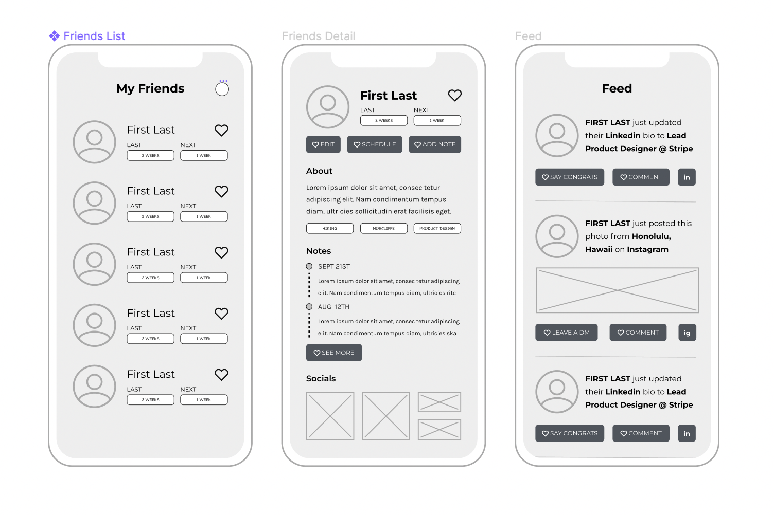
The friends flow goes through the user’s friends list and detail views for each of those friends. Users can see a list of their friends — along with each person’s photo, the last time they interacted with them, the next time they are scheduled to interact with them, and a visual representing how much time it’s been since the last catch up. This view aims to give users only the most important information, allowing them to quickly glance at the status of their connections. Users can also add additional friends to the list through a button on the top right.
Tapping on any one of the friends then takes users to all the additional details and specific actions for that particular friend. For example, users can view a collapsible timeline of notes they’ve written, all the recent social updates this person has posted across platforms, the groups/tags the user has categorized them in, and a quick bio of the person. They can take action to edit any basic info about the person, manually schedule a catch up, or add additional notes.
An additional flow I developed was one featuring a feed of all their friends’ social updates across all platforms. For example, “Friend X just updated their Linkedin job to YWZ”, then a follow up action that takes you to the Linkedin App to congratulate them. This groups the information all friend’s social updates all in one place, ideally allow users to stay in touch and engaged with their most important connections online in between in person catch ups, and give them the chance to maintain positive feelings despite not always seeing other.
Alix’s Sketchy Screens
Scheduling

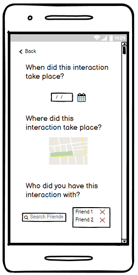
These screens are for when users schedule interactions with people. The first screen shows a form-like view with all the needed information. At the bottom, there is a suggested topics and notes section that allows for users themselves to select conversation topics based on their previous interactions, previous notes, shared interests, social events, etc. To clarify, the switch on the “dates” input is to switch between all-day interaction and a non all-day interaction.
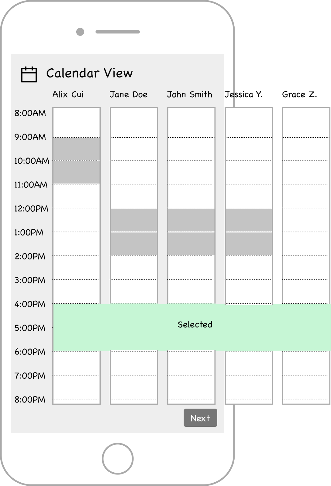
The second screen is a calendar view of people’s schedules or calendars. The overflowing of one’s calendar is to represent a horizontal scrollable list. If a user selects a certain time, there will be a selected overlay that will be shown on everyone’s calendar. This screen will be more interactive and give a more detailed view of people’s available times.
Note taking


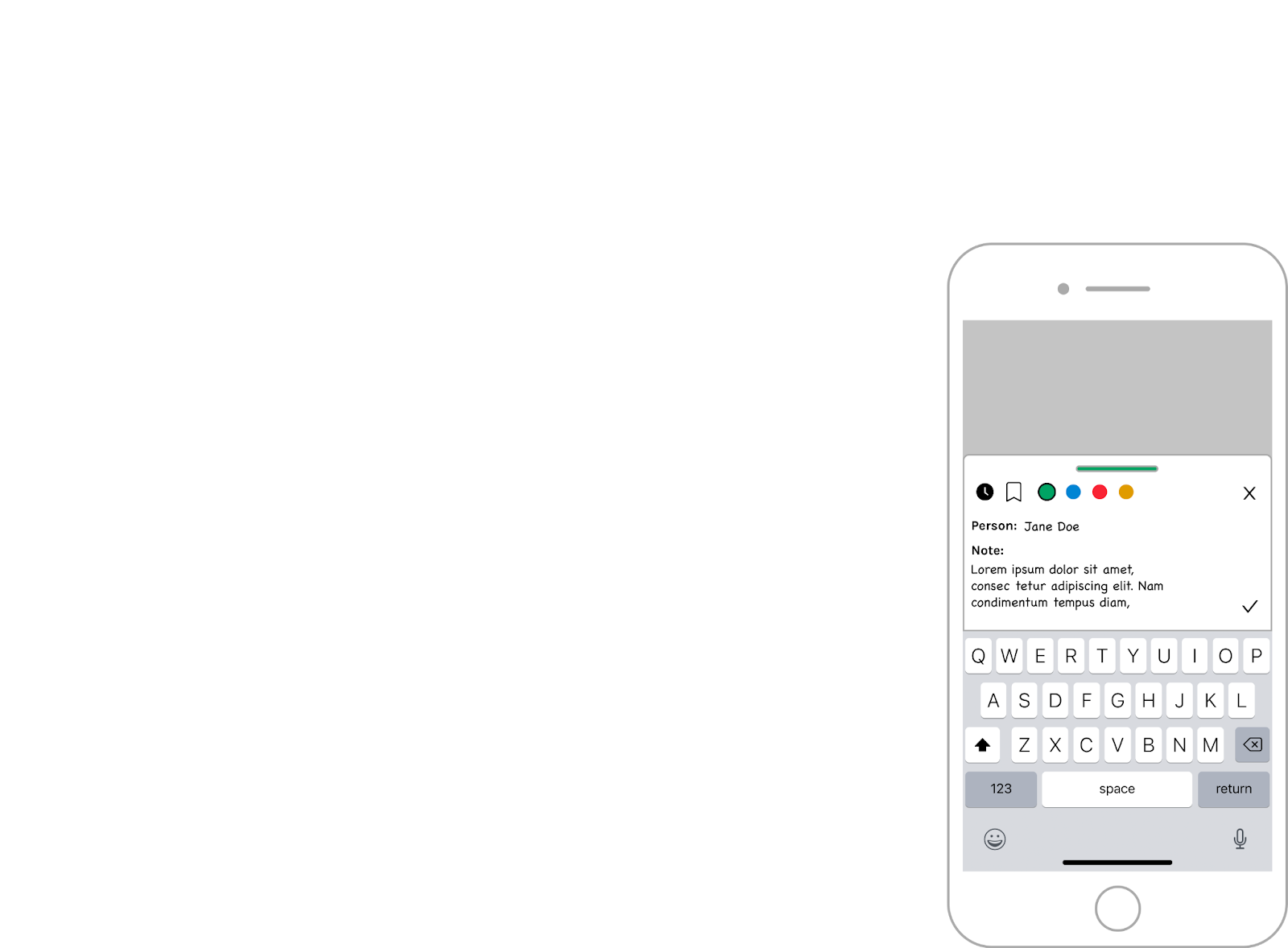
These screens show the note-taking flow for when a user wants to write a reflection or just a simple note about someone. The main text inputs are the person the user is writing about and the note text itself. The icons above the text inputs represent clickable options for the note. The clock icon links to the set reminder modal where users can easily set a reminder for the note. The bookmark icon allows users to add a specific note to a bookmarked or favorites section. The colors are ways the user can distinguish their notes. Selecting a color will change the accent of the note as shown in the first and third screen expand/pull indicator.
Notifications
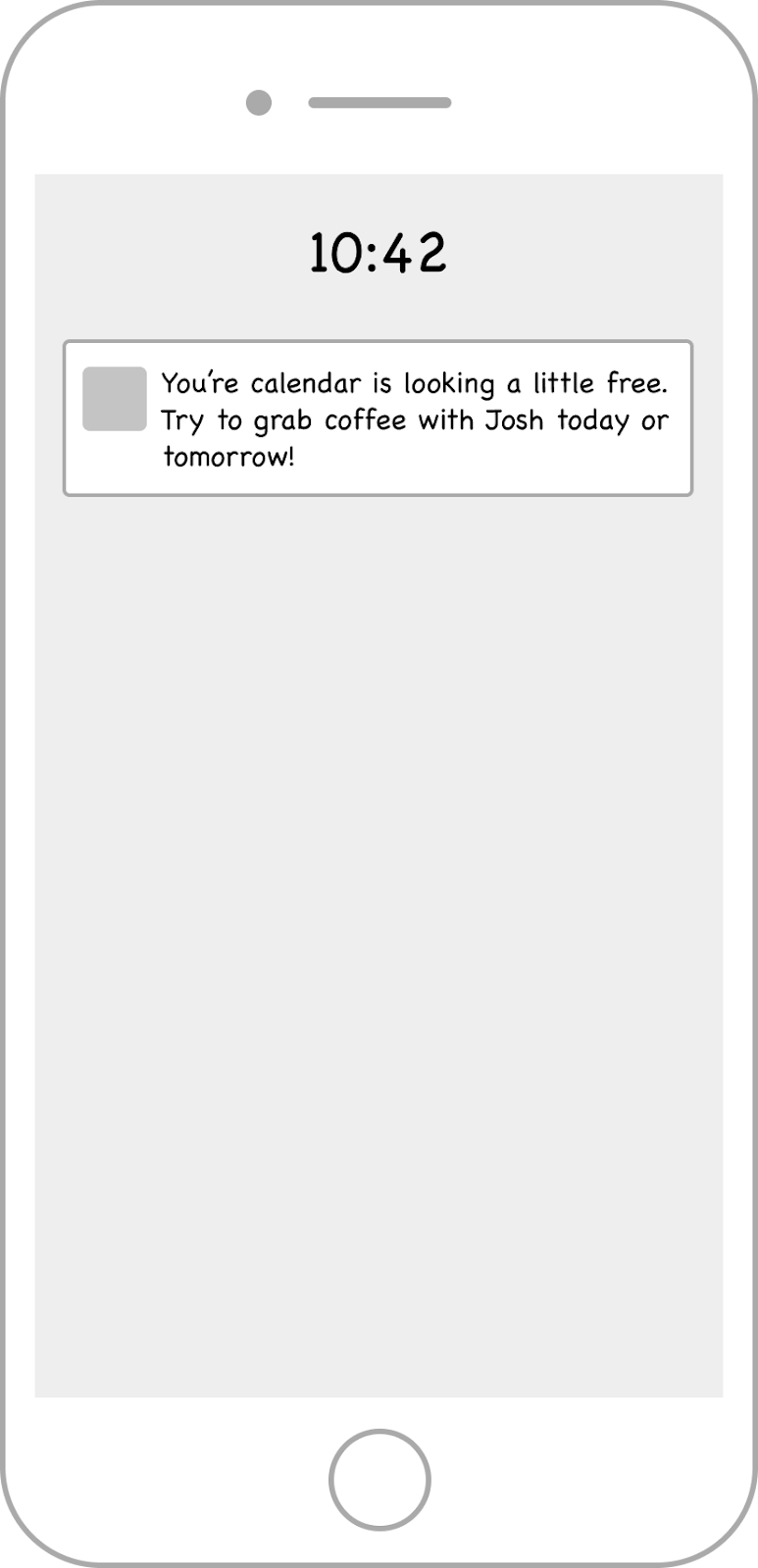

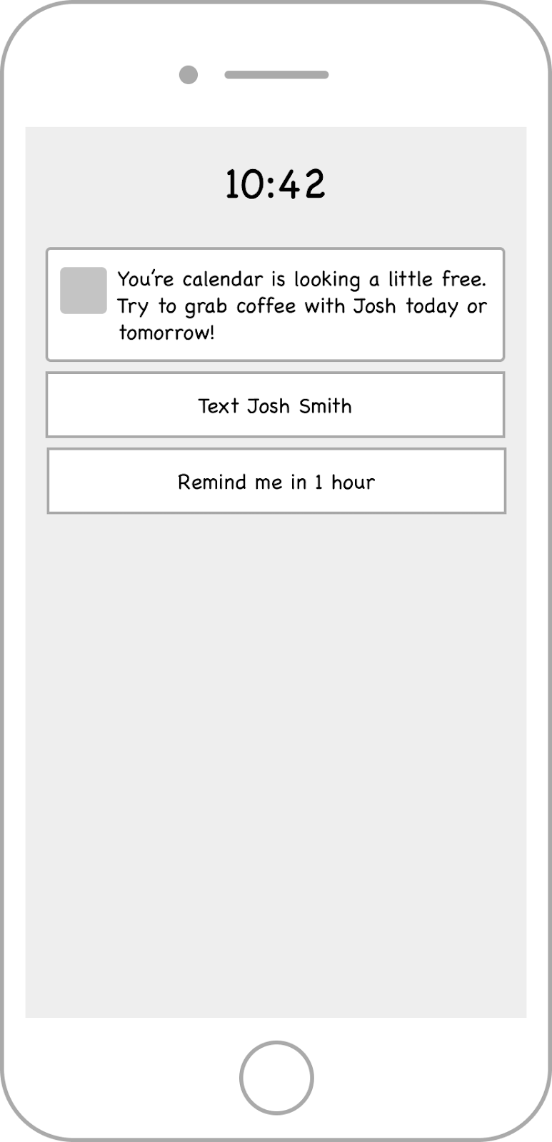
The notification screens are rather simple: they show the reminders a user has set up for themselves, notifications for an interaction, or nudges the app has shown. The screens above show the interactivity of a nudge notification our app has given the user. The user can open the notification directly in the app or they can use shortcut options to directly contact the person or have themselves reminded.
Grace’s Sketchy Screens:
Onboarding
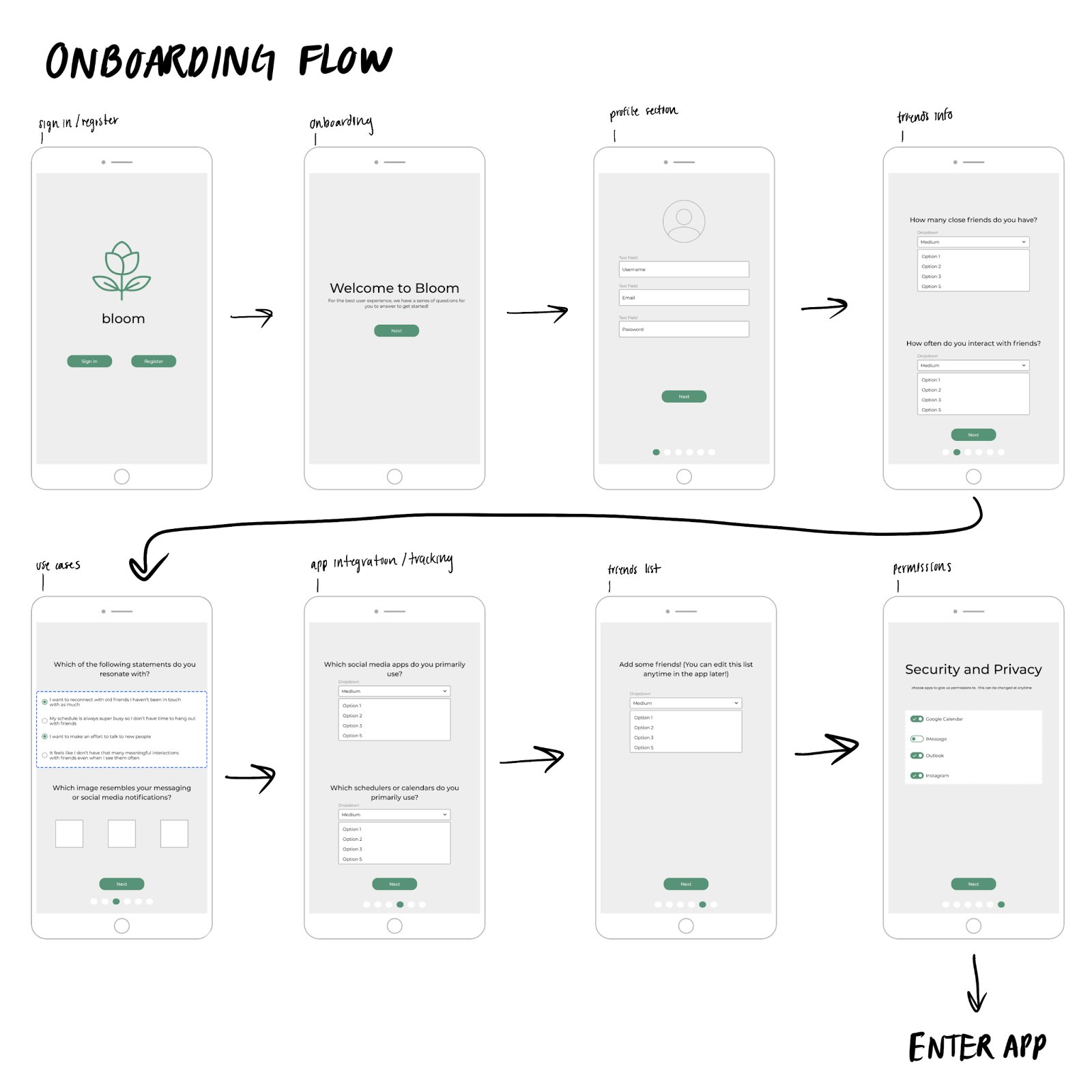
The onboarding screens are straightforward and what users would generally expect when first starting to use an app; they’ll fill out their profile information, and then a series of questions that we will use to help curate their experience. We will ask questions that give us a sense of their current levels of interaction and their interaction styles, as well as questions that will help us identify the type of use case the user is: whether they want to schedule things better, reconnect with friends, network better, etc. These will influence the types of prompts and notifications we send, as well as the scheduling flow and app interaction cadence. Lastly, they will be asked to enter their friends, which will interface with the friends section of the app and the functionality there.
Godsfavour’s Sketchy Screens:
Reflection
To get to the reflecting screen, a user either receives a post-interaction nudge prompting them to reflect, or they go to the screen of the friend with whom they had the interaction and click the ‘reflect’ button:
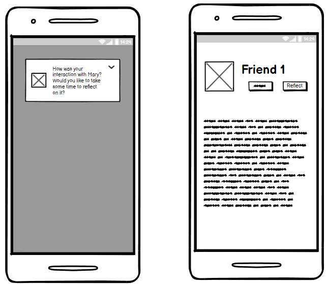
They are taken to the reflection screen:
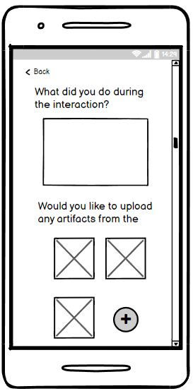


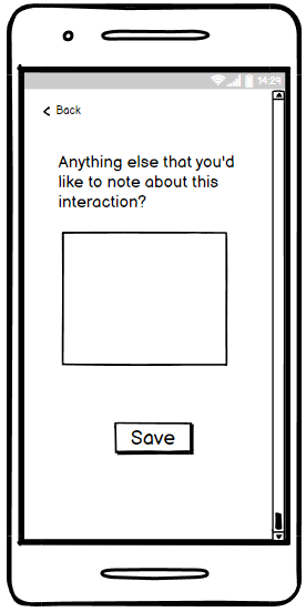
Here, we ask several questions about the interaction that are intended to help the user reflect on the experience.


