
Designing for Bloom, a home to foster and grow your friendships
Creating mood board and style tiles for our personal CRM
Our focus this week was on exploring the branding and personality of our app. After discussing the vision for our application and completing the brand personality sheet, we moved into creating a mood board that encapsulated our insights, which we then used as inspiration for our style tiles.
Some insights we wanted to reflect in our platform:
- Our target audience is busy (and probably stressed) university students who are too overwhelmed to hang out with their friends – we wanted to evoke a friendly, refreshing aura through our designs
- Our brand should be clean and clear, friendly but reliable – we want to help people navigate their schedules and days and focus on fostering their friendships
- A theme we wanted to focus on was organic growth – every user has a different use-case, but the overall goal is still to increase connectivity throughout friendships; what better way to represent this than to draw inspiration from nature
- We don’t want our app to be boring – hanging out with friends should be fun, not stressful or a chore, so we wanted designs that would evoke excitement with splashes of color and joy and life
Our Moodboard:

Throughout our moodboard, we wanted to convey a sense of invigoration and organic growth. We also wanted pops of color to add excitement and contrast and brightness to the overall palette.
Style Tiles:

Gray’s style tile:
I had a floral and natural and summery impression in mind when I was creating this style tile. I wanted the typography to be elegant but clean and gentle, without too many hard edges. The colors and icons would feed into the theme of growth and nurturing friendships over time, with accents that would add excitement. The color contrast keeps the visuals engaging yet light, and keeps users refreshed.
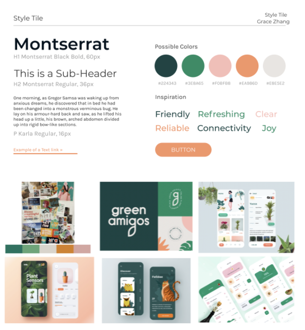
Grace’s Style Tile:
I envisioned a modern, sleek, yet still nurturing and reliable style. The prominent greens from our mood board in class really stood out to me as a good representative of growth, which is why I decided to make the two main colors both shades of green. The pink and orange serve as light accents to bring attention and delight to certain features without being too overwhelming for a busy user who already has high cognitive load. Overall, I sought to create a style that is warm and trustworthy, but still communicates ethos as a sharp, legitimate brand.
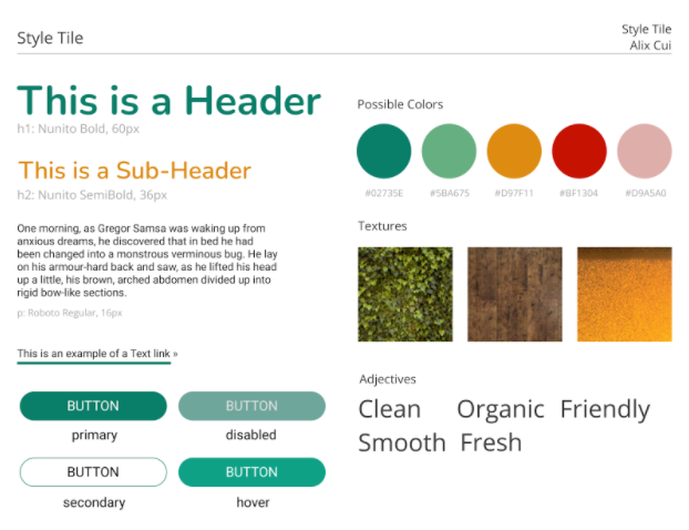
Alix’s style tile:
Hearing the word “organic” from many of my interviewers, research papers, tests, and data really showed me that people are both looking to grow and also form genuine connections and relationships. Therefore, I went for a primary color that has a green hue because green is usually associated with life, growth, and organics. As a secondary color, I went with a color that often complements green: yellow. If we were to use these possible colors, I would apply the 60-30-10 rule and use the yellow accent more sparingly. For the buttons, I envisioned a primary button with the primary color as the background, a disabled button with a gray overlay, a secondary button that was only an outline with the primary color, and a hover effect with a slightly different color. Some adjectives I brought in were words that reflect this growth and genuine theme. Overall, I want this brand to reflect something people will feel close to and reflect positively on.
Godsfavour’s style tile:
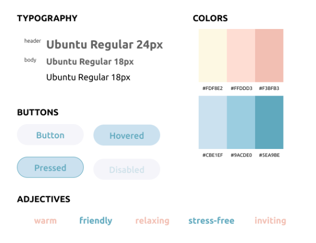
I focused on the busy college student with this one. I sought out elements that would communicate a stress-free environment and elicit feelings of calm for users. For font, I wanted something that was simple and elegant (specifically something in the sans serif family) and eventually landed on Ubuntu. For colors, I landed on light yellow, pink, and blue as the colors that I wanted to work with. I experimented with different mixtures and shades of these colors. Overall, I’m going with a minimalistic, warm vibe.
Synthesis:
Upon congregating and talking through our style tiles, we ended up really liking Grace’s and her modern and sleek take on a fun concept. However, we also wanted to add some more contrast between her accessory colors to add more definition and pop when we bring them together on the app. So, we changed some of them by adding more saturation and darkening the hue a little bit. Finally, we combined our button variations to get the ones below.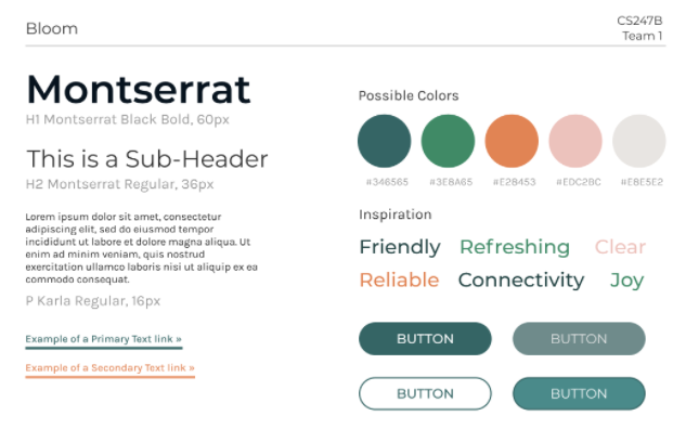


Comments
Comments are closed.