
Problem Finding
The pandemic has had a disastrous effect on mental health around the world. In a survey by the US Census Bureau, depression peaked at 30.2 percent in April 2021 from just 7.0 percent the year before [1]. Also, research has proven that practicing gratitude improves mental health and has lasting effects on the brain [2]. In a student well-being intervention study, a combination of stress management techniques and gratitude journaling is the most effective approach in heightening students’ levels of meaningfulness and engagement in their courses [3]. We want to design a good solution of building a journaling habit that makes us happier, calmer, and rejuvenated.
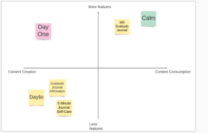
In the comparative research, we observed some good features, including cross-platform usability (DayOne), consistent and soothing color palettes (DayLio), streaks and reminders (DayLio) as nudges, clarity in onboarding (Calm), monthly mood tracking, and insights (5 Minute Journal), and integration with mainstream services like Google Drive (DayOne). On the other hand, packing too many features on a tiny phone screen (Calm) and not optimizing desktop apps for mobile were the main red flags (DayOne). For our app, we would like the simplest workflow yet provide users with the total freedom of creating content.
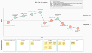
Storyboard and journey map of Iris the Irregular
To learn more about the behaviors of our potential users (sporadic journal writers or those with expressed interest in journaling), we launched a five-day diary study with eight participants, where for each day we asked participants if they recorded anything about their lives, the method and platform they used to accomplish this, and the type of content. If they did not record anything, we asked them for reasons.
As a result, people mainly wrote about takeaways, thoughts and emotions. More than half of the responses indicated people preferred photos or videos over writing, but the participants also think these records lack context and therefore cannot replace journaling. These insights prompted us to include photos into the wire flow.
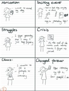
Followingly, we developed three personas. Iris the Irregular wants to journal but struggles with building a habit due to their busy schedules. Noah the Nullpointer does not see the point in journaling his mundane days and has a bad mental health. Peter the Photographer takes and shares photos but cannot reflect much of past thoughts due to the lack of necessary contexts. To get a more empathetic view, we created story boards of the personas overcoming their struggles, which helped us identify the potential elements of the app: incentives for people to keep journaling, interesting journaling experiences, and education of the benefits of gratitude journaling.
Solution Finding
After learning the utility of rewards, we decided to incorporate a reward system into the solution. Based on our interviewees’ preferences for more contexts in journaling, we decided to experiment with visual rewards.
For the intervention study, we sent a google form to our participants every night at 9 pm, asking them to choose a gratitude journaling prompt and write a journal entry with a photo and an emoji. We then make their input (text, image, and emoji) into a beautiful digital card which serves as an extrinsic visual reward. We hoped that the visual appeal of such cards sparks intrinsic motivations for users to keep journaling. The responses observed a higher engagement rate than baseline studies (users give more daily feedback). Participants’ feedback that their attitude towards journaling changed positively, indicating the effectiveness of our design. Surprisingly, a limitation of the study that people must share what they write with us became a characteristic that someone liked – she treated writing these journals as talking to a “silent friend,” a heartwarming experience to her. As a weakness, we wish to fix the mistake of not educating people about the motivation and benefits of gratitude journaling.
User story mapping helped us identify the causal relationships of the features and functionalities. In drawing the system path diagram and the bubble map, we ideated the basic operational logic of our app and the relationship of different pages, which helped significantly in designing the wire flows.
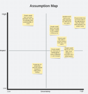
Assumption mapping and experiments served an essential role in eliminating wrong intuitions. After plotting a list of uncertain or arguable statements onto impact vs. uncertainty coordinates, we found that our final solution largely depends on the correctness of some major assumptions, such as the importance of the sharing utility and card designs. Thus, we tested against four major hypotheses by performing another round of interviews with our past participants. You can find the experiment designs in the images below.
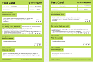
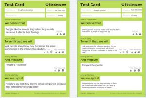
We learned that not all people are fond of mood tracking or representing their mood using emojis; People are more concerned with the essential functions of journal writing than some interesting design (AI or cultural topics) of journal cards; The majority of interviewees have a low willingness to share their journals. Therefore, we made all mood tracking features optional and minimized the sharing function with a simple API-embedded button.
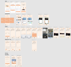
Designing the solution
After interventions and mapping, we moved on to the solution design phase. We used previous insights and learnings to create three major flows: catalog, editing, and mood tracking. We later drew more refined sketchy screens.
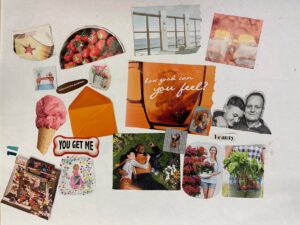
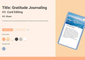
We wanted to create a sense of warmth and welcomeness for our mood board, resulting in many pinks, orange, and light blue. Followingly, we chose low saturated orange as the primary color and darker gray instead of black for texts. We included a shallow blue as a secondary color. With the help of our mood board and style tiles, we created a clickable prototype of our gratitude journaling app, Jorpy. After the usability tests, we incorporated more than ten feedbacks and made our app more user-friendly. You can find A complete list of past posts at the end of the document.
Combining feedback from usability testing, course presentation, and assignment submission, we have identified three major issues. The final prototype after fixing can be found here.
- Some icons are not immediately clear what they mean (navigation bar icons for catalog, streak icon, save button on editing page). We fix them by adding explanatory texts or replacing some with words.
- Some pages do not have back buttons, and users can feel anxious not knowing how to undo specific steps. Therefore, we added back buttons to appropriate places at the top bar.
- The page for mood tracking looks unwelcoming, inconsistent with the app UI. Users are also not sure what each number stands for. We added emojis to let users better assess their moods to fix this.
Moving forward, we will focus on helping our users keep the journaling habit in the long term. One idea is to incorporate light social functions so that friends and families can form a journaling community and become accountability partners. We also consider monthly or annual journal complications, of which users can choose to print out physical books.
Ethical Analysis and Broader Impacts
Ethical considerations play an essential role in our design process and the final application.
We changed the brand name from Jappy to Jorpy after learning about the triggering context of the word “Jappy” (Materialistic and shallow in a way stereotypically associated with Jewish women).
In week 3, we discussed nudging and manipulation and how they can be misused to the point that they abuse users’ wishes for well-being and force them into unhealthy habits. We want to motivate our users to keep journaling, but monetary rewards seem too external and do not align with the users’ internal goals using hard streaks. Therefore we decided to use rewards that align with their intrinsic interests in wellness and fulfillment, which eventually led to our digital cards. We would be opposed to punishment for missing a few days of journaling because that can stress our users. However, we know that some users may be motivated by the wrong reason (such as collecting cards) to keep journaling. But we do believe that formatting a habit of records would be beneficial regardless of the motivation.
In week 4, we discussed privacy which is our priority. That’s why throughout our diary studies, intervention studies, and assumption testing studies, we did not share the participants’ information with anyone outside of the team, even among participants themselves. We, not actual participants, created the digital card demos we presented in class and our prototypes. We are aware that the content of journals is highly private and sensitive. So we will be extremely cautious in bringing AI, potentially in the future, to create styles of digital cards that fit more with the journal’s content and make such customizability optional and strictly on the device, offline.
In weeks 6 & 8, we discussed design justice. What left an impression on us was how some icons and hints in designs offer some while creating disaffordances. We are conscious about choosing icons for our app to be as clear to users as possible, and they are the priority to fix for our app. We recognize that we do not have a built-in accessibility feature for multiple input forms. Editing is an essential part of our app, and we want all users to be able to create their digital cards. However, due to our limits in time and resources, we focus on visual inputs and outputs, which may be inaccessible to users with blindness. But we try to use gradients of colors to show elements in our app to be friendly to users with visual impairments.
Lastly, we discussed design for well-being in week 7. Though our app may not be perfect, it focuses on mental well-being and encourages self-reflection and gratitude. If widely adopted, it would be an app that promotes positive thinking, and we would love to see how it can help more people.
Conclusion
Behavior change is complex, and we often hold wrong assumptions as solution designers. We falsified so many of our preconceptions in assumption testing and had to reshape our flows significantly. The project informs us tangibly how complex real-world issues can get and the level of curiosity and commitment it takes to tackle the challenges. Next time, we will test our assumptions throughout the process to adjust the directions more promptly.
Past Works
2B – CS247B Topic and Screener
3A – Project Work for 3A
4A – Dairy Study Responses (cleaned).xlsx
4A – Literature Review
4A – https://highercommonsense.com/cs247b/comparative-research-for-gratitude-journaling/
5A – https://highercommonsense.com/cs247b/assignment/journaling/
6A – https://highercommonsense.com/cs247b/intervention-study-and-synthesis-2/
7A – https://highercommonsense.com/cs247b/project/team-2-designing-a-solution-assumption-mapping/
7A – https://highercommonsense.com/cs247b/wireflows/
8A – https://highercommonsense.com/cs247b/experiment-synthesis/
8A – https://highercommonsense.com/cs247b/project/team-2-mood-boards-style-tiles/
8B – https://highercommonsense.com/cs247b/team-2-sketchy-screens/
9A – https://highercommonsense.com/cs247b/clickable-prototype-and-usability-script/
10A – Team 2
References
- The Century Foundation. 2022. Mental Health Crisis during the COVID-19 Pandemic. [online] Available at: <https://tcf.org/content/report/mental-health-crisis-covid-19-pandemic/> [Accessed 14 February 2022].
- https://greatergood.berkeley.edu/article/item/how_gratitude_changes_you_and_your_brain
- https://journals.sagepub.com/doi/full/10.1177/1052562911430062


