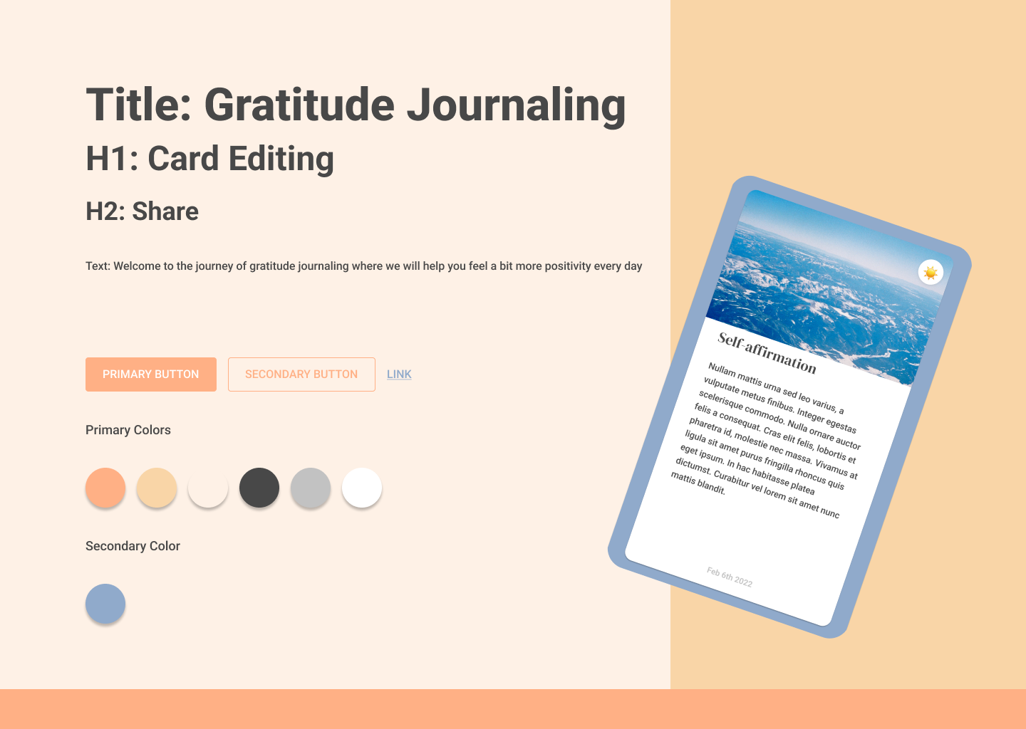
For our gratitude journaling app, we want to create a sense of warmness and belonging in the interactions. We also want our users to feel like recording spark moments of every day. Therefore, we chose orange and the primary color. We know that our users will upload a lot of photos in their journals and we will create many different cards with different themes and designs; for this reason, all of our colors are very low-saturated and pastel. We chose Roboto as our font because it’s rounded and sans-serif, it feels like still or indifferent but more welcoming. We are also thinking about lots of user generated texts to be presented on screen and use darker grey, lighter grey to differentiate different levels of importance in texts.
Mood-board: 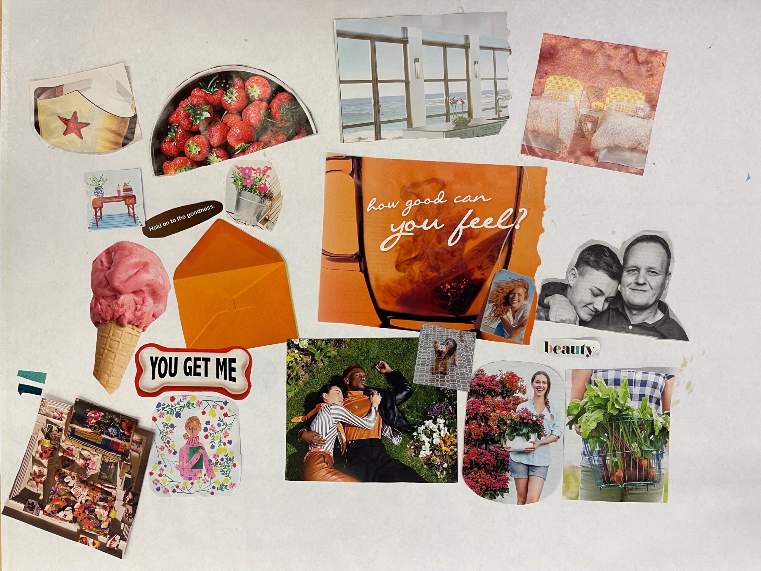
Style-tile: