In this blog, we present our wireflows to show how the users can navigate through our app.
Note: We are not focusing on the login/onboarding page at this stage of the project. The login function can be implemented with standard API and the onboarding page will depend on our final editing page design.
Editing
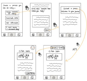
There are three buttons on the bottom, corresponding to the catalog page, the “add a journal entry” page, and the profile page. After launching (by default) and when the user clicks on the journal entry page button, they will be asked to choose a prompt they would like to respond to. Then after writing down some text, a photo and an emoji that speak to the content will be requested from the user.
Editing to cataloging transition
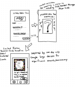
When the user finishes editing their journal entry and clicking confirm, the journal becomes an aesthetically pleasing card. These cards are mini-art items meant to turn mundane journals into presentable, shareable art pieces.
One way to design these cards is with limited edition, themed designs. Imagine writing a journal entry on Dia De Los Muertos, an important Mexican festival. Your card gets turned into a design inspired by the event. Perhaps you never knew about this festival, but now you do. In this way, the app introduces you to global culture, and the anticipation of learning something new through writing journal entries brings you back.
Another way to design these cards might be to ask the user about their favorite art style (impressionist, abstract, trending topics related, etc.) and feature those designs in their cards. The user can swipe through a few designs and choose what they like the best.
Weekly/Monthly Recap with Mood tracking
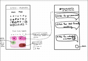
We want users to look back at journal entries they made in the past. In our diary and intervention studies, many users mentioned that they would like more motivation to look back at past journals. This is due to the high friction of looking for a particular entry in their diaries. We came up with the following solution:
Weekly/Monthly Recap with Highlights, Resilience, and Helping Hand markers on a calendar
- Categorize entries into three chunks: Highlights, Resilience, and Helping Hand. Highlights are your best memories/experiences of the month. Resilience is evidence of small wins on tough days. Helping hand is when you do something kind for someone.
- Create a heat map to reflect the overall mood throughout the month. Mark the map with highlights, resilience, and helping hand markers.
- Make the markers clickable. Clicking on a marker leads the user to a list of entries of that type. For instance, clicking on any “Highlight” will take them to a screen with “Highlights of the month” (clicking on a dated highlight will open that particular journal entry).
Questions under consideration
How do we categorize the entries?
- Should we use an AI that automatically classifies your entry to one of the three categories?
- Should we start with mood tracking BEFORE the write journal and give them journal prompts based on their mood? For example, a low scoring mood -> more questions about small wins/evidence of resilience; High scoring mood -> More questions about highlights + favorite moments.
- Should we allow users to self-categorize their entries instead?
Emoji calendar:
- In the intervention study, users reflected that putting down emojis relevant to their day is fun. This inspired us of an emoji calendar that lists their emoji entries.
- The interaction with emojis is perhaps a low-friction way to keep new users engaged.
- When they don’t feel like writing, they can just put down an emoji with a few words.
- Wordle gave us more inspiration for sharing functions, where a user shares their weekly emoji map on Instagram, and their friends can guess what happened during the day. The sharing process may increase the virality of the app.
Catalog page
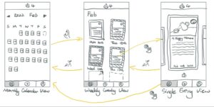
Ideally, the users can view all of their past journal entries presented as digital cards, with the choices of different ways of listings. To encourage our users to keep journaling, there are streaks of the number of days they have kept journaling, and “blank cards” in place of days missing an entry.
Page 1: The monthly calendar view displays all journal cards generated from past entries in the month displayed. At the top of the page is the streak number. The user can zoom in to the second page showing the weekly view of journal entries.
Page 2: The weekly view shows seven entries a week (some are blank due to missing). If a user clicks on a specific card, that single card will be displayed full-screen.
Page 3: The single entry view displays a single digital card. Users can swipe left and right to view all journals. Users can share a card by tapping the button on the bottom of the card. The sharing function will be implemented using Apple or Google APIs. Users can also tap the bottom-left catalog button to return to the monthly calendar view or zoom out by pinching in with two fingers.
Questions under consideration
- We decided to avoid making our app into a social media product and focus on journaling functions. However, we are not sure about how important the role of the sharing function is and how much we should emphasize it.
- Through the monthly calendar view, we aim to help people build a sense of achievement after they write journals in a long term. Therefore, we decided to replace the dates in the calendar with card entries or emojis. However, we are not sure what those blank spaces should look like for a new user.


Comments
Comments are closed.