
Sign In
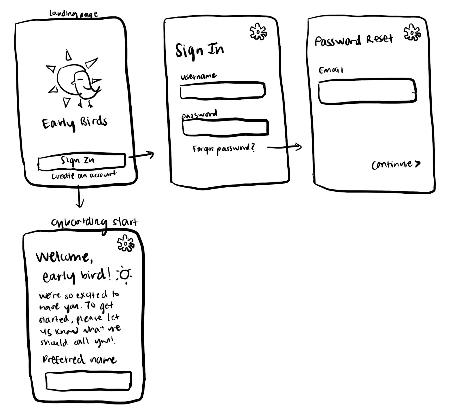
Our landing page contains the Early Birds logo above a sign in button, which is displayed in a bright color to draw users’ attention, and an option to create an account. The sign in page prompts a user for their username/email and password, and it also allows users to reset their passwords in case they forget. Creating an account leads to onboarding, which we’re excited to flesh out later this week. We intended to make our sign in and onboarding experiences as seamless as possible while still being secure and conveying warmth.
User Profile

A user profile page displays their name, streak progress, badges, insights, and a motivational message that changes every day. It’s meant to be a cozy place that reminds a user of their progress and accomplishments, in addition to sharing data insights that can help them notice trends in their morning behavior. Since we want this page to be uplifting, we haven’t decided if we will include data insights about time spent on distracting apps, but if we choose to pursue this route, we will be particularly intentional with our design in order to not evoke feelings of guilt from our user. A user can click on the badges and insights sections to see more details. Fun detail: the bird in the image on the main profile page can carry badges earned.
Tasks
Tasks are the bread and butter of our app, as they help users diligently plan out their morning routines and track their progress. Users can plan tasks as far in advance as they would like, but the app asks that, at the very latest, they input tasks for the next morning the evening before that morning.
The task home screen, displayed in the upper left hand corner, exhibits a user’s tasks for the day, which they can choose to sort by priority, custom order, or randomly. If the user is in priority view, which means the tasks that they mark as priority appear first, completed tasks and other non-priority tasks will follow. If they are in custom view, the tasks will be shown in their arranged order, still with completed tasks as its own section. If a user opts for the random selection, then the app will use AI to generate a task sequence it thinks will be most effective and satisfying for the user. In all three views, unfinished and finished tasks are separated to help users see their progress and clearly identify what needs to be done.
From the task home screen, users can navigate to the calendar, which shows them a brief summary of planned tasks for days in which they mapped out. This screen mimics Google Calendar – users can’t quite see everything due to phone size constraints, but they can still get a glimpse into important tasks. Calendar view also makes it easy for users to plan tasks on a certain day; a user only needs to tap on the day to view their existing tasks and add more. Days in which they finished all their tasks will also turn a different color, one that speaks more to user preferences, helping users visualize their progress.
From task home, users can also click on a task (not its checkbox) to see notes they’ve written for a task, since some tasks can be rather complex. They can also quickly view which days the task is scheduled on and modify them if necessary. Furthermore, users can make a custom selection that allows them to make the task a priority, move the task to a different day, and/or set it as recurring. They can mark the task as completed by clicking the checkbox next to the task title. Our add-task page currently mirrors the individual task view page because new and old tasks can always be modified. The only difference is that the new task is unnamed. We’re still thinking through the flow and may circle back to this screen.
Finally, users can pull up templates from task home and create them from the templates page, which shows groups of tasks that users have intentionally pieced together. Templates are really handy because people can have niche routines that repeat during certain days, weeks, or months. Users can always create new templates from this page and add them to preferred dates.
Streaks

Our streaks feature is meant to encourage the user to continue to improve their morning routine, so we want to make sure to highlight the current streak wherever possible in the app. When the user completes their morning routine (checks off the last item in the list), we will show the user a pop-up message displaying the current streak, how long they spent on the routine, and any additional information worth highlighting. We hope that displaying this summary information with highlights will make the user feel accomplished and motivated to keep up the good work. In the pop-up, we offer an option for the user to go to the streaks history screen.
On the streaks history screen, the user can see their current streak, this week’s stats, and past weeks’ stats. We display just the current streak number by default to keep the screen clean, but they can tap on the upside-down triangle to see more information such as longest streak and morning completion rate. We show the number of days in the current week they have completed their morning in the form of a sun with 7 total rays, with the number of colored rays corresponding to the number of completed mornings this week. The user can scroll down on this screen to see the list of tasks they planned and completed each day, grouped by week. We believe this is an intuitive way to show the user’s history without displaying too much information at once.
In the event that the user is unable to complete one of the tasks they planned, we want to encourage the user to just try again tomorrow instead of feeling bad about it. Therefore, we show the user a pop-up letting them know that they had lost their current streak and also offering to add an extra day to the user’s new streak if they’re able to complete the missed tasks tomorrow morning. If the user accepts the challenge, we’ll show them a confirmation pop-up (with an encouraging message) and offer shortcut buttons to the to-do list screen and streaks history screen for quick access. We believe that this would incentivize the user to get back onto the streak instead of losing motivation due to losing the current streak.
Notification Manager

The notification manager is responsible for blocking notifications from certain apps and holding them for later as pending notifications. Initially, notifications from all of the apps are blocked by default. If the user deems certain apps as important, they can enable notifications for those apps in the notification settings. For the blocked apps, all the notifications would be hidden from the user in the morning. Once the morning is over, the hidden notifications would be released. However, at any point during the morning, the user can visit the notification manager screen on our app to check the hidden notifications. Our goal here is to keep users away from prompts and nudges from other apps that may create distractions in the morning. The period of “morning” will be defined by the user. By default, we will release the hidden notifications at noon unless the user explicitly sets a different time.
While designing the UI, the simplicity and usability of the screens were taken into consideration. On the first screen we tried to convey the message that there are two main tasks that the user can perform on the notification manager – 1. set the notification settings for the apps, and 2 – check the hidden notifications. In order to avoid clutter, we only show three apps and three notifications on the main screen and provide a button to see all apps or all notifications. This design is based on Google’s “App Settings” on android phones. We use clustering with proximity and whitespace to separate the panels for the two tasks. On all of the screens, we extensively make use of whitespace instead of borderlines. We used simple grids consisting of three columns where the buttons, titles, and icons are placed either on the left or right column and the other texts take the middle column. As you can see, the middle column is wider than the left or right column. We plan to iterate the design as needed in order to make it the most effective.
App Blocking

For our whitelisting feature, we envision users navigating to a general settings screen through the use of a settings icon and from the settings screen, navigate to a whitelist screen where users can search for and toggle apps they wish to be accessible during their morning routines. For our warning, we envision a popup that counts down from 15 where the user must wait the whole 15 seconds before accessing an app that is blacklisted during their morning routine.


