
Team Axolotl: Angela Mao, Caroline Tran, Casey Nguyen, Shina Penaranda
Individual Mood Boards:
Angela’s Mood Board:
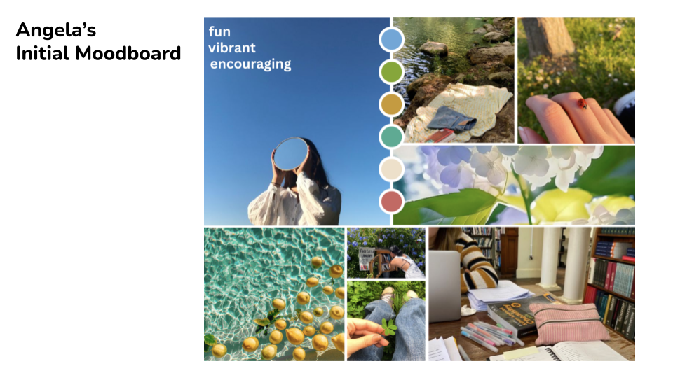
Description: The vision behind this mood board stemmed from the words “fun,” “vibrant,” and “encouraging.” As many shopping apps are meant to entertain and capture the attention of its users, we wanted this vision board to capture a sense of adventure and fun with bright colors, so that users would feel just as satisfied visually using our app. We used photos of people doing activities that are fulfilling and thoughtful to express how our app is meant to remind people to think of the bigger picture when shopping. This app is the right fit for the prototype because it is the perfect mixture of fun and mindful. Some potential cons of this mood board include too many colors fighting for attention and difficulty interpreting it in terms of shopping behavior, while some pros include the playful/entertaining mood it has and the room for creativity in terms of design/color palette for an app.
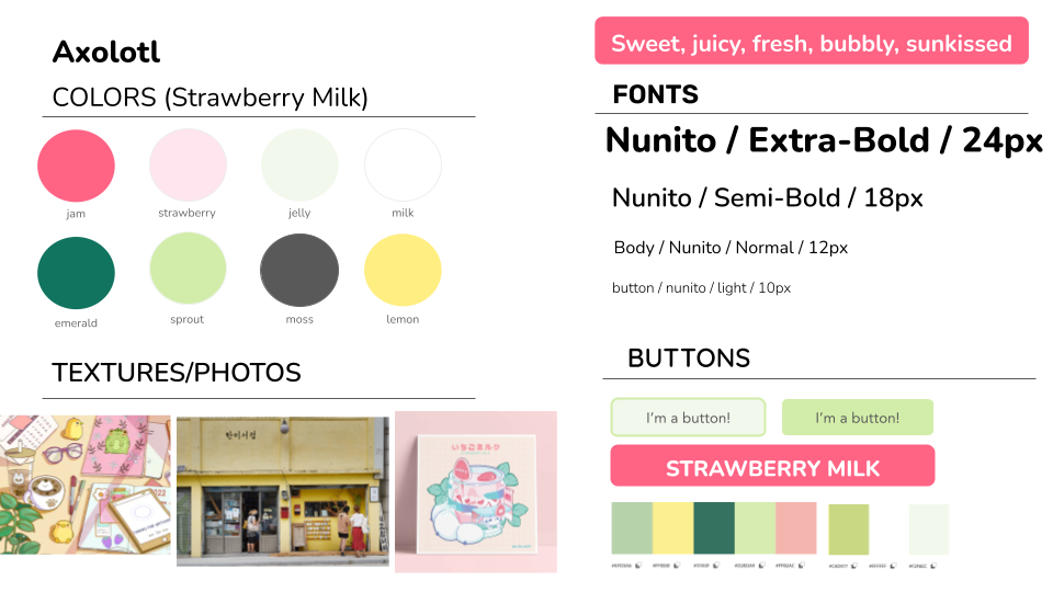
Caroline’s Primary Mood Board:

Description: When thinking about dream closets, I strongly associate them to bedroom spaces – one that is personal, forgiving, and comforting. The carefree attitude in wearing whatever I wanted to wear, was something from my childhood that I wanted to recreate in this space. The strawberry milk and matcha mood board communicates similar nostalgia as that of a childhood bedroom with sweet and warm notes. I targeted sensory elements like smells that might trigger childhood memories. In this case, we have the sweet strawberry fragrance as well as the comforting smell of sun hitting bed sheets fresh from the dryer. There’s also the crisp crunch of pocky sticks and tangy smells of citrus from lemons. Although warm and soft, this mood board is also bright – creating a light and less formal environment that encourages self-confidence in the outfits they wear. Building radiating confidence in their own closet with the carefree nature of a child, is the core message I hoped to deliver with this mood board.
Caroline’s Secondary Mood Board:

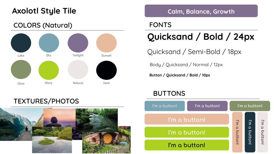
Casey’s Primary Mood Board:

Description: The vision behind this mood board is rooted in calmness, balance, and growth, drawing on nature’s serene and restorative qualities. The images of tranquil landscapes, balanced stones, and flourishing greenery collectively evoke a sense of peace and continuous development, aligning with the prototype’s aim to promote well-being and personal evolution through its use. This mood board is particularly fitting for a prototype focused on mindfulness or self-improvement applications, where the user’s journey mirrors the natural progression and balance depicted in the imagery. Some pros include the universal appeal of nature’s peacefulness which can induce a sense of well-being, and the visual narrative of growth may encourage users on their journey of self-betterment. However, the serene and singular focus on nature’s tranquility risks a perception of stagnation and may not resonate with users seeking a more dynamic or varied thematic experience. This could potentially narrow the prototype’s audience as the theme of growth and calm might be too subtle for an application that requires more direct, actionable engagement.
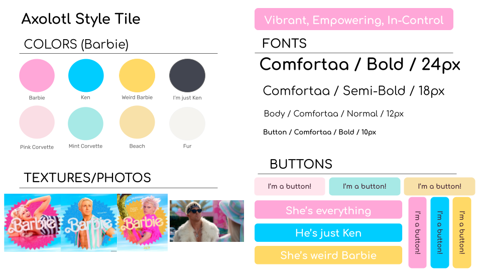
Casey’s Secondary Mood Board:

Description: The vision behind this mood board is bold self-expression and empowerment, channeling the iconic Barbie aesthetic that symbolizes the freedom to be anything. The vibrant colors, fashionable clothes, and eccentric vehicles reflect a dynamic and in-control lifestyle, making it an ideal fit for a prototype aimed at inspiring confidence in its users. The Barbie aesthetic is also thematically tied to consumerism which our prototype aims to address. Some pros include the fact that the vivid and playful elements can energize and motivate, and the empowering message and the nostalgic connection to a cultural icon can foster a unique and memorable user experience. However, these elements may also be perceived as overly niche or specific, potentially alienating people who do not resonate with the Barbie brand’s specific cultural imprint.
Shina’s Mood Board:
Description: The vision for this mood board was mainly a feeling that calms the user in the face of their excitement at buying new clothing, which could otherwise easily sweep them away. We want to encourage the user to feel satisfied with what they already have and behave in a more rational way by staying in control of their emotions, reining in their impulsive shopping behavior. This overall feeling seemed like a good fit for the prototype since the app’s main purpose would be to encourage the user to be more mindful about expenditures, rethinking new clothing purchases in particular, and help them be more content with using what they already have in their wardrobes. An advantage of this feeling is that it returns a sense of clear-mindedness and self-control to the user, but we know that our target users use online shopping as a way to take breaks, relax, and reward themselves, so the calming aspect may backfire by encouraging more shopping and thus prove itself to be a disadvantage for our purposes.
Synthesized Moodboard:
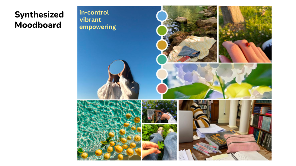
Justification:
Our team chose this mood board (Angela’s original moodboard) because of its cohesive representation of control, vibrancy, and empowerment—qualities that mirror our prototype’s ethos and goal to curb overconsumption. It balances serene nature scenes with lively personal activities, capturing the dynamic our app aims to encourage which active self-improvement within a peaceful life framework. This mood board aligns with our goal to inspire users towards an empowered lifestyle, carefully balancing a rich color palette with images that promote well-being. While the variety of elements and vibrant could risk visual overload, the mood board’s potential to resonate with users broadly justifies our choice.
Style Tiles
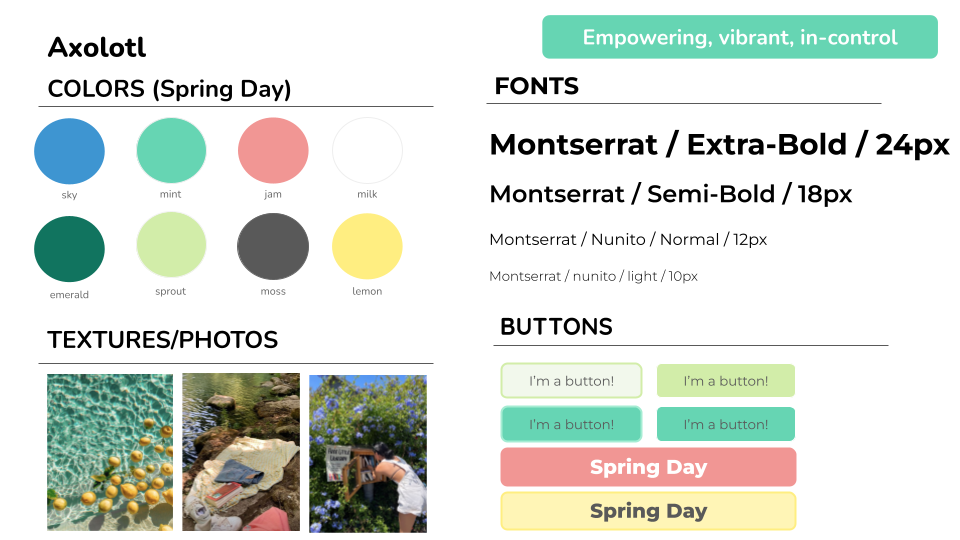
Synthesized Style Tile (created by Angela, combining aspects from her original mood board and other individual style tiles)
Caroline’s Primary Style Tile:
Caroline’s Secondary Style Tile:

Casey’s Primary Style Tile:
Casey’s Secondary Style Tile:
Shina’s Style Tile:


