Personal Reflection
Before this class, I had a narrow definition of design, as well as of behavioral change. I viewed designs as an advanced and highly time intensive creative process, often within the confines of certain rules and regulations. At the same time, behavioral change seemed like an extremely energy consuming attempt at making significant changes to one’s existing daily habits at structure. All of this was changed through CS 247B.
Within even the first class, I was struck by the power of minuscule interventions – how something as seemingly small and insignificant as putting a fly sticker in a urinal can foster mass behavioral shift. The level of thought and creativity between this design choice opened my perspective to the fact that simple designs are good, if not better, and that in an ideal case, they are so fluid that it facilitates easy and almost subconscious behavioral change.
This made me start reflecting on small changes I can make within my life. When reading about the Science of Habits, I appreciated another small design that triggers a larger behavioral change; as someone who has been meaning to eat more fruits, I reflected on why I haven’t been able to do so as much since moving into Munger with my own kitchen. I realized I often forget I have fruits in my fridge, prefer to eat bite-sized cut fruits, and am in a rush so I usually don’t cut my fruit. The reading inspired me to spend the extra dollar to buy cut fruits. This turned into such a habit for me that I had to start cutting down. When the conversation about the reading came up in class, I was actually munching away on my bowl of pre-cut pineapples! The removal of this minor barrier of cutting fruits made me gain a habit that I had been striving for.
From a more academic and technical standpoint, I expected this class to be similar to 147 – lots of prototyping, testing, and iterating. While I feel like we still got the value of doing all of those design steps in 247B, the fact that we came in with a conceivable notion of what each step afforded us more time to reflect on how they informed our design process. I really appreciated that we had more time to review data from user interviews, synthesize them, brainstorm solutions, and even do user testing on our design. I hadn’t realized how valuable some of these strategies are until this course. While I had very minimal Figma experience coming into the course, employing these strategies helped my team and I gain an understanding of design changes we should make, both in terms of aesthetics and user flow, to improve the UI.
However, a problem that we encountered throughout the project was that we made several assumptions about how users would interact with our app. Although this was asked of us and we tested them to validate that they would hold, I feel that there are still some which may not hold for some users and result in dramatically unintended usage for our app. For instance, the fact that we are providing an app to minimize distractions has the potential to give rise to even more distractions (as our tool does not do app blocking). Given more time, I would resolve this concern with more thorough assumption testing of a varied population. Our participants knew the intention of our app, and thus their focus levels and reported effectiveness may not be representative of the true effectiveness of our app.
Another problem throughout the design process was our limited creativity and scope in brainstorming initial behaviors. The behaviors we wanted to change were anchored to our own daily habits and behaviors, which, as a subset of university students, is very homogenous and narrow. Given the opportunity to re-do this project, I would focus on a target user audience and persona that is specific, and then empathize with them to find behaviors they’d like to change. I feel this would have required more user understanding, empathy, and could result in a more unique solution than those mostly relevant to our own experiences as designers. This would perhaps be more interesting and useful than creating and relying on user personas and journey maps, though those were informative for our solution as well.
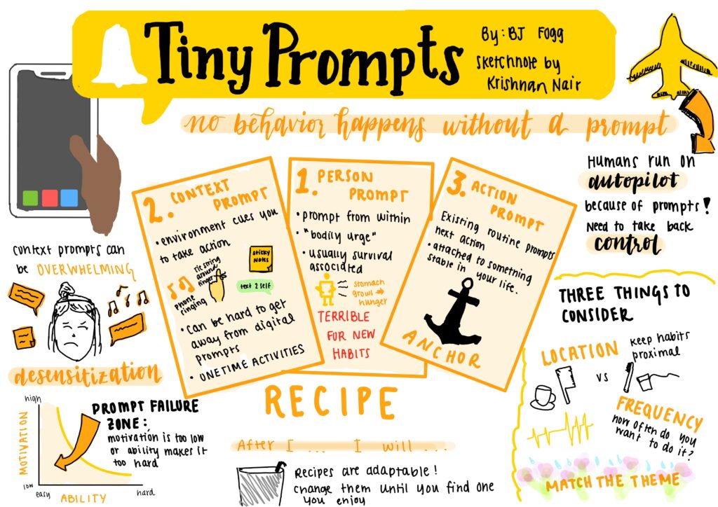
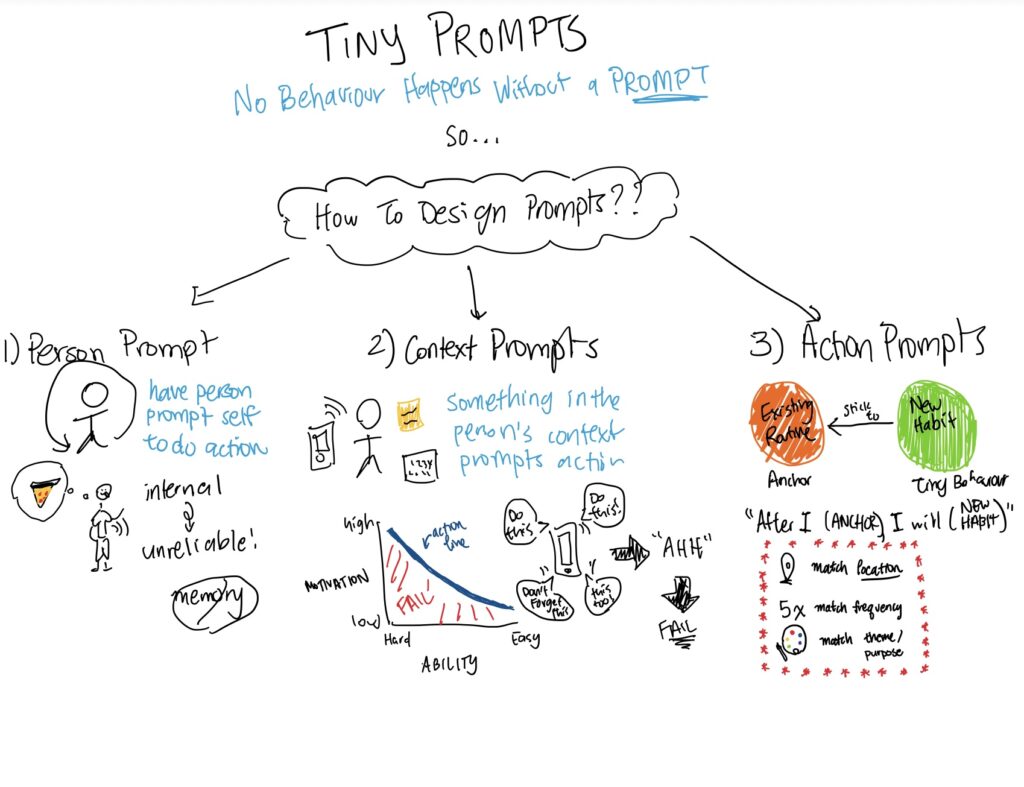
Throughout the beginning of the class, there were initially some ambiguities on deadlines and assignment goals. The moving parts were more easy to navigate with timelines that the teaching team shared. Several of the exercises and tools are things that I would definitely employ again. Aside from obvious improvements in Figma skills, I developed an appreciation for user testing, which was extremely informative both in class with peers and with participants from our target demographic of high schoolers. After working with the product and design for a while, I realized that my teammates and I developed a focused lens of what it should look like. It was so helpful to hear feedback and critiques from outside perspectives, who brought obvious improvements to light. For instance, Amy highlighted the importance of creating a sense of urgency on the “finished timer” page to trigger users to restart a timer for their work session. Rather than use our initial plain, white page, we instead animated growing concentric circles to create a sense of urgency. I also really enjoyed creating sketchnotes, which forced me to draw connections in my readings and process the content in a way that I wouldn’t have otherwise. Another useful thought exercise was dark horse brainstorming. This was the main way that our team was able to break out of our narrow, individually minded brainstorming and think of diverse solutions. Even though the dark horse solutions aren’t things we’d necessarily create as is, they definitely inspired more creativity and openness.
Concurrently to this course, I am enrolled in the Accel Leadership Program and found the curriculums to be very aligned at times. While we were working on creating a product for a population in CS 247B and discussing ethical implications on an individual level, the ALP program often discussed the implications of shipping that product and ethics on a greater scope. I was really able to conceptualize the interplay between the user, the product, the design, and the subsequent interactions that result.
Throughout the project, we became aware of a lot of the ethical considerations that we should be mindful of when designing for our audience of high schoolers. With regards to nudging, we erred on the side of simplicity and caution by creating nudges through blank space and implicit color or flow. For instance, on the home page, we nudged users to click start on the timer and minimize distractions by merely displaying the timer duration and start button. We also adopted a moving gradient approach on the timer itself, and growing concentric circles on the “start session” page to create a sense of passing time and urgency. Another important consideration was privacy and interface design. For instance, since a user profile was not essential to our app functionality, we decided to eliminate this. We do not enable profile creation to maintain our value of minimal invasiveness and time consumption, with the only personal information visible being one’s own focus progress tracking.
I now realize that everything is a design. I hope to remember this in ten years. Design then informs how we interact with it. I’ve liked expanding my sense of how everyday objects or designs play into our behaviors, and hope I’ll continue to do so. It is also important for me to remember that small designs can make big impacts. Again, a design does not have to be a grand, costly creation to foster meaningful change. It is also important to consider how different people would interact with a design differently, particularly if a design can exclude individuals or prevent certain demographics, such as disabled individuals, from engaging with it comfortably. On a basic level, this may include color schemes of an app, and on a slightly larger scale, may be the UC Santa Cruz campus’ abundance of stairs. Having realized that even fast iterations can be meaningful, another important evolution in my way of thinking is that all designs should be viewed as a work in progress. It is easy to get attached to something you’ve thought deeply about and spent time to create, but viewing designs in flux enables constant improvements.
Next time that I get to work on a project like this, I hope to remain open-minded at all stages, seek out diverse thoughts and opinions, change reasonably but rapidly, and trust that no matter how much time I may have spent working on something, I should truly internalize the fact that it is never complete.


