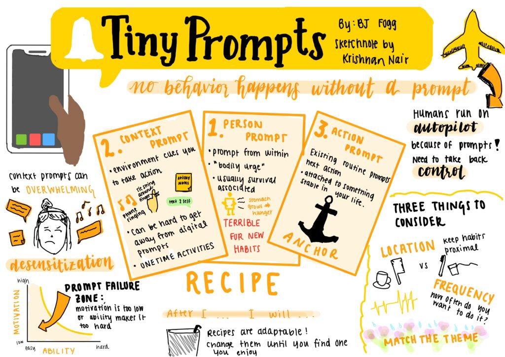
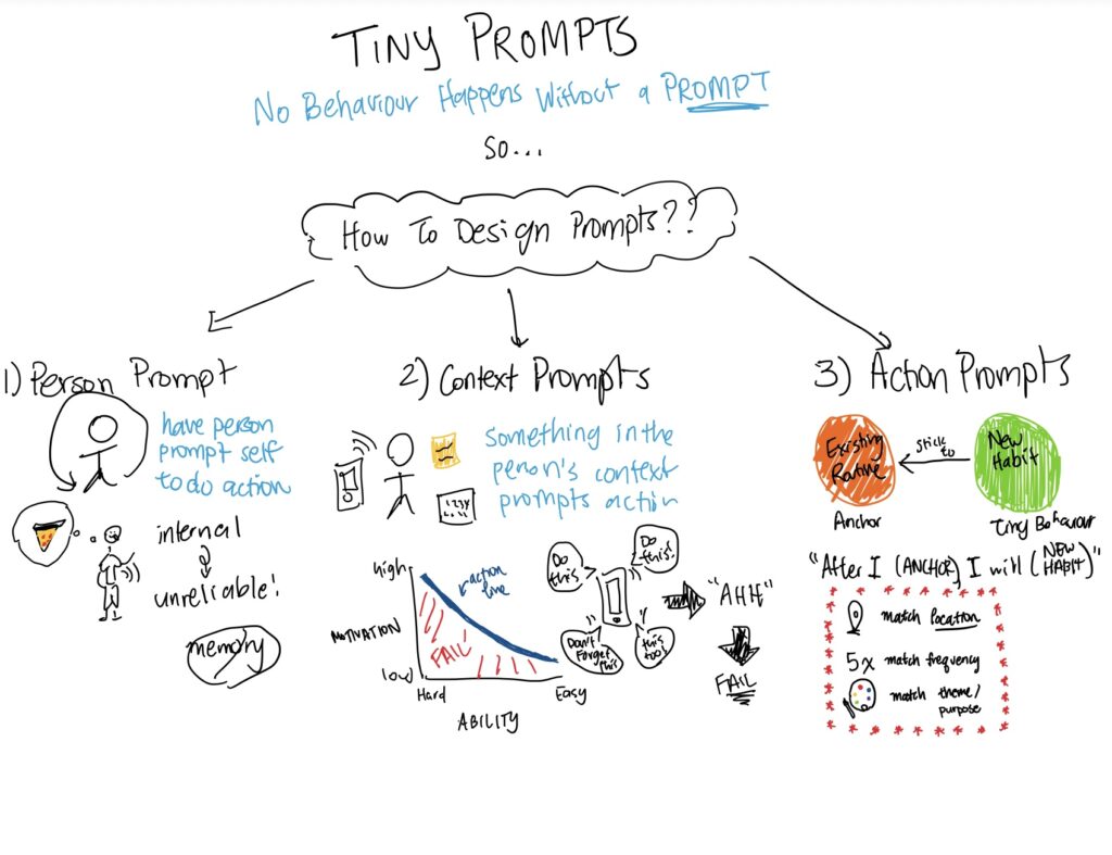
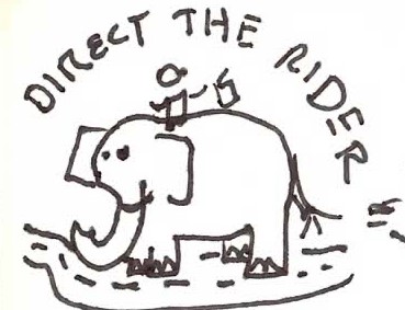
Before coming into this class, I fully expected it to be a mirror of CS 147. I expected every HCI class in the coterm to follow the same formula, taking us down the same 4-step design process. In a way, I was right about the assumption that a lot of our approach would follow the general framework of CS 147. Still, it was incredibly refreshing to get presented with some new approaches to designing for users. It was nice to get some background on why certain design choices worked for some users but not others, and it was nice to learn practical strategies for designing with a goal, as opposed to the much more general approach Professor Landay takes. As a Communication major, many individuals’ psychological principles and motivations were familiar, but it was nice to connect my Master’s degree and my undergraduate degree.
To some extent, this class has changed the way I’ll conduct need-finding interviews in the future. I found the interviews at the beginning of class an interesting exercise to flex my interviewing muscles. Still, I do wish some of the interview experience related to the project extended beyond our friend groups. Between the different diary studies and the interviews, I felt like selecting friends to undergo the process yielded valuable data but somewhat limited our perspective when it came to ideation. I feel like I made progress on my ability to interview others, but I wish I would’ve gotten a chance to conduct some “real” interviews, but not doing so was my own fault.
The intervention study was my favorite part of working on the group project. I’ve always been a sucker for academia and well-designed studies, so I thoroughly enjoyed creating an experiment and drawing conclusions from the results. Doing it with a group was interesting since I think we all had our approaches to the study, leading to results that were less conclusive than I wanted. However, it was still a fun experience to create and conduct a study that at least minimally showed how to affect user behaviors.
When it came to the methods we applied for design architecture, I felt like none of them worked for our solution as well as we hoped. Our solution appeared too simple, and further ideation would’ve ventured dangerously close to creating a social media app. Because of the simplicity of our solution, it felt like we were filling in the blanks to get a good score on the rubric regarding MVP features, bubble maps, and system paths. That may have been my fault for not engaging with the templates as thoroughly as I should have, but it feels like that step may have derailed some of the direction we had in mind for the project – almost like our team left more directionless than we were coming in. While no other specific examples come to mind, it feels like the class was structured around creating a mobile app when our solution would have worked much better as a widget or as a browser extension.
Our final solution still feels a little unresolved, given that we always intended for it to be two users sharing a flower that represents their relationship. When we go to the step about ideating potential pitfalls of our solution, we couldn’t devise a way to avoid accidentally creating an environment for one-sided, toxic relationships to thrive, where one user would nurture the flower for both friends. We only had an hour of in-class time to brainstorm the solution, so we took the easy way out and built our prototype around creating a one-sided depiction of the user’s relationships instead. From our research, I don’t think this works as well in practice, and if we had more time, we could have come up with a more creative solution. This would be the next best step to take our project to the next level.
My favorite parts of the project design were those at the beginning, between identifying the problem space and the intervention study. I enjoyed keeping potential users centered at every step of the way. Creating personas and deferring to them was a decent approach, but it might have been more beneficial for our solution to conduct multiple rounds of interviews or usability testing, given how much our solution changed between the ideation for the intervention and the usability testing. We took many productive steps between weeks 2 and 6, and I wouldn’t have minded spending the last four weeks iterating over those steps, an unrealistic approach to a 10-week class.
Our solution was based on a form of nudging that could easily fall into the manipulation category if looked at through a particular lens. We are pulling out all the stops to get our user emotionally attached to a digital representation of something that reportedly means a great deal to them (their friendships). If they fail to hold themselves accountable, our app essentially tortures an object we conditioned them to care about. According to our ethics readings and discussion, the fact that the user consents to participate, has an exit opportunity at any point, and we are doing it with the best interests of the user in mind would suggest that this is not unethical manipulation. Nonetheless, I think our group walks on a thin line along with any other solution that uses punishment to change behavior. It would be important to consider the impact this may have on the users beyond the fictional scenario depicted in our design fiction. People do get attached to digital characters, and exploiting their attachment to prompt them to take action in the real world is dangerously close to manipulation. Granted, users are opting into this experience, but it wouldn’t be the first time consumers act against their interests (i.e., any perpetual scrolling app.)
After this class, my thinking has evolved regarding how to approach application design, especially from scratch. In contrast to HCI classes I’ve taken in the past, this course took a detour on applying the artistic to create an aesthetic solution for users. Previously, I always figured functionality was the most important part of creating a product that users want to interact with. After seeing how effective storyboarding, mood boards, and style tiles were in creating a cohesive product, I’m more inclined to approach projects creatively rather than objectively. In other words, I’ve learned to embrace the fuzzy monkey mommy that does not produce milk (Harlow, 1965). We followed this aesthetic approach all the way to the medium-fi prototype, where the cuteness of the app was the backbone of creating an emotional attachment between users and the flowers that would represent their long-distance friendships. Without cute smiley faces and cartoon characters, our app simply would not have the same emotional impact.
Next time I’m faced with a project based around impacting the behaviors of others, I’ll be sure to choose potential users to interview a lot more carefully. This time around, it was mostly our friends that made up our testers and interviewee groups, which was a major flaw in our solution design. In the future, these groups must be made up of people without any investment in us or our product who genuinely represent our target audience. Another major flaw of our project was that it looked at solving the issue of long-distance relationship maintenance by affecting the behavior of a single party. To create a practical solution, we should have used pairs of friends interacting with our solution and documenting how their relationship changes due to both of their experiences. Because we were so limited in our dimension, our app’s background is that it should cause our users to reach out more frequently, even if it means they don’t get a response. However, our goal was always to improve long-distance friendships, so by only interviewing people with long-distance friends instead of friend pairs, we may have been treating the symptom instead of the disease. For future behavior change design projects or other projects related to relationships, this will be an essential aspect of my design process to improve.


