With the team’s wireflow, we identified several components where we would need to have dedicated screens:
- Home Screen
- Onboarding Screen(s)
- Profile Screen
- Settings Screen + Privacy Settings Screen
- Customization Screens
- Toggle Intervention Screen
- Data Visualization Screen(s)
Home Screen
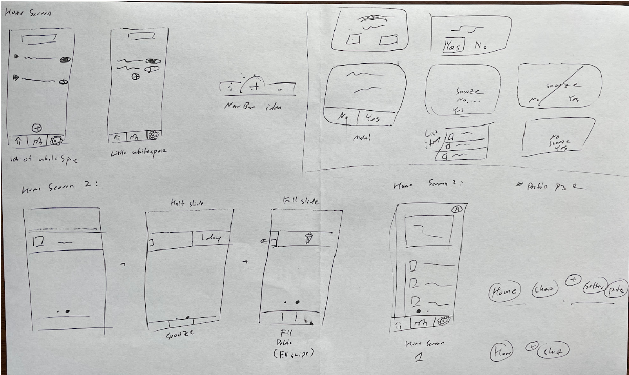
The home screen and components of the home screen had many different versions before being settled on. The home screen will consist of two different screens, each a single swipe apart from each other. The first screen is displayed on the bottom right corner. It will consist of a small chart that displays metrics about the user’s screen time data as well as a breakdown of screen time by app. One group member likened this format to the home screen of the investment app Robinhood.
The second screen consists of a list of active and inactive interventions. Interventions will be shown in a vertical list with more options displayed as a list item is dragged to the left hand side. The comparison here is to mail apps where similar swipe gestures are used to show more options. The reason why the list of interventions is on a second screen is to add a level of friction so that users are not able to effortlessly turn off an active intervention.
On all screens, we will also include a bottom navigation bar that consists of three items: home page, new intervention, and chart view. On the upper right hand corner of both home screens, we will also include a profile page.
Profile Page
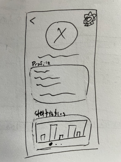
The profile screen will consist of three major portions: the header, the profile information section, and chart section. We believe that the profile page can serve as a page that can give a brief overview about a user’s process and history of using our app.
In the upper right corner, we will include a settings button that will take users to the settings page where they can change information about themselves, data visualization tools, and other privacy settings.
As a team, we do recognize that the settings page is somewhat hidden away from the main portion of the app. There was discussion about whether or not it would be better to include the settings option in the bottom navigation bar. However, we noticed that doing so would greatly unbalance the visual design of the navigation bar, leading to a tension between visual aesthetics and ease of reach. We ended up adding settings to the profile page (which would include a single additional click to reach) in order to preserve the symmetry of the bottom navigation bar.
Settings and Privacy Settings Screen
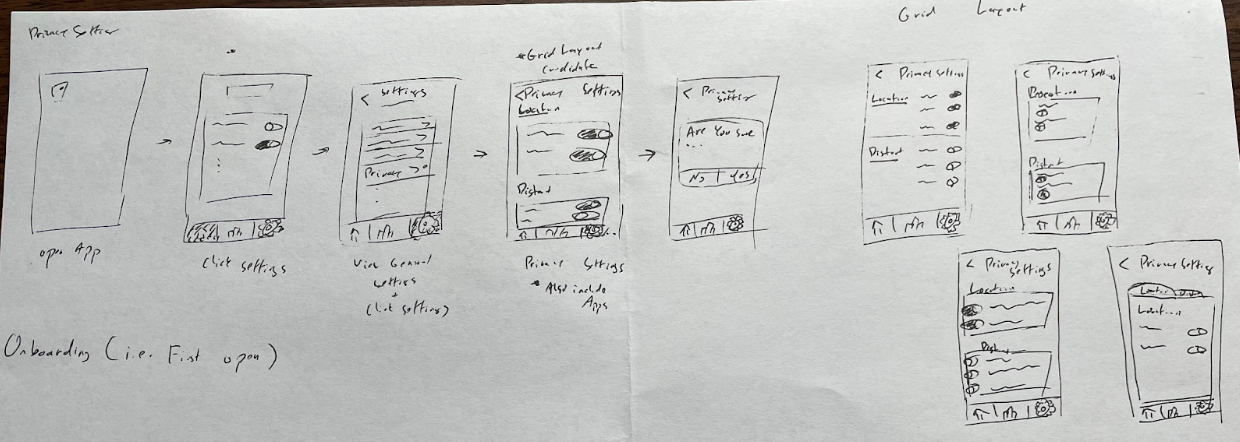
The Settings Screen will be presented with a title header and a vertical list of options. Each option will be labeled with text that describes what specific settings can be set on that following screen as well as a “>” to indicate that there is another screen after clicking that option.
The privacy settings screen will be separated into different sections grouped by privacy settings. In the sketchy screen we imagine a privacy setting screen with sections for location data and distortion options. Each individual setting will have an associated toggle on the right side of the text label. For this screen, we experimented with multiple different grid layouts, but decided to settle on the original vision as it conformed with gestalt principles and existing design patterns for settings pages.
Onboarding Screen(s)
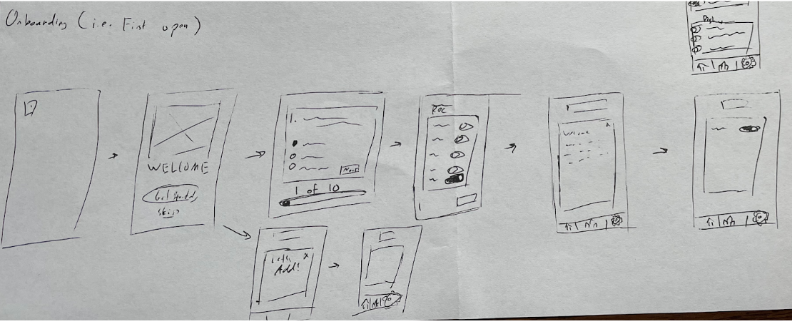
The onboarding process consists of going through a tutorial that showcases the features of the app to users, includes a survey to allow users to give more information about themselves, and a list of recommended interventions. Most screens during this process will only consist of a single main component with action items within that component.
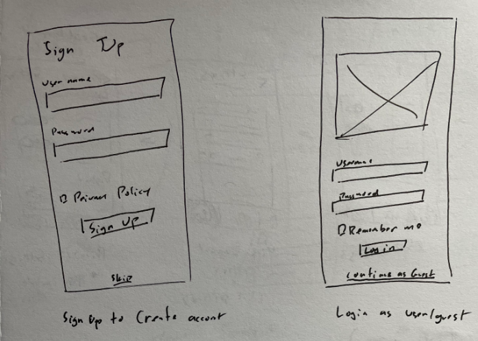
Additionally, we will also provide the option to create an account for shared data between different devices. Although this did not come up in our interviews (as we were only asking users to limit a single device), we believe that the flexibility of sharing settings between devices is valuable and would be valued.
Customization Screen(s)
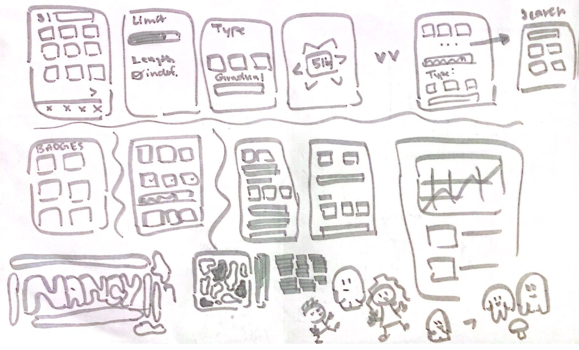
The customization screen allows users to create a screen time limit and customize the style of obstruction, timeline, and severity. For the sketch, we drew up two main ways: 1) Multi-screen flow and 2) Single page view. For the multi-screen flow, users are asked to choose an app/s, limit, obstruction, and severity, each on a separate screen. On the Single page flow, users are asked to input the customizations on one screen that they will just have to scroll down with and submit at the end. The team decided to go with the multi-screen flow as it will help simplify the screen and give a sense of progression as users swipe through the different screens.
Toggle Intervention Screen
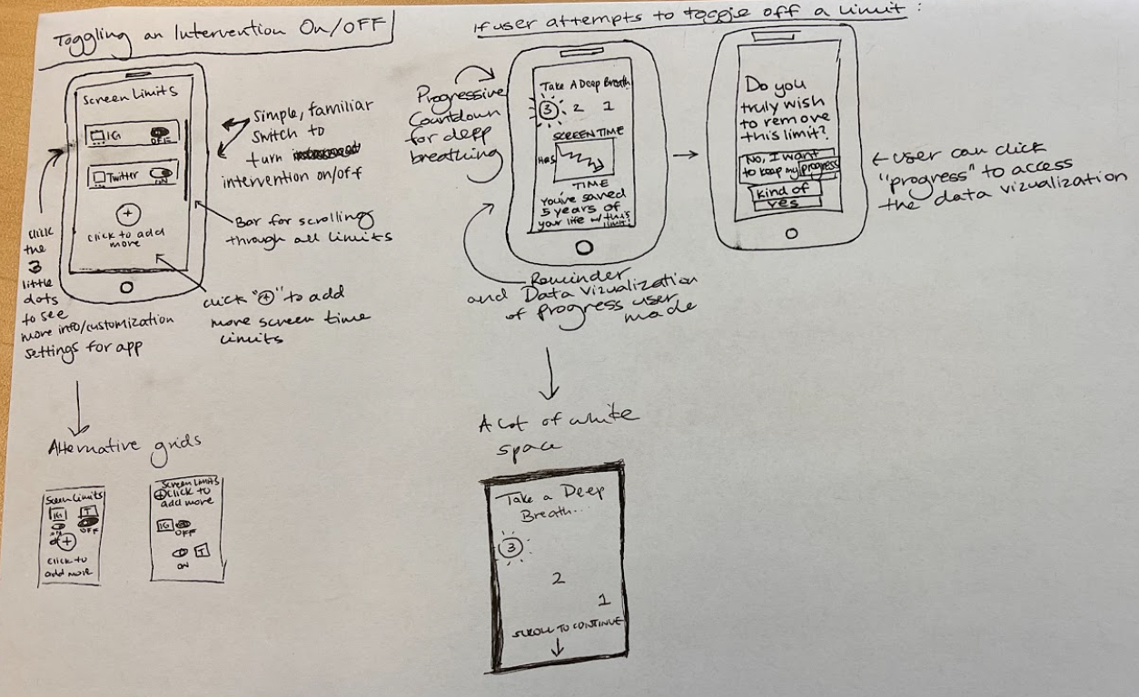
When a user attempts to turn off an intervention, we want to create friction during the process that disincentivizes them from following through with that decision. We want them to do a mindful practice, like taking a deep breath, to ensure that they’re disabling this intervention with intentionality. We also want to remind them of their progress to encourage them to continue their upward trajectory. In the end, we want to reward users who ultimately end up keeping the intervention.
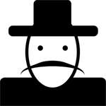
Data Visualization Screens(s)
For data visualization, we focused on two ways of presenting data to our users. The first is data from a specific app. For the upper two screens, we show that each app has its own component with a brief overview of the general activity. Once you click on one of the components, then there will be more detailed information displayed such as screen time trends, nudges ignored, and more. The second data visualization is a general trend of all tracked apps. In this view, we will show statistics of apps compared to other apps so that users have a quick view of their progress across all of the apps that they are limiting.