
Team Alpaca is excited to start thinking style and envisioning the feel of our prototype, a Wizard-of-Oz AI Agent that works as a scheduler and planner all-in-one to add spice and sentimentality to your senior year social life. Snazzy! Below is our work around mood boards and our style tile, which we will continue to update as we gather feedback and iterate:
Individual Mood Boards
Jin-Hee’s descriptive words: cute, approachable, simple.
The vision was based on the idea of fuzzy white/brown alpacas grazing in fields of green, something you have to say “aww” at and marvel at what a seemingly simple and beautiful life these alpacas lead. I looked to “cute,” familiar UIs such as that of Duolingo and simple ones such as Google Calendar for inspiration, and included a couple of possible palettes that were heavily green with an accent of pink (often regarded “cute”) and brown for the alpaca coat. While these fit the concept of an alpaca well and would ideally help the prototype feel more approachable to users, the red-tone (pink) and green-tone contrast would not be accessible to red-green colorblind users, which is a serious downside of this palette.

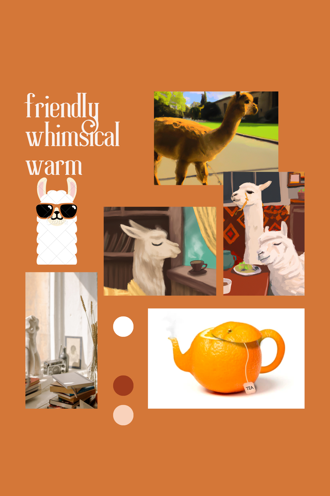
Ecy’s descriptive words: friendly, whimsical, warm.
Following the AI-generated event cards I used in my intervention study, I really tried to convey the “whimsical” feeling in the mood board, since alpacas themselves seem whimsical and the expressions on their faces make them even more so. The orange-based palette brings warmth to the prototype that should feel friendly-to-use, and the heavy use of alpacas should make the user feel welcomed. A couple of possible downsides is that a mid-orange color might not provide enough contrast against white or black type, and we want to balance whimsicality with the organized nature of scheduling.
Nolawi’s descriptive words: cute, helpful, easy.
My moodboard looked to reflect the potential that our product could have in terms of bringing friends together, and the types of activities that it might be able to provide to these friends. However, I don’t know how well my moodboard reflects a general color scheme or complete synchronicity between pictures.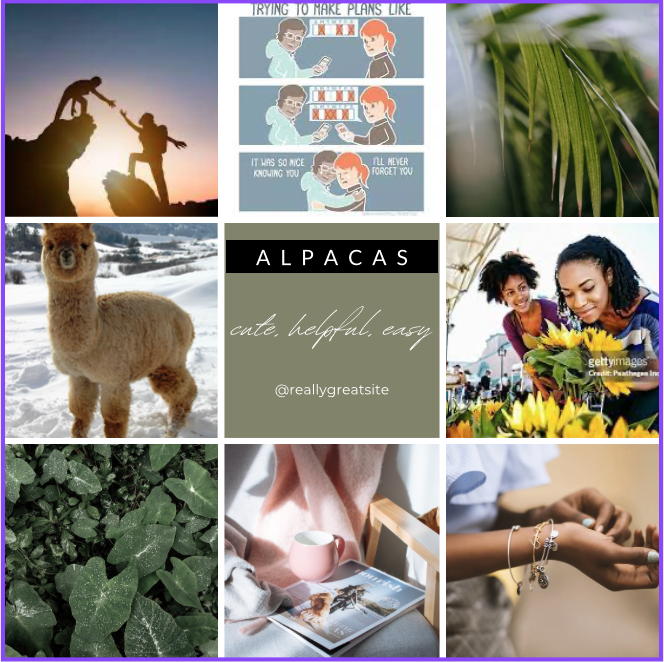
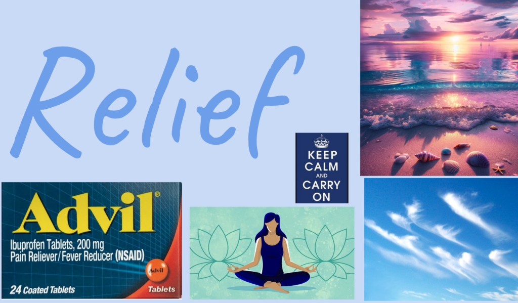
Cristobal’s descriptive words: relief, fun, surprise.
I initially expanded on each idea separately, hoping to fully realize the contrast between the peace and relief that users can feel when having their scheduling handled for them and the fun elements that I want our solution to have. For the fun and surprise, I turned to AI-generated images for creative inspiration. Across the board, I stuck with a cool-toned palette, which ended up adding an almost-bubblegum feel to the three moodboards together. I think the contrast between relief and surprise/fun is how users should feel when using the app, but would be worried about how to balance both in the actual style tile.


Synthesized Mood Board
When narrowing our mood boards into one final idea on which to iterate, we focused on the descriptive words first — we wanted to be on the same page about the feel of the mood board (or the mood, I suppose) before we worried about the nitty-gritty.
So, we individually voted for then had a group discussion on the adjectives, and landed on “warm, quirky, relieving, friendly.” In terms of color palette and alignment with our adjectives, we decided Ecy’s was the option we wanted to move forward with. Moreover, we found that this dark warm orange aesthetic is not one that many popular apps use, so we figured it would be more novel than choosing a forest green as the primary base color.

Style Tile


