Introduction
Our team aims to address negative phone screen-time, targeting audiences who feel like they spend too much of their daily lives on their phones. What “negative screen-time” means can vary from user to user; this can include people who “doom-scroll” on social media, people who feel stressed from too many notifications, or people who work from their phones. In general, we aim to support people who feel like they spend too much time on their phones in a negative way.
Competitor Analysis
We’ve analyzed 8 competitors, focusing on mobile iOS apps and features, aiming to look at a diverse array of features that help reduce mobile screen usage These features include blocking capabilities, gamification, social accountability, goal-setting, and more. Below is a more detailed look at each of these apps.
Forest
Forest is an app that encourages users to stay focused by allowing them to open the app and start planting a tree. The tree dies if the user leaves the app, preventing users from becoming distracted by other apps on their phone. Users build their own forests by planting trees in this way. They’ve further incentivized this concept by partnering with Trees for the Future, allowing users to spend in-app currency to plant real trees. There’s also a social aspect to the app, where you can plant trees together with friends or family, or view other users’ forests and compete. The app costs $3.99 on the ios app store.
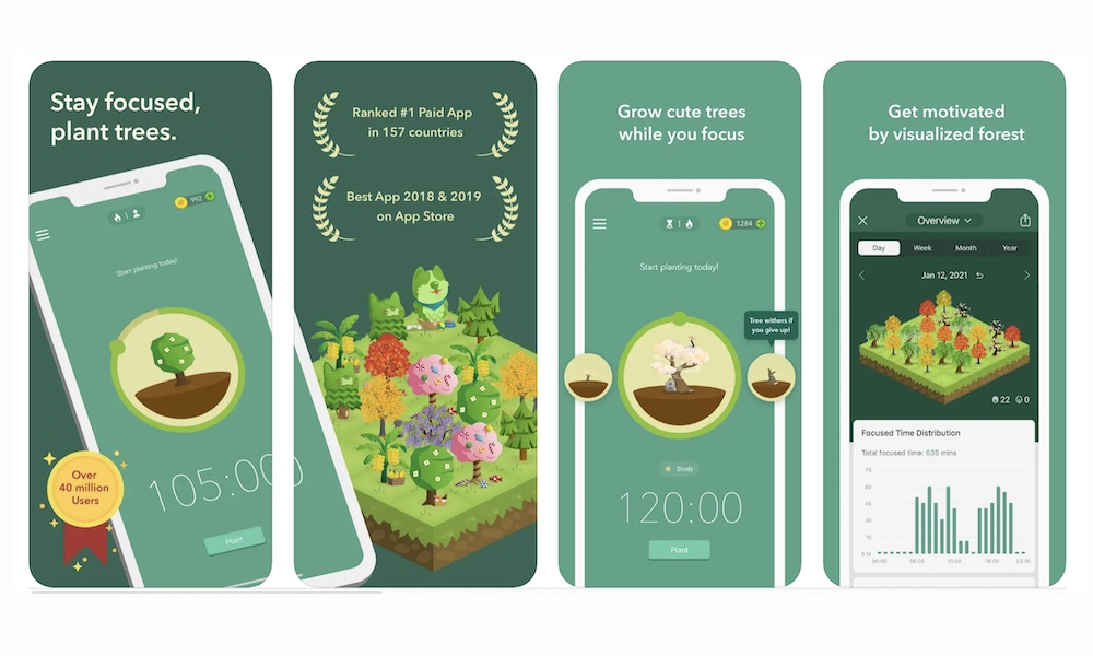
Some pros of Forest’s approach include its gamification of productivity and the integration of social and real-life features. Being able to grow trees, build your own forest, and use in-game currency to plant real trees makes the process feel fun and engaging. Furthermore, using a forest metaphor to track productivity allows users to visualize their progress in a way that feels rewarding and creative. It turns the process of ‘not using your phone’ into instead ‘doing something positive with your phone,’ which may motivate users to be more productive. The social and real-life aspects also add further gamification and accountability. Competing to build the best forest and growing trees with others can foster community and make users feel accountable for keeping their tree alive. Being able to plant trees in real life provides further motivation and accountability.
Some cons of Forest’s approach involve the risk of guilt-tripping users, especially when it comes to the collaboration with Trees for the Future. Users may feel as if they’re actively causing harm or doing something bad by letting their tree die, even if it’s for a valid reason (like picking up an important phone call or checking your to-do list). Furthermore, the gamification aspect may result in unintended consequences, especially when it comes to the competition aspect. Some users may end up spending more time than they need on the app in order to stay in the competition and build up their forest. This may prevent them from using their phone for other positive or fulfilling sources of screentime (like Duolingo or calling their friends), or from taking breaks in between their study/work sessions.
SPACE
SPACE is an app that aims to promote phone/life balance by allowing users to set screentime goals and track their progress. Similar to Forest, SPACE also utilizes social accountability by allowing the user to share progress with friends on the app and benchmark personal performance against other app users. They offer an 8-day phone/life balance course that gives daily recommendations for best practices. The app also offers an analysis of what ‘type’ of phone user you are, with titles such as “boredom battler”, “social sticky-mitt”, or “rabbit hole wanderer”. Although the goal-setting, type analysis, and progress tracking are free, other features like the 8-day course and social capabilities are only in the pro version which is $3.99. One thing to note is that the app requires location tracking services to be on in order to track your screentime.
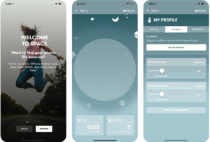
Some pros of SPACE are that the UI is fairly clean and simple, sharing capabilities can foster accountability, and the ‘user-type’ analysis is a unique feature compared to other comparable apps. The interface is monochrome in color and mostly straightforward, which can prevent overstimulation and promote feelings of relaxation and balance, which aligns well with their goals. Sharing progress with friends and seeing other users’ performance can also help users feel more accountable in reaching their goals and inspire them to learn from other users’ habits. The ‘user-type’ analysis also seems like an engaging feature that can help users understand where their habits are stemming from.
Some cons of SPACE are that it can foster unhealthy comparisons and feel invasive. “Phone/life balance” can look different from user to user and the goal-setting is individually set, so it seems a bit contradictory to allow users to compare themselves to others on the app. Similarly to Forest, this can foster unhealthy competition that feels more negative than positive. Furthermore, many reviews in the app store mention how they dislike the location tracking and how many notifications the app gives. Since the app requires location tracking to be on, users may feel an invasion of privacy because they need to constantly share their locations in order to benefit from the app. The constant notifications can also be distracting and feel invasive.
Session
Session is a pomodoro timer for Apple devices (Mac and iOS). Its target users are people who have trouble fighting off digital distractions and maintaining focus on their tasks. It not only has all the merits of the Pomodoro technique (25 min work sprint to keep the user focused, combat distractions by dedicating the time to one task, easy to get started, etc.), but it also has nice extra features: To help the user concentrate, Session blocks the distracting apps and websites that the user chooses and unblocks them when the focused session ends. This prevents the user from getting distracted by notifications or switching between tasks. If the user is spending too much time on breaks, like when they get sucked into a black hole of mindless scrolling, Session would prompt them to get back to work. Session also puts a huge emphasis on helping the user become mindful through prompting the user to take notes and reflect on how productive their session has been. At the end of the day, it provides a detailed analysis of the user’s focused and break time to help them become more aware of how they spend their time. It also enables the automation of the procedures that the user prefers to do when entering into a focused session, like setting a custom status on Slack or turning on a spotify playlist.
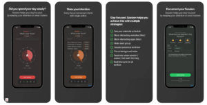
Despite all these well-thought features, Session has some drawbacks: If the user gets distracted by an app that is not on the block list during a session, the pomodoro timer would keep going without reminding the user to get back to work. And once the user switches back to the timer, there is also no penalty incurred. So it is hard to hold the user accountable if they do not hold themselves accountable. There is also a lack of community aspect that allows the user to share their progress with family and friends as a means to keep themselves motivated. Moreover, all the nice extra features mentioned above are behind a paywall—you have to pay $4.99 / month in order to go beyond the basic features of the pomodoro timer.
Buzzkill
Buzzkill is a notification management tool that helps users to take control of their phone notifications—get alerted for important notifications and minimize unnecessary distractions from less important ones. Buzzkill achieves this by allowing users to define rules in the format of “At a specified time period, when I get a notification about X, then do Y”. The users can specify the kind of notifications (from a certain app or contain a certain phrase) in the place of X, and specify the corresponding action to automate in the place of Y. Buzzkill currently has 18 actions the user can take regarding notifications. These include “Cool down” (only get alerted for the first message if you receive multiple notifications in a row within 5 minutes from the same app, person, or group chat), “Alarm” (get user’s attention in the case of emergency, e.g., an intruder into the house is detected by a security app), “Snooze” (delay the notifications till a specific time), “Dismiss” (dismiss the notifications before they pop up), “Sticky” (makes notifications sticky so you can’t easily dismiss them) among others. To solve the problem of FOMO (missing out any notifications due to the automated actions), Buzzkill also allows the user to find dismissed notifications, restore them and see a full breakdown of their notification history. The granularity of the rules that Buzzkill enables users to specify—you can not only specify key words, but also use connectors like “and”, “or”, “neither”—as well as the comprehensive categories of actions really make Buzzkill stand out among other notification management apps. Additionally, the UI is simple and aesthetically appealing.
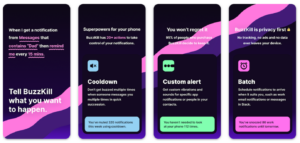
However, being able to come up with rules yourself can be a double edged sword. A rule you make for silencing some ads based on some keywords could accidentally silence an important timely message that happens to contain one of those keywords. So it does take some wisdom plus trial and error to specify a set of rules that work for you personally.
iPhone built-in Screen Time
For most mobile devices, there is actually a built-in screen time feature into the phone which allows for a variety of customizable functionality. Screen Time, the native feature for iPhones, is a tool designed to help its users manage and limit their screen time. Much like third-party applications such as SPACE and Forest, Screen Time integrates goal-setting functionality to help users monitor and accordingly adjust their device usage.
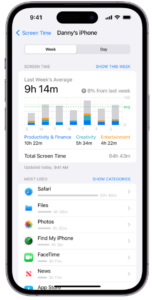
Screen Time stands out among other apps with its detailed reporting system, providing users with insightful analytics on app usage patterns. Users can easily establish daily time limits, set specified periods of downtime, and gain valuable insights into their digital habits. The feature extends to parental controls, offering parents the ability to monitor and manage their children’s screen time, promoting a healthier digital lifestyle for young users. Additionally, specific content can be restricted or blocked, allowing for a safer environment when using the device. Perhaps the biggest advantage of Screen Time is that it is native to the iPhone, meaning there is no need to download additional apps, and instead users can simply go to their Settings.
Despite its comprehensive functionality, Screen Time may lack the social accountability features present in third-party apps. Unlike apps such as SPACE, Screen Time does not provide a platform for users to share their progress with friends or engage with a community focused on similar goals. This absence of social features might be considered a limitation for those who find motivation through shared experiences and accountability. Another issue with Screen Time is the lack of personal accountability associated with it. Since most adult users are the sole users of their phone with no outside authority like parents to manage them, app limits can easily be circumvented as the user themselves usually sets the password.
Flipd
Flipd is an app aimed at fostering a healthy balance between screen time and real-life activities, providing users with tools to set screen time goals and monitor their progress. Like SPACE and Forest, Flipd incorporates social accountability by allowing users to share their progress with friends on the app and compare their phone usage–or lack of phone usage in this context– with other users.
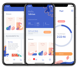
Flipd’s straightforward user interface enhances the usability and user experience, promoting a sense of relaxation and balance, while also making screen time management more approachable. The social accountability features, such as progress sharing with friends and benchmarking against other users, contribute to increased motivation and goal achievement, helping users not feel alone or have a fear of missing out when reducing screen time. A unique feature of Flipd is the ability to join study rooms where multiple users study together virtually. The app also has an additional educational aspect, offering daily tips and recommendations to improve habits.
Many of Flipd’s positive features can also be double-edged swords. One concern about Flipd is that it can be seen as fostering unhealthy comparisons and invading privacy. The subjective nature of “phone/life balance” may make individual goal-setting contradictory to the comparative aspects within the app. Similar to other lifestyle apps, the need for location tracking services to be on for Flipd might be perceived as invasive, leading to privacy concerns. Additionally, several app store reviews highlight dissatisfaction with the high frequency of notifications, which some find distracting and invasive to the overall user experience.
Opal
Opal aims to help users limit screen time through the following mechanisms:
- Motivate users to achieve phone usage goals by gifting them gems when they reach certain milestones
- Create different levels of friction to open and use certain applications according to the users preference. The user can define which APPs they want to block during specific times, limit the amount of time they are allowed to use certain APPs, and choose the amount of friction there is to remain using the APP if the time limit has expired. There are three levels of friction.
- Normal: A notification appears that says you should not use the application after their allotted screen time for that specific APP has run out. However, the user can snooze the notification and use the application as normal with the click of a button.
- Timeout: After the user has used their allotted screen time within an application, if they want to continue using it, they may hit the snooze button on their reminder, but they will not be able to use the APP for the next minute. After a set amount of time goes by using the APP, access to it will be denied for a greater amount of time, for example, 5 minutes. The lockout time gets increasingly greater. It is a feature similar to when you enter your password incorrectly too many times on your phone.
- Deep Focus: Once the allotted time has finished, the user is completely blocked from the APP until the specified rest time has completed.
- The user can visually track their screen time through charts. They can also view their friends’ data usage that they have invited in addition to see what percentile the users screen time usage falls within the community of users of this application. This gives social accountability.
The application has a sleek, clean, and modern UI design. It uses minimal color and exudes professionalism. The design was intentional for their target user – working professionals. The user experience is intuitive. Features are clearly described, easy to use, and quick to implement. The performance of the APP is swift. There is no lagging or clunky feel. To set up the application, I had to choose the APPs I wanted to limit. There are over 50 APPs on my phone. Sorting through all of them felt daunting. Since they already have my screen time usage after allowing them to access it, it would be much better if they recommended a few to cut down on based on my past usage.
ScreenZen
ScreenZen supports the user’s journey to reduce screen time of applications they would like to use less frequently. It implements the following features:
- Pop ups that ask you to reflect about the application you are about to engage with or are engaging with.
- Features to block apps after having used them for user-specified amounts of time. The amount of friction to continue using the APP after it has been blocked is dependent on the user’s preference.
- There is a feature that blocks you from even uninstalling the APP itself.
- Your apps will change location on your phone, making them more difficult to find.
- Apps will open slower and slower the more often you use them throughout the day.
The interface has a stoic feel. It is mostly a series of lists and drop downs that the user interacts with to adjust settings about which applications are blocked, when they are blocked, how long they are blocked, and the ease to use applications once the set time limits have exceeded. It is a practical design, but not aesthetically pleasing. It is not as inviting to use as Opal albeit it does offer more customization. The chart feature in the APP that the user can use to view their screen usage analytics is poorly designed – it does not give a clear snapshot of usage from a quick glance. This is due to both the layout and color choices. In terms of user experience, the excessive use of dropdowns and accordions makes it annoying to change settings. Unlike Opal, the user cannot see screen usage of friends and there is no gamified component.
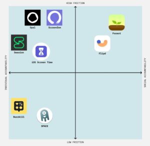
Competitor Mapping
We’ve mapped these apps in the below graph. On the x-axis is individual accountability versus social accountability and on the y-axis is low friction versus high friction. By individual vs social accountability, we mean whether the app expects you to self-monitor your usage and habits, or whether there is a built-in social function that allows you to stay accountable to friends and family. By low versus high friction, we mean how easy/hard the app makes it to bypass their restrictions and use your phone to fall back into negative behaviors (like doom-scrolling, etc.).