WIREFLOWS AND SKETCHY SCREENS
NIGHTHAWKS
Introduction:
Team Nighthawks is working on an exercise motivation solution to increase users’ workout satisfaction and make them feel more satisfied with their routines. We are tackling this problem by focusing on social motivation in hopes of helping two personas, Sally and Franklin, improve their workout routines by solving their unique issues of feeling uncomfortable and feeling unmotivated, respectively. Because of the nuance in Sally and Franklin’s challenges, we want our app solution to be flexible but palatable. An overwhelming app will dissuade workout routine improvement, which is the last thing that we want to do. To emphasize our intention of fostering social connection as a means to improve routine, we want user groups to be at the forefront of each screen and flow decision we make.
Key Interactions and Pages:
- Finding a group
- Interacting with your group
- Exploring recommended exercises
- Exercise reflection/progress
- Streaks, scores, and metrics
Wireflows and Sketchy Screens:
Yishu Chen
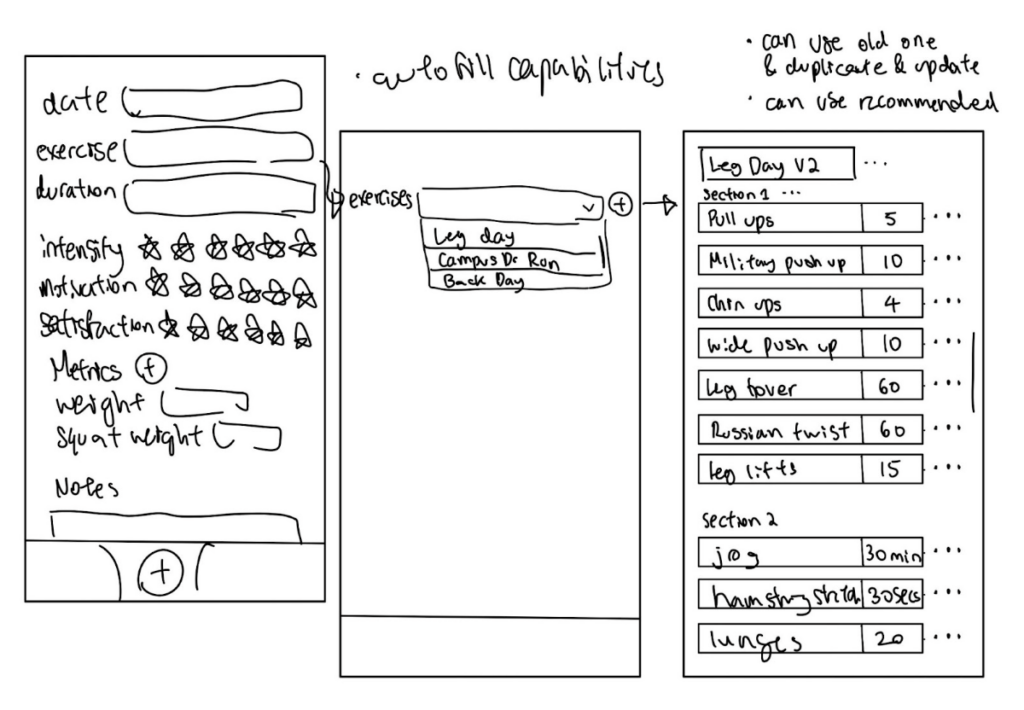
I drew screens for the reflection/logging aspect of the app and also explored other aspects briefly. The reflection serves as an easy means to reflect and keep track of what you did and in the long term, we want users to be able to visualize their progress (so they can feel good and become more motivated, or feel bad and become more motivated) by turning all the metrics they log into informative visualizations. For flexibility, users can customize what metrics they are interested in tracking/setting goals for. For example, some people may want to track their weight while others are more interested in the max weight they can squat, or perhaps even their 100m sprint speed or how long they can hold a handstand. As seen on screens, during or after a workout, users will enter their exercise. Since many current apps lack details and flexibility, our app lets those who want to dive deep into workouts by letting users create detailed workout plans that they can reuse/edit with each different session. This way, other users can get a better sense of what others do and potentially join or copy if they are interested or just starting out. On top of a detailed exercise plan, users can log duration as well as intensity, motivation and satisfaction easily out of a 6 star system (6 to prevent people from picking the middle all the time). If the user permits, their workout will be shared to the feed and others can like it use it etc.
Here are some sketches of the logging screens. The leftmost image is what happens when the user adds a workout log. The right two show the extent of detail a workout can hold. Users can create exercise modules like leg days for simple selection purposes.
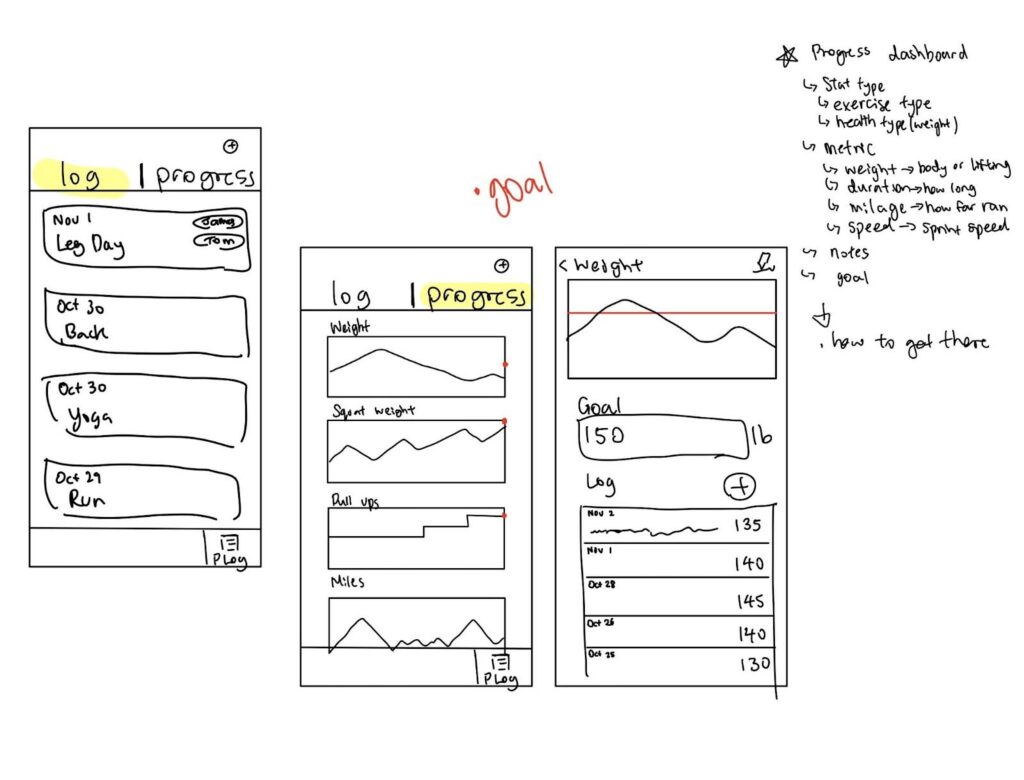
The following 3 screens show what the log looks like after it’s been submitted. Inside the log feature, I made a tab for simply the log itself along with another tab for the progress dashboard, where any statistics can be turned into visualizations. The user can even set a goal and see how their progress compares with the goal.
Jack Clark
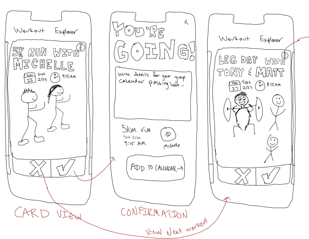
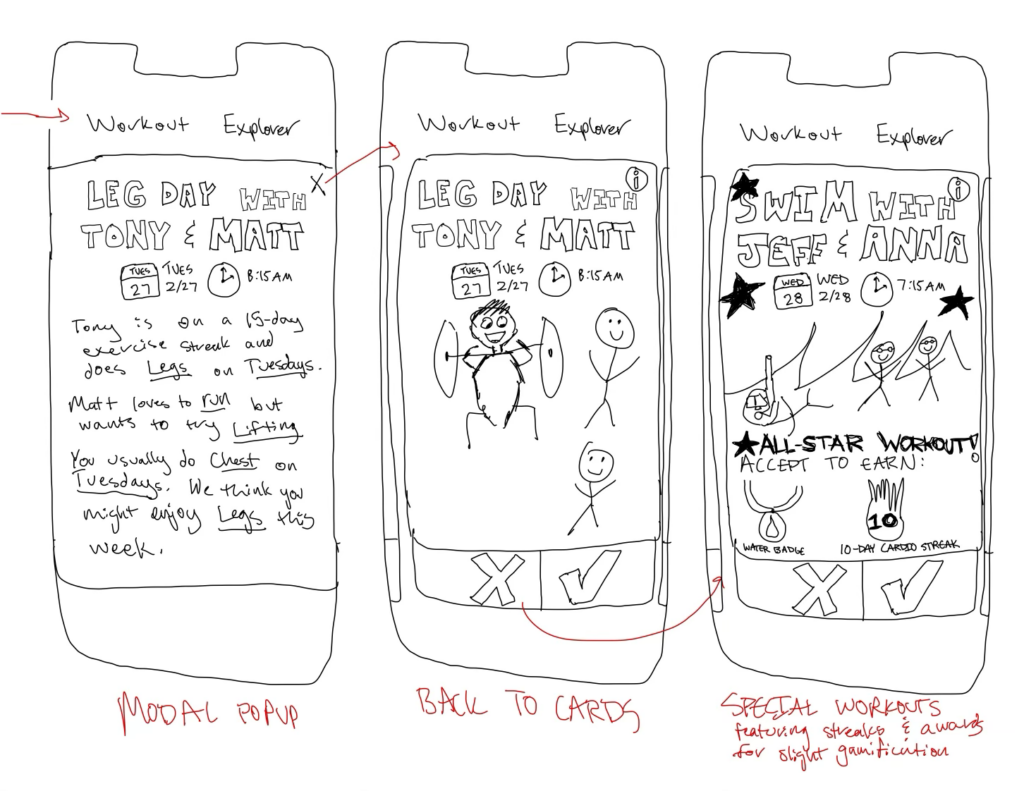
I drew screens for a Recommended Exercise flow, which uses a Tinder-like approach with swipeable cards to allow users to explore recommended workout options. Card swiping is a behavior that is familiar to most college-aged people and will hopefully keep the whole process lighthearted. Recommended exercises with various items are depicted on each card. Accepting allows users to add a workout to their calendar, and rejecting will show more workout options. Users can press the Info button to learn why they are receiving this recommendation. Finally, some workouts will be special recommendations that emphasize various gamification/small incentive aspects like different badges or increasing a streak.
Nate Fleischli
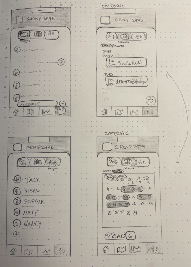
I focused on Interacting With Groups flows. I took inspiration from instagram by having a specific page for each group the user is apart of, changeable through the top group name section. I then explored what it might look like to communicate with my group members, coordinate challenges on a shared calendar, and manage members of the group. These three sub-tasks/pages are selectable through the icon bar at the top of that group’s section. The messages board allows users to chat within the group. The calendar board has two views – weekly and monthly. The weekly presents the planned workouts for the current week, also allowing the user to add a workout via a plus button (sub-flow not shown). The monthly view shows the streaks and or days members of the group have worked out. The bottom of the screen shows a current active streak counter to motivate the group. Lastly, the people tab is a straightforward way to manage/add members to the current group.
Sophia Ramsey
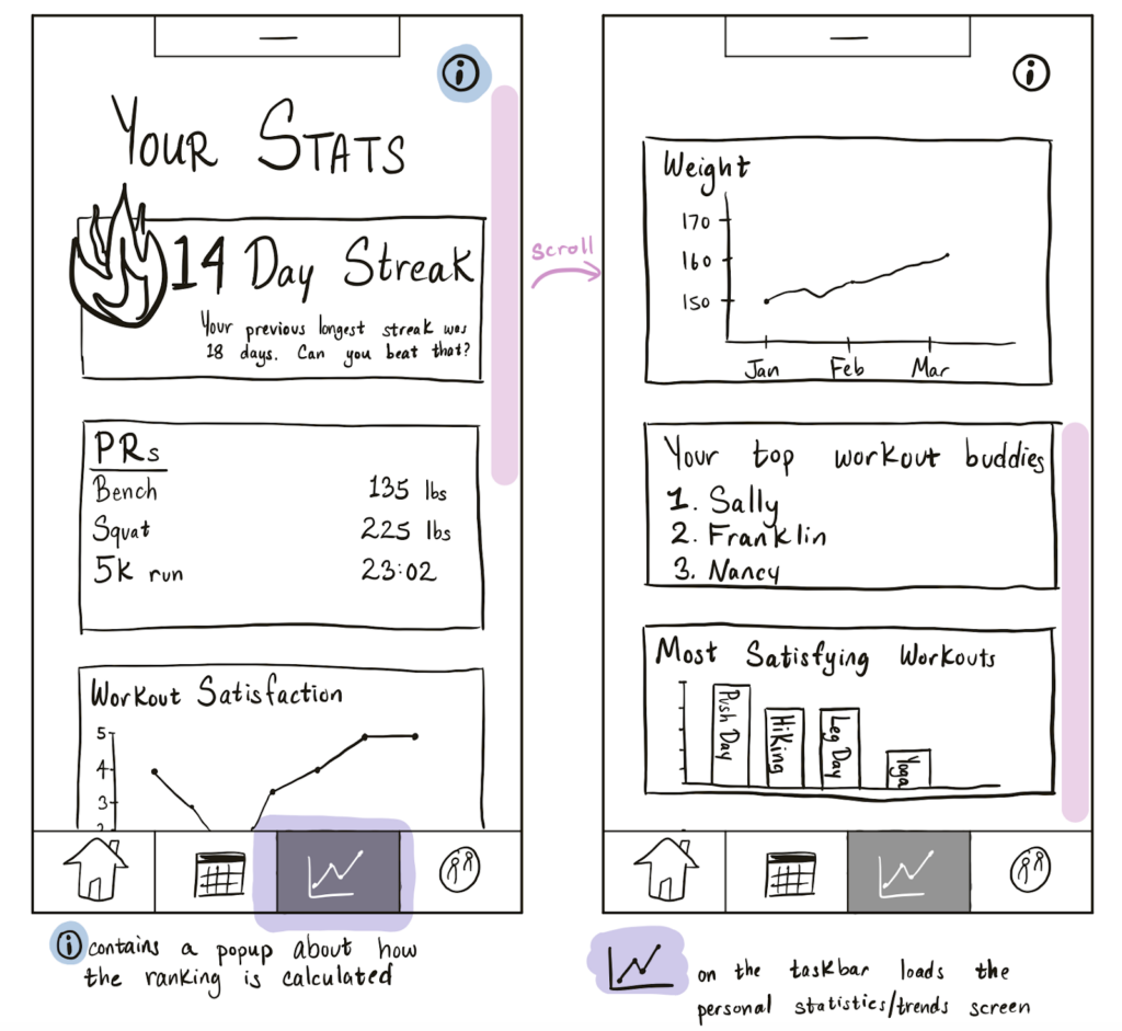
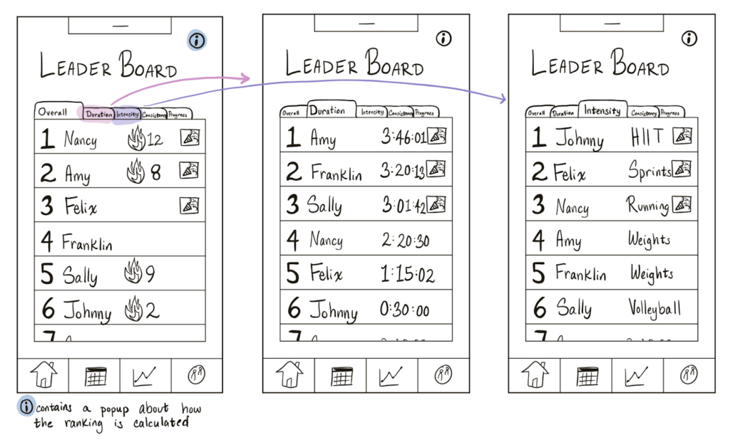
I drew screens for the leaderboard and the personal statistics. For the leaderboard, I wanted to keep it simple, with the focus being on the rankings. Based on the feedback from our intervention study, I included different tabs on the leaderboard so that there could be different competitions, since our participants agreed that different types of exercise have different success metrics. I included an information button to provide insight to how rankings were calculated, which would be useful for the subjective rankings, including “overall” and “progress”.
For the personal statistics, I wanted to focus on a mixture of performance-based and reflection-based metrics. Since our app has a post-workout reflection, I wanted to make sure that qualitative trends were just as important. The streak was the primary statistic, since we are aiming to build a habit. As a workout app, it was also important to include PRs and other performance statistics, and as a social app, it was important to include a section on workout partners. I chose to display information using different mediums, such as charts, graphs, and textual summaries, so that users can see each statistic as easily as possible.