
Team Nile Crocodiles: Adrian Rivas, Anchal Sayar, Andrew Franks, Maggie Skortcheva
Mood Boards
Maggie:

One of the major findings of our user studies is the fact that while practicing a foreign language can be stressful for a multitude of reasons, doing so with one’s romantic partner brings a sense of comfort and safety. I aimed to convey this sense of coziness with the use of warm colors and the inclusion of different food images as symbols of other culture-sharing activities that bring comfort.
Based on the feedback I was provided in class on Wednesday, I have successfully conveyed these two aspects of my mood board. What I failed to convey to my classmates is the romantic nature of the relationships of our users and the fact language learning is the focus of our app.
Pros:
- Conveys a sense of coziness and comfort.
- Depicts a world shared by two people.
Cons:
- The language learning aspect is not explicit.
- The romantic nature of the relationship is not explicit.
Anchal:

Many of our interviewees expressed that having a language-learning partner significantly boosts their motivation and engagement with the language. Conversely, the absence of such a partner tends to dampen their enthusiasm over time. Moreover, our intervention study revealed an intriguing finding: writing notes to loved ones serves as a reflective practice, allowing individuals to share otherwise overlooked details of their day. When conducted in the target language, this exercise becomes even more compelling, blending the solitary effort of language learning with the enriching experience of interpersonal connection.
Pros:
- Aspects of reflection and solitary effort are clear. At the same time, it communicates a sense of connection.
- Elements of learning are coming alive.
- Simple.
Cons:
- Seems like it’s about labor of love / self-care.
- Might communicate “love isn’t easy”.
- Colors don’t communicate the dual nature of learning a language, i.e. it is a calming yet energetic process.
Andrew:

The primary focus for this mood board was leaning into the concept of love and connection inherent to building a love note platform. The primary adjectives that I used for the mood board were Learning, Companionship, and Connection. As a result, the emerging color scheme heavily emphasized pinks, reds, and blues. The images for the mood board emphasize connection, communication, and companionship, as seen through the two birds, the frequent heart imagery, and the line of figures holding hands.
Pros:
- It employs imagery and color schemes that have strong connotations that people can identify and understand.
- It promotes the overall goal of the platform, which is connection.
Cons:
- It leans too heavily into the love motif and not enough into learning.
- While connection/love is an important element of this moodboard, our platform is primarily for language learning and this color scheme leans too heavily away from that.
Adrian:
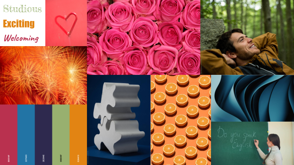
Like the top left image of a heart formed by a reflection, I envision our solution to symbolize the formation of a stronger, deeper connection between partners as a result of going through their language-learning journey (and relationship) together. Learning a partner’s native language is an act of love: it is a time-intensive, intentional effort to relate with their culture, communicate with their family tree, and understand things that may otherwise be “lost in translation”. At the same time, we want to cultivate an intellectually productive environment where our learners can feel comfortable in taking risks to improve their proficiency and achieve their learning goals. Chalkboards and classroom decor are oftentimes green to help elicit feelings of refreshment, harmony, and optimism which are conducive to learning effectively. Receiving a love letter from your partner, especially if it is hidden or a surprise, can feel like a burst of excitement reminiscent of an exploding firework. The color orange is “punchy” and “zesty” like the sour, citrusy taste of the fruit. Since our solution will most likely be deployed in a virtual environment (i.e., mobile application), we might want to maintain a modern design language to reflect our ongoing effort to improve our technical platform and effectiveness using the latest techniques in psychology, design, and computer science.
Pros:
- Bright colors can be eye-catching, helping direct the users’ attention to action items and navigate task flows.
- Each color has a connotation that reflects our values and intentions as designers.
- Has a wide range of colors to choose from.
Cons:
- In our effort to keep a modern visual design, we might mistakenly remove the “personal feel” that other visual philosophies may be able to better provide, like leveraging skeuomorphism to help users learn what to do in a more familiar environment as in the case of Frutiger Aero.
- The colors may contrast too much to the point where it is difficult to read and distinguish important from background items.
- The bright colors may confuse users into believing that it is an app meant for younger audiences.
- May include too many colors.
Synthesized Mood Board
After coming together as a team, we unanimously decided that Anchal’s mood board best encapsulated our project’s goals while maintaining a learning-compatible aesthetic appeal. It encapsulates the team-oriented philosophy of our solution to language learning to help users stay motivated in a judgment-free zone with the root of their motivation at their side: their partner. The color palette is simple and distraction-free, allowing the content of their love notes to take center stage. The pastel colors are soft, yet joyful which hopefully energizes the language learner to push on with their studies. We can also reinforce the hand-written love letter metaphor by incorporating hand-drawn elements into our design language to help the letters differentiate themselves from traditional texts and instant messaging bubbles. The content of each image in the mood board also helps convey the thematic goals of our project: the nonlinearity of love and language learning, the communicative powers that are unlocked from learning a new language, and the deeper emotional connection that is built throughout the journey.
Style Tile


