Team Nile Crocodiles: Adrian Rivas, Anchal Sayar, Andrew Franks, Maggie Skortcheva
Wireflows
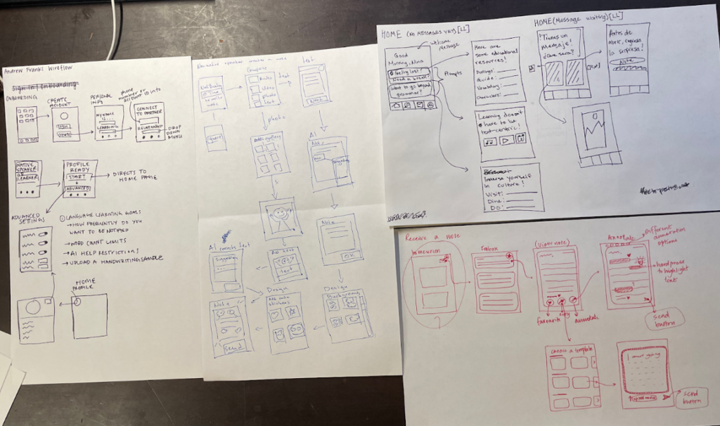
We created wireflows for the core flows of our app: onboarding, home screen/inbox, composing a note, and reviewing a note. We used our system paths and MVP features to identify the key flows of our product.
Sketchy Screens
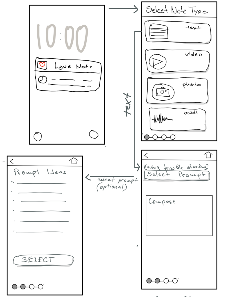
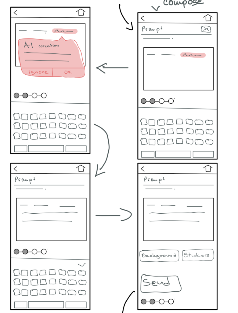
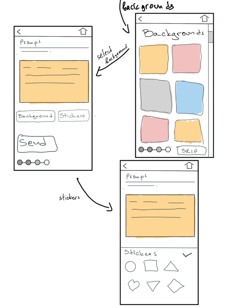
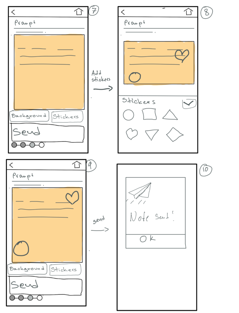
Maggie: Initial Sketchy Screens (“Send Note” Flow)
My teammates provided me with the following critique.
- Begin the note creation process with a text field and have an “upload media option”. We want to nudge our users to engage with writing.
- The navigation bar is missing on some screens.
- The second screen is missing the “o” in Audio.
- It might be a good idea to include a “send” button, “background” button, and “stickers” button options in the third screen to include the case where they do not choose a prompt and want to send a quick note.
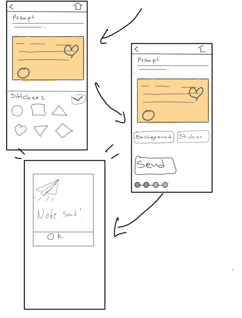
- The buttons on the eighth screen seem to be a bit on the large size. Giving them a bigger text box can help motivate them to write more and navigate bigger messages easier.
Revised Sketchy Screens (“Send Note” Flow):
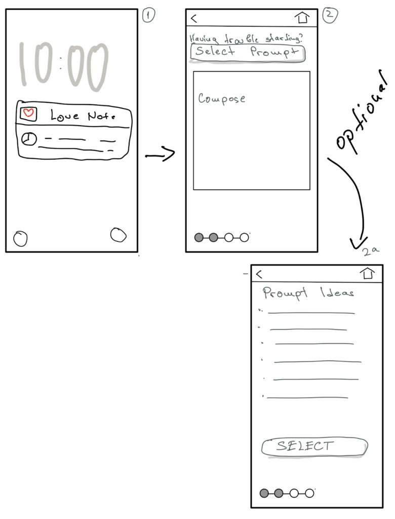
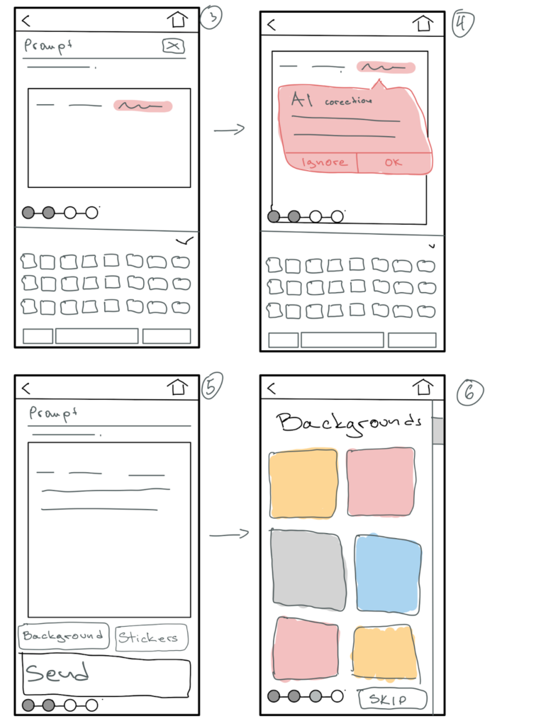
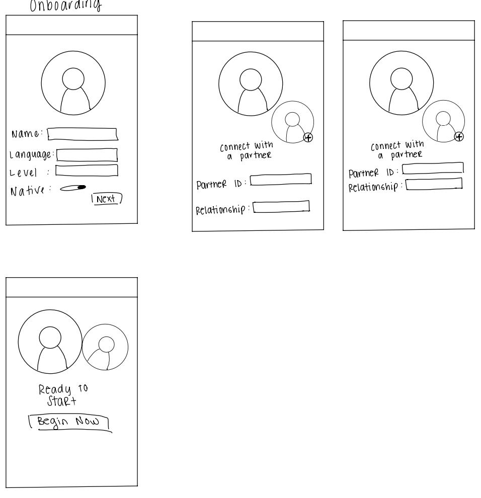
Andrew: Initial Sketchy Screens (“Onboarding” Flow)
My teammates provided me with the following critique:
- The field “level” on the first page is ambiguous and it is unclear what that refers to.
- I adapted it to specify “Language Level”
- The binary toggle button for “Native” is redundant with the level field before it.
- I combined these two in the following onboarding to be a sliding scale from beginner to native speaker to include the array of language levels.
- I received feedback that there should be a mechanism for selecting a user profile picture or avatar.
- I adapted my design to include a profile button screen.
- I improved the second iteration of this flow to include clear communication about where in the onboarding process users are through the three empty bubbles at the bottom of the screen that “fill in” as users make more progress in the onboarding journey.
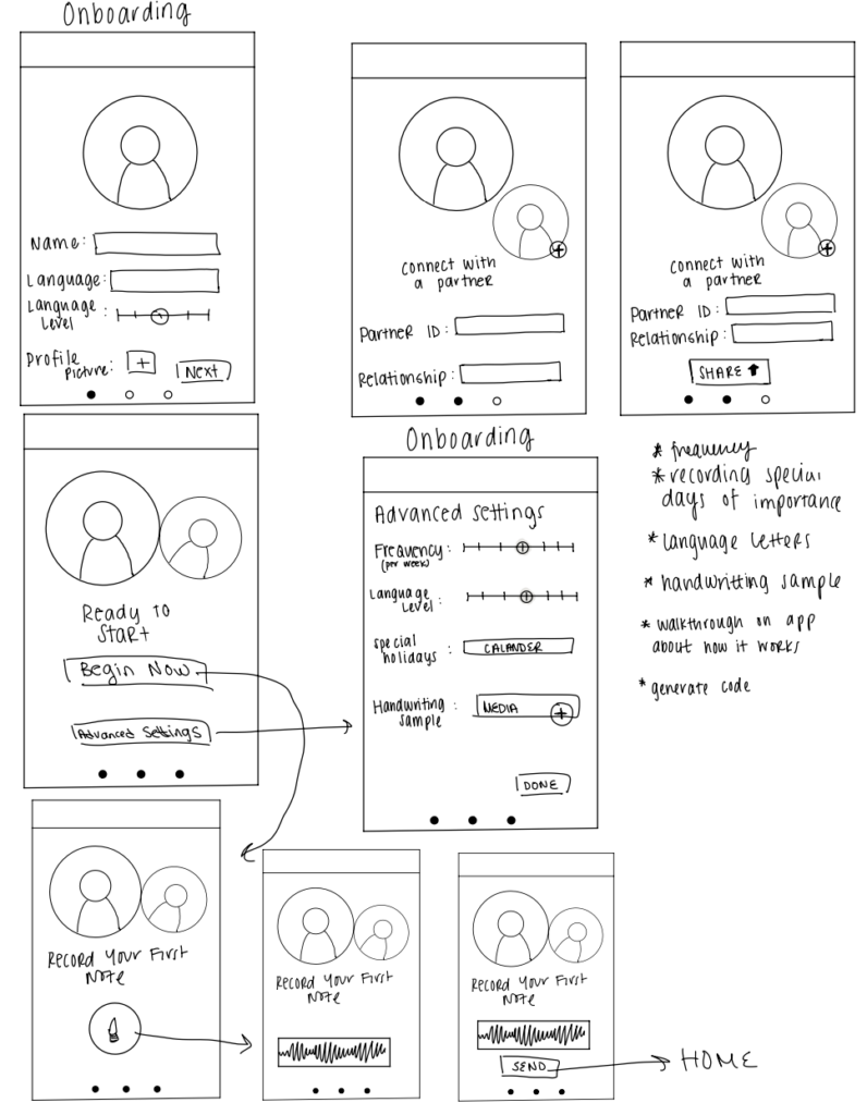
- I received feedback that after users connect to their partner and before they enter the app they should be able to adjust more advanced settings (i.e. input specific dates/holidays for their relationship, note how involved they would want their AI to be in letter composition, and indicate how frequently they wish to be prompted by our app).
- I implemented this feedback by including advanced settings in the onboarding flow.
- I also introduced an option for users to upload a handwriting sample in their target language so that letters could be viewed in their handwriting.
- Last, I received feedback that users should be familiar with the product by the end of the onboarding flow.
- So, once users select “Begin Now,” they will be prompted to create their first message, which will be an audio recording (for ease).
Revised Sketchy Screens (“Onboarding” Flow):
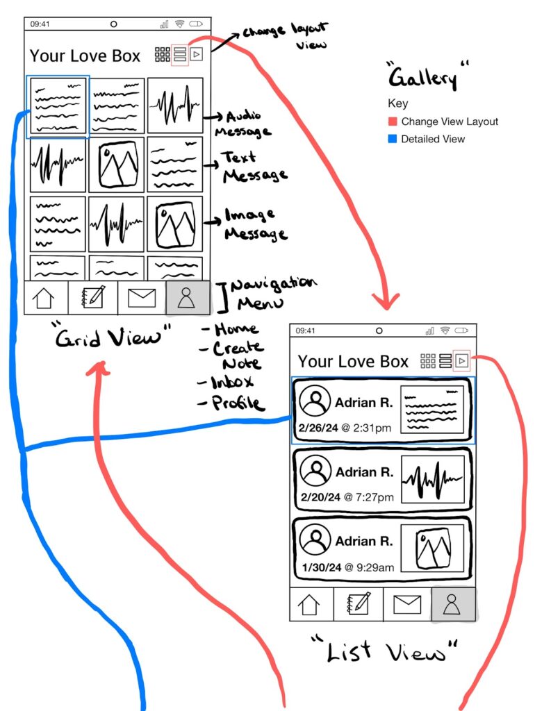
Adrian: Initial Sketchy Screens (“Gallery” Flow)
My teammates provided me with these points of critique and I rectified them in the following ways:
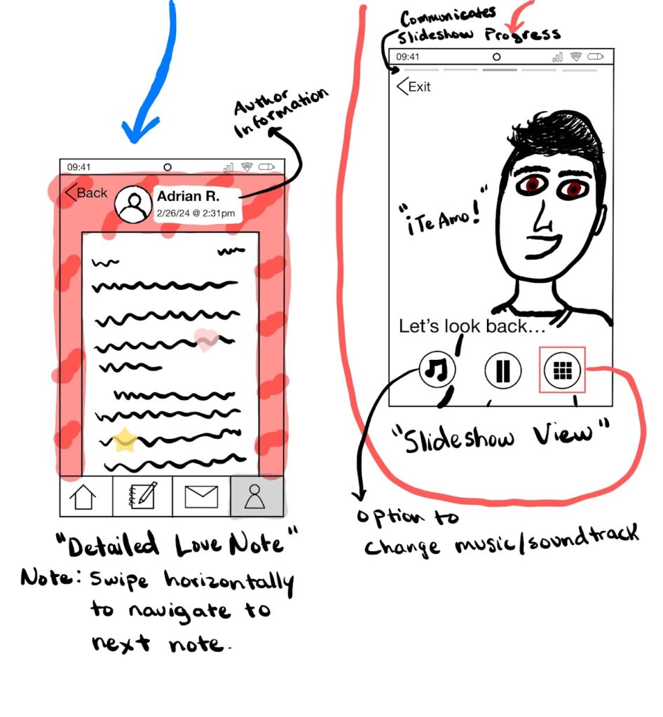
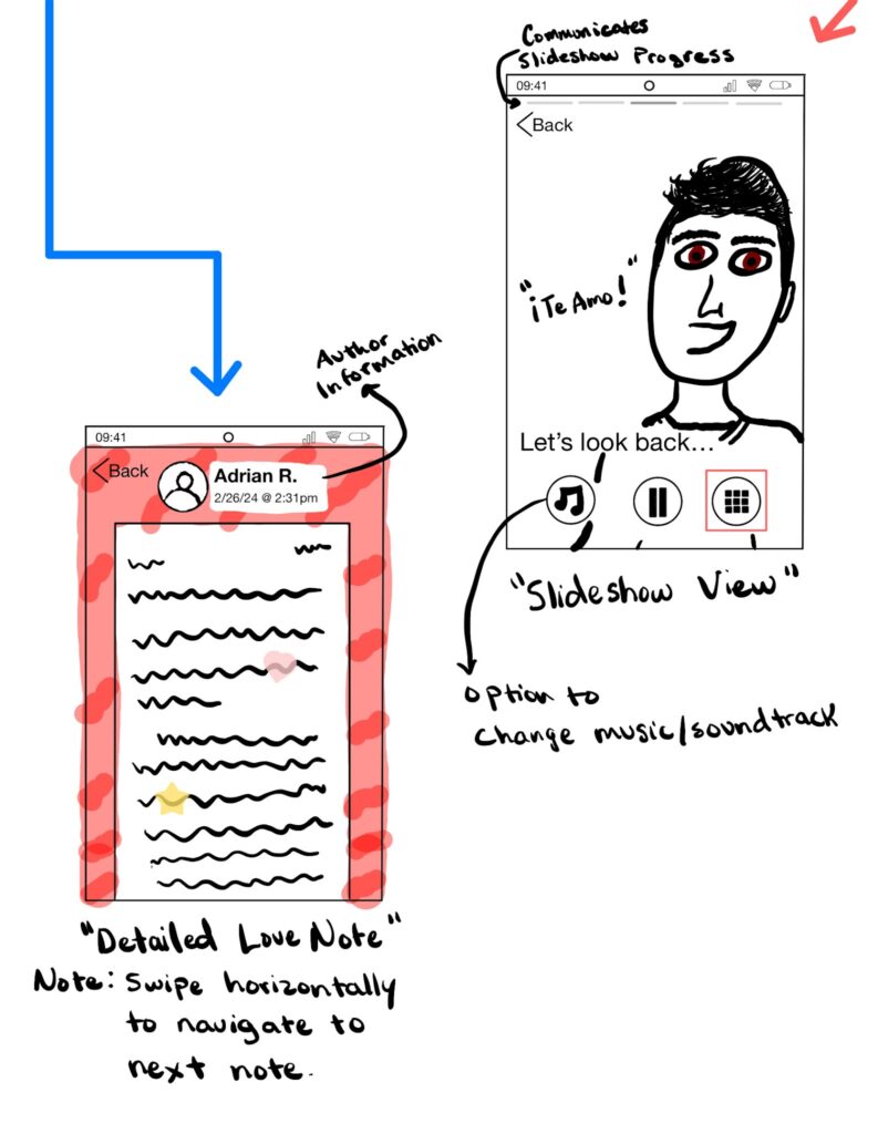
- Change the “Exit” button to a “Back” button.
- I agreed with the team and changed the button to disambiguate between exiting the app and exiting the slideshow view.
- Include a way to filter by type or date.
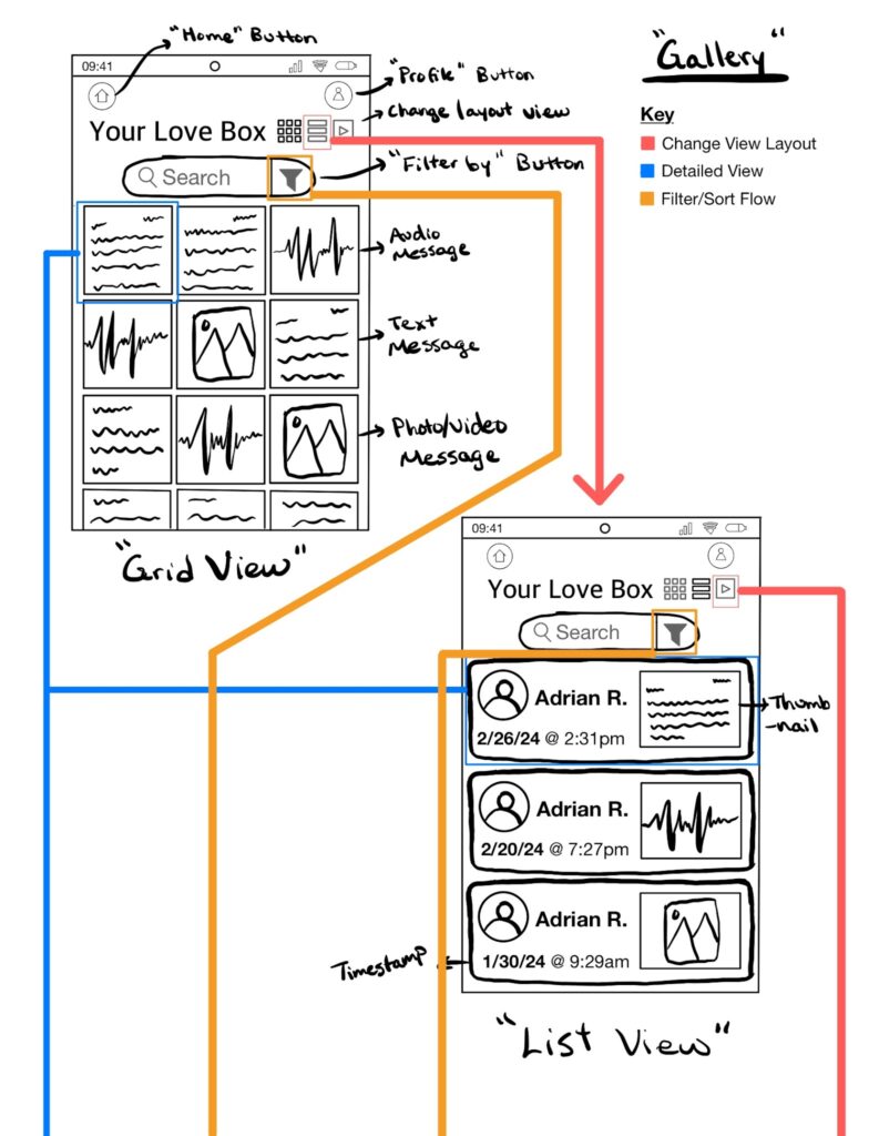
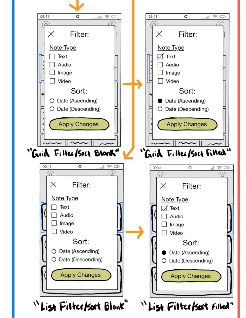
- I included an option to change filters and sorting preferences next to the search bar to help users refine their search. The search bar and the filter button serve similar roles in refining search results, so they are placed close to each other to communicate this fact. We thought that users may want to quickly sort by date and filter results based on note type.
- We might consider including additional filters and sorting options in the higher-fidelity prototype.
- Include a way to search existing letters.
- I included a prominent search bar towards the top of the gallery to help them quickly find particular strings in their notes.
- We might be able to parse the video and sound clips for transcription to enable search functionality for more file types.
- Eliminate the navigation menu since an inbox is redundant when the Home page displays open threads/conversations similar to an inbox.
- I have eliminated the navigation bar menu at the bottom of the screen with two buttons: Home and Profile, which would be sufficient to cover all of our existing flows. This change improved the screen area available for content and communicated that the scrolling function is continuous.
Revised Sketchy Screens (“Gallery” Flow):
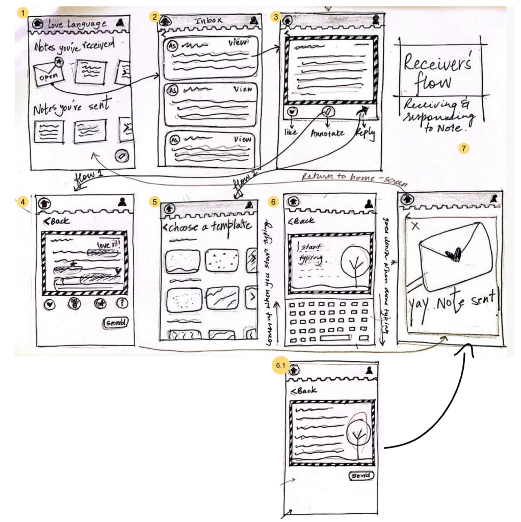
Anchal: Initial Sketchy Screens (“Reciever’s” Flow)
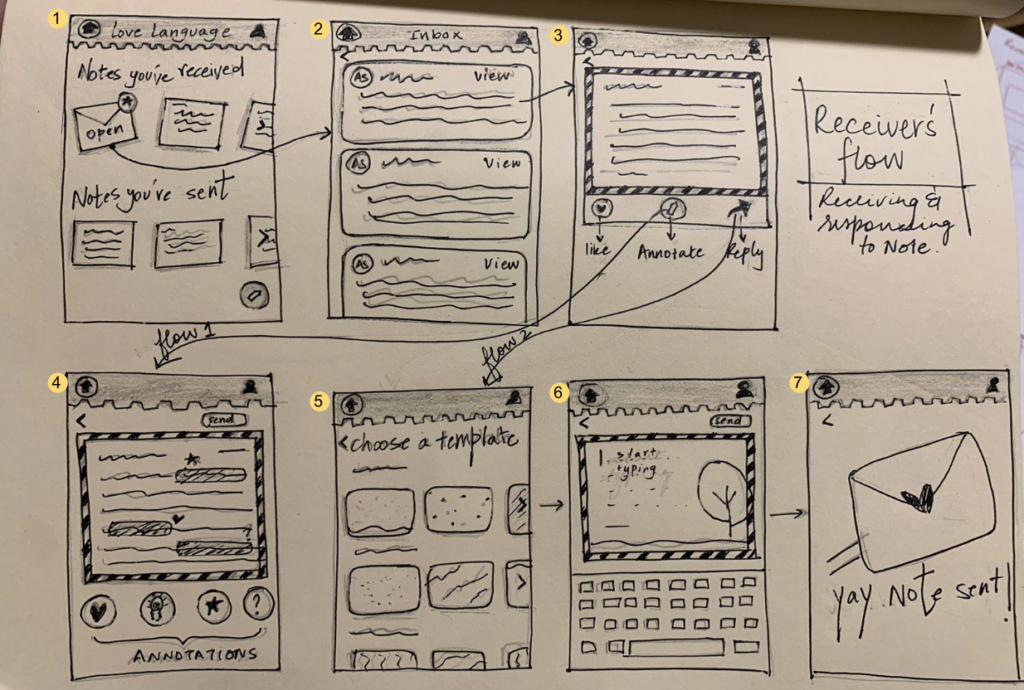
The feedback I received from the team:
- The users should be able to directly go to screen 3 after screen 1.
- The send button’s placement on screens 4 and 6 is not legible.
- The success pop-up on screen 7 should have a dismiss button
Based on the feedback I redrew the specific screens I got feedback for.
Revised Sketchy Screens (“Reciever’s” Flow):