
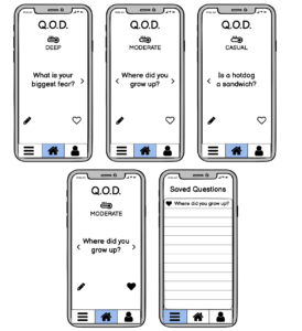
Viewing and Saving Questions (Option 1)
Above are the sketchy screens for the task flow in which users will view and save questions. Since these screens are the main functionality of our app, we wanted them to be very simple and straightforward design-wise. We also chose to go for a more simple design as a way of encouraging users to actually use the questions we suggest. Since the social interactions we hope to support are intended to occur outside of the app, we hope a simple design will encourage people to spend less time on the app and more time immersed in these outside conversations. Element-wise, we added a temperature icon and label in order to show users which depth-level of question they are looking at. Each day, we intend to offer one casual, one moderate, and one deep question so that users can use their own discretion to decide which depth of question is most appropriate to ask the specific people they have conversations with. We included a navigation bar at the bottom to allow for easy app-navigation and to remain consistent with our simplistic design. The user can interact with a question by creating a log to write down notes about the conversations they had using it (pencil icon) and by saving a question in case they want to use it later on (heart icon, which becomes full when a question is saved).
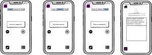
Viewing and Saving Questions (Option 2)
Another view of the viewing and saving questions. Rather than just the traditional swiping left and right, we decided to have explicit buttons for people to press. We wanted to keep the questions the main focus of the page but to emphasize the functionality of writing in to the log (hence why it is part of the nav bar). Additionally, when clicking into the saved questions library, we wanted to try out the filtering option so that users can more easily choose how to filter down the questions that they’re looking through. We also tried out the meter bar at the top to show people how intimate the questions were.
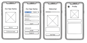
Signing In and Onboarding
Above are the sketchy screens for the task flow in which users sign into the app. If they are signing up then they will go through the onboarding process before being directed to the app’s profile page. These screens are not the most important but they will become a big barrier for users if not executed properly. Most importantly, this process should be very simple and expected for the user, which is why the design relies quite heavily on the designs that users will have seen in other applications. We wanted to make sure that first time users were properly on boarded to the app, which is why we added the whole onboarding flow. Since the focus of these designs is the Sign Up flow, we did not focus too much on the profile screen design itself.
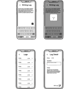
Logging and Viewing Logs
Above are the sketchy screens for the tasks of adding logs and viewing logs. The focus of the app, and thus these screens, are sheer minimalism. Thus, in writing a log, we simply show a blinking cursor, the text that is written, and a check button to finish the log. Upon pressing the check, it shows a “toast” saying “log save”. This decision was made to give a more explicit signal to the user that there was a successful save, before they get sent back to the home screen. The bottom two screens are the View logs flow. Here, you can see a list of all your prior logs, with the two most important pieces of information, the name of the person you were asking, and the date. You can press the arrow to open the detail. The dates are important to give a chronological sense to the logs, and were prioritized over the question of the day for spacing reasons. When segueing into the Log Details screen, you can now see the question of the day for important context, along with the written log. The bottom right button allows users to edit the log, which would take them back to the log editor screen in the top right. Among all the screens, we use a left chevron as a back button.
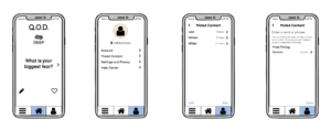
Muted Content
Above are the sketchy screens for the tasks of muting content from the QOD. This is done by going through the profile page and then adding words, topics, or content that the user may not want to be asked questions about in their QOD. They can chose for how long to mute them as well.


