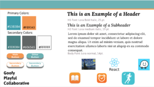
Style Tile:
We looked back at the Brand Personality document that we made and synthesized that into three adjectives. From those, we chose colors that seemed to go with those adjectives. From lecture, we learned that blue is a popular color for applications so we chose a type of blue for one of our primary colors and a bright orange as our second primary color. We are planning to use this orange as an accent color. For the fonts, we chose a readable font that we put in bold and italic for the headers and then used in regular for the body. When in italic, the font is more playful, but still readable which is what we are going for. In the bottom right corner of the style tile are the apps and painting we looked at to come up with our primary and secondary colors.
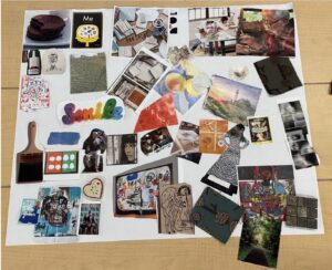
Mood Board:
We were inspired by the brand personality worksheet exercise when making the mood board. Our brand personality was overall relaxed and wanting to create a chill environment to express creativity. It’s also welcoming of all different creative practices such as drawing, baking, painting, fashion, etc. We wanted to include a variety of representations of creative practices and also wanted to include calming scenes and patterns.