
Since our team has completed our initial intervention design and synthesis, we’ve begun the process of designing our solution. Similar to what we did in 6B, we started by creating a system map to better understand the various personas using our application and how they would relate to our app. Three of our personas were represented:
- Bored Bob – the user who finds himself scrolling for hours on end while lounging on his couch due to boredom. He feels like there is nothing else to do…
- Social Suzy – the user who justifies her overuse of social media by saying that “it helps her keep up with all of her friends”. She gets sucked in by the addictive Instagram Reels, but she knows that her scrolling time is getting out of hand.
- Busy Billy – the user who finds himself trapped in a vicious cycle of using social media as an outlet for stress but then getting more stressed as he falls behind on his work due to the hours-long scrolling sessions. His scrolling has started affecting his ability to perform well in his classes as well as his sleep schedule.
Each of these users has a different motivation for using our app, Tap Out, and for wanting to cut down on their social media usage. They all begin at the onboarding stage where they will:
- Input the scrolling limits they want in place for individual social media apps
- Input goals / other things (i.e. reading more books, playing the guitar, etc.) they want to do with the time they will “get back” from scrolling
- Set a location for where they think they spend the most time scrolling – this location will act as the location that they will need to “move from” when they meet their scrolling limit but want to unlock more time
After registering, our app will run in the background. Once the user-set scrolling limit has been reached for any particular app, users will have the option to:
- Tap a specified amount of times to unlock more scrolling time
- Choose to move from their current location by:
- Moving outside of the radius on a walk or run
- Doing a workout and logging it
- Browsing local activities and choosing one
Using location tracking, users will be rewarded with points once they leave their specific location. Points correspond to the leaderboard where users get to interact with friends and see how their scrolling time measures up with their friends.
Additionally, our system will empower users to better understand their habits surrounding screen time, scrolling, and their environment with data and data visualizations.

After understanding the system of our solution, we then created a bubble map diagram to begin navigating the different components of our solution and further reinforce how they interact with each other.
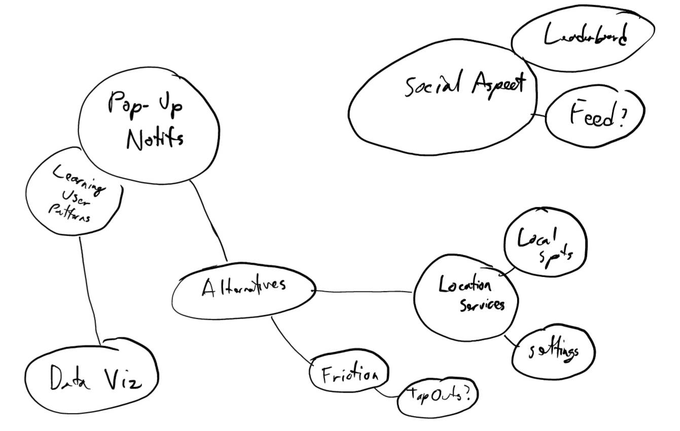
Having the system map, bubble map, and our past storyboards together ultimately let us assemble all of this information into concrete wireflows, where we can finally visualize what the app will look like for the user from start to end. Each team member focused on a different aspect of the app:
- The default home screen
- Onboarding for the first time
- Prompting the user to move their physical location or see cool things in the nearby area
- Personalized data/user information
- Tailored notifications
- Leaderboard functionality
Home screen & personalized data/user information:

The default page breaks down the user’s current screen time. If they click on the breakdown, they’ll get a more in-depth view including a “map view” that shows the geographic locations where they scroll the most. The calendar view lets the user see the screen time break down for any specific day.
Onboarding:

The onboarding wireflow shows the information that the user will have to input when they first download the app, such as their daily screen time goals, activities they generally like doing, locations where they think they scroll the most, and turning on location services.
Prompting the user to move location or do an activity based on their location:

Prompting the user to move locations or do an activity based on their location gives the user autonomy with what to do.
Leaderboard:

The leaderboard shows users where they stand compared to either friends or strangers if no friends are on the app. The user can congratulate/”nudge” their competition and get notified when their streak continues or breaks.
Reaching time limit:

When the user reaches their time limit, they get a little informational breakdown with how long they scrolled. The user also has an option to bypass the time limit by tapping a button repeatedly (over 100+ times), although it will drop their rank in the leaderboard if they tap out to completion.
Tailored notifications:

Tailored notifications include notifying the user when they have climbed the leaderboard, drop in the leaderboard, reach their time limit, if they’re in a location where they tend to scroll the most, etc.
Synthesized wireflows into one cohesive wireflow:

Synthesizing all of our individual flows into one was fairly straightforward, especially with our system path and bubble map in mind. Because scrolling through short-form content is addictive to millions of people, we want our app to be as effective for as many people as possible. This is why we implemented multiple different features so different users can reduce their time spent scrolling, such as: a leaderboard for people that thrive on gamification, suggestions on fun things to do based on the user’s current location for people that scroll out of boredom, and a “tap out” button for users that thrive on getting shamed. Our wireflows are connected in the same way we drew out the system path and connected our bubble map. Every major feature is one click on the home page.


