
This week, our team focused on app branding. Building off from the ideation and wireframes we created during class, each member had a clearer vision of how the app should look & feel. Each of us first came up with words/phrases that capture the overall “vibe” we wanted to portray, then searched for images that accurately resonate with that feeling. Each team member criticized and weighed the pros/cons of each mood board and we agreed on a final mood board that holistically portrays a common vision among the team members. The style tile was completed based on the final mood board and the “vibe” we wanted to capture.
Claire’s Moodboard:

Rationale
Words and phrases that I had in mind when creating this mood board:
- Reaching goals
- De-stressing
- Increasing productivity
- Empowering
- Growth
- Community
For my mood board, I found images that I felt acted as symbols for some of the above keywords and phrases. For example, the two images showing individuals climbing to the top of a mountain are meant to illustrate achieving a goal which can be a challenging but very fulfilling process. Analogously, breaking the habit of deadlock scrolling is hard but a worthwhile pursuit. Additionally, our solution aims to allow users to repurpose the time they used to spend scrolling and purpose personal goals, such as learning to play the guitar, try cooking, or work out, and in this spirit, I included images of individuals participating in these activities. Overall, I want our app to empower individuals to be free from their habitual scrolling habits and reclaim their time supported by other friends working towards the same goal.
Pros
- Very bright, vibrant, welcoming
- The activities conveyed (being active, stimulated, enjoying life beyond the phone) and emotions evoked from this mood board (happy, focused, empowered) accurately reflect a lot of what our app aims to achieve
- The colors aren’t associated with existing social media apps, especially IG/TikTok; it could be a good thing to not associate with such apps to prevent the user from thinking about & reopening IG/TikTok
Cons
- All of the images convey some intensely bright/happy emotion.
- Our app should be used at all times to reduce deadlock scrolling, not just when someone wants to do something fun/exciting/be very stimulated
Overall Commentary
The empowerment is an awesome theme that goes well with the overall direction of our project. However, there may be times in which the user doesn’t feel or want to feel the bright energy, especially if they haven’t been doing a good job of meeting their goals of late. We might need to mix this with a calmer theme that can match the user mood in mellower times. There could be space for a good transition between these empowerment feels and the calmer feels.
Nick’s Moodboard
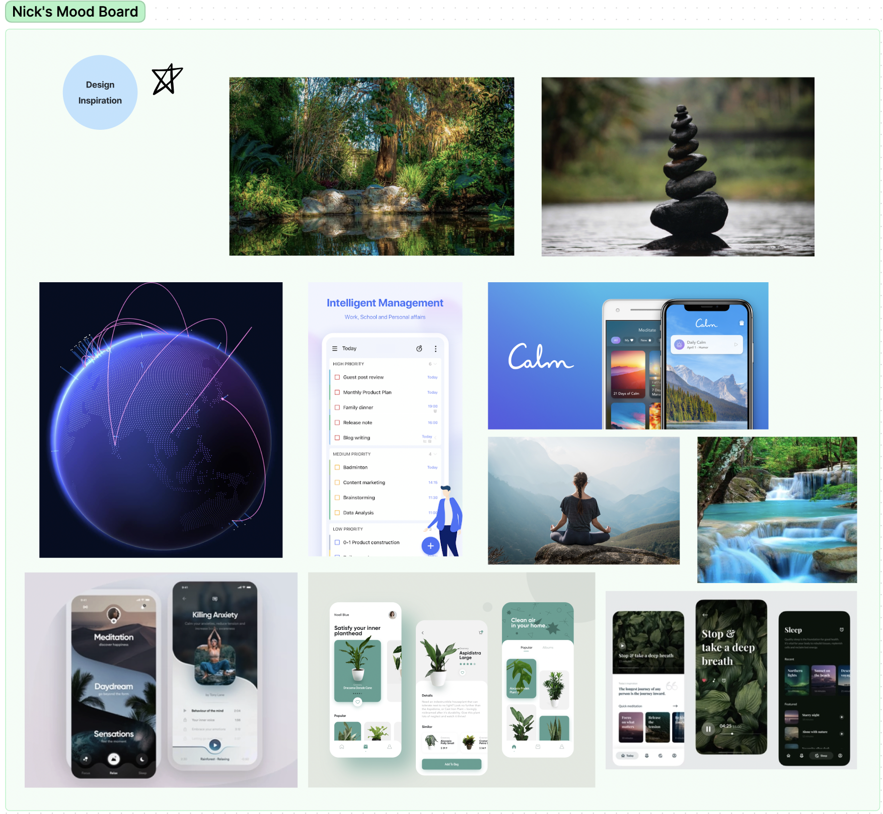
Rationale
Words and phrases that I had in mind when creating this mood board:
- Productivity
- Cleanliness
- Growth
- Peace
- Air
- Water
Immediately I wanted cooler colors for this app. Cool colors feel soothing, which I feel is appropriate for the absence of social media. When I get off my phone, I also tend to feel more connected with my natural surroundings. I think of nature as the opposite of man-made tech, so I brought in some plant motifs and UIs. In our app, we encourage users to get outside, and I hope our app can capture a sense of peace and help our users be more productive and resist the endless scrolling.
Pros
- Strong “calm” vibes — this theme is successful and validated by all of our competitors
Cons
- Too calm could potentially equate to not being stimulating enough.
- So many of our users end up deadlock scrolling specifically because they’re not getting enough stimulation elsewhere. If this app isn’t stimulating enough, how much value will that user segment get from this?
Overall Commentary
The calm vibes are similar to many of our competitor apps which clearly shows that there’s a strong rationale for this type of theme. But we wonder if this is really what the user wants. Many times, the user does want to just relax and take a break but the current routes that they use are social media which can be calming but can also be funny or crazy depending on your content. The variety and change of themes may be something that we want to incorporate into our app.
Hyunseok’s Moodboard
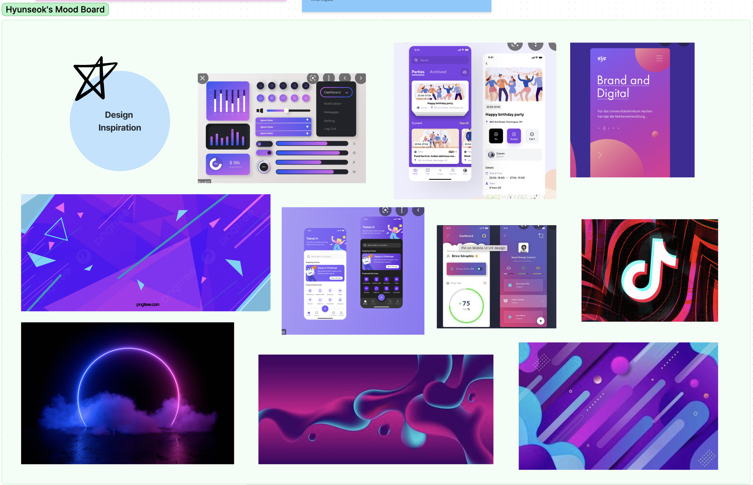
Rationale
Words/phrases: Passion, Fun, Entertainment, Addictive, Flashy, Vibrant, Eye-catching, Energy, and Intensity.
I began developing the mood board with an intention of replicating the primary and secondary colors of popular short-form content applications, namely TikTok and Instagram. My rationale for this decision came from the fact that our target audience uses the app daily. Our app aims to prevent users from accessing short-form content; it is essentially competing for attention with TikTok/Instagram and they intentionally use vibrant colors because satisfies the visual needs of their users.
Many competitors of our app attempt to portray a calm, soothing, decluttered aesthetic; however, their interface is not interesting enough to compensate for the lack of visual stimulation users are missing from short-form content applications. I believe that when designing to change behavior, we should aim to provide some form of a substitute to accommodate the transition of behavior. This is based on the assumption that users will be more inclined to enter our app via notification from TikTok’s home screen if our app can provide a similar level of visual stimulation.
Also, this mood board creates an instant connection between our app and social media applications. This intuitive connection can be useful and can be eye-catching to the users.
Pros
- Color/brand competes with TikTok/IG, which is what we’re doing!
- Not as bare-boned & “calm” as competitor apps; ours is as stimulating as TikTok/IG, which could cause the user to actually use our app.
Cons
- Potentially remind users of social media & accidentally lead them back to the apps we want them to get off of
- Does the aesthetic of this mood board (beyond the color) truly match the function of our app (such as getting a user off their phone and stimulating the user in other ways, e.g. suggested activities based on their location)
Overall Commentary
We really like the popping colors and bright energy of this board. The idea of competing with the social medias as opposed to providing a calmer theme is really interesting and will probably help the user transition away from social media while using our app. However, one possible complication could be if a user feels like they are getting a small taste of the full experience which then moves them towards their social media again. We want to make sure that we don’t just remind them of social media and push them back towards the thing we’re trying to reduce.
Team 10 Synthesized Moodboard and Style Tile
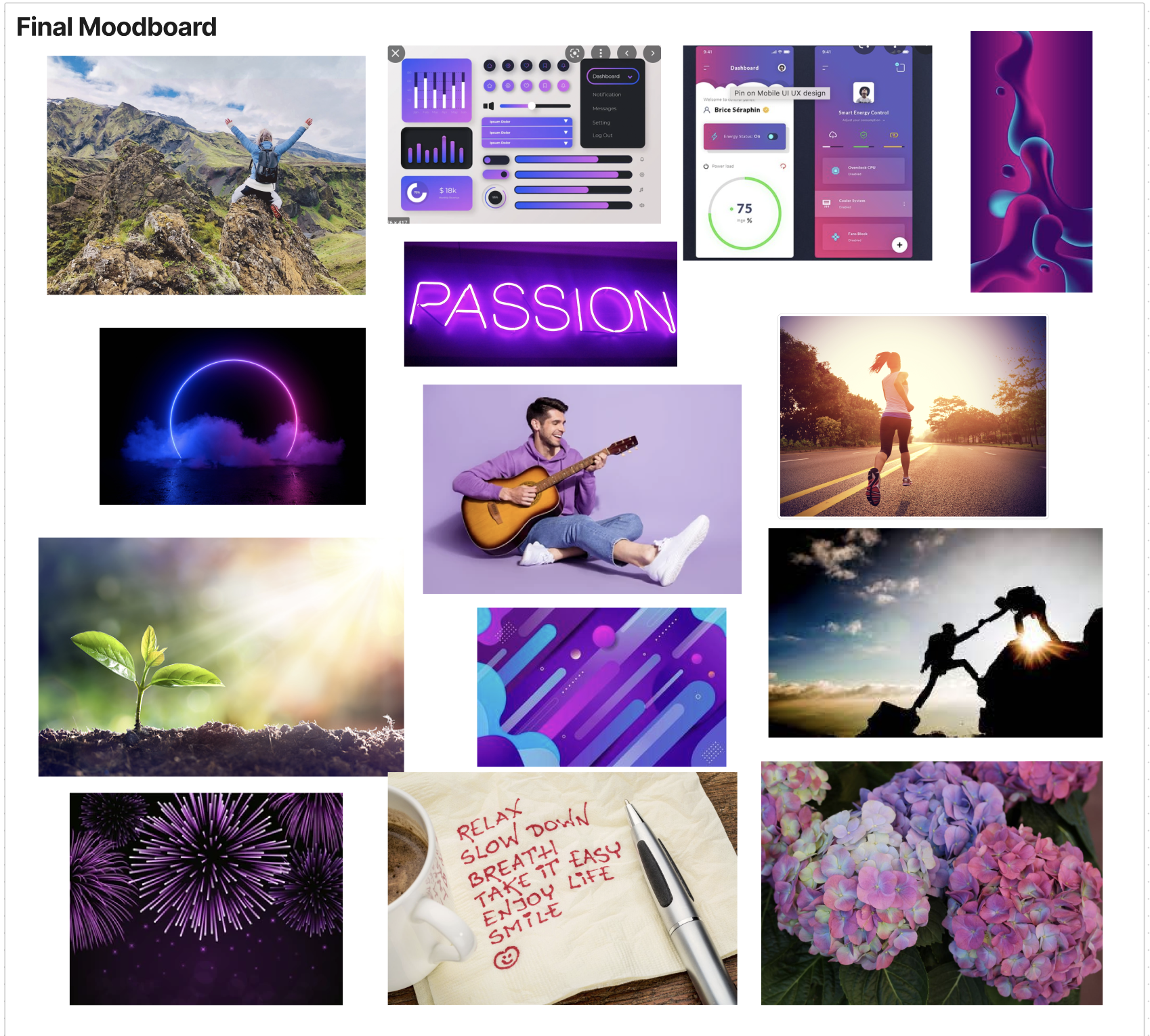

Rationale
During the deliberation process, we found that Claire’s vision of portraying moods of “Increasing productivity”, “Empowering” and “Growth” was very much aligned with the value proposition of the app. We also liked Nick’s vision of incorporating natural objects into the UI to create a calm and relaxing mood in the app. Although Hyunseok’s mood board differed significantly from the vibe of the 2 other mood boards, we decided that the rationale behind our application providing a similar level of visual stimulation as TikTok was something we wanted to experiment with.
Symbolic Images
Images that embodied the personal growth and reaching goals, such as summiting a mountain or a plant growing under the gentle beams of sunlight, were included here to exemplify the underlying purpose of our tool. Additionally, we incorporated images of people doing different hobbies such as playing guitar or running, to inspire individuals to think about their personal passions that could be poured into with the time gained from lessening their scrolling on social media.
UI screens
We incorporated UI screens that we found from Dribble and Behance in the mood board. Here we wanted to portray the data-driven nature of the app. One of the key features of our application is to provide a better synthesis of screen time data, in a meaningful manner.
Colors
The primary and secondary color was chosen based on the dominant colours that are illustrated in Tiktok. We seek to create a similar level of visual stimulation so as to assist users to enter into our application. These colors are also associated with upbeat moods such as vibrant, fun and energy.
Although the mood board may seem cluttered without a unifying theme, we believe that it is our job to design and create the necessary UI elements to capture the 3 conflicting moods under one app. By incorporating the essence of nature, growth and fun into a single app, we believe that we can deliver a competitive advantage.


