

Our sketchy screens cover our core features from last week’s wire flows.
Home page:
 We want the user to see a quick overview of their screen time and goals immediately upon opening their app. As seen on the first sketchy screen, the amount of time they’ve spent on particular apps is visualized by the size of the app logo. This lets the user quickly see which apps they’ve been spending the most time on without having to read anything. If they do want a deeper breakdown, however, the user can just press the center square to see a more detailed chart of how long they’ve spent on various apps throughout the day.
Setting up screen time limit:
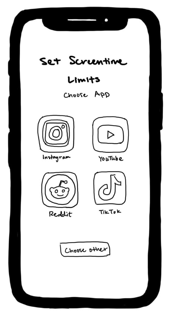
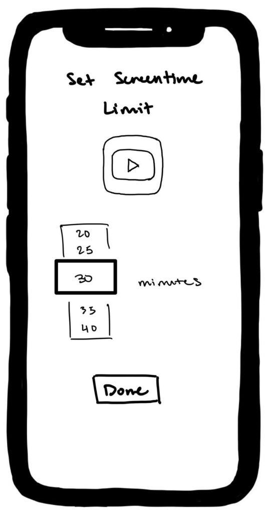
The design for setting up screen time limits for specific apps is intentionally very minimal. The user will be prompted to set a screen time limit for the social media apps that currently exist on their phone, but are able to select other existing apps if they want. Once they’ve selected an app to set the screen time limit for, they can set the limit by scrolling through a dial. We kept the design very simple with only the crucial feature so the user can efficiently set their goal and start using the app asap.
Reaching time limit:

We wanted to explore two different visual representations for the screen that would pop up when users had reached their self-set scroll limit.
The first screen makes use of an hour glass which is a classic icon used for screen time limits, especially for Apple users. The user can then choose to “explore” suggested activities based on their current location and interests OR continue scrolling. The explore button is highlighted to incentivize the user to click on it.
The second screen contains a more traditional alarm/clock image with an emphasis on the actual amount of time that has been reached. In this screen, the design choice that nudges the user to “live a little” is the difference in emojis (trash can emoji for the “keep scrolling” button; winky face with tongue emoji for “live a little”).
Leaderboard

Like all of our other screens so far, the design for the leaderboard screen was also kept pretty minimal. The leaderboard screen itself highlights the top 3 people, while the ranking beneath the profile pictures indicates how many points each user actually has. The second sketchy screen shows what a streak increase looks like — just a fire emoji, the streak count, and how many points the user gets from their streak increase.
Example notifications

This one is less sketchy, but still a screen! We created these screens anyway to really visualize how a notification would pop up and what the notification would actually say and look like when the user is on their phone.
Overall, our sketchy screens were designed pretty minimally; we wanted to avoid anything frivolous or anything beyond the core functions of the app, since we don’t want our users to sink time into their phone in general.


