
What we’re going for
We intend to design Tend as a calming and engaging application. We used the branding exercise to brainstorm what traits our brand would embody, and here’s what we came up with. We want our users to feel relaxed and rejuvenated while using the app. Moreover, we want them to feel attached to their in-app experience and creations so that they want to come back to grow their ecosystem. The brand personality we are aiming for is a mixture of a wise and warm grandparent and a relaxed holiday on the beach. We want our users to feel calm and relaxed as soon as they enter the app. We want to greet them with their flourishing picturesque ecosystem and soothing pastel colors that put them right in the mood of doing a nourishing creative activity. We want our users to feel a sense of attachment to the ecosystem they are creating. Thus, whenever they have some free times, they will be inclined to view how their ecosystem is doing and how they can help the ecosystem by helping themselves. The narrative of the ecosystem goes a step further. They are part of the ecosystem that they are creating, the more that they flourish in their activities, the more their ecosystem will also flourish.
Mood Board
For our mood board, we focused on finding textures and images that invoke a sense of calamity and healing. We focused on scenic mountains, lush greenery, and warm colors. Another interesting focus point for us was on animals. As you tend to your hobbies and your nourishing activities very similar to how an animal takes care of its little ones. We wanted to appeal to the sense of parenthood that our users should have towards their ecosystem by including imagery of small wildlife. We were also inspired by some activities that were mentioned in the magazines like playing guitar and reading. We found that those activities were creative and nourishing.
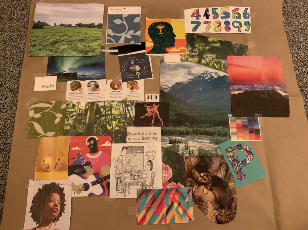
Image of Moodboard on a Paper Canvas
Style Tiles
So, we each split off to create our own Style Tile that embodies this vision.
Michael’s Style Tile
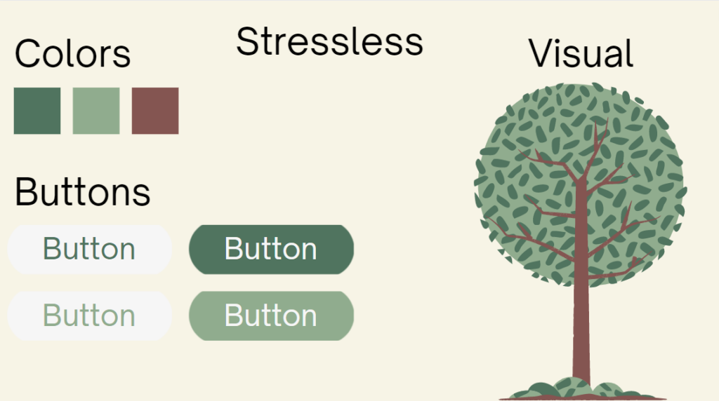
From Michael: With my style tile, I wanted to focus on the rejuvenating aspects of a simple tree. I wanted to have the app inspired by the beauty of nature. I used matte pastel colors to elude a sense of calamity and relaxation while ensuring that the app remains colorful to add some energy to it. The tree is reflective of how strong and powerful a habit can be even in harsh winds. However, it still needs the attention of the user to care for it. With every successful break spent, the tree will grow bigger and become more established in the ground. For the font, I decided on open sauce, since it was very calm while also feeling energetic and young. It was respectable without being authoritative. I could not find an app name that fits the metaphor precisely, thus I called the app stressless. I found that this encompasses a large amount of what we want to do with the app. However, I was not satisfied with the name.
Serena’s Style Tile
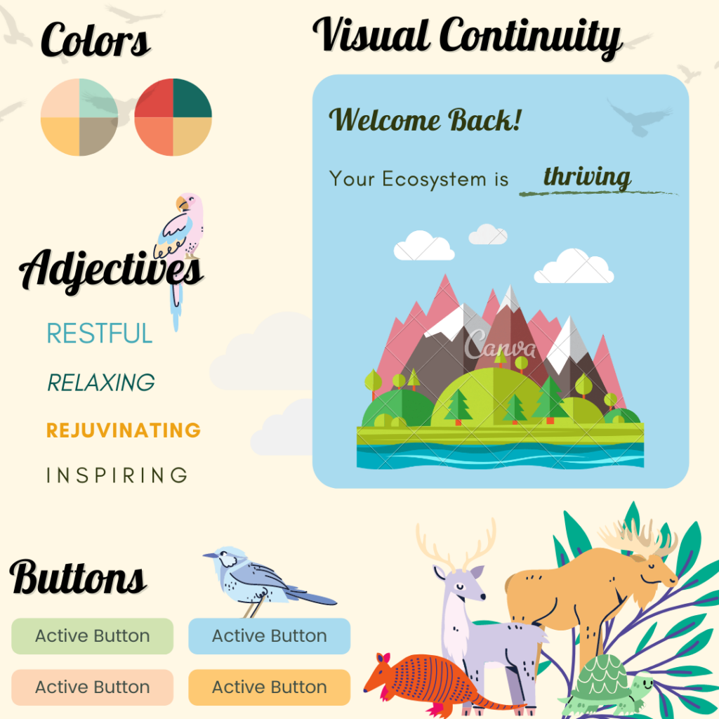
From Serena: I wanted to combine the healing, calming effects of nature with rejuvenating and inspiring energy. As such, I incorporated a lot of wildlife and dynamic components of the natural world (i.e. rivers, clouds, birds in flight) into my design. I opted for bold, eye-catching fonts and colors that would give the app an energizing, excitable vibe. I also envisioned a visual incentive for users as the opportunity to develop a vibrant, dynamic natural ecosystem with each successfully spent break: an ecosystem abound with flowing water, colorful grazing animals, and breezy skies above towering mountains. Fittingly, I named the app “Ecosystem”, a representation of sustainable, steady, and mutual growth.
Arjun’s Style Tile
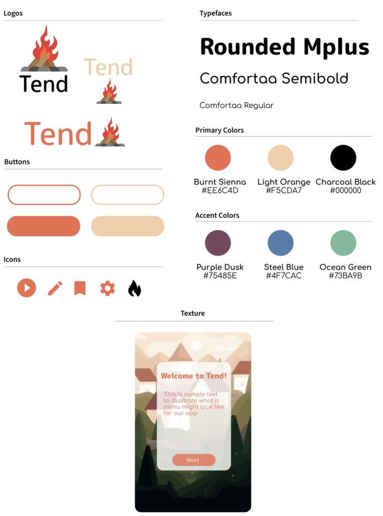
From Arjun: With my style tile, I wanted to find a growth metaphor that conveyed the relaxing, homely warmth that a rejuvenating activity can provide. Eventually, I settled on the metaphor of a growing village, all centered around a campfire – a hearth. This showed up in many aspects of my design. The logo name, Tend, referenced the act of careful, deliberate, maintenance – not toward any kind of upward progress (there’s no pressure to tend to a fire to make it the biggest or brightest), but just towards maintenance. The logo features a cartoon-y campfire, solidifying the campfire metaphor while also highlighting the fun, low-stakes vibe we’re trying to convey. The primary colors of the app came from this campfire, featuring dark orange, light orange, and a charcoal style black. The accent colors represented what the background of our village would be composed of – a purplish night sky, a green landscape, and a light blue day sky.
Combined Style Tile
Putting what we thought were the best parts of each design together, we then came up with our unified Style Tile.
The general aesthetic of Tend is: nature with a vibrant pop. We want our app to have a nourishing, energizing, and motivating feel. This objective plays out in multiple ways.
After much discussion, we decided on the final name for our app: Tend. Our aim is to convey a very specific meaning: short, but regular and sustainable periods of attention towards a goal. The type of effort that one applies toward tending, say a garden or flame, is exactly the kind of attention and energy we want our users to channel into their break times. Our vision is to help our users engage briefly, but meaningfully, with things that have a larger purpose: restoration, rejuvenation, and longer-term benefit.
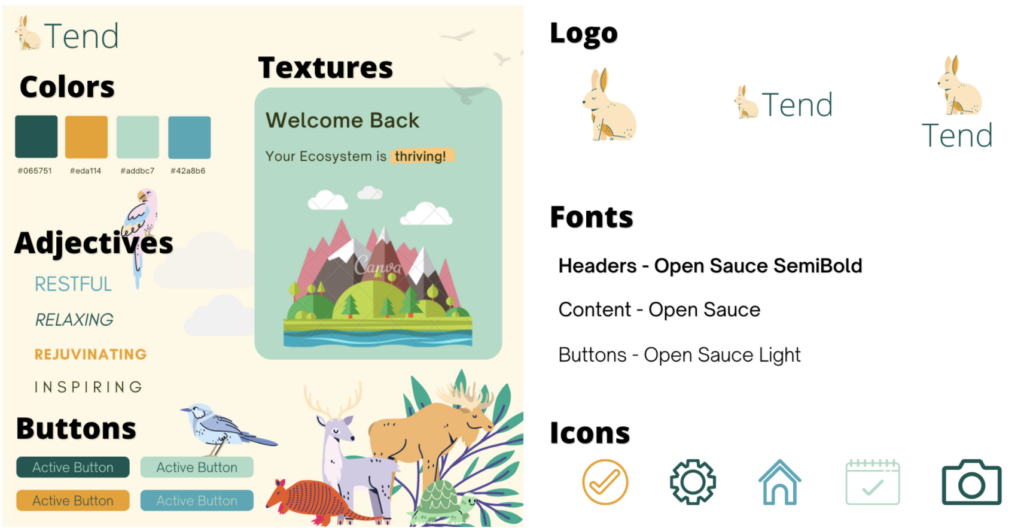
Firstly, our logo is a bunny: a symbol of longevity, gentleness, abundance, and rebirth (and cuteness!). We wanted to choose a “mascot” that people would want to nourish and watch grow, and encourage a sustained involvement with the app. In combination with the app’s name, Tend, we want to market the app as an enriching experience full of life, rejuvenation, and growth!
Additionally, we plan to incorporate a substantial aspect of visual continuity as a way to incentivize users’ sustained “tending” to rest and recovery during their short breaks. Each user has their own unique ecosystem. With each break spent meaningfully (i.e. resting or enjoying a fulfilling activity), a new thing is added to the user’s ecosystem. This “thing” can range from: the birth of a new animal/species, a new type of flower, the emergence of a new mountain, a new branch of a stream. As users continue using the app, their ecosystem will dynamically evolve into a vibrant and visually appealing display. In line with this, our brand’s colors are what we describe as “hipster earth”: organic and natural, made edgy. We also chose our fonts to have a simple, minimalistic feel with lots of white space so as to ensure that this visual display remains the focal point of the app.


