

Moodboard
For the moodboards, each team member created their own moodboard. We also have the moodboard from class. The moodboards are below:
Braedon’s Moodboard
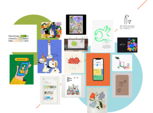
Braedon’s reasoning: “I tried to preserve a feeling of whitespace in order to contrast from a busy college student’s day. The whitespace is supposed to help create a decluttered, peaceful environment with the sole focus of connecting with family. I also included a flower and plant motif to symbolize growth–in our case the growth of the bond between our user and their family member(s). To capture openness and friendliness, I included playful illustrations that exude those characteristics as well as bright but soft colors.”
Cat’s Moodboard

Cat’s reasoning: “When I think of our app’s brand, I think of soothing colors like baby blue and peach. I focused on the feelings of warmth that arise when you contact your long distance family member. I focused on wholesome sincerity between family and included this with simple round cartoons of long distance calling. I also included some images of simple UI to incorporate, since I want our app to be accessible for family members of all ages.”
Clara’s Moodboard

Clara’s reasoning: “When I think of our app, I think of home and coziness. I selected images that captured these feelings for me, with a focus on togetherness and relaxation. I also wanted to capture the simple happiness of childhood and family, so I used images from summertime and nature. Finally, I imagined a certain cleanness to our app, so I picked some green images in order to create a sense of calm and simplicity.”
Isabelle’s Moodboard

Isabelle’s reasoning: “I sought to visually channel the sensation of a warm hug from a family member on a rainy day, which I felt was similar to the feeling of speaking with a close family member during hard or busy times at school. This evoked lots of bright and warm colors such as red, orange, and yellow, with lots of fuzzy sweaters, warm lights, and hot chai lattes. I also wanted to add an element of casualness so I added playful “kawaii” cartoons of cute animals and hearts to show that our product is a family-oriented app rather than a colder distant connection app.”
Minha’s Moodboard:

Minha’s reasoning: “I wanted to capture the sense of safety and home that spatial grounds create. The depiction of cozy places like the tree house, fire place, open room with natural scenery and camping van feels peaceful and warm. Familiar images associated with home such as the laundry hangers, family pet, comfort food like boba, and candle from Encanto also gives it a friendly, everyday comfort. I included various colours to represent diverse and colourful adventures of life, and at the same time attempted use have some consistency and simplicity through the animaion aesthetic.”
Team Moodboard
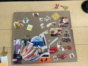
This is the team moodboard from class. We captured emotions of family, the freedom of summertime, and potential colors for the product.
Style Tiles
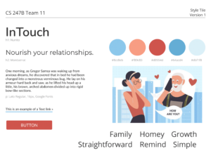
Isabelle’s Style Tile

Isabelle’s reasoning: “To make the feel of our app welcoming and easy-to-navigate, I picked Gaegu as the header font and Varela Round as the paragraph font. Gaegu felt whimsical and friendly, which is in line with our app’s goal of non-judgmentally helping users keep in touch with their family more. I chose to switch to Varela Round for paragraph font to make it easier to read, and because Varela Round felt more open than traditional sans serif fonts like Arial (the font of this paragraph). I picked a dark orange as the main color our style tile because it’s unique and reminds me of fall/warm lattes/fuzzy sweaters, all positive symbols that are often associated with warmth and family.”
Cat’s Style Tile
Cat’s reasoning: “I imagine our app and brand to be very friendly and welcoming, with round fonts at the forefront. Definitely no serifs or other sharp edges on characters, as these are too formal. My color proposal sticks with a light blue and a maroon for accents – two colors keep things simple. This app will have a very straightforward goal and that is to keep you in touch with your family members according to the goals you set for yourself. Therefore, this app will be minimal, clean, and welcoming.”
Minha’s Style Tile

Minha’s reasoning: “I chose Fredoka One as the project name font since the smooth/roundedness of it goes well with the kind approach we have with the branding. The color palette was inspired by the two images included, where the turquoise blue and pastel purple gives a unique and invaluable look and the soft orange and yellow brings some warmth and bright highlights on the frame. The general splash of color in the background would be nice so that the overall look is still bright but there is a warm undertone instead of the cold blankness of white. The body font I chose is Assistant, where the x-height is relatively high so that it’s more legible in smaller texts on phone screens.”
Braedon’s Style Tile

Braedon’s reasoning: “I chose DM Sans and Rubik as the main fonts to keep a clean, minimalistic feel for the same reason as the whitespace in the moodboard (to contrast from business and clutter). To capture openness and friendliness, I included bright but soft colors as well as slightly rounded edges. The goal was to keep everything minimal to focus on the main intrinsic reward that comes from connecting with family.”
Clara’s Style Tile

Clara’s reasoning: “I decided to use warm, Earth tones in order to create a welcoming environment which is warm and friendly to use. I imagined our app would have a calm and friendly feel, and chose fonts which embodied those emotions to me, while still be easy to read quickly. I also picked colors which are warm but relatively muted in order to create a calm feeling to the product.”
Team Combined Tile

We combined elements of all our style tiles together for our final style tile, which uses Earth tones to create a joyful and bright style, which is simultaneously homey and warm.


