
Sunflower
Project Dates: 1/9 – 3/17
Team Members (left to right):
Labib Tazwar Rahman, Kaitlyn Lee, Tiffany Lee, Michelle Xu, Kayla Patterson,
Roles: We all took turns doing UX research, UI design, and Product Management
 This quarter, we decided to focus on the habit of sunscreen wearing for young adults, with the greater goal of helping individuals develop the habit to last the rest of their lives.
To achieve this goal, we developed Sunflower, a virtual sun plant & social “garden” in the form of an app & widget. With Sunflower, you receive reminders from your friends to build on your sunscreen wearing habits, and you can build your own habit by taking care of your virtual plan. Sunflower leverages your social network to create a shared, collective garden to encourage all to keep up with daily sunscreen wearing and keep your friends accountable.
Problem Finding
Many young adults skip the habit of wearing sunscreen daily, despite spending time in the sun. A survey by the NThey see wearing sunscreen as a hassle. However, wearing sunscreen during early adulthood can reduce the lifetime incidence of skin cancer tumors by 78% [source].
We were excited about this problem space because we all believe that sunscreen is an integral part of skin health and saw it as a chance to help many of our peers integrate sunscreen into their routines.
What is known about the problem?
Sunscreen usage amongst young adults is very low– a survey by the CDC found that only about 30 percent of women and less than 15 percent of men regularly use sunscreen on both the face and other exposed areas of skin. [source]
From our literature review, we found that
- Sunscreen education has positive correlation with sunscreen use, but basic sun-induced skin hazard awareness is not enough. There is a need for more comprehensive education
- Text messaging has efficacy in research to promote sunscreen use; however, the effectiveness of text reminders tends to drop off over time
- More personalized messages tend to be more effective
- Important factors to consider for starting a new routine behavior are: a desire to reduce effort, prior experience with similar behaviors, and beliefs about effective approaches.
Our full literature review can be found at the following blog post.
To get a sense of what was already on the market, we analyzed sunscreen reminder apps, habit trackers, and skincare applications in our comparative analysis.
Many of our habit tracker competitors focused on tracking multiple habits instead of one, which we found could be overwhelming for users. In addition, sunscreen-focused apps like Sun Index, Sola, and Mii Skin often required users to provide private data such as location, healthcare provider, or camera access, which added friction.
Some of the strengths of the competitors include: inclusivity of different skin types, individualized data personalization, reminder notifications of habits, smart reminders based on UV index throughout the day, and a social aspect that allowed users to encourage each other’s habits.
2×2 Matrix

In summary, from this comparative analysis, we found apps that can be categorized on two axes: i) Tailored for sunscreen vs General habit-building/tracking and ii) Social vs Individual-use
We see that there is an opportunity in the top left quadrant, for social apps that are tailored to sunscreen. We believe that this is a unique area to position ourselves in, as we don’t see anything in the market like it. Social habit-building apps can work, as evidenced by the 3 social habit apps we found, so this would be a good opportunity to create a similar app in the sunscreen space.
Our unique value proposition will be an app that helps you build the habit of applying sunscreen with friend(s). The messaging could be something like: “With our app, you can protect your skin while staying connected with friends. Remind yourself to reapply sunscreen throughout the day, and share your sun-safe moments with friends to encourage one another to protect your skin.”
Users can stay on top of their skin protection while also staying connected with friends and family by incorporating features into a sunscreen-focused app.
For more information on our 11 competitor analysis please view our comparative analysis blog post.
Baseline Study
You can find a more detailed study plan here.
Our target users were young adults from the ages of 19-25 (typically college students or new grads). This was an easy group for us to target and immediately begin the baseline study with because we had the greatest number of connections for this audience. We also focused on this group because it’s important to develop sunscreen-wearing habits early, since the process of protecting skin should be done over time.
We decided to monitor how, when and how many times users would wear sunscreen each day, as well as information about their morning routine for 5 days (Wednesday – Sunday). If users wore sunscreen that day, we asked users what prompted them to do so, and if they didn’t wear sunscreen that day, we asked them why they chose not to that day. We decided on these key questions and activities because we wanted to learn more about in what context users would wear sunscreen. We also hypothesized that most users would fit sunscreen into their morning routines alongside other skincare products, so we monitored their morning routines to see if there were any opportunities for behavior change there.
Baseline Study Synthesis
You can find our full synthesis process in our midpoint submission.
We synthesized our findings from our pre-interviews and the baseline study into 2 conceptual models– a connection circle and a fishtail model.


Our baseline study showed a few common themes:
- Necessity: People felt like they only needed to wear sunscreen at the beach to prevent sunburn. If it’s cold or cloudy outside, they don’t feel the need for it.
- Aesthetic and comfort: People hated the greasy feel or white-pasty look on the face.
- Immediacy: People didn’t think that skin aging or skin cancer were problems they needed to worry about, and didn’t immediately see the effect of not wearing sunscreen.
- Time: People have minimal morning routines because they’re in a rush to get out the door.
- Social Pressure: People’s attitudes towards sunscreen were influenced by their peers.
Based on these insights, we wanted to investigate how we could make the impacts of not wearing sunscreen more immediate. We also wanted to investigate the social pressure aspect further and see if we could increase one’s exposure to more people who want to wear sunscreen and tie it to a habit. We hope that by doing so, we could help incorporate daily sunscreen-wearing as a habit.
Refining our Problem Statement:
Our initial problem statement was “How can we help young adults wear sunscreen more often?” From the results of our baseline study, we saw that only 2 out of 10 participants wore sunscreen at least once during the study. As this further validated our problem statement, we did not change it much. However, we considered different aspects of how we could do so– “How might we remind people to wear sunscreen?” “How might we incorporate sunscreen into people’s morning routines?” “How might we help people choose the right sunscreen for their skin type?”
We ended up moving into ideation with a slightly more narrowed question– “How might we people build a daily habit of wearing sunscreen?”
Personas & Journey Maps
Based on our baseline study, we came up with 3 primary personas with distinct needs and motivations (detailed versions in post):
- The “Busy Bee” knows how important sunscreen is for skin health, but is often in a rush and forgets to wear sunscreen on the way out. They want a seamless way to introduce sunscreen into their busy schedule.
- The “Reluctant Rhino” knows that they should wear sunscreen, but they don’t see the importance of wearing sunscreen on a daily basis, especially because it’s hard to see an immediate effect. They are looking for a low-effort way to make sunscreen a habit.
- The “Working Walrus” knows that sunscreen is important, but they spend most of their time indoors working an office job. They want to be educated more on why they should wear sunscreen daily even with their low sun exposures.
Our corresponding journey maps (higher resolution) :


These insights helped us understand the best way to encourage them to wear sunscreen. Because all participants thought about putting on sunscreen during their morning routines, we ensured that our intervention starts in the morning. Our future steps involve tapping into a person’s morning routine and pushing the intervention there to get them to start using sunscreen. We also found that two of our personas didn’t feel a sense of urgency to wear sunscreen (the Working Walruses and Reluctant Rhinos), and so we wanted to explore how we might increase that sense of urgency and motivation.
For more information, view our detailed personas and journey maps in the original blog post.
Solution Finding
Intervention Study
Based on our baseline study, literature review, and comparative analysis, we ideated interventions. The key insights grounding our top three ideas were 1) users need to be more educated about sunscreen, 2) users need a way to incorporate sunscreen into busy schedules outside of the morning routine, and 3) using social pressure to promote sunscreen use.
Our top three ideas were 1) Sensor attached to sunscreen cap + Educational nudge, 2) Sunscreen dispenser by swiping Stanford ID card, 3) accountability group chat. Our full ideation process can be found in the original post.
We decided to go with the accountability group chat where participants would be asked to keep each other accountable for wearing sunscreen. We wanted to target the user’s motivation to wear sunscreen, which was already lacking for both Working Walruses and Reluctant Rhinos. Busy Bees specifically would rather get to their activities on time rather than putting sunscreen on. Insights from our baseline study showed that people’s attitudes towards sunscreen were heavily influenced by those around them. We hoped that by prompting users to put on sunscreen each morning in an accountability group chat, we could utilize social pressure to push users to prioritize sunscreen more.
Our research question was “Will the social pressure from an accountability group chat increase the frequency of wearing sunscreen?” We hypothesized that the social pressure would indeed increase how often the participants wore sunscreen.
We recruited nine young adults (ages 18-25) who were interested in increasing their sunscreen use. Two of the participants came from our baseline study (the rest were filtered out as being not the right fit or did not want to continue) and seven of the participants were new. Of these nine participants, seven are students and two were recent college graduates.
Study Protocol
A detailed study plan and synthesis can be found here: detailed post here.
In order to simulate the social accountability factor, we added each participant to a group chat with 2-3 other participants and 2 members of our research team. One member of our team was the prompter (Wizard of Oz for the “app/computer” itself), and the other member acted as a participant. Using text message prompts, we prompted the participants to introduce themselves to each other on the first day in order to increase familiarity with each other, in hopes that it would increase social pressure to be active in the chat.
The rest of the study was conducted as follows:
- Each morning, the prompter in each group chat sent a message around 9:15 AM, saying “This is your daily reminder to wear sunscreen! Send a picture of you or your sunscreen if you wore sunscreen today!”
- The other team member in the group sent a photo of them applying sunscreen to further prompt the other participants to act. This also serves as a second reminder.
- We then collected information at the end of each day from each participant using this Google form. The form collected data such as the day of the study, if the participant wore sunscreen, what motivated them to wear sunscreen, what their morning routine looked like, and changes to their motivation based on the chat.

After the 5-day study was over, we conducted post-study interviews to further flesh out responses.
Data to be Collected
From our pre-study interviews, we collected logistical data about when people apply sunscreen, how long people spend outside each day, and how many times they apply sunscreen each day. We also collected content data about how often people wear sunscreen, their feelings towards sunscreen, why they do or do not wear sunscreen, and details about their morning routines. From our intervention study, we collected logistical data on each time the participant applied sunscreen (when and where it happened), and logistical data about their morning routine (how long they spent on each activity, when it happened, etc). We also collected content data about how the group chat made them feel, and its impact on their motivation to wear sunscreen. During post-study interviews, we focused mostly on collecting content data specific to each participant’s behavior during the study, such as their moods and feelings over the five-day period, and their thoughts on the group chat and how it was executed.
Intervention Study Synthesis
Overall, the intervention study seemed to have an impact on the frequency that people wore sunscreen. While only 2 out of the 10 participants in the baseline study wore sunscreen during the study, 6 out of our 9 participants wore sunscreen at least once over the 5 day study.
We extracted the insights from our pre-study interviews onto post-it notes, and synthesized them using post-it notes.
Affinity Map and Frequency View: FigJam

We first grouped similar insights together, which revealed several insights.
- Text notifications became more annoying than helpful as the week went on
- Chat activity significantly dropped after the first couple of days, as did enthusiasm about applying sunscreen
- Human participation in the chat was a better motivator / reminder than the text reminder sent by the “app” (the team member acting as the prompter)
- Fear of missing out was also a large motivator for participation
- Seeing others apply sunscreen helped participants learn
- Interestingly, chat activity helped remind users even when they were running late in the morning
- Even if they didn’t participate in the chat, the chat itself was a prompt
- Participants felt encouraged by positive and cheerful messages

We then grouped the insights by quantity, after which we could see which parts of our intervention had the highest impact.
- The biggest motivator behind the increased sunscreen use seemed to be the social pressure from other participants in the chats
- However, the text notifications seemed to be a big detractor
Models
We took these insights and prompts and mapped them into a connection circle.

We noticed a causal cycle from this model– more people putting sunscreen on would lead to more people posting in the chat, which increased chat activity. This in turn would increase the peer pressure on other participants of the chat, which would increase the frequency of other participants wearing sunscreen, continuing the positive reinforcement cycle. However, the opposite could also occur– some people not putting sunscreen on would lead to less activity in the chat, which would discourage other people from participating.
One other interesting insight was that text notifications actually decreased participation after the first couple days– once people got used to them, they learned to ignore the messages.
We also mapped our insights into a fishtail model broken up into six categories– people, method, reminders, mood, schedule, and environment.

We noticed from this model that people and mood actually had a larger effect on users putting sunscreen on than their environment did. One other interesting thing was that the survey that we used to collect data from participants also served as a reminder for several participants– but they seemed to have less negative reactions to the form as compared to the text reminders. Finally, methods like incorporating sunscreen into skincare and moving sunscreen to a more accessible place still seemed to be effective, especially in conjunction with the reminders from other participants.
Implications for Future Directions
This synthesis informs us that perhaps we should pivot away from text reminders as a medium, and focus more on fostering more human connections and interactions, as those seemed to be the most effective at encouraging our desired behavior change. While the text reminders from us (acting as the “system”) were effective the first couple of times, participants tended to ignore them after the first couple of days, implying it would not be an effective medium for long-term behavior change. In contrast, people felt that seeing other people wear sunscreen was a better reminder. In addition, people felt that reminders that required some action to resolve would be more effective, as they would be harder to ignore.
In addition, there was a worrying drop off in engagement after the first couple days of the study, leading to a similar decrease in sunscreen usage. From our synthesis, we found that users were discouraged by less activity, leading them to want to participate less and exacerbating the issue. Moving forward, we will consider ways that we could encourage sustained participation that doesn’t rely on variable factors like other peoples’ behavior.
Assumption Mapping & Testing
After the intervention study, our team had an idea of where we wanted to go with our project– we wanted to build an app that leveraged social pressure from friends to remind users to wear sunscreen. Based on our baseline study and comparative research, we also thought that by using a metaphor for the user (a plant), it would increase the sense of urgency for wearing sunscreen. In addition, since text reminders didn’t seem to work as well in the long-term in our intervention study, we thought of using more passive reminders by having a widget for our app on their phone homescreens.
As a result, the top three assumptions our team wanted to test were:
- We believe that people care about seeing how their friends are doing
- We believe that people have a personal investment in a digital plant
- We believe that people will consistently pay attention to widgets day after day
Below is our assumption map, also linked here.

Assumption 1
- We tested this assumption in the form of contextual inquiry and observing how people asked about the well-being of their friends.
- Our insights were that people care about their friends’ well-being, and check-in with each other often. In-person check-ins were more detailed than virtual.
Assumption 2
- We tested this assumption by giving users a virtual “plant” by physically drawing the plant on post-its, and then texting the user an image of their plant. Throughout the day, if they texted us asking to “check in” on their plant, we would draw them a new image of how their plant is doing.
- Our insight that we gained from this test is that users are invested in a virtual plant, especially if they can customize it.
- One thing to note is that our assumption test allowed for the user to customize the plant however they wanted and allowed for a wide range of emotions, as we were manually drawing the plant–however, the app itself limits this.
Assumption 3
- We tested this assumption by having users self-report the magnitude to which they check their widgets on their home screen actively everyday (on a scale of 0 to 3) on a Google Form.
- Our insight that we gained is that people do pay attention to their widgets.
- One thing to note here is that self-reporting may not be completely accurate, but we hoped that doing it on a magnitude scale (“not very often” to “often”) would make the data more generalizable.
The one important assumption that remained after our assumption testing was if people would feel that logging on an app daily would be tedious or not.
In addition, we received feedback that our first assumption, that people care about seeing how their friends were doing, was a little too general. If we had more time, we would have tested the more specific assumption of “people will care about their friends sunscreen habits”; however, we thought that since skin health falls under wellbeing, we could more easily test if friends care about each other’s well being. If we had more time, we would have done some short interviews about how important people think it is to know their friends’ sunscreen habits, how likely they are to ask their friends about their sunscreen use, and what factors influence their decision to do so. By analyzing the responses we can determine whether people really do care about their friends’ sunscreen habits and what specific factors might be driving that concern.
To view our assumption testing in depth, please view the blog posts here and here.
Design Architecture
Bubble Map
Bubble Map is a tool from architecture to show rooms relative to others in both their connection and proportion.
Our bubble diagram was segmented into two experiences: social and individual. While everyone has an individual experience with the widget/app, we also wanted to understand how social pressures come into play. As a result, the two largest bubbles are the “social pressures” and the “logging individual performance” bubbles because they are of the highest importance. The smaller a bubble is, the lower priority it is. However, we realized that most of these are important and we decided to continue wireflowing while trying to incorporate all of the largest bubbles.

Story Map
Story Maps are a form of high level architecture. Although it can be represented in a number of ways, we chose to have activities, steps, and details.
Our biggest gain from doing the story map came from laying out and getting on the same page with the team regarding the main activities we will enable users to perform in the app. From there, we found the steps users need to take to use Sunflower and the granular, discrete interactions that will allow users to perform these steps.

System Path Diagram
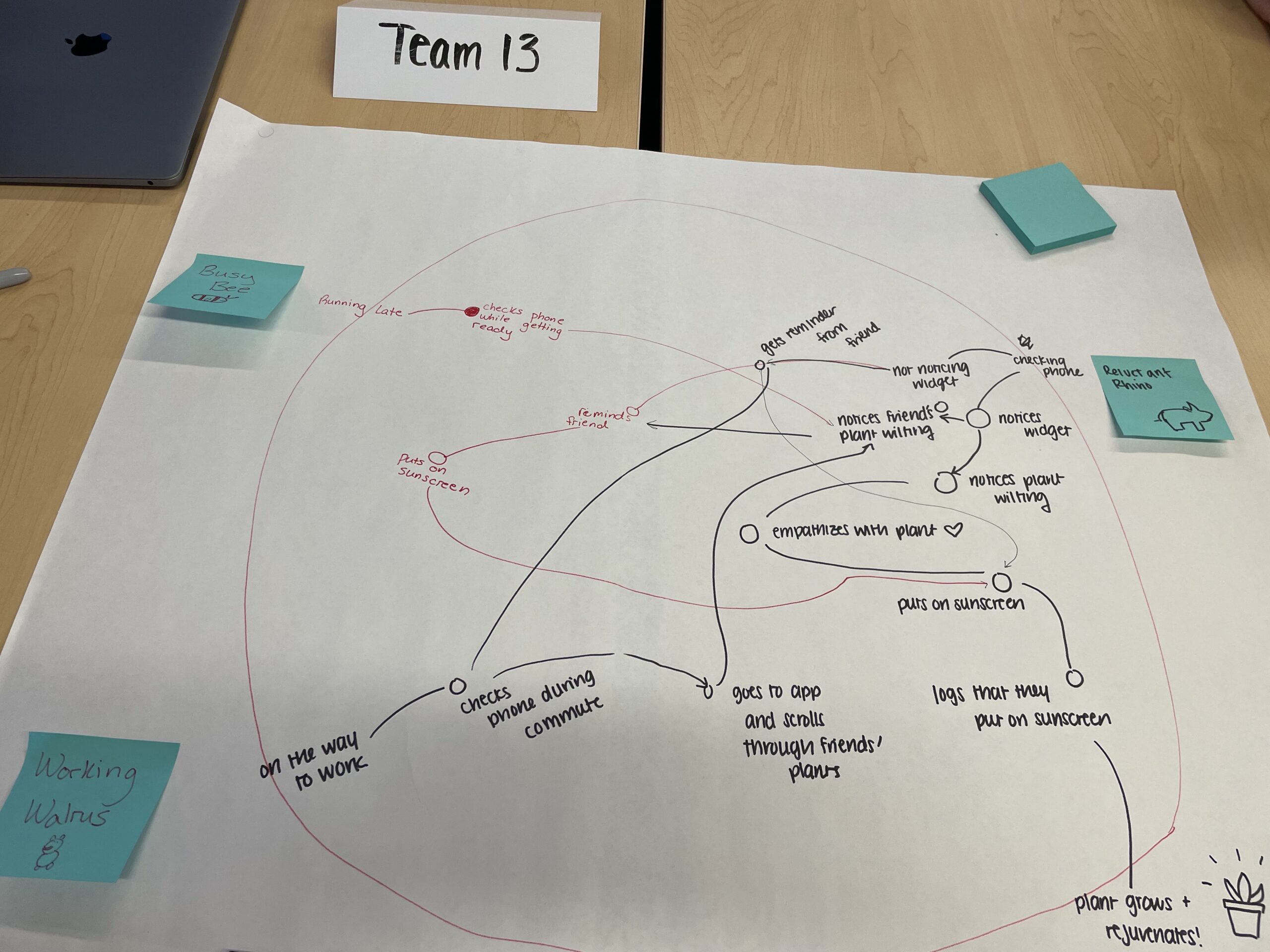
A system path diagram is a fast, collaborative way to agree on the key components of a design architecture. The circle represents a system and personas around the circle interact with user stories (nodes) and eventually exits the system.
With our system path diagram, we were able to identify paths that are most commonly used by users, which helped us prioritize which wireflows we should construct. We decided to use the main personas to tease apart the differentiators between some of the different paths taken by different types of users.
Although all the mapping we did for this course helped us in a unique way to progress with your project, we believe that the system path diagram was most helpful. What was exciting for us is noticing convergence at different points or interaction between the different users based on the different ways they are linked to each other. This was particularly helpful to refer to when we were creating our prototype because we had a clear understanding of how the screens will be linked to each other.
Building a Solution
Wireflows to sketchy screens


The happy path we are aiming for is a path that is concise and easily understood. Our app can be broken down into 5 main parts.
- User logins or registers using Apple or Google. A prompt also appears for them to add friends from their contacts.
- Next user customizes their plant.
- Users can now look at the garden where they can see all of their friends.
- Users can click on their friend’s plants and look at their profiles and even purchase the sunscreen their friends use on Amazon.
- Remind friends to put on sunscreen if their friend’s plant is dying.
This flow is very simple and allows users to easily navigate through the pages to get to where they want to go. This was not shown in the wire flow but there will be a navigation bar to also assist users with the flow of our app.
To view our wire flow in depth, please view the blog posts here.


Above are our sketchy screens that we used to help create our wireflow. As a group we all choose a part of our app to do a flow on. Our UI decision was based on the plant being the focus since the state of the plant represents if the user is putting on sunscreen or not. Due to this you can see that a lot of the screens the plants are the focus. We also wanted a very clean, simple UI look to allow users to easily follow the flow of our app. We really wanted to emphasize the plant and give it its own personality which is showcased in our UI. This decision was definitely based on the fact that we want our users to feel connected to the plant and want it to live. Hence, doing this would encourage the users to put on sunscreen.
To view our sketchy screens in depth, please view the blog posts here.
Mood Boards & Style Tiles
For our product, our team wanted to create something that is bright and inspiring. We wanted the user to feel inspired to put on sunscreen, and we also wanted a UI that felt “sunny” in itself. Below are our final mood board and our style tile.
Mood Board
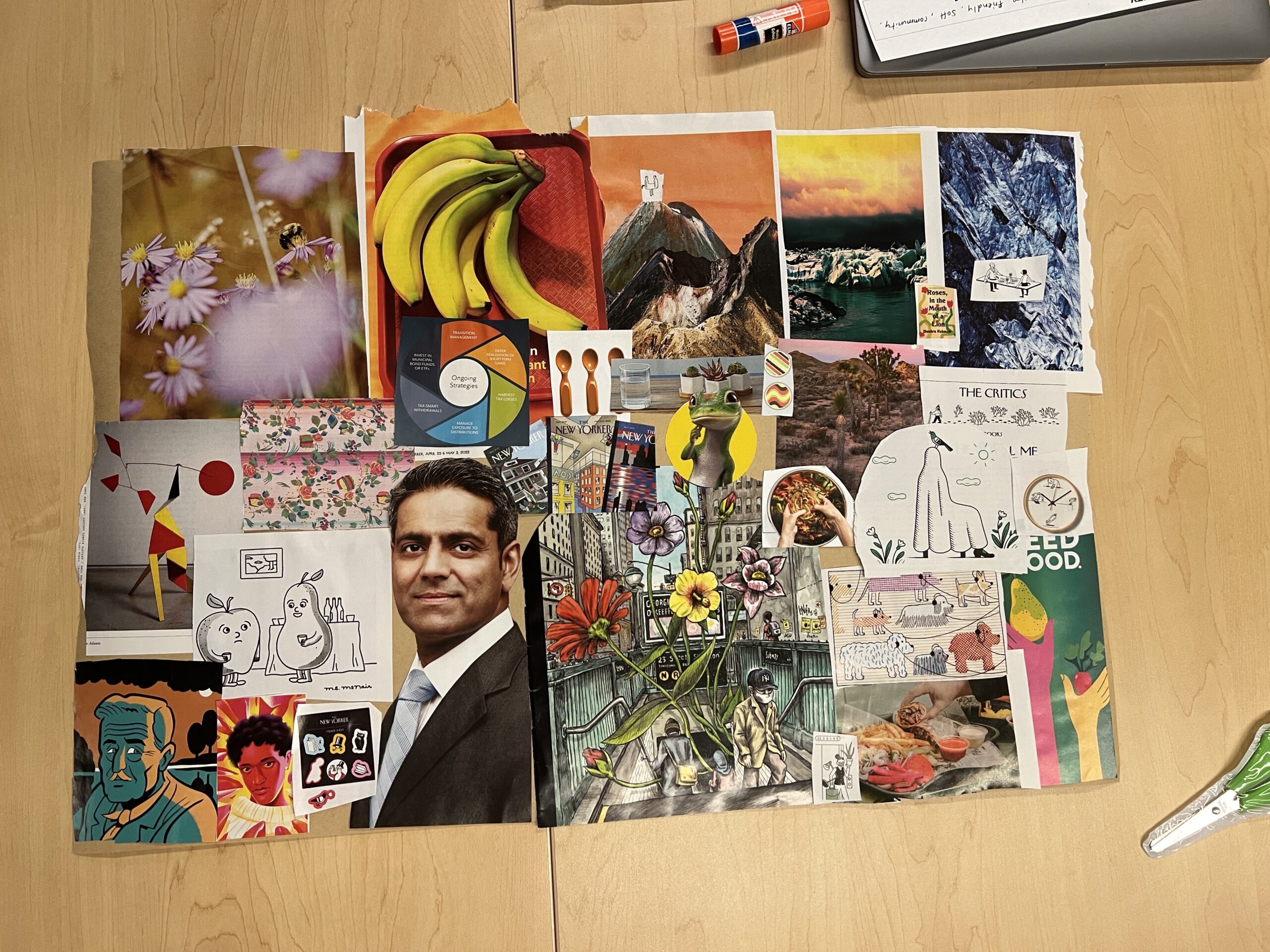
Style Tile

For our style tile, our main colors are blue, yellow, and green. We chose yellow to go with the theme of sunscreen and sun, and the green linked to our usage of plants. We felt like a light blue nicely tied all of these colors together, as it resembled the sky on a sunny day. Light blue also feels refreshing.
For a more in-depth view at our mood boards and style tiles, please refer to the blog post here.
Usability Testing
After we built up our initial clickable prototype (NOTE: THIS IS NOT THE FINAL PROTOTYPE; THAT IS LINKED BELOW), we performed usability testing on Stanford students to accomplish the following tasks:
- Create an account and then login
- Create your plant profile.
- Add / invite friends to your garden
- Notify a friend to wear sunscreen.
- Go to the garden and switch from this view to list of friends
- Remove friends from the garden
- Go to your widget and check on your plant.
After running these tests on two students, the 3 biggest issues we found were onboarding length, volume of text, and button location.


First, the onboarding process has several steps that are discouraging, without clear explanation for why some of the steps are needed or at least heavily suggested. When it comes to choosing settings (contacts, notifications), there is poor signaling for how a user can opt out. To fix this we added more explanation and context for why we are asking users to perform certain actions (i.e. why do we need them to sync contacts / enable notifications?) on the pages where we ask them to do it, rather than having these explanations be an optional pop-up.
The second biggest issue was that on the info page of a friend, there was a lot of text that was overwhelming and blended together. The text itself does not provide meaningful information about their friend’s habit behavior. It was also unclear what the reminders were for at first. To fix this, we added some more context to the friend’s plant info page about when and why they should notify their friends. We also reduced the volume of text to just be the type of sunscreen and skin type their friend had. We also swapped out text for visual week view to track sunscreen wearing by using check-marks (wore sunscreen that day) and fire emojis (did not wear).
The third large issue that came up was that the location of buttons at the top of the page were hard to identify and reach as well as not being in an intuitive place to navigate. (referring to the top nav buttons on the customization screen). To fix this, we modified the button positions/ colors to make them stand out more.
Moving forward we would also like to consider other forms of notifications that aren’t just friend prompts, consider a different metric to represent plant health (not just a binary healthy/sunburned), and how to better label different icons and pages to make the information clearer.
To see more about our usability testing process, see our Prototype and Usability Script and Usability Report.
Final Prototype
Our final Sunflower prototype can be found here! Note the several flows available in the sidebar.
Onboarding Flow (Accessible through the Signup flow)
For our onboarding flow, we wanted to give users the flexibility of either making an account from their email, or using their Gmail or Apple ID. The user is then asked about the sunscreen they use and skin type (since this will be important information displayed on their profile), and whether or not the app can sync with the contacts on their phone. We added syncing contacts as part of the onboarding because it’s an important step to add friends to the user’s garden. Finally, the user can customize their plant–naming them and selecting the type of plant, color, expression, and accessories.
Onboarding Flow Draft

Onboarding Flow (Final)

There is also an optional customization flow that can be accessed from the user profile or the last page of onboarding.

Logging Sunscreen Flow (Accessible through the Small Widget or Large Widget flow)
Because we want the user to be able to see their plant on their home screen, we display a widget to the user that gives a glimpse of how their plant is doing, along with their friends’ plants. If the user hasn’t yet logged sunscreen for the day, the widget will display their plant on fire. Directly clicking on the widget will open up the homepage of the app, which has a big button that allows the user to log their sunscreen usage for the day for convenience. After the user’s sunscreen usage for the day has been logged, the button will turn into a “Remind your Friends” button instead so the user can check in on their friends whenever.
Logging Sunscreen Draft (Top) & Final (Bottom)


Changes: We made the user’s plant stand out more in the large widget so that they could distinguish it from the others.
Checking On Friends Flow (Available from the Signup flow)
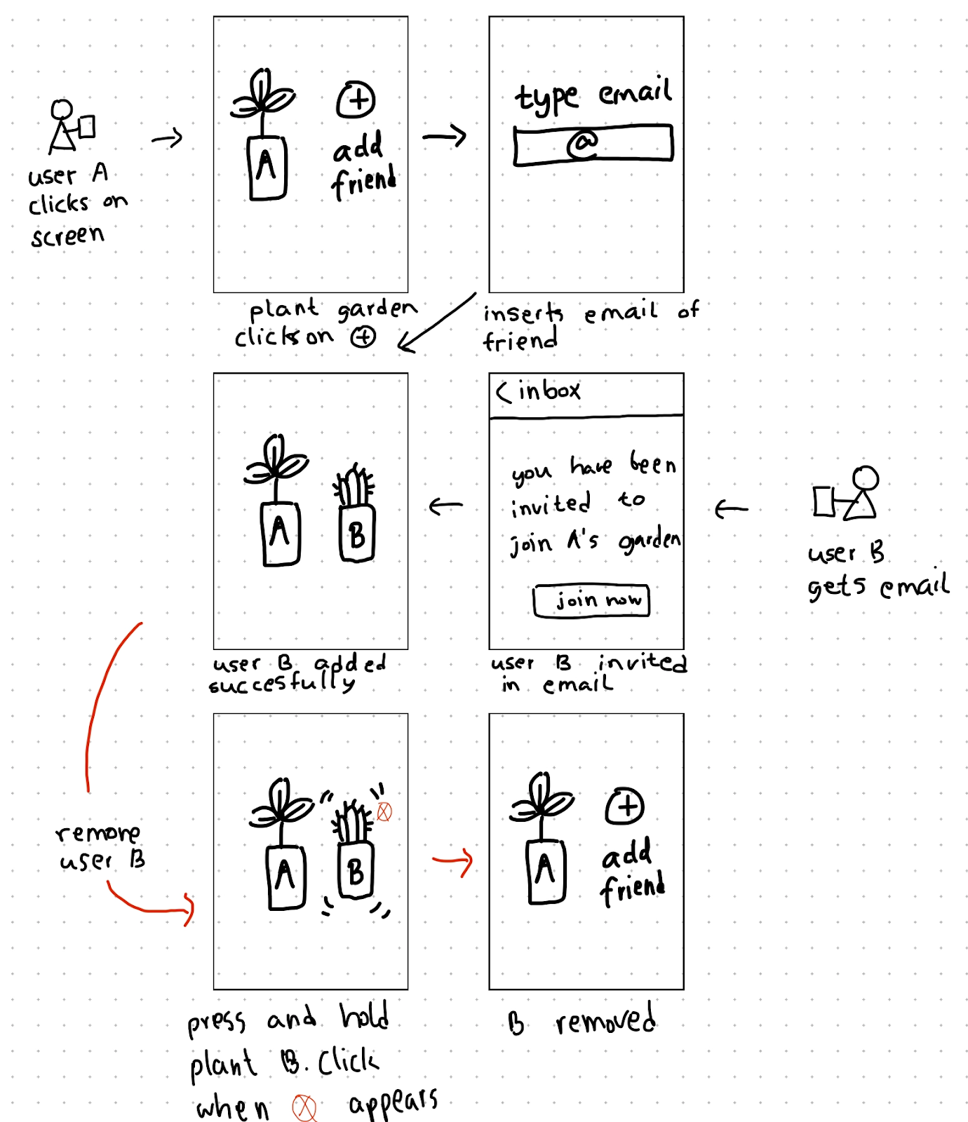
When the user clicks on the button to “Remind your Friends,” they are taken to a view of the “garden,” which displays all of their friends’ plants and how they’re doing. You can also visit this page whenever by clicking on the “Garden” icon in the bottom toolbar. In the garden, directly clicking on a plant will lead to that friends’ profile, where you can send them a reminder directly to wear sunscreen, and you can also check out the brand of sunscreen they use. Clicking on the brand of sunscreen will directly link to the product on Amazon–we did this to encourage users to try out different brands of sunscreen to find the one that they like. The garden view also allows a person to remove a friend from their garden or to add a new friend. By clicking on the icon at the top right, the user is taken to an alternate view of all their friends, which displays the friends as a list instead of as a garden. We implemented these two views for flexibility.
Checking on Friends Draft (top) & Final (bottom)


Ethics
Nudging and manipulation (week 3)
- After discussing the “Nudging and Manipulation” article, we talked about how we could make sure that our design was not manipulative (perverting the users’ decision-making process), while still prompting our desired behavior change. We utilized some nudges when trying to get users to grant contact and notification permissions. While the language could seem a little manipulative since it is meant to appeal to user emotions, the permissions we are requesting are very important to the purposes of the app (they need to add friends to the app in order for the social pressure aspect to work, and notifications serve as a primary function for reminder users to wear sunscreen). In addition, we do provide users with an escape hatch, so they are able to simply skip the step if they do not wish to grant permissions.


- During our intervention study we found that our participants liked when we nudged them to put on sunscreen when we texted them a reminder in the morning. Us reminding the participants in the morning as well as them seeing other users send their sunscreen in the morning pressured the participants to also wear and send their sunscreen. As a result, we decided to nudge users by having their friends do the nudging. If a user notices that their friend’s plant is dying/on fire then a user can send a reminder to that friend. Once they click on the send reminder button then a notification will show on that friend’s phone reminding them to put on sunscreen. This social pressure encourages users as well as reminds them to put on sunscreen. However, this nudge doesn’t actually force the user to do anything and can be “escaped” by swiping the notification away, so we felt that it wasn’t manipulative.
- We recognized that users may get annoyed at the volume of nudges if friends keep spamming them, so we limited it to being able to remind your friend only once every 24 hours.


Rewards (week 5)
After reading the Rewards chapter in “Good Habits Bad Habits” and the article “The Dark Side of Gamifying Work,” we discussed how we could make sure that the use of any rewards we implemented in our design would not be unethical.
We felt that having a reward element would encourage our users to put on sunscreen daily. The rewards on our app are reflected through the condition of the user’s plant. If the user logs that they put on sunscreen then their plant will look healthy (smiling, plants look healthy overall, etc.) However, if the user does not log that they put on sunscreen then the plant will look sad and it would be on fire indicating that the plant is not healthy.
One concern we had with the implementation of our rewards system was that users may be more motivated by the rewards than the behavior we are trying to encourage. We tried to address this by making sure that the rewards and metaphors we are trying to use are very well linked to the behavior– since users may get sunburned if they don’t wear sunscreen, we made sure that the plant’s condition reflected that. In that way, the plant is more of a reflection of the user’s condition rather than abstract gamification.
We also chose not to implement a streak feature where we kept track of how long, and only chose to show the user’s behavior in the last few days. This was to stop users from fixating on a number or punishing users if they broke a long streak.


Accessibility (week 9)
We narrowed down to two disaster scenarios for accessibility that we should be mindful of:
- Implications for mental health: This app could potentially induce negative mood seeing plants suffer. Feeling guilty for worsening plant health can impact not only wellbeing but also their ability to meet their sunscreen goals. To address this in the future, we plan to ensure that there are ways to take users’ mental health into account. For example: If someone has not been using the app for a few days in a row, instead of punishing their plant by giving them negative reinforcement, we want to check in to see how they are doing. Throughout this quarter, we did want to balance positive and negative reinforcement, but if someone’s health is getting in the way of their sunscreen or app using habits, we we will ideate on and implements ways to address user churn by providing in-app support or by suggesting a break of a few days after which they can restart.
- Implications for blindness: Screen readers not compatible with the icons can impede users who have visual disabilities. To address this, we must ensure alt-text for all visual elements as this is a visualization-dependent app. Additionally, since this app was designed with only sighted people in mind, we will try to simplify an interface that is easier to use by users with visual disabilities.
In Broader Society
Overall, this app is designed to be deleted—so it is not for long-time use but for serving as a catalyst to help people get to a stage where sunscreen use is already a habit, so hopefully we are not promoting more screen time usage in the long run. However, even for short-time use, the broader impact of our app on the society is that it can positively affect not just physical health by promoting sunscreen use but also mental health by inducing positive feelings of belonging and connectedness by creating a community of friends who help each other stay accountable to reach a common goal.
Conclusion
From this experience, we learned about two aspects that can help a user keep up a new habit: personal investment in the product and social accountability. We worked to implement both through our app–customizing and naming the plant helped to keep the user invested, and having friends on the platform helped the user stay accountable.
Given more time, we would also like to explore how we could incorporate sunscreen education into our product. From our studies, we encountered many users with misconceptions about sunscreen usage. For example, many participants believed that sunscreen was not needed on a cloudy day. While we hoped to mitigate some of these misconceptions through our depiction of a plant and having it wilt a bit even on a cloudy day (as UV rays still penetrate through clouds!), we would love to look into making our content more explicitly educational. If people are better informed about the effects of wearing sunscreen and how SPF works, we believe that they will be naturally more motivated to keep up a daily sunscreen habit.
Another thing we would like to look into is a rewards system on our app. We believe that we can incorporate a rewards system naturally into our customization feature–for instance, if a user has consistently logged a certain amount of sunscreen usage, they could unlock some exclusive items in which they could customize their plant. We hope that an investment in their plant and being able to accessorize their plant more could be a rewarding motivator to consistently put on sunscreen.
To approach these two additional features (education and rewards), we plan on conducting two more assumption tests. One, that users who are better educated about the effects of wearing/not wearing sunscreen are more motivated to wear sunscreen daily, and two, that unlocking exclusive items to customize your plant incentivizes users to keep up their daily sunscreen streak. Given the results from our assumption testing, we are hopeful that we could add these features to the next iteration of Sunflower.


