
System Path

To make our system path diagram, we considered how one of our primary personas, “Artsy RJ” (focused on enjoying his alone time without his phone), would enter our system. We knew RJ’s first visit to the app would involve some onboarding activities such as approving privacy permissions and sharing his past screen time data. Then, we believed RJ would appreciate a home page that acts as a central hub for all other activities in the app (settings, screen time limit customization, data visualization, etc). Then, we navigated the same diagram using another persona, “Night Owl Nick” (who struggles to get off his phone at night), and we realized he had a very similar path to RJ. The big difference between their paths would be the settings that they choose to customize. For example, Nick may want more limits at night while RJ may prefer more during the day. Overall, this diagram demonstrates the importance of easy navigation through the customization process.
Bubble Map
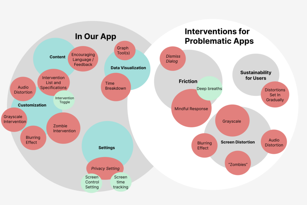
To make our bubble map, we first broke up our intervention into the components that occur within our app and then those that occur in our interventions for problematic apps. In our app, we conceptualized the breakdown in terms of settings, customization, data visualization, and content. Within settings, we have privacy settings for screen time tracking and screen control. Our largest bubble is customization, where we have a large collection of options for zombie, grayscale, audio, and blur types of distortions. Our data visualization includes graph tools and time breakdowns. Finally, our content purposefully includes some encouraging language and feedback for users, in addition to an intervention list and specifications. In the other half of the bubble map, we broke interventions for problematic apps into the categories of friction, screen distortion, and sustainability for users. Friction includes things like the dismiss dialog and a mindful response that encourages users to take a deep breath. The distortions feature the same aforementioned ones like zombie and grayscale. Lastly, in terms of sustainability for users, we ensure that the distortions set in gradually so as to not put off the user. Overall, these are the main categories we have in mind and will continue building on both in the app and in our interventions on problematic apps, in order to create the most effective experience at reducing screen time.
Individual Wireflows

Amara: I drew a wireflow depicting what the user would see if they attempted to delete a specific app limit (the TikTok limit, for this example). I drew the “My App Limits” page so users would have a one-stop-shop for managing their app restrictions. I also included the deep breathing prompt to implement mindfulness as a form of friction on the path to disabling an app limit. We want to remind users of why they chose these limits in the first place, and we hope that a sense of pride and a willingness to make further progress will encourage them to keep the limits on.
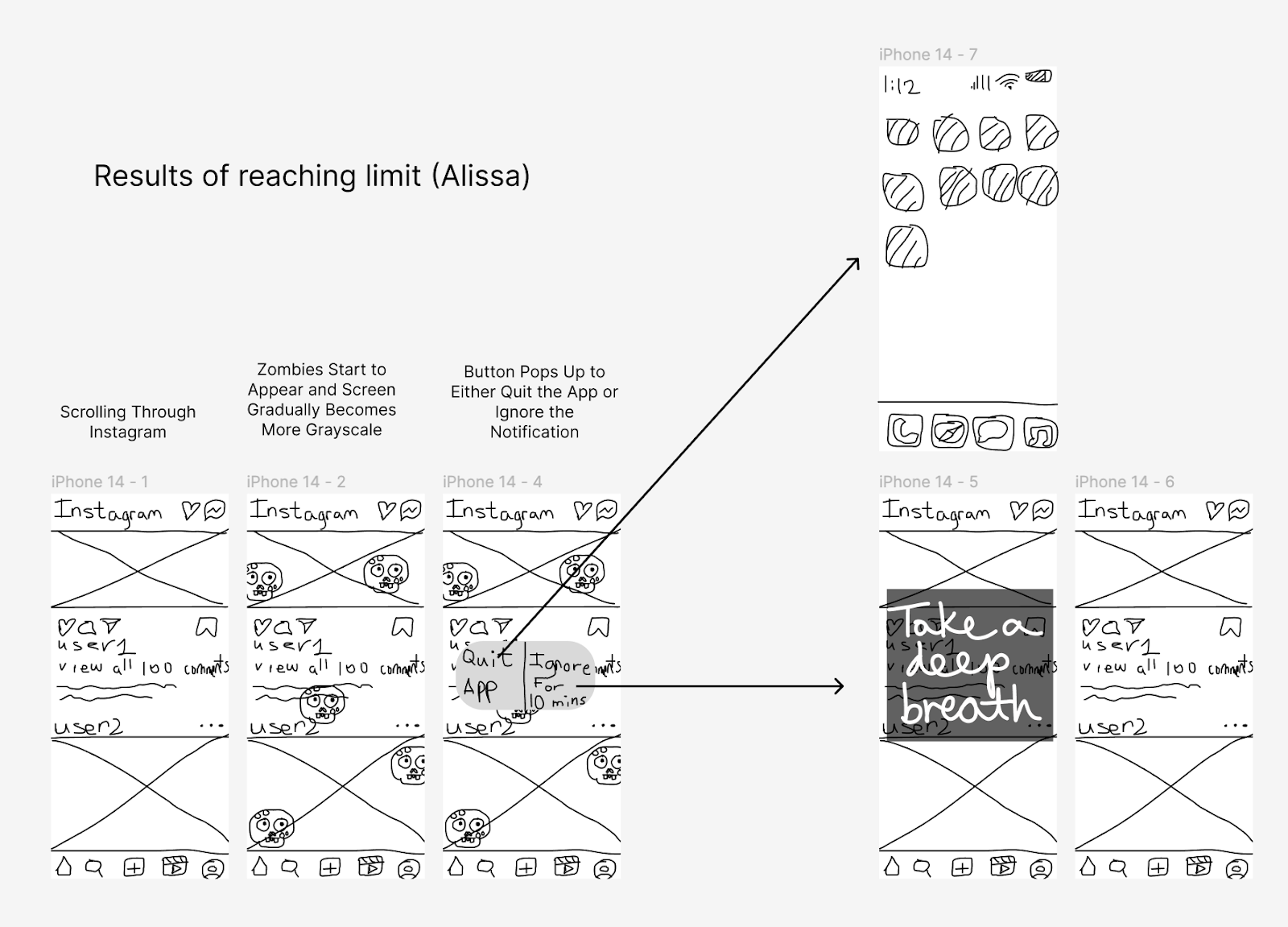
Alissa: I drew a wireflow portraying what happens when users are scrolling on an app they set a limit on (in this example, Instagram) and reach their limit. I drew zombies slowly filling up the screen and explained that the screen also becomes grayscale gradually as the user keeps scrolling. Then, I drew out the pop-up button that gives the user the choice between quitting the app and ignoring the notification. If they choose to ignore the app, I include the same breather we included in our app to give the user the chance to reflect on whether they actually want to keep scrolling. If they quit the app, the wireflow brings them back to the home screen of their phone.
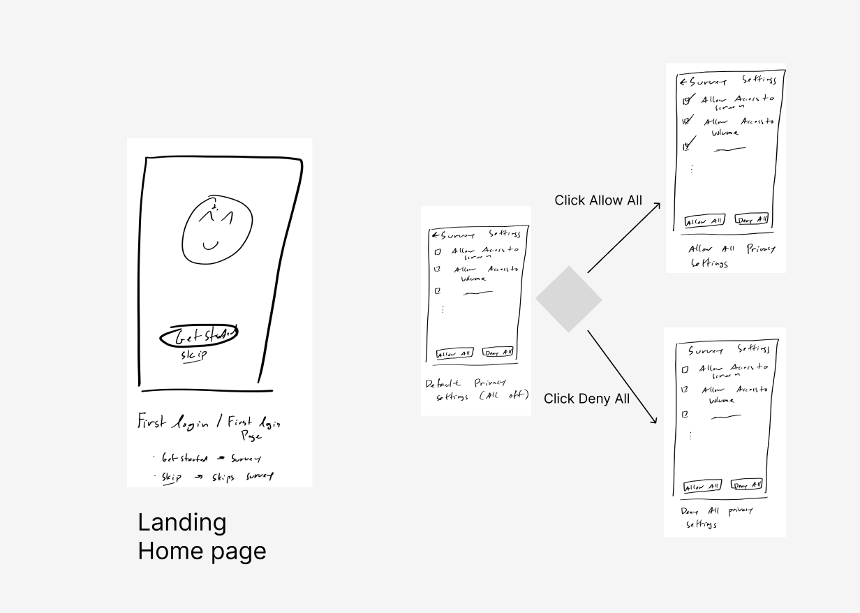
Derek: I helped to draw both the starting screen as well as the privacy setting screens. Upon first usage of our app, we will offer users the ability to answer a short survey so that we can get an initial understanding of their screen time habits or to skip this survey and enter directly into the app. For this wireflow, we consider the survey a “nice to have” feature and as such, relevant screens to this survey are not displayed. As for the privacy settings page, we believe that it is important to display all the privacy settings in one area so that users can see what information we are collecting and what functions of their phone we will be managing. As we do not need all privacy settings to be enabled for our interventions, we will allow users to disable privacy settings and disable interventions which depend on those privacy settings. By doing so, we are confident that we can provide a customizable experience without compromising on use privacy.

Nancy: I drew the implementation screen for setting up the time limits. This includes several factors of control for our users. First, they are able to choose the app they want to create the limit on and the second panel demonstrates the effects of the “+” button. Afterwards, they can scan through three of our potential distortions including blurring, screen filtration with zombies or bugs, and a deep breath sign. Lastly, they are able to scroll a bar to adjust their time limit and when they want the limit to be enacted to.
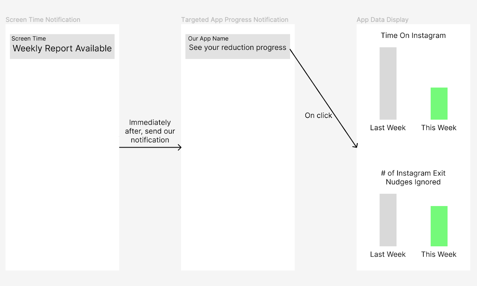
Alex: I outlined how our app would work in conjunction with Apple’s weekly Screen Time notification by immediately following this notification with one of our own that directs users to a data visualization page that tracks app-specific progress in screen time reduction, number of times nudges to exit the app were ignored, longest scroll of the week, and other data of interest. The user could also access this data at any time from the info button for each individual app (as shown in the App Time Limit page). We decided that although this would be a nice-to-have feature in our app and might not be included in the MVP, it’s important to consider how users would be able to see changes over time and when it would make sense to inform them of differences/improvements over time.
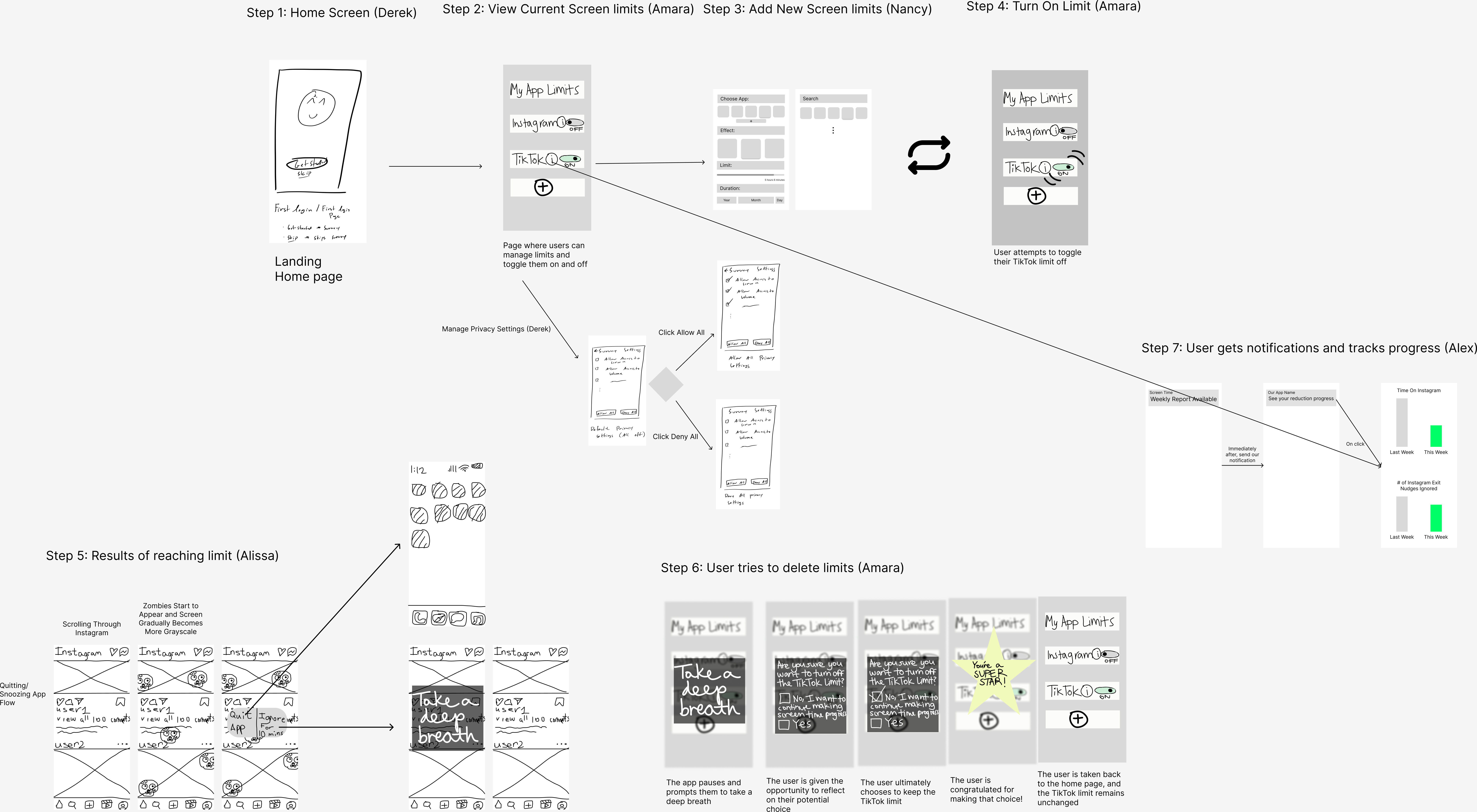
Combined Wireflow

In our wireflow, we go through 4 phases of changes that are moderated and/or affected by our app. First, the user sets up their app limits and allows permissions in steps 1-4. Once these are set up, in step 5, the user will start seeing the nudges they chose when they scroll for long periods of time and reach their chosen time limit. Then, we show a potential point of friction for users who are frustrated and want to delete the limits for an app in step 6. Finally, step 7 demonstrates how the user can track their progress and even gets a weekly nudge along with their phone’s screen time notification. These stages reflect the initial, during, and after effects of our behavioral change and highlight key transitions in user behavior.


