
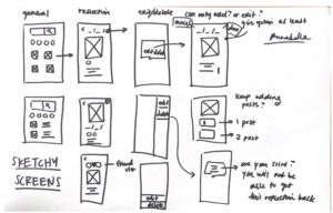
In this assignment, our team used our insights from our studies and wireflow experiments to build sketchy screens for several key flows of our product. In class, each team member made several physical sketchy screens to explore layouts and hierarchies for a specified flow. We considered our main path and agreed to discuss more standardized areas of the app (onboarding, registering, settings) later.
Happy Path:
- The user can add a contact to the app.
- The user can navigate to the contact’s page.
- The user can select a photo of the contact.
- The user can reflect on the photo through writing.
- The user can view their past reflections.
Edit: we’ve changed the word “friend” in the app to the word “contact”. “Friend” made test users think we were a social media app when we were actually an individualized reflection app.
Sketchy Screens
Full feedback from each member on each member’s screens can be found in this Figma file.
Jared: Add a friend
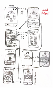
The primary action of this flow is to Add Friend. I wanted the action of selecting to add the friend between From Contacts or manually to be the first thing to choose. If manually, the user would edit a new friend’s profile like making their own, and import selected photos from in the camera roll. The user isn’t prompted specific photos to add with the friend in mind this way. Using the From Contacts option would allow a more robust array of choices with pre-chosen photos to look through, with an expanded view of each profile card providing metadata detail about each image. In hindsight, this metadata could just be something in an expanded photo view rather than a part of the gallery.
The team’s feedback:
- Incorporated manual and auto-contact options!
- After creating a friend profile page, what page would we breadcrumb back to? Profile with a list of friends? Main page? Discover?
- We wondered if we should show a list of friends instead of showing three preview pictures associated with that friend. It seemed like a lot to scroll through.
Madison: Navigate to a friend’s page

I imagined the user would select a friend from their friendship visualization screen. On the friend’s profile page, the page would feature the user’s past reflections related to this friend. At the same time, the page will also provide a button that leads to a search result of the friend in the user’s photo discovery page, which allows them to choose a new picture to reflect on.
The team’s feedback
- Wondering about adding metadata on friend profile pages such as “last reflected” or “last taken a photo with” to have more statistical data to measure relationships.
- Ans: We want to add something like the latter option, perhaps even more!
- Could we add small visualizations here to represent dyadic relationships? Nothing as big as the main visualization, but something small like CoStar.
- Ans: Ambitious… but we can try…
- Should the reflection history page and discovery page be combined?
- Ans: No. We discussed this in-depth and decided to keep them separate. There was an obvious separation in user flow for these pages.
- How do we get new pictures into the app?
- Ans: After deliberation, the team decided on two routes of importing photos -> manual selection vs full system access. This depends on what access the user gives us. If they give us only selection access (not full), we will allow them to import batches of photos relating to their friends into the app (they would have chosen what contacts they wanted to import before). If they give us full access, we can directly get photos of their specific friends and import + update automatically in app.
Carina: Discovering photos to reflect on (pick photos of friends)

The primary action of this flow is to look through all the photos, with optional filters. I did not really focus on the actual layout of how each picture is displayed (i.e. whether there should be a visible “tag” on any of the photos), but rather, how the filtering system is laid out. We know that we want to be able to filter by friend and by various photo tag features (i.e. “grass” or “flower”), but everything should be unfiltered at the beginning in order to make sure the user is organically picking a photo.
The team’s feedback:
- Browsing felt more intuitive with face circles as compared to sidebars (more commonly used for websites). Having the search bar for search terms that didn’t include people felt comprehensive for the search page.
- Bottom-right photos represent what a photo might look like when clicked on on the discover page. We discussed creating a scroll-up feature similar to Apple photos where you scroll up to see metadata, as compared to having all metadata already displayed on the same screen.
- Do we want our image grids to have white space between pictures? If so, how much? The team has still not discussed this detail.
Serena: Reflecting on a photo

This is the photo interaction flow. The primary action is reflect on a photo. In order to that I first made a photo discovery feed and played around with the grid layout of that feed in the top right corner. Then after selecting a photo, they can see some information about the photo (mainly who’s in the photo from their added friends) and a reflection prompt. Finally they can choose to share the reflection as well as draft the reflection. I wanted to provide a lot of options for the reflection since it’s the core of our app.
The team’s feedback:
- We liked being able to draft reflections!
- We preferred the n x n grids as compared to differently sized photos when viewing photos. The differently sized photos felt more like mood boards or galleries as one would see in VSCO or Pinterest. We weren’t really going for aesthetics, so we wanted to stick to something more standardized.
- From our assumption tests, we knew people didn’t always want to share their reflections verbatim with their friends unless it was overwhelmingly positive. We could change the wording of the “share?” so that the user knew sharing meant letting the friend know that the user is thinking about them, rather than sharing the reflection verbatim.
Annabelle: View the history of reflections
(Small clarification — every column is a new screen and the different versions of each screen are shown underneath the top screen in the column.)
This is the screen that allows the user to review their past reflections by time reflected. From here, the user can edit or delete the reflection, and continue adding posts to the reflection over time (so that they will never just reflect on a photo once and forget about it). There could even have some kind of notification system to check in back on the photo after some time.
The team’s feedback:
- The team’s ideas of what certain parts of the app would look like really showed when we discussed this— there was some confusion on how we got to this page, how this page would be structured, and how other pages would connect to this screen. We had a much longer discussion that helped expose different mental models across the team, and helped get us all on the same page, TLDR’d below.
- Should we let users edit or delete reflections? Maybe we shouldn’t allow users to edit, let’s say, a month after posting (to maintain authenticity). Users should be able to add more reflections for a past photo though.
- Is the date something we want to show for the photo? Or for the reflections? Or both? The team has still not discussed this detail.
Drafted edits and direction
After our discussion, the team was able to understand our priorities going forward into a clickable prototype. We wanted a home page for a visualization, a screen for discovering photos to reflect on (not just looking at the system photo album, but imports that are of the friends the user has imported into the app), a screen for past reflections, and some way of getting to the user’s profile which would have friends imported into the app + a list of contacts to add more friends from. In this context, “friends” are who the user wants to maintain relationships with. Here’s a messy brainstorm whiteboard of this thought process, though we didn’t promise it would be cohesive.

Evidence of the team having fun :0

Signing off,
Team 18


