
Moodboards
#1: A sense of advancement
This mood board was very technological and cutting edge which was very cool. We wanted to give a sense of advancement in the users’ life and embody how technology can help fix some of the problems in their lives. However it seems like since we deal with people, it lacks the touchpoints for a warm human connection.
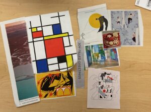
#2: Interconnectedness

This moodboard has a lot of elements for objects related to humans and collaborations. It also had a nice mix of many colors which implies the diversity of the population we deal with. However the shape and colors could have been a bit distracting.
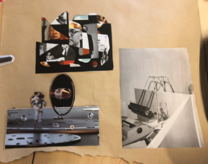
#3: Spontaneity and Structure
This moodboard has elements that try to give both a sense of the joy and spontaneity that comes from meeting up with people (the yellow jazz photo, the joy-filled greetings, smiling cookies), as well as a sense of structure and calm (gradient photo and grid on the left) that we should probably infuse into the inherently chaotic activity of looking at calendar availabilities. However this board goes overboard with the “fun” part – Batman leaning over right next to people serenely climbing a tree does not really create a cohesive mood.
Synthesized mood board:

We mixed the mood boards into a single theme. We want the app to feel empowering and exciting for users. So we have images of fun social scenes, created mostly with clean lines.
In addition, we knew we’d be dealing with multiple people each with their complex availabilities, which could potentially get overwhelming for users. Instead, despite all the calendars, we want our app to feel simple to use. Thus, some mood board images are grids and cubes, diverse colors laid out in minimalist and flat – aka organized – styles.
Style Tile

Our style tile conveys a sense of excitement and minimalism at the same time, which are reflected in our adjectives and images. In addition:
- We use a sans serif font, which is minimalist, but it’s one that’s “modern, curvy, fun”! According to color theory, we have the excitement of a yellow/orange-ish color, but also the calmness of the opposing color of something more greenish blue-ish.
- Our icons are simple and straightforward, with purposefully no “creativity” there to make navigating and using our app straightforward.
- To put all this into practice, we took the step of drafting up three of the example buttons – Events in your area, Friend request, Received Invites.
Fun fact – the center image and the bottom middle image were generated by putting our adjectives into DALL-E!


