
Introduction
Our prototypes were incomplete when we started our usability testing so there were three main things we chose to focus on: can the user figure out how to initially schedule an event, can they figure out the difference between the two options on the home screen, and can they figure out how to upload contacts to schedule with.
Looking at the home screen, the two options were ‘view/edit my schedule’ and ‘input my schedule.’ The view button is intended to view study sessions that are already scheduled, and the input button is to schedule new events.
The ranking of severe, moderate, and trivial are provided next to each issue.
Issues
1) Not having a way to remove contacts seamlessly when uploaded (medium)
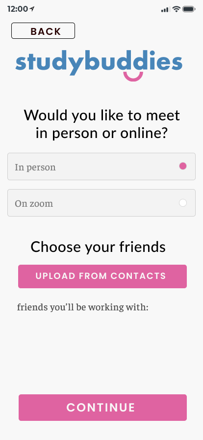
User 2 helpfully pointed out that after uploading contacts, a user receives a list of their friends to work with. He then commented, “But what if I change my mind and want to uninvite someone? I’d like to see a sticker for each person so I can “on and off”- remove friends whenever I needed.” We realized that currently, there is no way to change this unless you go back to ‘upload my contacts,’ which makes users have to go back and unselect people which may become cumbersome.
We plan to address this! In the “friends you’ll be working with” section (see image below), we will add a colored square with an ‘x’ by each friend’s name. Thus, it will be easy to simply click the ‘x’ and remove friends.
2) Only Way to Go Back to Home Is Through Several “Back” Buttons (severe)
Both users pointed out that the only way to go back to the home page from the ‘upload my contacts’ is by clicking the ‘back’ button 2 times. They mentioned that this can be quite annoying, especially as the number of pages in the “preferences” section increases, which is the case since this section was not fully complete during User Testing.
We plan to address this by implementing a navigation bar at the bottom of every page. The navigation bar will allow users to go back to the home page, user profile page, and view calendar page in one click (ie 3 sections in nav bar).
3) Confusing wording on the home page (‘input schedule’ vs ‘view/edit schedule’) (severe)
We ran User 1 through our first scenario: the user wants to plan their week and schedule an online study session with Natasha, Shreya, and Marithza. During this task, User 1 clicked on the “view/edit my schedule” button first instead of the ‘input my schedule.’ The wording of the buttons was quite confusing for him and he commented: “I’m not entirely sure what the difference between them is…” For him, he couldn’t understand how editing a calendar was different from inputting a schedule. After experiencing how much difficulty User 1 was having with the two buttons on the home screen, we were surprised when User 2 found the wording “intuitive” and immediately clicked the “input my schedule” (correct) button.
Our goal is to make the various actions users can take as easy to understand as possible (i.e. without any ambiguities or unnecessary clicks). As such, we plan to address this problem, even if only a subset of users were experiencing it. Particularly, we plan to address this by removing the “edit” from the first button, altering the buttons to say: “View Calendar” and “Input Schedule” instead.
4) Cluttered Preferences Screen (moderate-severe)
User 1 pointed out how the first preference screen (see image above) seemed quite cluttered. Though there was slight hierarchy from the font sizes and different icons, he felt that more hierarchy, through white space between the questions, would make the content more easy to digest and navigate.
We plan to address this by splitting these 2 questions into 2 pages. Although this may increase the number of pages slightly, we felt that they were very easy-to-navigate pages that users will only spend a second or so on. Adding hierarchy was a good idea but we realized that it may still take a bit longer to parsing the page, and additionally making fonts smaller may impact overall accessibility visually.
5) Buttons hard to click (trivial)
Some of our buttons, for instance the “Upload From Contacts” button seen in the above image, were very hard to click. Users 1 and 2 required a few attempts of clicking in different parts of the button to get the button to actually trigger the next page. User 1 even had to ask whether it was actually a button since the button wasn’t very responsive.
In reality, this would be a major issue if we deployed our app. However, in our case, it was an issue we were having with Protopie, so although we can take some time to figure out why exactly this button was having issues, it is not as important as the other issues. In theory, when we create the UI and add the button components, the issue should go away.
We do not plan to really address this for the final writeup, unless it is recommended we do.
6) Name of App Unnecessary On Every Page (trivial)
While User 1 was commenting about Issue 4 (see above), he also mentioned that having the name of the app was unnecessary and mainly just added to the clutter on the page. We plan to address this by removing the app name from every page except the relevant login/signup, Home page to free up more space and so our app also looks cleaner.


