
Mood Boards & Style Tiles
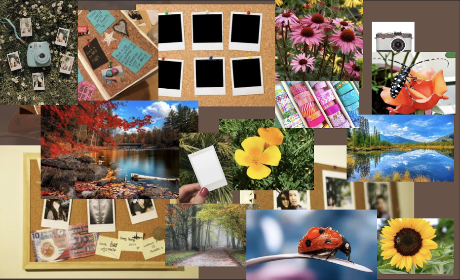
Mood Board #1
Related words: vibrant, relaxing, grounded, creative, art
Our first moodboard explored a more vibrant and outwardly artsy feel. The perks of this moodboard are that it would work well with creative types, and bright outdoor images suit it well (i.e. sunflowers, a cute red ladybug). These bright outdoor images go along with our project idea of trying to get people to be outdoors through taking photos. One possible downside of this aesthetic is that it can feel a bit cluttered and eclectic, so while the artsy creative might love it the more organized Type-A person could be overwhelmed by its spontaneity.
Mood Board #2
Related words: cute, happy, kindergarten teacher, art, kawaii, motivating, encouraging, nurturing, pastel, soft
Our second moodboard hones in on the kawaii aesthetic, featuring pastels and many adorable characters. One of the perks of this mood board is that it goes well with our proposed sticker feature. These cute characters would work perfectly as stickers to add in a photo scrapbook, and the cutesy aesthetic is always adorable. The cute characters also work great as motivators for our audience! Receiving soft encouragement and sentiments from a childlike character can be soothing and motivate the user to meet their goal of going outside more. One possible downside is that it could narrow down the target audience too much, as the kawaii aesthetic can be niche and appealing to a limited audience. Receiving advice or encouragement with these “childish” characters could also be seen as patronizing by some audiences and be a complete turn off.

Mood Board #3
Related words: soft, dainty, ballet, nudes, lace, feminine, peaceful, comfy, warm
Our third moodboard encompasses a more soft and dainty aesthetic, almost like a cherry blossom blooming. This aesthetic might encourage more quiet introspection while taking photos outside, and would be calming to look at. Another perk is that it is easily digestible by anyone and can capture a large range of users. One possible downside is that since the mood is muted, uploading super bright or loud pictures might not fit, which could discourage users. On the other hand, it is extremely calming and a majority of our study participants indicated wanting to spend more time outside for its calming effect and related mental health benefits. The scraggly handwriting with kind messages also helps comfort the user.

Mood Board #4
Related words: funky, groovy, fun, vibrant, loud, eclectic, quirky
Our final moodboard is funky, bright, and focused on lots of colors. It is great for creating a fun atmosphere and inspiring creativity from our users. It would fit the more quirky artist, and would go along with photos outside very well. One possible downside is similar to the downside of moodboard one—it could be too much for a Type-A organized person and overwhelm them with all the brightness.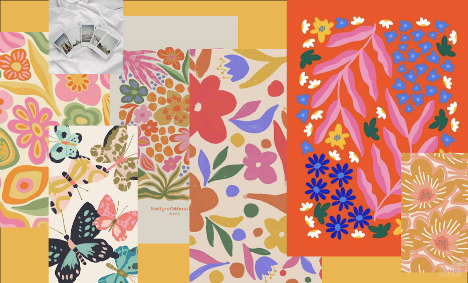
Our decision
We ultimately ended up taking elements from each mood board and came up with a few style tiles to nail down the branding. Each moodboard had a strong sense of creativity, flow, nature and a diy attitude! We enjoyed the hand drawn look of the art in moodboards 2 and 4 which inspired our hand-drawn looking decorating elements. Moodboards one and four had very strong, vibrant colors which made sense for our prototype because we want to invigorate our base and make sure our colorways complement the natural images. Moodboards two and three feature handwriting-like fonts which felt comforting and played up the crafty feel of our prototype.
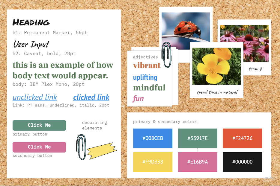
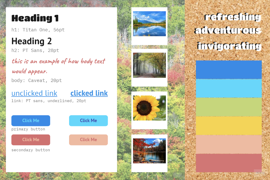
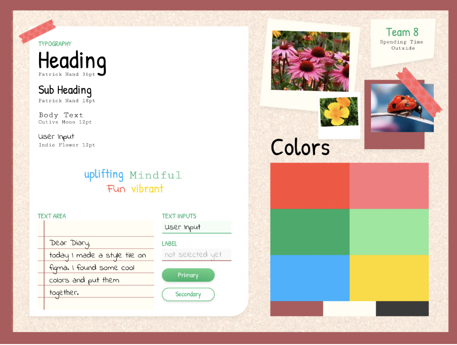
Our style tile takes some of the primary colors from moodboard one and incorporates them. These are bright—yellow, red, green—any color that pops. There is a mix of fun, polished looking fonts that will represent the app communicating to the user, and anything in the scrapbook will be in fonts that look handwritten. There are three style tiles shown


