
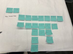
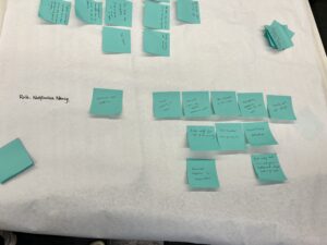
Story Maps
Through our story maps, we noticed that a single notification or an interaction with the phone can lead to hours of mindless scrolling. The user needs a way to stay mindful of their time on certain applications, especially when that is getting in the way of the goals they are trying to achieve or when overuse leads to negative feelings towards oneself. This led us to MVP features that aim to help users to be more mindful of the time that they have spent within an application.
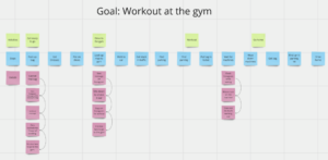
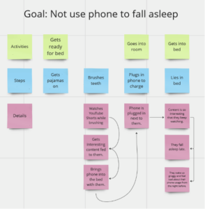
Our initial in-class story maps:
MVP Features
From our storymapping, we generated a list of MVP features for our solution. The outcome we wanted was for users to not use their phones mindlessly. For our audience, we decided to target Stressed Steve in order to address the issue of doomscrolling. We focused on this persona because it seemed to be the most prevalent issue in both our Baseline and Intervention studies. Through these studies, we also realized that phone usage is highly personal, so we wanted to build in the idea of setting personal goals and practicing mindfulness when it comes to a user’s own screentime. We thought that our persona Steve was an especially fitting target audience for these goals because he often uses his phone as mindless stress relief or distraction.
For our solution, we drew on our storymaps and study findings and decided to design an interactive app blocker. Our app allows users to set target limits for certain apps and choose a pet cat. If they open an app that they’ve indicated they want to limit, their cat appears in the corner of the screen. The cat continues eating and growing the closer the user gets to their time limit, and once the user has reached their time limit the cat is so big that it covers most of the screen. In order to make the cat shrink, the user has to exit the app. We’re also thinking of building in different ways of making the cat shrink faster (like going on a walk or putting your phone down altogether). Within our app itself, the user can add friends, and their friends’ cats will live together in a community with their cat. The user can view their screentime for the day and add a reflective message for their cat to say (e.g. “I’m proud that I didn’t use TikTok today!”) which will be visible by other users (and vice versa the user can see their friends’ reflections too). As the user continues to meet their daily goals, they will earn points with which they can buy clothes or accessories for their cat. With this idea, we’ve aimed to design an app blocker that is engaging, customizable, and not easily ‘swiped’ away, since in our studies our users indicated that many screentime blockers they’ve tried are too easily removed. We’ve also tried to build in social accountability and mindfulness by prompting users to reflect on their screentime and share it with their friends. The cat community idea was inspired by a mobile game Neko Atsume — you can view an image of the game below to get a better sense of where the inspiration came from.

From there, we formulated these MVP features:
- Step 1: Choose 1 to 3 apps you want to engage with less
- Step 2: Choose your cat (customize color, patterns, and personality)
- Step 3: Put your cat in your ‘friend hang out space, aka, make a friends group (in this space you can see and interact with your friends’ cats)
- Step 4: When the user opens one of the apps they want to engage with less, their cat appears at the top of the screen. The cat asks, “Are you sure you want to be here?”
- Step 5: If the user exceeds the time limit they set for the app, the cat starts to grow bigger, taking up more and more of the screen. The cat in the friend playground synchronously grows for the user’s friends to view.
- Step 6: If the user wants to use the app more without the cat blocking the screen, they must shake their phone to shrink the cat. During this process, they have to hear the angry sounds of the cat being jumbled around on the phone.
- Step 7: If the user does not exceed their screen time limits with the set apps, they are rewarded with clothes, toys, treats, and accessories for their cat.
Extension: User enters in goals to achieve. Cat reminds the user of the goals they should be doing as they mindlessly scroll.
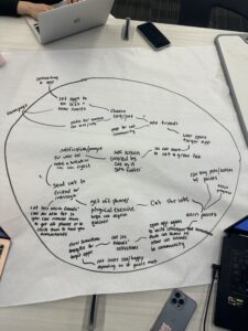
System Path
After designing our initial solution, we drew out our system path, again focusing on our persona Stressed Steve. The system path takes Steve through an entire flow of this solution, starting with an onboarding process that consists of goal-setting and customization, and ends with various paths of Steve finding motivation to change his behavior using our solution. The system path was helpful to figure out as a group because we were forced to account for a variety of previously unknown issues such as how to balance app usage with productivity and how to incorporate more personal solutions for users. Using the key insights from the Story Maps and MVPs, we wanted to focus on a less notification-based solution and keep our users invested in positive change that they would be able to visualize, which in the case of this system path, would be the pet’s facial expressions and items.
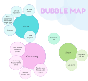
Bubble Map
For our bubble maps, we focused on three main features that we wanted to focus on for our solution that were intended to solve the issues found in our story maps. In our map, the size of the bubbles in this map represents the importance of different modules. As shown in our graphic, the three most notable modules were the “Home”, “Community”, and “Shop”. Each of these central nodes represents an essential aspect of our solution. The “Home” bubble represents a visual representation of progress and the basic analytics surrounding phone usage. This bubble is meant to be a more personal way of approaching screen time reduction and allow users to set goals and check progress. The “Community” bubble represents our emphasis on social accountability. Although small personal change can be done through individual motivation, we find that having a community and support group of friends can be beneficial, and at times, necessary for making progress. Through the community, users will be able to send support to each other and view everyone’s progress as they ideally reach their goals together. The final bubble is the “Shop”, which represents a reward system. Instead of an intrusive gamification system where users become addicted to artificial currency and doing mindless tasks, we opted for a more subtle approach in which users can be positively rewarded for good change such as using productive apps or exercise, where they can go to our shop and buy cute outfits or items for their pets. This means that even if users “grind” for these points, they will be more actively achieving their goals by spending time exercising and being more productive.
Creating our bubble maps as a group meant consolidating our ideas and figuring out how to make our solution approachable, personal, and effective. Throughout our brainstorming process for this map, we discussed a variety of different ideas that resulted in many important additions such as a shop to introduce gamification into our app and sending messages and reactions through user pets to facilitate a more social aspect.
Assumption Map
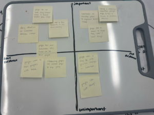
The assumptions most critical to our solution are mainly in the top right corner in the “Important” and “No evidence” section. Specifically, the three assumptions are: “Having a distraction/intervention prompts people to have a moment of mindfulness/reflection”, “Gamification can encourage people to implement behavior change”, and “People tend to connect to things they anthropomorphize or attribute character to”. Another assumption that we found important was the ones regarding visualization of progress and “momentum” of positive changes. These insights are important for our solution because they lead us to a more personal, visual solution that allows people to feel supported while facilitating behavior change. Additionally, phone usage is unique in that people are always with and surrounded by their phones, so being able to personalize solutions and make people connect with our solution is essential for making positive change.
Assumption Tests
Assumption 1:
We believe that gamification can encourage people to positively change their phone habits
To verify this, we will have participants set a time limit goal for a target app/apps (e.g. “I want to spend under 2 hours each day on TikTok”). Then, over the course of 5 days, each day they meet their goal, they will be rewarded with a small prize. If they succeed for all 5 days, they will win a gift card.
We will measure the time they spend on their devices, specifically on their target apps.
We are right if the user’s screen time is reduced because it shows that gamification with a reward can positively impact one’s mindfulness.
- Goal: With this test, we want to see how much of an incentive a reward-based system provides for participants. This relates to our app because we want to see how important it is for users to be able to concretely visualize or track their positive progress throughout a period of time
Assumption 2:
We believe that having a distraction/intervention prompts people to have a moment of mindfulness/reflection
To verify this, we will have participants set a time limit goal for a target app/apps (e.g. “I want to spend under 2 hours each day on TikTok”). Then, for each day over a 5 day period, every time they want to go over their limit, they have to go into a shared Google Doc and write:
- Why they want to keep using that app
- How they feel about their screen-time that day
At the end of the day, participants will send us their screen-time with app distributions so we can hold them accountable for the reporting
We will measure the time spent on their target apps and the notes made on the shared document.
We are right if mindfulness and self-awareness regarding app usage corresponds to a reduction in negative phone usage.
Assumption 3:
We believe people tend to connect to things they “raise” / things that have life/character
To verify this, we will have participants set a time limit goal for a target app/apps (e.g. “I want to spend under 2 hours each day on TikTok”). Then, each participant will choose a plushie of their choice and name it, which we will keep for each day of the study. At the beginning of each day, we will send a picture of all the plushies having a fun time together (e.g. having a tea party together). At the end of each day over the study period, participants will send their screen time and if they broke their limits for that day, we will send a picture of their plushie in punishment time (e.g. they are isolated from the tea party and they look sad). The participants will also be able to chat with their plushie occasionally, with one of us on the other end.
We will measure the time spent on their phone and the messages sent between the user and their plushie. We are right if the user displays connection with the plushie and reduces screen time. If we conduct a post-study interview, we can also verify that the punishment for the plushie was a factor in their phone usage.
Intervention Study
For our intervention study, we had to go through a series of changes right before we began our testing based on feedback from the teaching team. This meant that instead of our intended 2 check-in a day structure at 2pm and 7pm, we had a shorter check-in every 2 hours starting at noon and going until 8pm. At each check-in, we asked 2 main questions. The first was about “What are you doing on your phone?” and the second was “Is this an intentional use of your phone?”. Even with the change of plans, the intention behind our study was the same: Seeing the effect of a constant reminder on someone intending to reduce screen time and the impact of guided mindfulness.
One thing we noticed was that although we posed as a distraction and reminder to be mindful of screen time, the intervention was not as effective as intended in the sense that scheduled reminders asking about a user’s phone use did not directly affect phone usage. However, this did not mean that we weren’t able to gather important data. Looking at the screen time screenshots each of the participants sent us at the end of the week, we found that the actual time that users spent on their phone did not decrease by a significant factor. With that being said, when we conducted our post-study conversations, we were told that the constant check-ins made them feel more accountable for their screen time. Additionally, we found that although we were sending messages semi-frequently, we often missed our participants who would be off their phones at the exact moment we sent the texts, which resulted in them getting back to us as soon as possible, but still later than what we intended.
From these initial findings, we were able to gain a number of key insights. First, although our intervention may not have directly reduced our participants’ screen times, we were able to successfully make them feel more in control and accountable about their phone usage. Even if users were on specific apps or partaking in specific actions on their phone that could be perceived as negative, because they were interrupted or saw our messages asking if their phone use was intentional and had to respond, we were able to introduce a new aspect of mindfulness and have our users take a step away from mindless doom-scrolling. In this regard, we believe we were successful in that we were able to subtly change a user’s mindset and make them aware of a third-party involved in their phone usage. At the end of the study, one of our users even said, “Now that there are no more check-ins, I’m like ‘Oh, I guess nobody is checking on my screen time anymore so I can go on TikTok however long I want’”. This showed us that having a third-party at the back of a user’s mind still has the intended effect of keeping users mindful and thinking about their phone usage.
Another key insight we found was that scheduled messages or “one-and-done” time limits like iPhone’s screen time are not very effective. We believe that having set notifications by time or a specific time limit for apps that just says “Stop using this app” actually reduces accountability because it is easy to become indifferent to these notifications and ignore them. Instead, we have come to believe that a more individualized solution is needed and that true change in this regard is only possible with some aspect of personalization. Specifically, instead of timed messages at set times or a timer that goes off every hour that someone is on an app, a solution centered around subtler, more frequent reminders could prove more effective. This is further reinforced by our previous research done that showed that apps like Forest, which are “activated” by the user and incorporate aspects of flexibility are better received than features like iOS screen time in which users are forced to either be completely off of an app or ignore the screen time alert for the remainder of the day. A user gave us feedback about this topic as well saying, “The screen time notification thing is dumb because it’s just like ‘YOUR TIME IS UP’, and it’s easy to click out of it. But I feel like if I got a notification that’s like ‘Checking in! Are you being intentional with your screen time?’ where I could say yes or no, and maybe at the end of the week the app can tell me how I responded over the week, that would be nice”.
This intervention study was crucial in finalizing our solution design in that it showed us aspects that were weak in our initial ideas while highlighting aspects that were beneficial and impactful. Based on our key insights, the first change we wanted to make was a transition from a notification-based solution into something more physically visible. Some of the biggest flaws to notifications that we found was that it is (1) Inherently easy to ignore if doing something by simply swiping up on it (2) Only really effective if it’s seen by the user and (3) Can be counterproductive and bring users to check their phones more due to the compelling aspect of unread notifications. In other words, if a user is using their phone mindlessly between noon and 2 pm, and the notification or time limit comes right at 2 pm, that whole 2 hour period was wasted and the user may not have been aware until right when the notification came. An alternative solution we proposed that could solve this is a constantly visible feature that displays on apps that a user wants to use less. Instead of intermittent notifications, the user would be able to see our solution constantly as a subtle reminder of their screen time. Similarly, a second change we wanted to make was making our solution more personal. Notifications and screen time alerts are quite impersonal and may feel like the system itself telling users to stop what they are doing. However, if we were able to introduce a feature that is more personal such as a virtual pet or plant that reacts to their screen time, we believe users would be more susceptible to alerts or reminders about their phone usage. Additionally, this would further strengthen the feeling of accountability as users would be supported by a virtual pet that is always alongside them rather than the cold notification system with no personality.
Using the findings from our intervention study, we were able to refine our original plan of mindful phone usage into a much more personal, engaging system of change. Although the physical results of our intervention may not have been significant, we believe that the process and insights gained from the study were an important factor in redesigning our solution. Now, in conjunction with our assumptions and subsequent mappings done, we hope to be able to refine our solution even further and incorporate all the crucial aspects that we have uncovered so far in reducing mindless phone usage in our users.


Comments
Comments are closed.