Individual Mood Boards
Sophie’s mood board
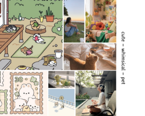
For my mood board, I chose the key words “cute”, “whimsical”, and “pet”. I wanted to emphasize the cutesy nature of our solution, and how it tackles screen time behaviors in a way that feels more fun and quirky than other solutions on the market. To fit with the whimsical and cute vibe, I chose images with bright but soft colors, like light pinks, greens, and sunset orange. I also chose the word “pet” to emphasize the fact that part of our solution is about nurturing a companion that can help you stay on track, and tried to also include images that conveyed this sense of companionship and mindfulness. Some pros of this mood board are that I tried to keep the color scheme fairly cohesive and think that most of the image convey at least one, if not more, of the key words that I chose. But it may be potentially detrimental to over-emphasize the “cute” theme of the app, because it may detract from its credibility.
Xinyi’s mood board
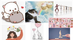
I aimed to convey the themes of “personal improvement, connection, and cute” through my mood board. The theme of personal improvement is revealed through the girl watering the flowers that grow out of her head and the little figure walking up the stairs. The theme of connection is conveyed through figures holding hands into a line and two elephants holding love-shaped balloons with their noses. And the theme of cuteness is apparent through the images of cats. My classmates easily guessed all three key words in class, so the elements I selected are representative of the themes. Our team decided to incorporate some elements from my mood board into our final mood board, like using the pink as the secondary color and including cartoon images of animals to express cuteness.
Collin’s mood board
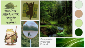
For my mood board, I chose the words companion, progress, and friend. I focused more on the grounded, slow-progress aspect of our app, which I tried to convey through the words green and with images depicting pets and friendship. During our group discussion with people not from my team, they were able to guess concepts such as “progress” and “calm”, but it seemed that this choice of pallet felt too tied to nature and greenery, which wasn’t my intention. I was able to find my images on Pinterest mainly. This board was a right fit for the prototype because it shows aspects of calmness and support, which our product aims to do. The pros of this mood board are that it is aesthetically pleasing in terms of color and shapes, and a viewer is able to get a good general idea of what it conveys. The cons of this mood board are that it shows too much connection with nature and not enough of friend or companion.
Brent’s mood board
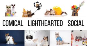
For my mood board, I was trying to evoke three themes: comical, light-hearted, and social. The comical and social aspects are well-represented by the chosen imagery. In class, my partner was able to guess both of these. The comical aspect is clear from the animals in goofy clothes. The social aspect is apparent from the dogs and cats together. The light-hearted aspect was not easily guessed by my partner. The easiest solution is to exchange this word for ‘fun’. This adjective is better represented on the mood board and is another mood our app provokes. One of the biggest issues with my mood board is the choice of style. I chose photographic images whereas it would have been better to choose vector art in a cute style. However, I chose the images because there were more readily available that portrayed my three adjectives well.
Synthesized Mood Board
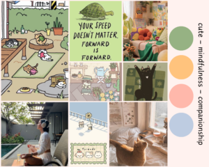
From our individual mood boards, we consolidated the images and themes that we liked from all of our ideas into one mood board. We decided on the key words “cute”, “mindfulness”, and “companionship” because we felt like our mood boards had all of these themes in common and we felt like they were the most important aspects to emphasize in our solution. We thought that making the visual design of our app cute would increase engagement and make users feel more accountable when it comes to nurturing their cat companion. We also wanted to emphasize mindfulness, since the point of our solution is to enable users to be mindful of their own goals when it comes to their negative screen time behaviors. We also thought that companionship was central to our solution, not only through the companionship that you develop with your cat companion, but also through the social capabilities where you can share your reflections with friends and hold each other accountable.
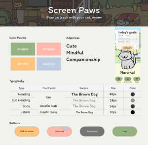
Style Tile
From our synthesized mood board, we designed a style tile to have a template for our fonts, buttons, and color palette. You can view our collaborative Figma board here, or see below for an image.