Ananya’s Moodboard
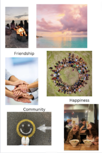
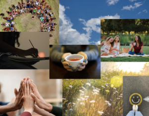
For my moodboard, I chose the words – Friendship, Community, and Happiness. My inspiration for this was the feeling of being together and happy and I found the images from Pinterest. Our product is one that helps people have a sense of community/belonging by allowing them to deepen their current friendships/make new ones and I feel these images did a great job of depicting that. I think what I missed was the aspect of introspecting and journaling – which is a major component of our product.
Anna’s Moodboard
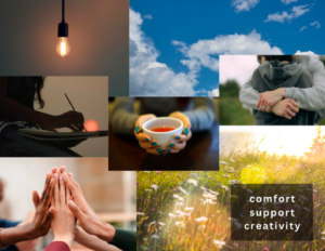
I created this moodboard based on the three words: “comfort,” “support,” and “creativity.” I thought about a key user of our product — people who may be feeling a bit unsupported or lonely. Support is expressed through the hugging and hands. Comfort is expressed through the warmth from the sun and sky. The sky, along with the lightbulb, are used to express creativity, which is required to brainstorm activities/conversation topics and reflect on their interactions.
Nick’s Moodboard
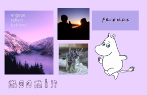
I made this moodboard with a style tile in mind to come after. I really liked the light purple color feeling of lavender and wanted to have that be a theme throughout. I also messed around with the name of “moomin” for our app, based off of a show? that anna watches along with a little friendly hippo character. My three words were engage, reflect, and befriend because I was trying to describe a mission for our app, but I don’t think i captured those very well in the moodboard.
When bringing this up at my table group (not my team group) they guessed “serenity, nature, cozy, and relaxation” which honestly made me feel good since I want those feelings to come through for users on our platform. I think that making friends can be difficult and stressful and if there’s anything we can do to make the process relaxing, I think that should start with our color scheme and app design.
Qi’s Moodboard
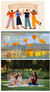
I made this moodboard by centering the picture with the theme color – orange, aiming to create a sense of warmness, indicating welcome and accepting atmosphere. The warm yellow tone also aligns well with the orange and the green and blue background in the pictures.
Team Moodboard
As a team, we realized that Anna, Ananya and Qi’s mood boards were very similar in terms of the vibes of the images. We decided to make sort of a combination of these 3 to create our team moodboard. The messages we wanted anyone who saw it to get were – happiness, introspecting, community, friendships, and connecting.
We felt that Nick’s moodboard was a better fit for the style tile and we used it as major inspiration for our team style tile.
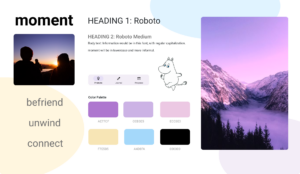
Team Style Tile