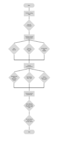
Wireflows
At this point, our team decided to slightly change the focus of our app such that it’s more one-sided. This is so that users do not have to worry about getting their friends on the app or about the stress that comes from having a shared representation of a friendship (ex: if friend A lets a Snapstreak die, it may reflect poorly on them. But friend A had a streak only of when they send messages to friend B, friend B doesn’t need to be involved). It will also greatly simplify the process of engaging with the app. This also means that no password/forgot password, login, sign-up, or privacy settings are technically required, as it can all happen locally and be stored locally on the device.
Specifically, what we mean when our app is one-sided is that a friend can have their own garden of flowers based on their other friends, without their other friends needing to get the app or opt-in.
There is an assumption inherent in this new individual design: people are interested in investing in relationships when there is a lack of reciprocation. Based on our interviews, people sometimes felt guilt for not responding to or engaging with their long-distance friends enough/promptly, and some felt the need to improve. This points toward their openness to improve individually. Additionally, a number of the apps on the market that we looked at for earlier assignments already utilize this assumption, showing it’s tested: ex: Smart Contact and Catchup.
Given this, we created three wireflow parts (highlighted in green) and justified them in the context of our personas (Busy Bessie, Lazy Louis, and Emotional Emiko):
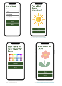
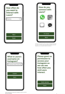
- E: adding a new friend (includes some onboarding): selecting a friend, customizing, and connecting services (ex: WhatsApp, iMessage, Signal, etc)
- Description: This part of the flow involves: adding a friend’s name/pronouns (not your own—this is done elsewhere in the nap), choosing a flower color palette and desired communication frequency, and identifying where you connect with them (includes authenticating with other apps, like WhatsApp, iMessage, and Instagram, and selecting your friends’ username(s)), and submitting to add their flower to the garden. This flow includes enough explanation throughout it that it can serve as onboarding.
- Justification: All of our personas want to maintain and nurture their long-distance friendships, so having representations of them in the app is critical. Busy Bessie and Lazy Louis will appreciate how this part of the flow involves connecting your other social apps so that communication frequency in practice can also be tracked automatically. The ability to customize preferred communication frequency and quantify that may also be important to Bessie. Finally, Emotional Emiko may appreciate that they are able to engage with the app without burdening their friends because their friends are not involved at all; additionally, this portion of the app will allow Emiko to appreciate and design something based off of their friends that they care about.
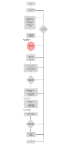
- D: viewing existing friends (includes some onboarding when in empty state): viewing flower statuses, updating customizations, remove a friend
- Description: This flow begins with a garden where each flower inside represents a different friendship. Clicking the flower leads to a screen that monitors its current status and growth, as well as other customizable options such as communication style preferences and customizing flower cosmetics. Many of the customization options will lead back to the task flows presented during onboarding.
- Justification: This feature is to help keep our users invested in our app, and help them keep their long-distance connections more present in mind. Being able to revisit different customization aspects would be useful for someone like Busy Bessie or Lazy Louis, as the ongoing personalization may make keeping in touch with their long-distance friends a more present task. Furthermore, it accommodates diverse communication styles among all users, promoting understanding and managing expectations in long-distance interactions. Given that people’s priorities and commitments shift, we wanted to give users the option to adjust these preferences accordingly.
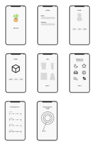
- C: Profile:
- Description: This portion of the flow is the first entry point of the application where users are able to set up their profile, and set their preferences for frequency of communication with their LDFs.
- Justification: This flow’s features are specifically relevant to users who have similar pain points as our personas Lazy Louis and Busy Bessie. The former struggles with setting out intentions to reach out to LDFs and keep themselves accountable for regular communication. The latter has similar accountability issues, but rather than a lack of motivation, it is due to a cramped schedule and low bandwidth. Asking the user to set out intentional communication goals and practices (which will then be encouraged via nudge notifications), is immediately helped to both of these personas.
- Flow Details:
- set your name/pronouns
- configure gardener avatar 🌱
- Default communication frequency (but can be changed individually – deterministic)
- What are your communication preferences?
- How often do you want to be in contact with your LDFs
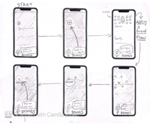
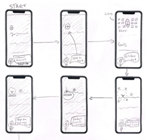
F: Onboarding/Tutorial Wire Frame
- Description: This flow depicts the onboarding process as users first log into the application. The app carries them through their home page, creating a flower, and the rules of friendship maintenance. At any point, the tutorial can be skipped.
- Justification: This flow’s features are important to personas like Emotional Emiko, who is heavily invested in successful long-distance relationships. While it would benefit her the most, other users would find the information given to them preferable over having to guess how the app functions. This could help avoid the initial frustration that might cause them to delete the app or mistakes that could cause them to give up on relationship maintenance. Busy Bessie would likely appreciate the ability to skip the tutorial at any point, as they may be too preoccupied to sit through the full sequence, which would last a minute or two. Lazy Louis could go either way, depending on whether the interaction with the tutorial is guided enough. If it was too unstructured, (i.e., referring 5 friends), he would likely be pushed away from the app due to the high amount of effort right off the bat. As a result, this flow is especially linear.
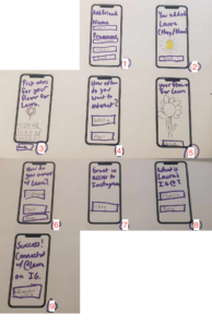
Individual Sketchy Screens
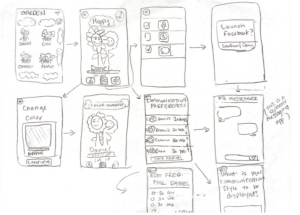
E: I made very quick sketchy screens for my first draft and will do them with slightly more fidelity after getting team critique on the overall idea/layout/elements.
D: I made a sketchy screen for the task flow of viewing existing flowers in a populated garden.
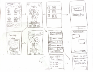
C: Here I crafted my rough sketches of the process for the Profile flow after reading feedback from the teaching team on our wireframes. Based on feedback, I sought to add more detail in the customization stages in the wireframes which is reflected in the sketchy screens section.
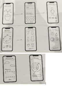
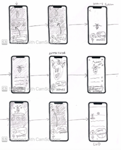
F:
I created some sketchy screens of our onboarding process, including a tutorial through planting, growing, and nurturing a flower
Team Critique of Sketchy Screens
E:
- Critique:
- E’s sketchy screens could have been a little neater. This could have been improved by increasing the size of them so that more could be drawn in. Improving this is important to see how different elements are positioned across the screen and their relative sizing.
- The back buttons in E’s screens were not consistent or clear. This should be remedied so that the design is easier to navigate without causing additional friction for the user.
- Some of the user inputs could be dropdowns (ex: frequency of interaction). This will make it easier for the user to choose.
- The selection of connected platforms could be done via logos and buttons instead of a text input with autofill. This looks better and will make it easier for the user to choose.
- An explanation should be added around why we need access to their accounts on other services/platforms. This will make users more comfortable with providing access to other services.
- Revised screens:
Cameron:
- Critique:
- C’s sketchy screens could have had more icons to illustrate the range of options for the user
- There could be more iconography
- Some of the initial screens lacked text and details on the options for the different users (eg. options for skin, hair, eyes, and accessories for the plant background)
- Revised screens:
Daniel:
- Critique:
- Some of the iconography was a bit too much visually – though it was pleasant to look at, it might be overwhelming for a user
- I really liked the social media selection page where you could easily click which platforms to connect
- Put an explicit note that our app redirects to a separate messaging app
- The icon symbolism was confusing. Settings gear might be more appropriate for app sync.
- No back buttons
- Revised screens:
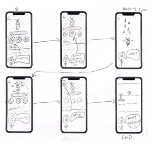
Francis:
- Critique:
- It is unclear that one sketchy screen represents the entirety of another flow (the add a flower one). It should be noted on the screen that this represents multiple screens, so it’s clear to the reader.
- The watering system needs more detail
- There should be a dismiss button available throughout the whole tutorial so people can easily back out
- Make it more clear the app is dimmed/shaded
- I really liked the plant speech bubbles, I think the transitions could be a bit more clear between the different stages
- Revised screens: