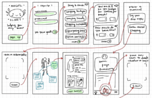
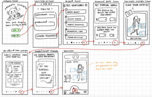
Wireflows
Wireflow #1: Onboarding (done by Caroline)
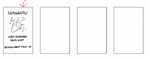
The wireflow includes two main highlights – a personalized goal-setting questionnaire and a quick introduction of the top features. After creating an account, the user is asked to drag and rank their closet and shopping goals such as “staying trendy” or “staying within budget”. This information helps the mindful prompt algorithm tailor more towards each user’s interests. For the “I’m just a girl” persona, this questionnaire allows them to tailor the experience towards staying trendy and trying new styles. This allows users of this persona to build their outfit and make mindful shopping decisions without losing sight of their original interests in style and fashion. On the other hand, the “low-budget shopper” may wish to reflect more on budgeting and savings. With their budget and personal spending habits collected during the onboarding, mindful shopping prompts can be more personalized to that user’s financial limitations. Following these questionnaires, the new user is given a screenshot of an example of a scanned outfit, a scanned item while shopping, and a stack of mindful shopping prompts. The scanned outfits aid in the life value calculation which further emphasize the needs of a low-budget shopper. Additionally, while scanning potential items during shopping instances, both personas can view similar items in their closet as an alternative helping them stay on trend while still being mindful of spending.
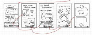
Wireflow #2: Mindful Shopping Prompts (done by Casey)
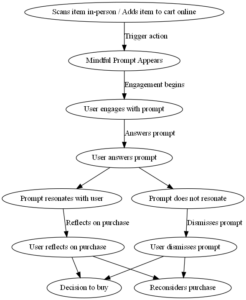
The original wire flow above is designed to prompt mindful reflection at critical moments, aligning with the personas’ needs to manage impulsive shopping habits and financial constraints. For our “I’m Just A Girl” persona, the flow introduces mindful prompts right after item selection, potentially interrupting impulsive trends-driven purchases by encouraging reflection on personal style and necessity. For the “Low-Budget Shopper” persona, it addresses their conflict between wants and needs by providing a moment to reconsider purchases in light of their budget constraints. The flow’s structure—featuring engagement, reflection, and decision nodes—offers a solution that adapts to various user motivations, reinforcing mindful shopping practices across diverse user experiences.
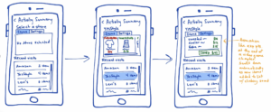
Wireflow #3: User Metrics/Trends Summary (done by Shina)
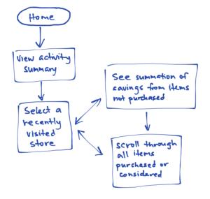
The wire flow for viewing a user’s activity summary is designed mainly bearing the low-budget shopper in mind. We first group their activities by store so that they may more easily remember the time they spent at the store during a shopping session and how many items they may have considered purchasing during the session. From there, selecting a store (shopping session) brings the user to a page that immediately begins an animation listing and summing up the costs of the items they had considered but ended up refraining from purchasing during that session. Seeing the live summation of money they had “saved” is meant to help the user feel a sense of gain and accomplishment, as if they were seeing their experience points or money being tallied up in a video game. On the same page, they can also scroll through the items they had either purchased or considered purchasing during this shopping session to help them better recall this shopping session and review or reflect on their choices while not caught up in the excitement of shopping.
Initial Sketchy Screens
Sketchy Screens #1: Onboarding (done by Caroline)
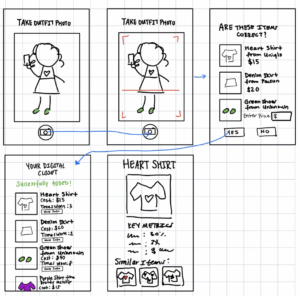
Sketchy Screens #2: Scanning Outfits (done by Angela)
Sketchy Screens #3: Mindful Shopping Prompts (done by Casey)
Sketchy Screens #4: User Metrics/Trends Summary (done by Shina)
Revised Sketchy Screens
Sketchy Screens #1: Onboarding (done by Caroline)
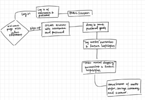
Initially, the sketchy screens for the onboarding included 15 screens. This overwhelming number of screens was reduced to 8 including the welcome and home screens. In the welcome screen, there were initially only options for signing up, so a login option was added in the revised version. Although the screens were cut down, it was still hard for users to understand how far into the onboarding they’ve reached. Dots visibly representing their progress were added to the bottom of the onboarding screens and clearer, more intentional headers were added to each screen. These headers also highlighted the features and their purpose more clearly. The examples for the scanning task and shopping mindfully tasks were also summarized more concisely. The outfit scanner was represented with a polaroid that captured the date and items of the outfit. The mindful shopping prompts were emphasized as a deck of cards and the life value summaries used less text and more visual elements like photos of the items. These representations of the features delivered a stronger purpose and clearly described the ways users may apply them in their daily lives.
Sketchy Screens #2: Scanning Outfits (done by Angela)
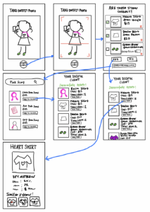
There were two main revisions done to these sketchy screens. First, a check box was added to the left of each scanned clothing item on the “Are These Items Correct?” page. This was done so the user could approve certain items that they wanted to add to their closet and ignore the ones they did not want to add. A trash button was also added to the corner so the user could have the option to delete a scanned clothing item if it wasn’t correct or if they didn’t want to add it. Second, in case the scan didn’t find certain items or the user already knows a specific item they want to add (but may not have the item on hand), a search page was added where users can look up items and add it to their closet. The main justifications behind these additions were to think of edge cases/scenarios that the user might face when scanning their clothes.
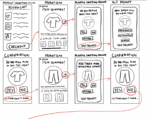
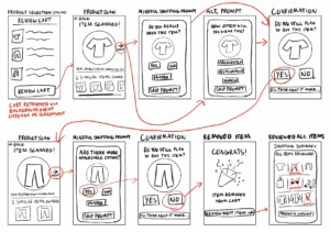
Sketchy Screens #3: Mindful Shopping Prompts (done by Casey)
The revisions to the sketchy screens are justified by the need to streamline the user experience and encourage mindful shopping. Changing the wording from “Checkout” to “Review Cart” more accurately prompts users to reassess their potential purchases. Outlining interactive elements like “Skip Prompt” clarifies navigation, while redefined arrows in the illustrations clarifies the flow between screens. The note on using a background event listener or user-uploaded screenshot for cart retrieval provides clarity about the app’s functionality. Lastly, introducing a “Shopping Summary” screen provides a conclusive overview that highlights removed items, aligning with the app’s goal to facilitate thoughtful purchasing decisions.
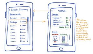
Sketchy Screens #4: User Metrics/Trends Summary (done by Shina)
The first draft of the sketchy screens for the user’s activity summary had a lot of repeated elements (e.g., stores recently visited). The screens didn’t have a lot of white space as a result of having so many elements on the screen at once. We decided to separate the list of recently visited stores from the items and savings within the shopping sessions at those stores so that the user wouldn’t be distracted by other store names while viewing their activity at one particular store and to give the UI a cleaner look. Now, each store can be selected to bring up a new page just for the user’s latest session at that store. Also, the items considered or purchased and the user’s savings during the session no longer need to be cramped in tabs within the same box—they can be separated and viewed simultaneously since the list of stores is no longer taking up half of the page.