

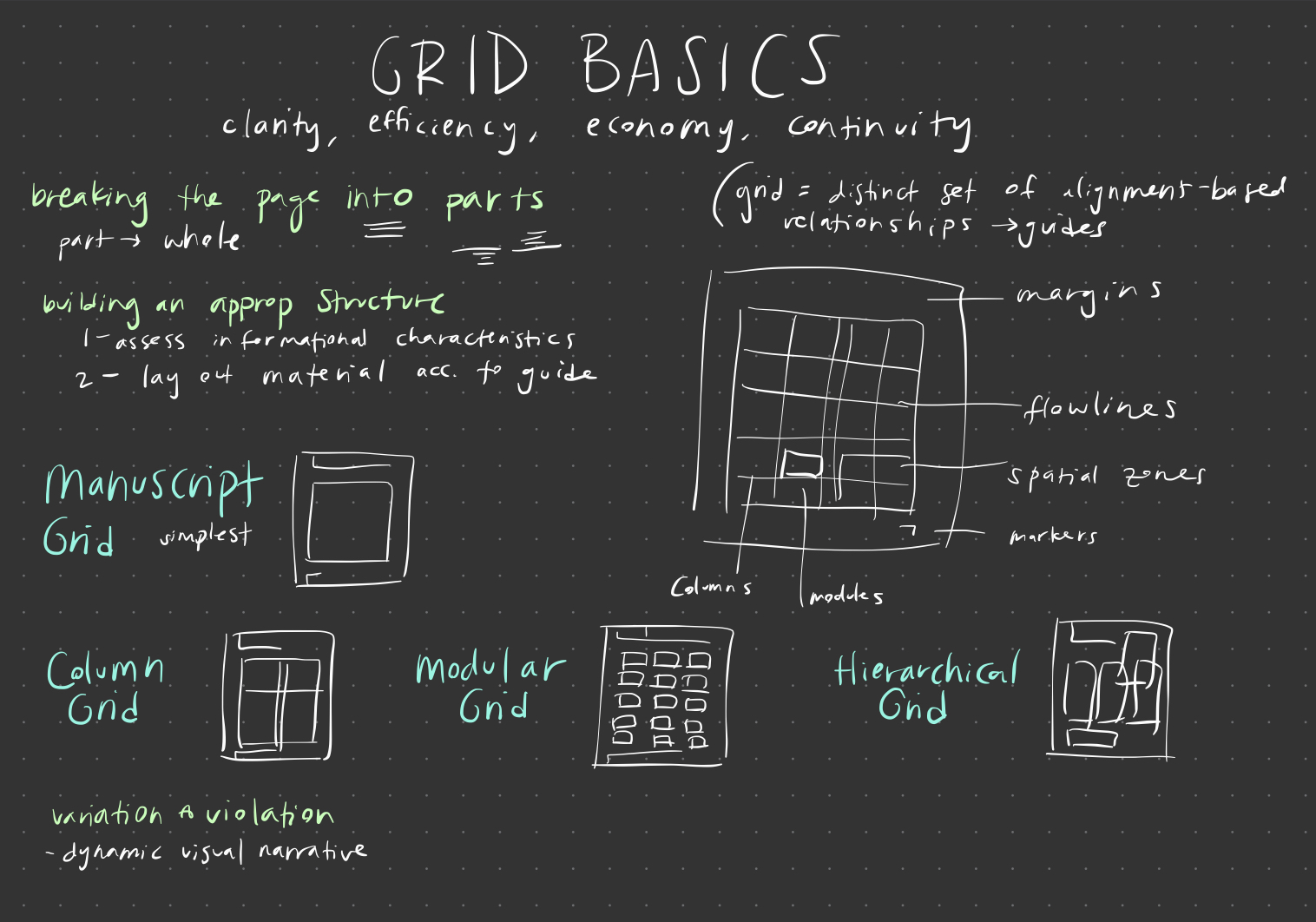
Proximity
Proximity of the ingredients and dish title allows them to be associated.
Alignment

The headers are aligned
Contrast
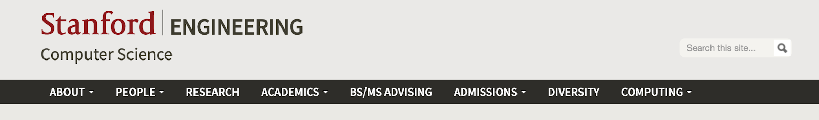
Contrast between the links (white text) and black background, plus Stanford font and engineering/link fonts in all caps
Similarity

Group similarly styled information (normal vs. bolded vs. purple text) together
Good font pairing

Pairs bold all caps font with italicized font that has more “details”
Good Color Palette used
Pastel color palette; simple main colors with accents that have similar level of tint
Identify the grid (take a screenshot and find the grid)

Modular grid with the different blog posts


