Mood Board and Style Tile
NIGHTHAWKS
Introduction:
Team Nighthawks is working on an exercise motivation solution to increase users’ workout satisfaction and make them feel more satisfied with their routines. We are tackling this problem by focusing on social motivation in hopes of helping two personas, Sally and Franklin, improve their workout routines. Because of the nuance in Sally and Franklin’s challenges, our individual mood boards took several routes to establish a sense of strength, satisfaction, motivation, and community. We feel that a focus on groups can increase feelings of social safety, accountability, and exercise education.
Sally has a two-part problem of feeling unsafe at the gym and also not knowing what exercises to do, and we feel groups will make her both feel more comfortable and also be able to collaborate to become more creative and intentional with her workout plan. Franklin does not stick closely to a routine and his workout frequency varies greatly based on outside factors like weather or school workload, and groups can hopefully help keep Franklin on more of a routine as we can leverage the idea of social conformity as a motivation. Overall, we want our audience to feel more energized and motivated to take on the challenge of improving their health.
Individual Mood Boards:
Yishu Chen
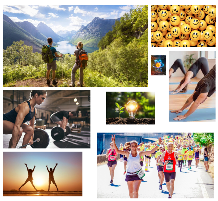
Vision/Fit/P&C: For my mood board, I picked the words strong, happy and fresh. Exercise is about progress, dopamine, feeling good and celebration to a lot of people, including myself, thus the choice of the words strong and happy. As a big hiker myself, I also associate a lot of different sports with the outdoors, whether it be hiking, climbing or skiing. I chose the word fresh because there’s something about exercising outside and breathing in the fresh air that draws me back outside over and over again and I hope everyone is able to experience that feeling. I believe these are fitting for our app not only because they’re exercise-related, but also because we want exercise to be associated with positivity and motivation. I also pictured different types of exercises to show the wide range of diversity. What this mood board does well is capturing a diverse set of exercises and experiences relating to working out. What could be improved is the cohesiveness of the images in terms of color. I also think that I could have explored more abstract, non-exercise-related images that express similar concepts.
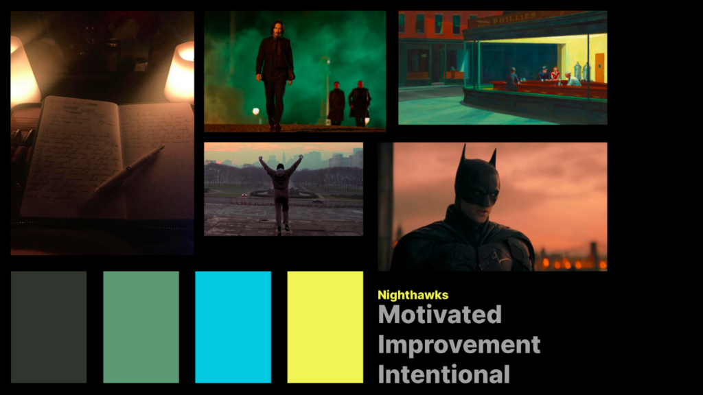
Jack Clark
Vision/Fit/P&C: For my mood board, I wanted to focus on pop culture characters who are intensely motivated and adhere to strict sets of values. I followed the color scheme of the painting Nighthawks by Edward Hopper (this painting is our namesame). This mood is the right fit because it depicts people who reflect on their past hardships and use that reflective knowledge to trudge forward and accomplish big and inspiring goals. What this mood board does well is having a unified aesthetic and drawing on recognizable symbols to convey a message, but it falls short in emphasizing the community aspects we want to focus on in our solution
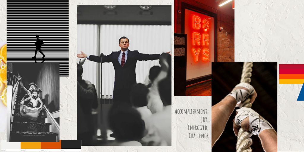
Nate Fleischli
Vision/Fit/P&C:
The aim of this mood board is to encapsulate the emotions unearthed during our usability research. Central to our design is an evocative image of Leonardo DiCaprio that embodies empowerment and pride. Surrounding this focal point, the left-hand side images exude joy and awe, while those to the right channel resilience, tension, and vitality. To complement the primary hues of black, white, red, and orange, I introduced an off-white texture in the background, enhancing the overall warmth and inviting atmosphere. This choice aligns perfectly with our prototype’s goal: to motivate users to engage in physical activity, capturing the exhilarating rush of post-exercise endorphins. The mood board’s strengths lie in its straightforward color scheme and its harmony with the prevailing trends in fitness app design, ensuring our prototype feels current and relevant. However, a con is that the intense energy conveyed may not appeal universally, potentially alienating some users. Additionally, it falls short of fostering a light-hearted community spirit, an aspect we are keen to promote in our app to create a sense of belonging and inclusivity among users.
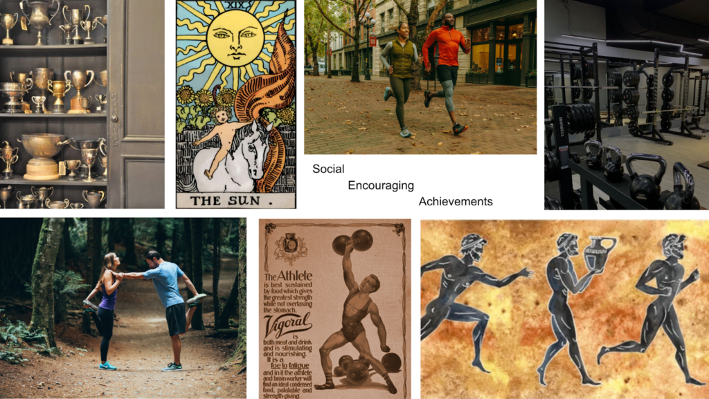
Sophia Ramsey
Vision/Fit/P&C: The goal for this mood board was to focus on different visualizations of strength and accomplishment. With “encouraging” and “achievements” being two of the focus words, we must acknowledge that our users will have different goals. The trophies, gym, bodybuilder, and Greek paintings symbolize different forms of strength, the Sun represents success and fulfillment, and the pairs of runners represent the social encouragement that we hope to embody. However, this mood board focused more on outcomes, and it did not include the sense of joy that users should feel in the process of exercising.
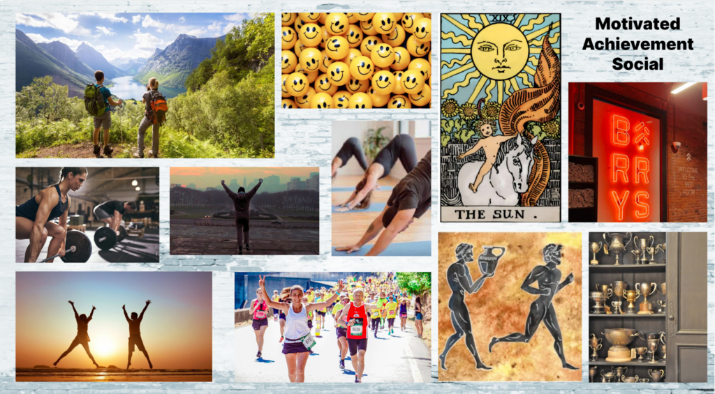
Synthesized Mood Board:
We compiled each of our mood boards into the above product. We took the idea of intentionality from Jack’s board, the focus on challenges and competition from Nate’s board, the athletic focus from Sophia’s board, and the joyful teamwork aesthetic of Yishu’s board and came to this bright conclusion. We want to focus on how working together can bring us closer to accomplishing our goals, and how, in both the journey and in the outcome, we can feel more satisfied, more a part of a team, and more motivated to go and achieve more.
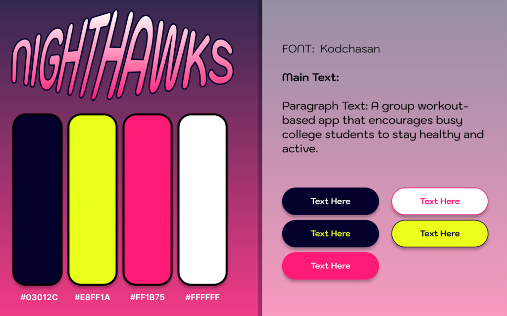
Style Tile:
In our style tile, we chose to highlight the energetic and bright intensity of exercise through a highlighter yellow and a hot pink. Our intended audience is college students, who are a young audience that already utilizes many other applications with which we want to compete, such as Figma and Apple Health. We feel we can differentiate ourselves by focusing on a fun and popping aesthetic. Our font choice, Kodchasan, is an accessible sans-serif font that is rounded and unique when compared to more traditional application fonts. We want to utilize rounded corners within our buttons and UI components to compliment our font and overall convey an air of physical, social, and mental energy to achieve goals.