Project Name: RiseRight
Designing for Phone Behavior Change: A 10 week project aimed at helping people curb early morning phone usage
Project Date: Winter Quarter 2023 (January 9 to March 17, 2023)
Team Members and Roles
|
|
|
|
|
Sonya Kotov |
Julie Wang |
Ellie Yang |
|
MS in Design Impact ‘23 UI/UX Designer |
MS in Computer Science ‘23 UI/UX Designer |
BS in Computer Science ‘24 UI/UX Designer |


Overview
How might we help young adults reduce their screen time during the early morning hours?
Our goal was to help people, particularly college students, reduce their early morning phone usage. We created an app that asks people to set two different alarms: one for when they wake up and one for when they get out of bed. In between, they are free to use their phones as they wish. With this approach, we aimed to reduce unintentional phone usage and “doom scrolling” without getting rid of the parts of early morning phone usage that people find useful.
Problem Finding
The Problem Space
Relevant blog posts: “Comparative Research”
What is the first thing you did when you woke up this morning? For many people, the morning starts by turning to their phones and checking messages, scanning emails and scrolling through social media. We were inspired to tackle this problem when reviewing our and our peers’ Measuring Me’s. We found a contradiction: participants bemoaned their early morning phone usage, wishing they could spend less time staring at screens. But as we dove into their lived experience, we found that participants also gain many benefits from screen time: it’s a nice way to ease into the day and reviewing notifications helps people feel caught up. Overall, we found that heavy morning technology use can be overwhelming and distracting, overall impacting productivity and wellbeing throughout the day.
Our anecdotal evidence is backed by data. According to Statista, people spend 3 hours and 15 minutes on their phone per day. Assuming an average of 8 hours of sleep per night, this amounts to 20% of their day! What’s more, 3 out of 4 Gen Zers feel that they spend too much time on their phones. Although we can’t boil the ocean, we wanted to tackle a small slice of this: phone time spent in the early morning.
We started by doing a comparative research of the academic literature and market competitors in the space. The literature review highlighted key behavior change tools like timely feedback, tying behavior change to personal goals around health and happiness, and leveraging social connection. The literature also highlighted the importance of a carefully crafted morning routine in setting the tone for the day. Consequently, this makes it all the more important to tread carefully when attempting to disrupt a morning routine. Otherwise, our interventions won’t stick.
After reviewing our competitors, we found that they were best positioned to build an app that involves a minimal change to our users’ daily routines and feels pleasant to use, which we implemented by using a tone that is encouraging and friendly, a warm yet calm color palette, and visual imagery to evoke positive emotions from users. Amongst competitors, there are alarm apps, habit trackers, and behavior change apps – but none that do all three. This is the gap we aimed to fill. See full competitor analysis here.
Baseline Study and Synthesis
Relevant blog posts: “5A Synthesis and Proto Personas”
Our target audience is young people living away from their families who wish to reduce their early morning phone usage. These participants typically wake up using an alarm clock (not naturally) and snooze it frequently.
In our baseline study, we looked at screen time throughout the morning, noting where it fits in the context of their morning routine. Importantly, we also looked at emotion (valence and intensity) throughout this process. Behavior is interrelated – it does not happen in a vacuum. Hence, we wanted to understand all the behaviors around their phone usage.
Here is a sample of a log that one of our participants kept:

We found an important feedback loop: participants wake up feeling tired, which motivates them to stay in bed on their phones, and ultimately results in them feeling rushed throughout the course of their morning routine.

We also found another behavior dependence. In the diagram below, we see how morning phone usage is important (for getting caught up with notifications) yet deters users from getting out of bed promptly. From the connection circle, we found the time it takes to get out of bed ties closely with how/when they are using their phones.

Based on these learnings, we decided to consider how to reduce unintentional phone usage without disrupting intentional engagement with phones (for example, to prepare for the day ahead). This helped us refine our problem statement by focusing on a specific type of phone usage in a specific setting (in bed in the morning). For more information, see blog.
Personas and Journey Maps
Relevant blog posts: “Journey Maps and Provisional Personas”
The baseline study helped us refine our personas. We created the personas we did in order to detangle two challenges our target audience faces when getting up in the morning. Most participants had a combination of both, which is why it was paramount that we address both blockers.
We came up with two personas: Sleepy Sam and Conflicted Cameron. Sleepy Sam feels tired in the morning, which leads to more phone use with both notifications and scrolling to try to wake up, but this leads to feeling more rushed later. Conflicted Cameron does not necessarily feel as tired, but feels torn by different tensions around staying in bed and using their phone. Both of these personas struggle with staying in bed on their phone for too long, which leads to being rushed and mentally feeling overwhelmed as they get up.


Once we had our personas, we were able to draw journey maps for these.
Sleepy Sam’s Journey Map

Conflicted Cameron’s Journey Map

You can read more about our personas and journey maps at this blog post.
Solution Finding
Intervention Study
Relevant blog posts: “Synthesis and Proto Personas”, “Midpoint Writeup”
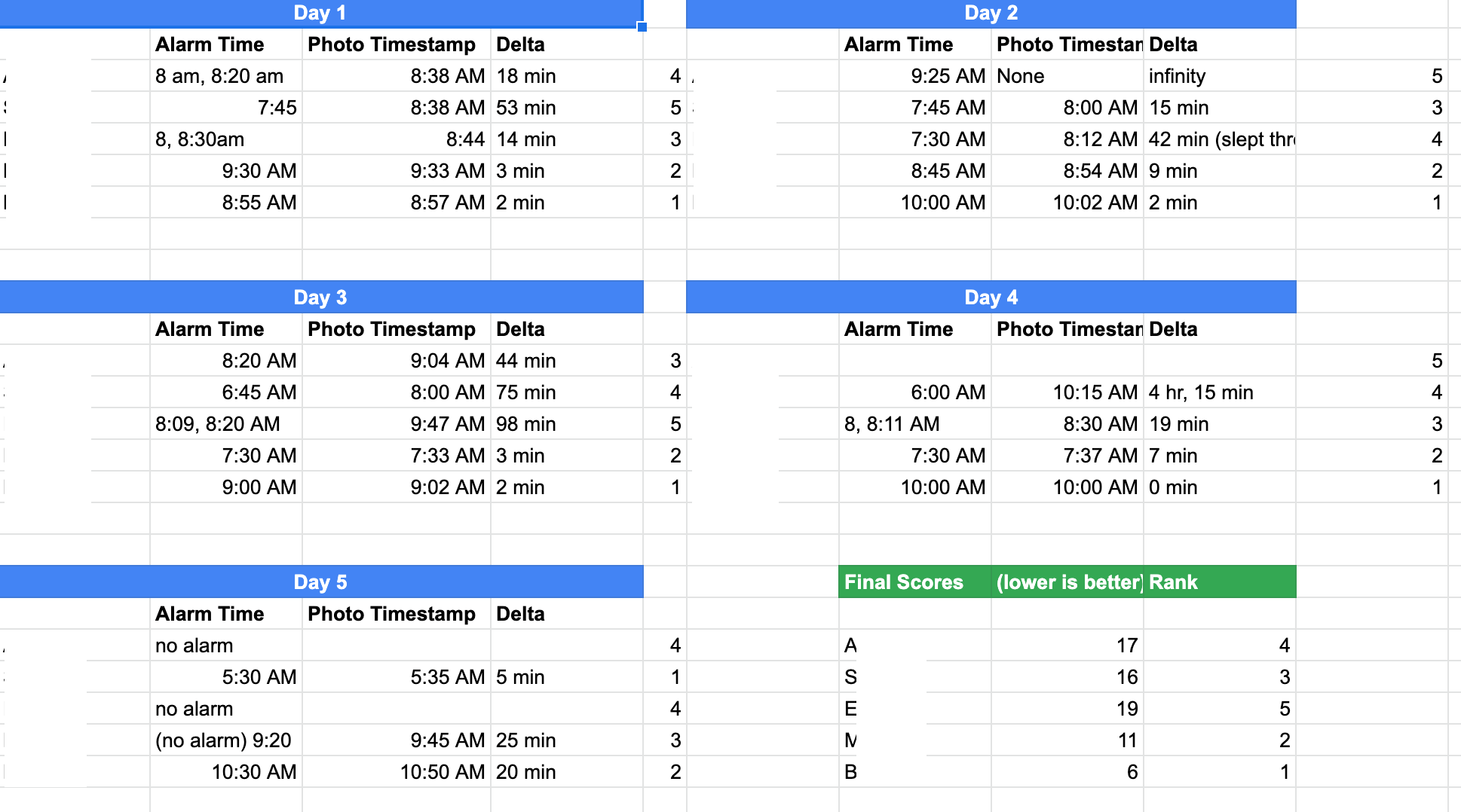
For our intervention study, we decided to focus on getting users out of bed as soon as possible. For five days, we had our participants send a screenshot of their alarms in the evening and text us a photo once they got up and out of bed. We would calculate the difference between their alarm and the time the photo was sent.
We came up with this idea because we noticed that some of our participants benefited from social pressure when going through their morning routines. Some participants had a partner who encouraged them to get out of bed early or held them accountable to their wake-up goals. Others had roommates that provided small bursts of social interaction, making them less tempted to get this interaction from their phones. This led us to consider a few highly social interventions to encourage this habit change. We considered a variety of social interventions, which you can read about in the blog post here.
Ultimately, we aimed to create an intervention that decreases unintentional time spent on the phone without disrupting intentional phone time. We did this while balancing between a number of factors: minimally disruptive, so that the intervention sticks; requiring a small amount of overhead from our participants, so they stick with it; and causing minimal shame, to avoid emotionally hurting our participants.
We wanted to understand how adding a “social” element would change people’s behavior. We hypothesized that participants will indeed spend less time in bed in the morning, as well as less time on their phones, as compared to baseline. We tested this hypothesis by calculating the difference between their alarm time and the photo they sent, letting this stand in for time spent in bed, and using this time to create a leaderboard. We also had routine logs and image data to see what participants do and how they feel about it.
Key Insights from our intervention
- Screen time is stimulating and helps people wake up, but excessive use of technology leads to stress. Users reported feeling stimulated by screen time in the morning, as it helped them wake up and feel alert. However, they also reported feeling sucked into technology, which resulted in wasted time and ultimately led to feelings of stress and anxiety.

- Alarms come in two flavors: “Wake Up” and “Get Up.” Stress happens when you confuse the two. We noticed that some of our users set multiple alarms. When the first went off, this signaled the transition from deep sleep into awakeness. When the second alarm went off, this signaled that it was time to get out of bed. There is a difference between simply waking up and being ready to start the day. We also notice that people purposely set the 2nd alarm to ring at the very last minute so that the conscious sense of running out of time motivates them to get out of bed. This ultimately became the underpinning for our solution.


- Competition may have been ineffective due to lack of (perceived) similarity. We were surprised that sharing the wake up time scoreboard did not motivate much movement day to day. Our participants stayed in the same relative positions, though some participants spent less time in bed compared to baseline. We wonder if establishing social connection and a sense of similarity would increase the amount of healthy competition amongst users.
Design Architecture
Relevant blog posts: “Architectural Design”
The story mapping exercise illustrated how our solution would fit into the context of our users’ mornings. It helped us tap into empathy for our user and design a product that made sense in their routines.


Although the system path diagram is meant to showcase a happy path, the process of creating this diagram was instrumental in helping us understand all the places where the user could go wrong. This gave us a clear “to-do” list of error cases to design for.

Our bubble diagram helped us bridge how each of us was individually thinking about the end product into a cohesive vision that we all endorsed. Our final diagram synthesized app contents under three headings: Persona Features, Social Features, and Privacy & Legal. This was also immensely helpful in designing our information architecture.


Assumption Mapping & Testing
Relevant blog posts: “Assumption Mapping”, “Assumption Testing Results.”
We created the following assumption map by listing out what is feasible, viable, and desirable, then plotting these assumptions on a 2×2 of known/unknown and important/unimportant.

We decided to test two assumptions.
The first assumption we tested was: “Users will be comfortable sharing their streaks with friends and are interested in seeing the streaks of their friends.” To test this assumption, we asked users for a list of five friends they are comfortable sharing streaks with and mocking up a picture of a leaderboard with these friends.
The second assumption we tested was: “Users are interested in maintaining a streak of their wake-up times.” We tested this by showing users a 5-day streak that is tailored to their individual wake-up goals. We then asked users how motivated they are to maintain that streak.
Findings
Our first experiment confirmed our hypothesis: users do indeed feel comfortable sharing their wake up times, day after day, with their friends. The experiment was extremely useful in getting more nuance to this statement. This led us to prioritize the social aspects of our app: nudging users to connect their contacts, share streak information, and send encouragement to friends.
Our second experiment had mixed results. We found that some people probably won’t be motivated by a streak, which means our app needs to provide value outside of the streak. We also learned that a long streak is extremely motivating to maintain, while a short streak can be discouraging. Providing additional encouragement to users in the early days of developing a streak can go a long way.
To learn more about this process, head to our blog posts: “Assumption Mapping”, “Assumption Testing Results.”
Assumptions remain. The most pressing ones to verify are the assumption that the double alarm format will actually get users out of bed and that users can set realistic wake-up and get-up times using this double alarm format.
Building a Solution
Wireflows to Sketchy Screens
Relevant blog posts: Sketchy Screens
The following wireframe shows how each of our task screens connect with each other. The turning off alarm flow is the entry point to using the app at the start of the user’s morning routine. The first alarm goes off and triggers a browsing countdown. After the second alarm, users are prompted with a congratulatory screen with their updated streak. We aim for a happy path where the user wakes up to the first alarm, turns it off, starts browsing, and stops when their second alarm goes off, promptly getting out of bed.

To view more on our wireflow, navigate to this link.
What you see above is the synthesis of the sketchy screens that we made, which we describe below.

This set of sketchy screens explores the key flow in the app: turning off the first alarm, browsing apps in your “allow-list”, then getting up when the second alarm goes off. Every day you successfully turn off both alarms, one more day is added to your streak.
In this sketchy screen, we explored the following:
- How do we display a users’ “allow-list” of apps while also letting them browse these apps? To solve this problem, we explored a solution in which, after the first alarm goes off, the user can turn it off with a swipe and view a list of chosen app icons. This enables the user to browse each app, close it, and move on to the next icon, without having to navigate outside of the app.
- We also explored a floating list of apps that remain on the user’s to-do list while they are browsing.
- The 4th and 5th screens display the user’s streaks and their friend’s streaks. The app presents a card UI that indicates the length of the user’s streak and whether their current morning added to or broke the streak. The user can expand the card to view their friend’s streaks on the app page.

In this sketchy screen, the user can go through the process of setting their two alarms and choosing apps for their app list. The “recommended” apps section in the first screen on the second row is added to increase efficiency of usage and clarify best practices around using this app. We also discussed how to best represent the two alarms, and recognized that having a separate alarm 1 and alarm 2 card matches the current standard interface of an alarms list, building on user familiarity. Also, the format of an alarm 1 and alarm 2 card can help address the potential for conflicting alarms. The app list and search bar on the last few screens also follow existing patterns of lists and search features, and the addition of the recommendation section hopefully makes it easier on users to see popular apps.

The above onboarding flow includes signing up for an account, agreeing to the terms of service, and starting to set your first alarm. When this flow ends, users immediately get plopped into the alarm flow described previously. In this flow, we prioritized getting only the required information from users and then sending them on their way (to enjoy the rest of our app!).
The image above is the result of several iterations that addressed the following concerns that resulted from the initial wireflows:
- Way too many questions were asked, which ballooned the number of steps in the onboarding process. We agreed that we need to make this process as fast and easy as possible and bury any additional questions in the settings pane.
- The onboarding process is too mundane. To create a moment of delight in the middle of it, we added a little success screen with a pretty graphic that congratulates the user and motivates them to keep moving forward.
- We debated whether to ask for the user’s name. Ultimately, we decided to include it because it quickly adds a sense of personalization, which makes users feel more invested in the setup experience.
Branding – Mood Boards & Style Tiles
Relevant blog posts: “Mood Boards and Style Tiles”
When thinking about our brand, we wanted to evoke the best parts of a great morning: feeling bright, fresh, and excited for the day ahead. To do this, we used bright tones to symbolize the morning sunrise and positive energy inherent to starting the day on the right foot. That said, we wanted to balance this brightness with a sense of peace – after all, a great morning makes you feel grounded for the rest of the day. Hence, we used simple lines and lots of white space in our app. We want our users to feel energized and grounded.
This comes through in our mood board through the combination of bright colors with natural elements. We made sure to include lots of yellow and orange – just like the sunrise. The cartoon and hand-drawn images give a sense of levity, while the realistic photographs ground things back into reality. On the style tile, this shows up as a playful font and a color palette that leans on warm tones. We made sure, however, to add an earthy green to use for grounding the look and feel.
Our Synthesized Mood Board

Our Style Tile

Usability Testing
Relevant blog posts: “Clickable Prototype and Usability Script”
In our usability testing, we tested the following:
- Task 1: go through the onboarding flow
-
- Does the double-alarm premise of our app make sense to users?
- Do users understand why they would want to set two alarms?
- Task 2: Set a pair of recurring alarms
-
- Do users understand how to set a pair of alarms?
- Do users understand how to set repeating alarms?
- Task 3: Turn off first alarm, browse apps, turn off second alarm
-
- Do users understand how to turn off an alarm when it goes off?
- Do they understand the app “allow-list” and what they should be doing in between alarms?
- Do they understand how to turn off the second alarm?
- Task 4: View streaks and leaderboards
-
- Do users understand what the streaks represent?
The following are the 3 biggest issues we found, all with severity rating “Severe”:
- Confusing onboarding flow when it comes to setting the first alarm
- “Select Apps” section sits vertically above the “Set alarms” section on the UI. Users’ eyes are drawn to “Select Apps” before the “Set Alarms” button. However, during onboarding, we want users to set an alarm before selecting apps because setting an alarm is a simpler task. To address this issue, we would extract the “Select Apps” interface to its own independent screen.
- What happens if you try to access an app outside of your “allow-list” in between your two alarm times?
- Users are confused as to whether you can access other apps outside of your “allow-list” in between the two alarm times. To fix this, clicking on an app on the app list would take users to the external application that occupies the full screen, with the timer and app list being widgets on the notification screen.
- Users are unclear as to what is contained in their profile.
- Users need to know what information is shared on their profile. If they don’t know what is shared, they certainly won’t be comfortable sharing that information. To mitigate this, we would mock up a user profile page and an example friend’s profile page.
Other issues we would like to consider include moving the streak calendar to a Profile page with the streak counter such that users are more likely to notice their streak history and in turn be more motivated to keep their streak. Also, the design did not clearly indicate to users that they could click on their friends’ information on the leaderboard to see more details or send encouragement. To mitigate this, we will change the card design to indicate that friends’ information on the leaderboard is clickable.
For future work, we might consider less essential but still valuable aspects of the prototype, including more functionality around adding/removing friends and prompting users to import contacts.
Prototype
The clickable prototype can be found here
Draft Prototype
Onboarding Flow
The following onboarding flow is the starting point of our app for all users. New users can click on the “Create Account” on the login page, which directs them to screens that introduce the value proposition of our app. The flow explains the most important aspects of our solution such as the two-alarm format, as well as taking users through creating their first alarm, creating a morning app list, and adding friends.
Instead of an FAQ that a user may or may not read, we decided to include an engaging visualization to set an upbeat and bright tone for our app that matches its stimulating color scheme. Since our onboarding length is substantial with multiple action items, we included a progress bar to keep completion rate high as users are able to visibly see where they are in the process.


Flow for Creating and Editing Alarm Pairs
In the following flow, we take users through viewing their alarms list and editing or adding pairs of alarms. Initially, we considered two different possible layouts for the alarms list UI. The first option was a list of cards that showed a pair of alarms and which days of the week the alarms are active. Clicking on a card takes the user to a screen where they can edit both alarms at a time. The second option we considered came out of our sketchy screens brainstorming, which is a list that shows the first alarm, app list, and second alarm on separate cards. Clicking on either the first or second alarm card takes the user to another list of all first or all second alarms. Even though the latter option is more of a traditional alarm setting interface, we decided on the first option as it captures the two-alarm structure of our solution more clearly and allows users to have a better overview of what each individual morning looks like from the get-go.

Flow for Turning Off Alarms
For the following turning off alarms flow, users wake up to the first alarm (first screen), swiping in any direction to turn off the alarm. This triggers the start of their app usage countdown until the second alarm. During this time, users can choose to use the app within the app interface in order to quickly browse through their desired apps while also sticking to a set schedule. When the second alarm is turned off on time, users are prompted with a screen that awards them with a new streak (last screen).

Leaderboard, Friends, and other Social Features
Our left-most “home” tab is a leaderboard page, where users can see the current length of their streak, view their streak history, see where they stand on the leaderboard, and interact with friends. Clicking on a friend’s position on the leaderboard leads to a popup that allows users to view their friend’s full profile and cheer on their friend, which then leads to another popup success message. Users can also click on “View History” to see the history of their streak.

On the rightmost tab, we have the Friends flow that includes tabs for Contacts, Friends, and Requests. Clicking on Contacts prompts users to add contacts if they have not already or displays contacts already using the app and contacts to invite. The Friends tab displays a list of current friends and a list of cheers received from other friends. The Requests tab then includes a list of other people that have sent friend requests, and the user can accept or decline these requests.

Final Prototype
To interact first hand with the clickable prototype we made after user testing, navigate here.
Onboarding
The final onboarding flow consists of the following set of screens:

Between the draft and the final version, we responded to feedback around making the flow a little shorter, improving body copy, taking out redundant screens, adding the app name to the front page, and clarifying the order in which you set alarms and select apps to use between alarms. In this version, you’ll note that we ask users to set the alarm and only later introduce the notion of pre-selected apps. This creates a more streamlined onboarding experience.
Flow for Turning Off Alarms
We kept the flow for turning off the first alarm largely the same, but took feedback about the ability to “embed” other apps (or lack thereof) by incorporating our countdown/app list through widgets on the notification screen, rather than a floating icon:

We found that this flow was intuitive for our user testers to understand.
The change we made for the final prototype was to flesh out the case where users fail to turn off the second alarm and therefore lose a day on their streak. We updated the flow to turn off the first and second alarms to include an option to cancel the alarm. We did not want to make this option particularly appealing, as it means that the user will lose their streak.
The first two screens pictured below depict a “successful” alarm turn-off. The user turns off the alarm, gets out of bed, and a day is added to their streak.
The final two screens pictured below depict an “unsuccessful” alarm turn-off. The user hits snooze and loses a day of their streak. It was important to us to make a screen that clearly communicates what happened. But we wanted to do so gently. We learned in our assumption testing that restarting a streak can feel demotivating, so we added a reassuring message and image to this screen.

Leaderboard
In our user testing, we got the feedback that the profiles listed on the leaderboard did not look clickable. We went back and introduced more color into the leaderboard so that the listed profiles look a bit more appealing to click.

We also built out profile pages, as this was a key feature that our user-testers asked about. The profile summarizes a user’s streak and displays cheers that they have gotten from other members of the network. We moved our streak display into the profile in response to user feedback. In our usability testing, we found that users’ eyes glazed over the streak length display when it was shown on the leaderboard. This was despite the fact that it was written in large text. Moving it to the profile is a more intuitive approach to displaying the user’s streak.

Finally, other small changes to social features included linking to friend profiles on the cheer history view.
Feedback From Project Fair
What is the difference between this app and simply setting two alarms on your phone?
If simply setting two alarms helps you reduce your morning phone usage, then more power to you! Our app is a higher-touch version of this, with a multi-pronged system of accountability around the two alarm framework. We make it easy to set pairs of alarms, we remind you of your pre-commitment, and we connect you with friends who encourage you to stick to this commitment.
How does the app know that I got out of bed?
It doesn’t – right now, everything is on the honor system. We explored this question and could not think of any modifications we could reasonably do within the scope of this course. However, we would love to explore IoT based solutions like commodity sensing that do know whether you got out of bed. By making it harder to cheat, the streaks will be taken more seriously and be even more motivating in nudging users’ behavior towards a more positive morning routine.
It is unclear when the onboarding ends and the regular app experience begins.
During user testing, it was found that some users had difficulty distinguishing when the onboarding experience ended and the regular app experience began. This confusion may lead to users missing out on important features or getting stuck in the onboarding process for too long. To improve the user experience, it may be helpful to provide clear visual and textual cues that signal the end of the onboarding process and the start of the regular app experience.
Ethics
Persuasive technology
In our user research, we found that people get a lot of value out of using their phones in the morning. At the same time, they also get sucked in easily into notifications and social media. We struggled to strike a delicate balance in order to help reduce this unintentional phone usage while keeping the intentional phone usage. After all, we need to have an opinionated approach to behavior change, otherwise it won’t stick. But how do we get to the “right” opinion that pushes people where they want to go? As one of our user tests said: “I don’t care if I’m using my phone for 40 minutes or 2 hours as long as I’m using the time intentionally and in a way that is ultimately valuable to me.” It’s hard to measure the utility or intentionality of phone usage, making this problem especially difficult..
Rewards
Our aim was to encourage intrinsic rewards as people are able to accomplish their goals of getting out of bed within a time frame they personally set, and to encourage this behavior further by showing progress through a streak. We tried to avoid extrinsic rewards, and although we have the concept of “cheering on friends,” these cheers do not necessarily correlate with strictly good behavior that should be rewarded in traditional terms — they are more encouragement than rewards. If we do think of them as rewards, however, we may need to think more deeply about concerns with uncertain rewards, as cheers may be given at seemingly random intervals from friends. Additionally, while we have elements of gamification, our leaderboard encourages a behavior that happens once a day instead of rewarding a count of individual actions, which slows the pace down. Our streak feature also focuses on personal progress, although there is a slight addition of competition as they are put in context on a leaderboard. Overall, it was important to us that we have buy-in from our users – that they are genuinely interested in making their early AM screen time more intentional.
Nudging and Manipulation
To nudge users towards reducing unintentional phone usage in bed in the morning, the app asks them to set the applications they would like to browse in the morning the night before. Setting the app list the night before allows users to act on their intrinsic goals more than they would in the morning when they are groggy or tired. Our app branding also serves to nudge users to stick to a happy path. For example, the bright color palette of yellow and white on the first and second alarm screens is intended to wake users up. Also, the app’s contrasting tones (“Congrats You got up!” vs. “You will lose your 20 day streak if you don’t get up!”) encourage the happy flow of turning off alarms/getting out of bed and discourage the unhappy path of snoozing/staying in bed. Our app also minimizes the snooze button in comparison to the turning off alarms buttons in the best interests of the user. Our app stays aways from aggressive techniques to manipulate and exploit the users’ emotions and vulnerabilities against their wishes.
Accessibility
This app was not designed with accessibility in mind – we have not designed it to work well with screen readers, have a high contrast color palette, or integrate with wearables (i.e. so the alarm could be a vibrating one, rather than based on sound). Thus, many aspects of our app may still put the burden of assistive technology on individuals that have disabilities; given more time and resources, improving the accessibility of our app would be a valuable consideration.
Broader Impact
In terms of broader impact on society, we have a few concerns. We worry if this enables helicopter parents to monitor their children, even after they’ve left the house. After all, parents will be able to see a streak of whether their child got up with their alarm (even if they cannot see the alarm time). Finally, people deserve to waste time if they want to! We don’t want to publicly shame those who spend lots of time in bed in the morning. This app is only meant to help people achieve their screen time goals.
Conclusion
We set out to design a solution that encourages users to reduce their technology use in the morning, focused specifically on phone usage in bed. We aim to reduce screen time while still providing users with the necessary tools and information to start their day effectively.
If we had more time, we would like to continue testing the unverified assumptions. We would also like to explore integrating with IoT products to more accurately track wake-up and get-up times, rather than relying on an alarm, which is easy to game. We believe that when streaks are easy to fake, the gamification powers become less motivating to participants. Additionally, we could explore other features we came up with in our process such as adding the ability to collect “badges,” which could also help make current features more robust (e.g. a badge for starting a streak after losing one to encourage that behavior).
In our next behavior design effort, we are interested in focusing on a demographic that is different from our own. In this case, we focused on Stanford students due to the short timeline (only 10 weeks for a full design sprint). Next time we encounter these behavior change projects, we are excited to build upon everything we learned in this course. This includes, but is not limited to:
- Learning how to conduct user studies and extract meaningful data from them with personas, journey maps, and models such as connection circles and feedback loops
- Practicing how to generate and iterate on a solution through various activities (assumption mapping, mood board, style guide, sketchy screens, wireflow)
- Having thoughtful and meaningful discussions on a wide range of ethics topics, weaving these considerations into our design process rather than tacking them on.